Grüns · Conversion / Purchase · Cold / prospecting · August 2026 · Handoff: Continuous · By Taylor Sicard
Grüns ad teardown: Lose the gut, not your metabolism
A hand-drawn bear on a treadmill, four marker callouts, and a men's weight-loss page behind the click.
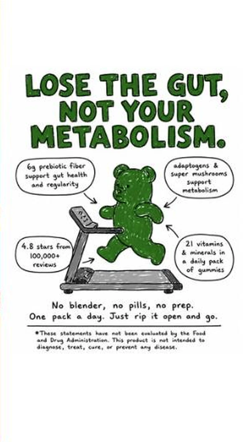
“LOSE THE GUT, NOT YOUR METABOLISM.”
Handoff: Continuous
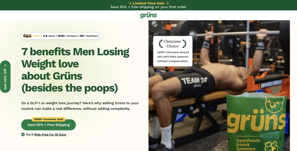
The hand-drawn bear on a treadmill under "LOSE THE GUT, NOT YOUR METABOLISM" lands on "7 benefits Men Losing Weight love about Grüns (besides the poops)", with a bench-press hero and the advertised Superfoods Greens Gummies pouch composited into the frame. Audience, product and the blunt bathroom register all carry, and because the ad printed no price the page's "Save 55% + Free Shipping" contradicts nothing. The one thing that thins is the second half of the headline: the dek talks about "a GLP-1 or weight loss journey" and never restates the adaptogens-support-metabolism callout the illustration made its argument.
The read
Running since 10 August and pointed at /pages/weight-loss-men. Everything on the frame is drawn by hand in one green marker: the headline, a bear jogging on a treadmill, four callout bubbles leadered into it, and the FDA disclaimer at the foot. The bubbles read 6g prebiotic fiber support gut health and regularity, adaptogens & super mushrooms support metabolism, 21 vitamins & minerals in a daily pack of gummies, and 4.8 stars from 100,000+ reviews. It closes on No blender, no pills, no prep. One pack a day. Just rip it open and go. I split this out of the New Bestie entry rather than filing it as a fourth variant: there is no GLP-1 language, no offer bar, no product shot and no shared layout, the destination is a gendered page, and the persuasion is objection handling rather than borrowed category attention. The two teardowns say different things.
What the ad does
- The headline names the fear, not the benefit. Losing metabolism is the worry a man already carries into a cut, so LOSE THE GUT, NOT YOUR METABOLISM arrives as an answer to something he brought with him rather than a promise he has to evaluate cold. Every callout drawn underneath is then read as support for a position he already holds.
- Two bubbles are mechanism, two are reassurance. 6g prebiotic fiber and 21 vitamins & minerals say what is in the pack; adaptogens & super mushrooms support metabolism and 4.8 stars from 100,000+ reviews say why it should be believed. Four claims share one frame without becoming a spec sheet because a marker drawing can carry them as leadered bubbles.
- The close removes effort, not price. No blender, no pills, no prep. One pack a day. For a man who has abandoned a supplement routine before, friction is the live objection, and the frame ends there. Nothing on the creative is discounted at all, which leaves the entire offer job to the page behind the click.
Objective fit
Conversion / Purchase. With no offer printed anywhere, the weight is carried by the 4.8 stars from 100,000+ reviews bubble and the effort close, and the click goes to a dedicated men's weight-loss page rather than the storefront. That is an ad built to hand a self-qualified reader into a matched pitch and let the page carry the price.
Grüns ran this conversion creative to the landing page it clicked through to, both captured August 2026. A hand-drawn bear on a treadmill, four marker callouts, and a men's weight-loss page behind the click. Read as a pair, the handoff rates continuous.
- The headline names the fear, not the benefit. Losing metabolism is the worry a man already carries into a cut, so LOSE THE GUT, NOT YOUR METABOLISM arrives as an answer to something he brought with him rather than a promise he has to evaluate cold.
- Two bubbles are mechanism, two are reassurance. 6g prebiotic fiber and 21 vitamins & minerals say what is in the pack; adaptogens & super mushrooms support metabolism and 4.8 stars from 100,000+ reviews say why it should be believed.
- The close removes effort, not price. No blender, no pills, no prep. One pack a day. For a man who has abandoned a supplement routine before, friction is the live objection, and the frame ends there.
- What to fix: Keep the FDA disclaimer inside the artwork if you lift this layout.
Ad captured by Taylor Sicard 2026-08-19, landing page 2026-08-20. Screenshots reproduced for commentary and criticism.
Tagged
- Objective
- Conversion / Purchase
- Funnel
- Cold / prospecting
- Format
- Static imageMeme / low-fiListicle static
- Placement
- Meta feedInstagram stories
- Category
- Supplements & Wellness
- Mechanic
- Objection handlingPattern interruptSocial proof stackIngredient callout
- Handoff
- Continuous
- Brand
- Grüns
Pattern interrupt is #5 of 21 ranked mechanics, on 41 pairs. See where pattern interrupt ranks
How this was evidenced
- Evidence
- Pair captured The ad and the page it clicked through to were both captured first-hand, and the destination recorded is the page the ad pointed at.
- Ad creative
- Captured August 2026
- Destination
- https://gruns.co/pages/weight-loss-men Captured August 2026. Advertisers change their ads and pages continuously, so the live page may differ from the capture above. That is expected, and the capture is the record.
- Ad Library
- Ad ID 1605008341409839
What to fix
Keep the FDA disclaimer inside the artwork if you lift this layout. Adaptogens & super mushrooms support metabolism is a structure function claim sitting directly under a headline about losing the gut, which is why the disclaimer is drawn into the image rather than left on the landing page. Swap it out for a logo and you have a regulatory problem, not a design one. Second condition: the scrawl reads as charm only because the bear is already the brand's mascot.
Across every brand: the 6 ways a handoff breaks · persuasion mechanics, ranked by how often the page keeps the promise.
More from Grüns (7)
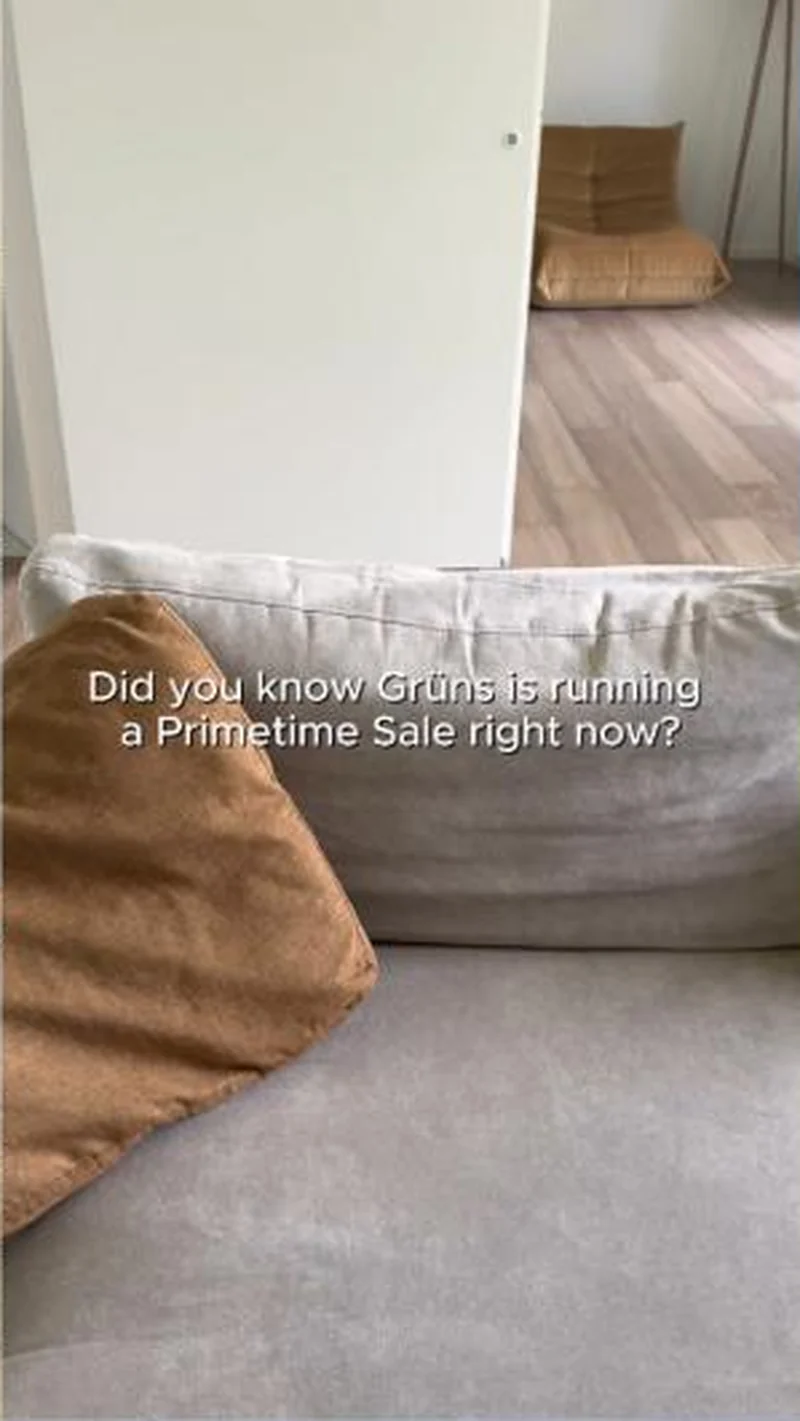 Conversion / PurchaseThe offer-led half of the same account: brand-voiced, discount-first, and aimed at people who already know the product.
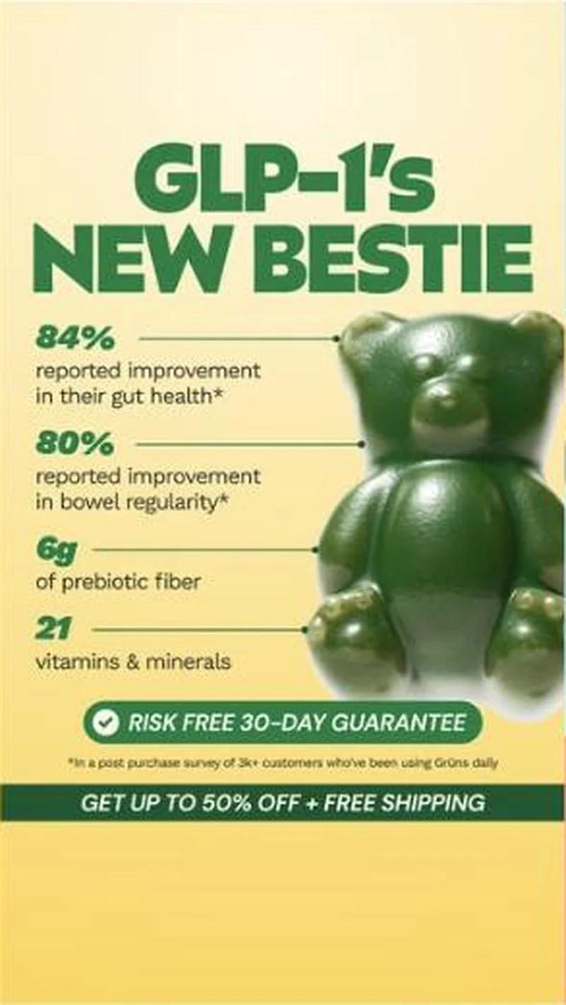 Conversion / PurchaseOne possessive headline turned into a static system: Grüns makes itself the sidekick to the drug rather than a rival to it.
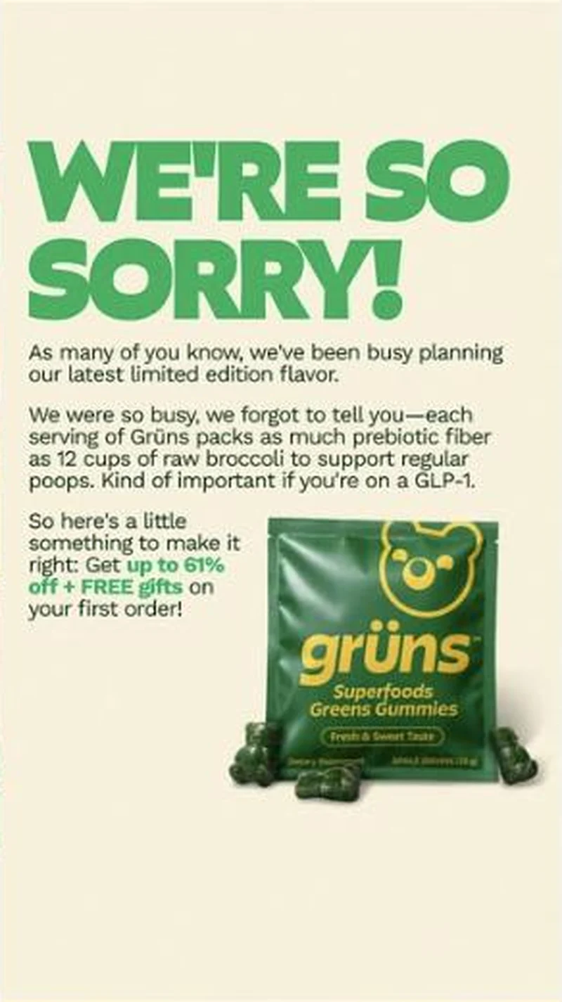 SubscriptionA corporate apology statement that turns out to be an apology for under-selling the per-serving prebiotic fiber, closing on up to 61% off plus free gifts.
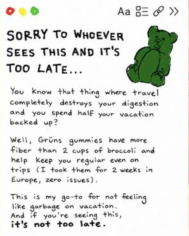 Conversion / PurchaseA fake notes-app screenshot in handwriting, written as a first-person warning about travel constipation, with a hand-drawn gummy bear instead of packaging.
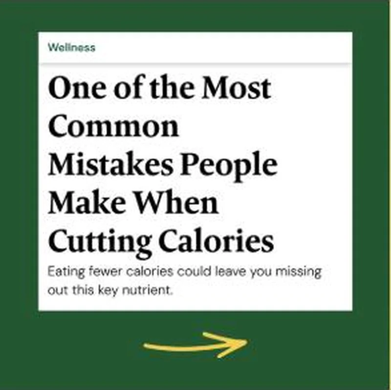 SubscriptionA magazine headline card with a Wellness section kicker, a serif hed and a dek that withholds the nutrient it is teasing.
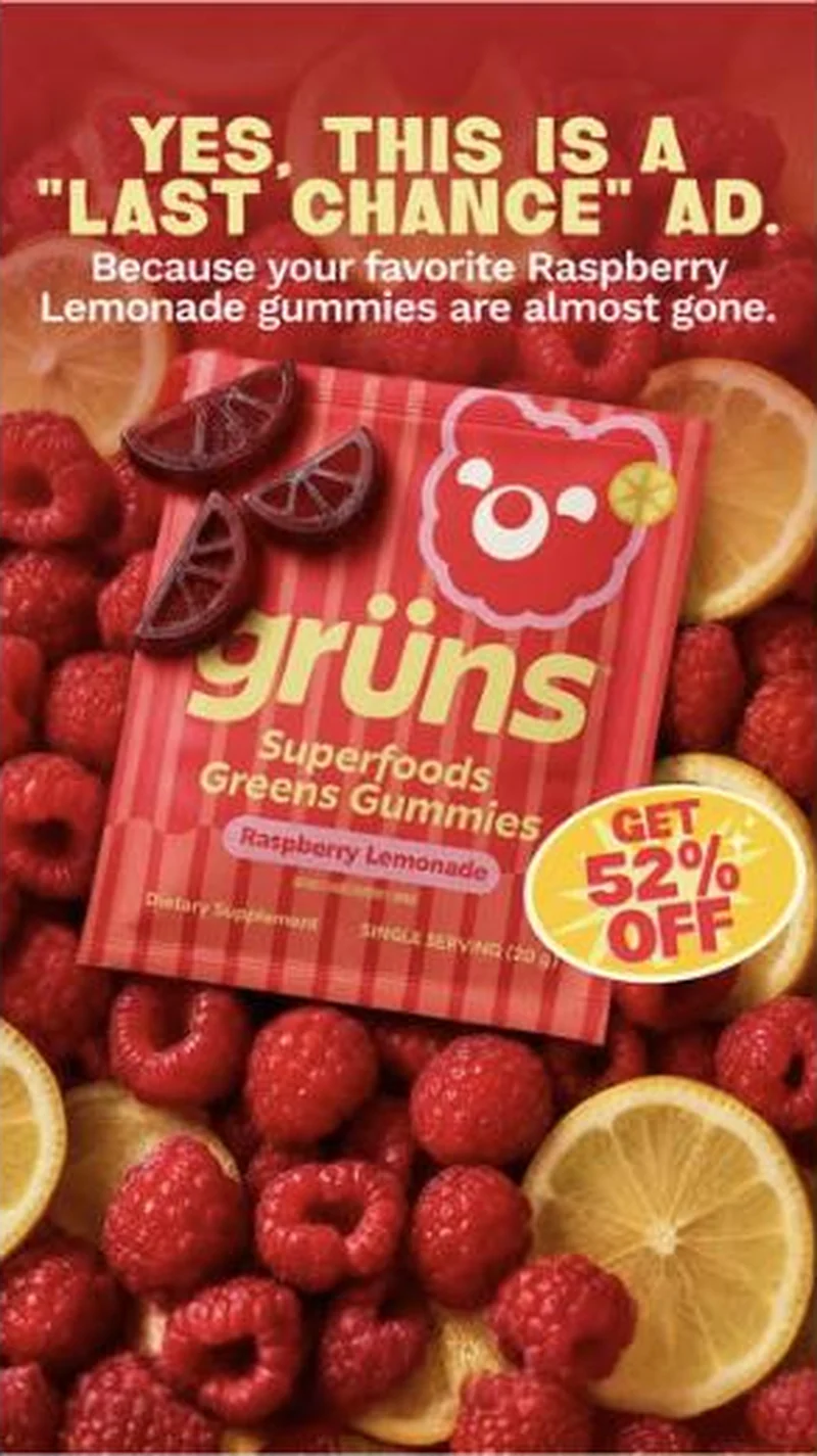 Conversion / PurchaseOffer-led statics that name their own genre out loud, attach urgency to a specific flavour, then route each flavour to its own discount page.
The same play elsewhere
Same ingredient callout, different brands.
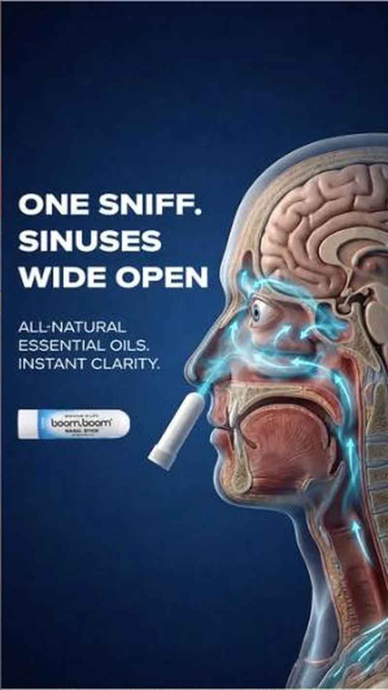 BoomBoom Naturals A five flavour lineup for menthol nasal sticks, landing on the matching product page with every flavour and the price intact.
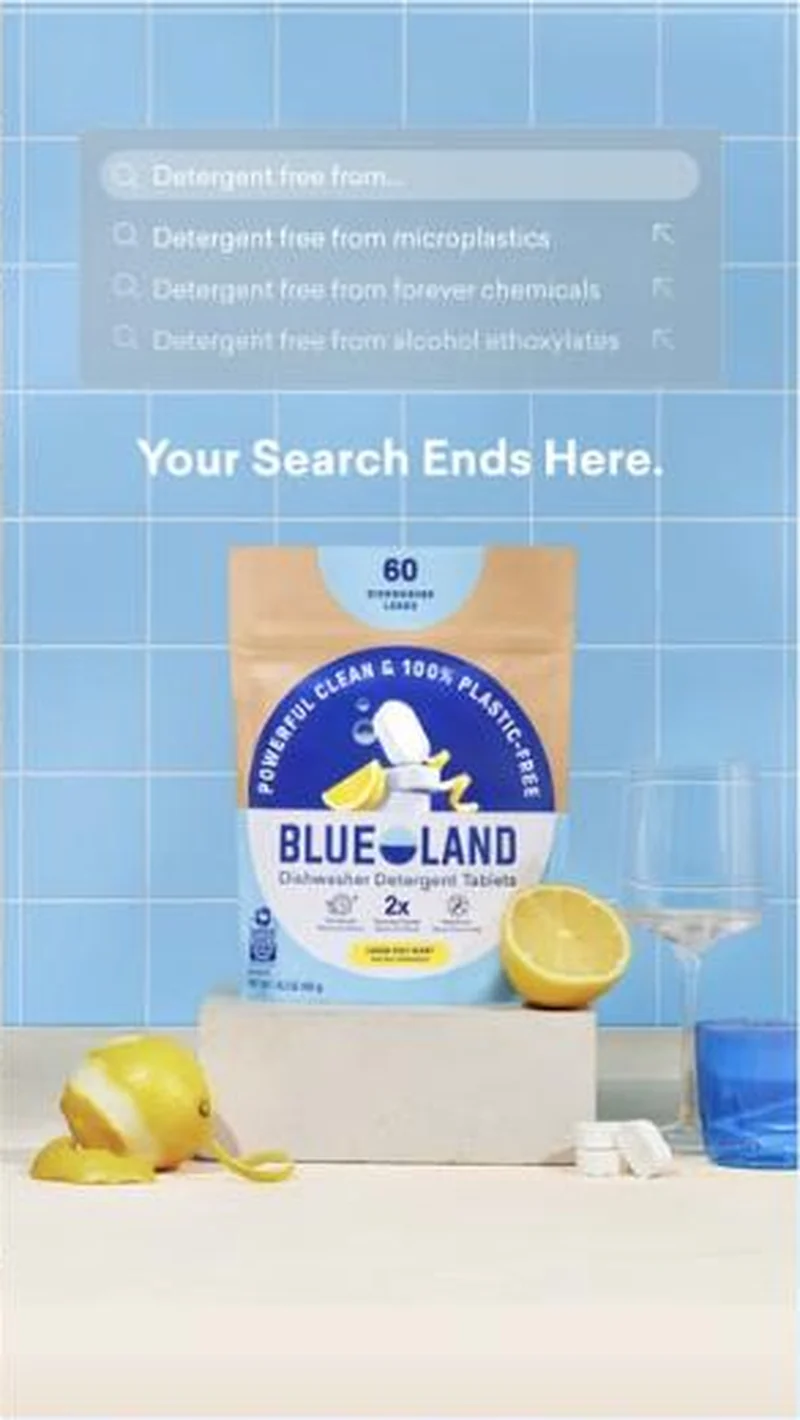 Blueland A simulated autocomplete dropdown puts an unfinished query in the reader's head, then completes it three times with named chemicals, and sends the click to a page called fb-microplastic.
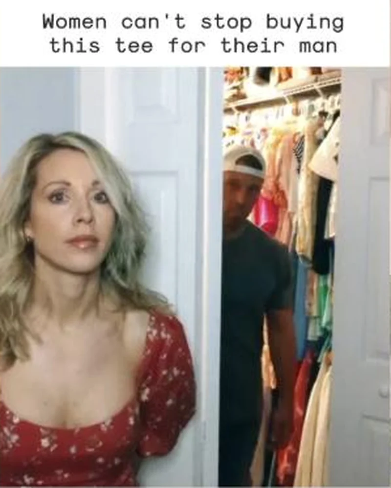 True Classic Looks like something a person made rather than something a brand approved.
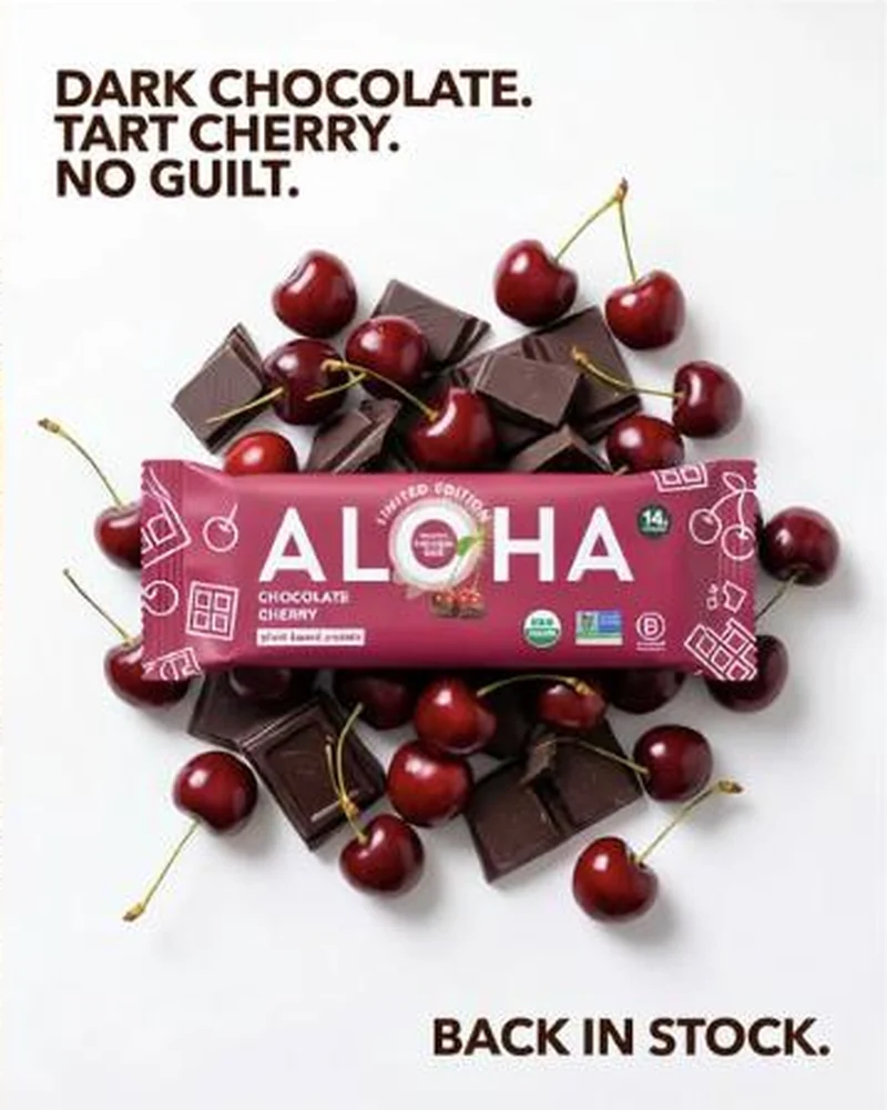 ALOHA A limited edition Chocolate Cherry bar billed as back in stock lands on the full protein bar grid, led by Pumpkin Spice behind a discount modal.
Does your own handoff survive the click?
This is the same read I run on live funnels: the ad, the page, and the gap between them. Scored, free, no call required.
Audit my store freeNew teardowns as they land, in Commerce Dispatch: the ad, the page it clicked to, and what the gap cost. Same free newsletter as the footer, no separate list.
Back to The Handoff, the full library of 253 teardowns, 226 of them ad and page pairs, filterable by objective, funnel stage, format, placement, category and persuasion mechanic.
Read next: what the continuous pairs have in common, drawn from every pair in this library.
Grüns is named here solely to identify the advertising being analysed. Brand names and marks are the property of their respective owners. No brand shown has any affiliation with, or has endorsed, Taylor Sicard Consulting.