ALOHA · Conversion / Purchase · Cold / prospecting · August 2026 · Handoff: Break · By Taylor Sicard
ALOHA ad teardown: Dark CHOCOLATE. tart CHERRY. no guilt
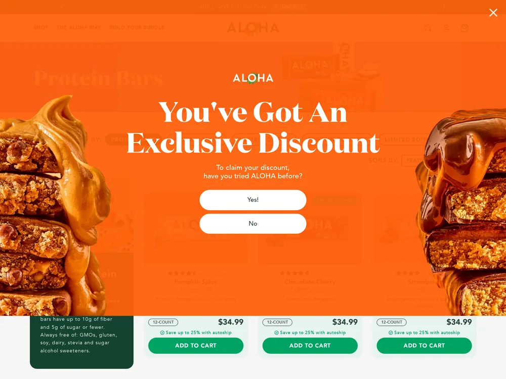
A limited edition Chocolate Cherry bar billed as back in stock lands on the full protein bar grid, led by Pumpkin Spice behind a discount modal.
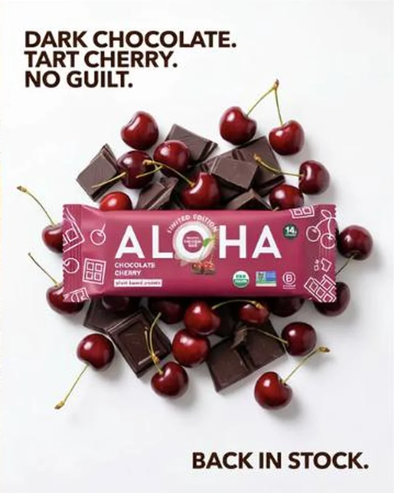
“DARK CHOCOLATE. TART CHERRY. NO GUILT.”
Handoff: Break
The ad sells one bar and one event: the magenta Chocolate Cherry wrapper, limited edition, back in stock. The click opens the whole Protein Bars collection, headed Protein Bars over a filter row, and the first card in the grid is Pumpkin Spice. Chocolate Cherry does sit second in that row with a LIMITED EDITION pill on it, but nothing on the page repeats back in stock, and at the fold the entire viewport is taken by an orange interstitial reading You've Got An Exclusive Discount over Yes! and No buttons, which covers the card the ad was pointing at. The one bar the creative promised is a tile the visitor has to dismiss a quiz to find.
The read
A flat overhead shot on plain white: a magenta ALOHA bar reading CHOCOLATE CHERRY and LIMITED EDITION lies across a pile of dark chocolate chunks and whole cherries with the stems still on. Black type in the top left corner stacks three lines, DARK CHOCOLATE, TART CHERRY, NO GUILT, and a fourth line sits alone in the bottom right, BACK IN STOCK. There is no model, no hand, no price and no button, so the wrapper and the two type blocks carry the whole unit.
What the ad does
- No guilt answers the only objection. A dessert flavour in a protein bar raises the sugar question immediately, and the third line of "DARK CHOCOLATE. TART CHERRY. NO GUILT." closes it before the viewer goes looking for a panel. The cherries and broken chocolate around the magenta wrapper do the rest at thumb speed.
- Back in stock is a return, not a launch, and the page forgets it. The line flatters people who already missed the bar once, then the click opens the whole Protein Bars collection led by Pumpkin Spice, with Chocolate Cherry second under a LIMITED EDITION pill and back in stock repeated nowhere on the page.
Objective fit
This is a purchase unit built around a single SKU, and a single SKU is what it should have been able to buy. Sending it to the category listing turns a decided click into a browse, and the visitor pays for that in scanning.
ALOHA ran this conversion creative to the landing page it clicked through to, both captured August 2026. A limited edition Chocolate Cherry bar billed as back in stock lands on the full protein bar grid, led by Pumpkin Spice behind a discount modal. Read as a pair, the handoff rates break.
- No guilt answers the only objection. A dessert flavour in a protein bar raises the sugar question immediately, and the third line of "DARK CHOCOLATE. TART CHERRY. NO GUILT." closes it before the viewer goes looking for a panel.
- Back in stock is a return, not a launch, and the page forgets it.
- Where the handoff lands: The ad sells one bar and one event: the magenta Chocolate Cherry wrapper, limited edition, back in stock.
- What to fix: Point a named flavour at that flavour's own page, with the magenta wrapper at the top, and suppress the first order quiz for anyone arriving on a paid click.
Ad captured by Taylor Sicard 2026-08-21, landing page 2026-08-29. Screenshots reproduced for commentary and criticism.
Tagged
- Objective
- Conversion / Purchase
- Funnel
- Cold / prospecting
- Format
- Static image
- Placement
- Meta feedInstagram storiesMeta reels
- Category
- Food & Beverage
- Mechanic
- Scarcity / urgencyObjection handlingIngredient callout
- Handoff
- Break
- Brand
- ALOHA
Scarcity / urgency is #6 of 21 ranked mechanics, on 39 pairs. See where scarcity / urgency ranks
How this was evidenced
- Evidence
- Pair captured The ad and the page it clicked through to were both captured first-hand, and the destination recorded is the page the ad pointed at.
- Ad creative
- Captured August 2026
- Destination
- https://aloha.com/collections/protein-bars Captured August 2026. Advertisers change their ads and pages continuously, so the live page may differ from the capture above. That is expected, and the capture is the record.
- Ad Library
- No permalink. This creative was observed running in-feed; Meta does not issue a stable public URL for a non-political ad, and purges it from the library once it stops running. The capture above is the record.
What to fix
Point a named flavour at that flavour's own page, with the magenta wrapper at the top, and suppress the first order quiz for anyone arriving on a paid click. At the fold the entire viewport is an orange interstitial reading You've Got An Exclusive Discount over Yes! and No buttons, and it covers the exact card the ad was pointing at.
One of 38 pairs where the ad sold one thing, the page shows the whole shop. See the pattern · See all 38
Sources
The same play elsewhere
Same ingredient callout, different brands.
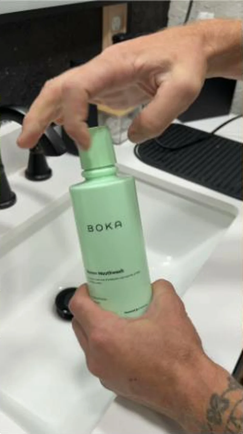 Boka A hand held sink demo of the green Renew bottle lands on its own product page, where alcohol free and pH balanced lead the copy.
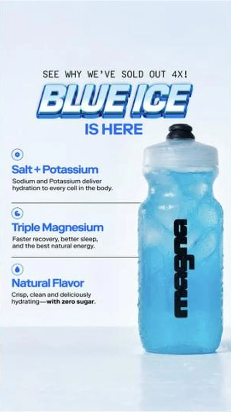 Magna A flavour launch that uses repeat stock-outs as its proof, pointed at a flavour specific URL that does not open on the flavour.
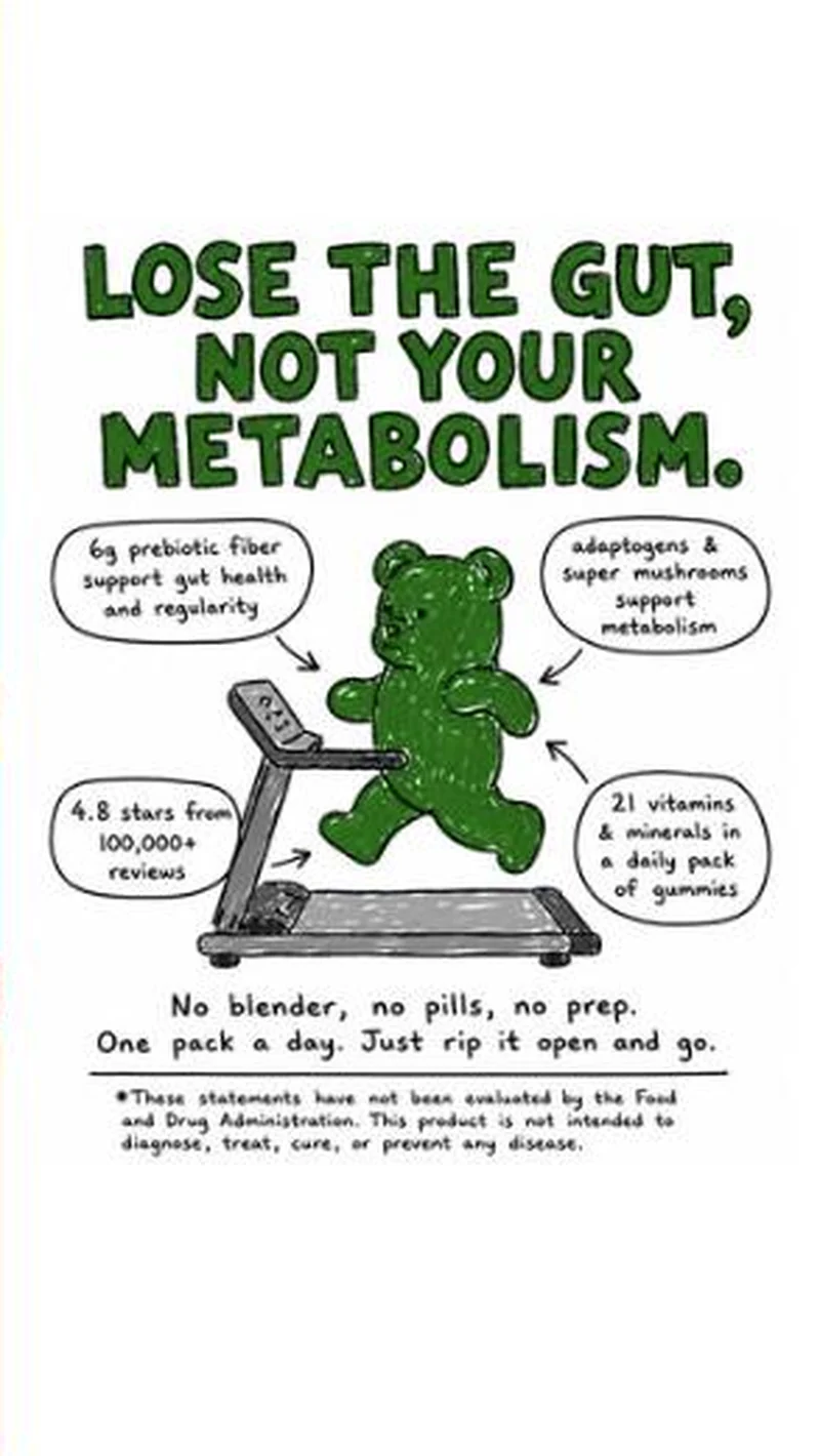 Grüns A hand-drawn bear on a treadmill, four marker callouts, and a men's weight-loss page behind the click.
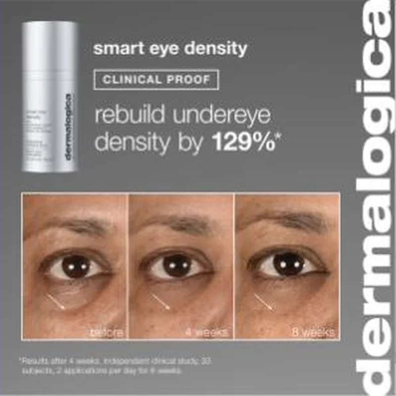 Dermalogica A block of live creatives sends paid clicks to Ulta and Sephora product pages instead of dermalogica.com, and the same products run to both destinations at once.
Does your own handoff survive the click?
This is the same read I run on live funnels: the ad, the page, and the gap between them. Scored, free, no call required.
Audit my store freeNew teardowns as they land, in Commerce Dispatch: the ad, the page it clicked to, and what the gap cost. Same free newsletter as the footer, no separate list.
Back to The Handoff, the full library of 253 teardowns, 226 of them ad and page pairs, filterable by objective, funnel stage, format, placement, category and persuasion mechanic.
Read next: how DTC promotions survive the click, drawn from every pair in this library.
ALOHA is named here solely to identify the advertising being analysed. Brand names and marks are the property of their respective owners. No brand shown has any affiliation with, or has endorsed, Taylor Sicard Consulting.