Grüns · Subscription · Cold / prospecting · August 2026 · Handoff: Break · By Taylor Sicard
Grüns ad teardown: Native article cutting calories
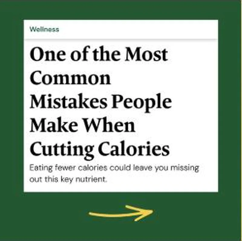
A magazine headline card with a Wellness section kicker, a serif hed and a dek that withholds the nutrient it is teasing.
“One of the Most Common Mistakes People Make When Cutting Calories”
Handoff: Break
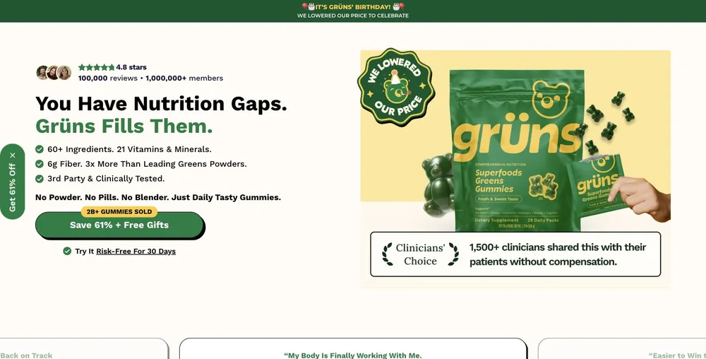
The creative is a serif Wellness card headlined "One of the Most Common Mistakes People Make When Cutting Calories" over a dek that withholds the answer: "Eating fewer calories could leave you missing out this key nutrient." The click lands on a direct response sale page headlined "You Have Nutrition Gaps. Grüns Fills Them.", with a "Save 61% + Free Gifts" button and a "Get 61% Off" tab pinned to the left edge. Nothing in the captured viewport is an article, the calorie-cutting scenario is not named, and the withheld nutrient is not revealed; the page offers "60+ Ingredients. 21 Vitamins & Minerals. 6g Fiber." instead. An editorial promise resolves as direct-response copy plus a discount the ad never mentioned.
The read
The longest-running of the three, live since 1 June 2026. The creative is a white article card floated inside a deep green frame, with a green Wellness kicker, a heavy serif headline set over five lines and a sans-serif dek reading, eating fewer calories could leave you missing out this key nutrient. No product, no logo, no price, no bear. The only brand-owned element is a hand-drawn yellow arrow at the foot of the frame pointing right, which supplies the click affordance that the editorial styling deliberately strips out.
What the ad does
- Typography is the disguise and one arrow breaks it. Green Wellness kicker, heavy serif hed over five lines, sans dek: that is the exact stack a wellness publisher uses, and at thumbnail size it reads as journalism. The only brand owned element on the card is a hand drawn yellow arrow at the foot pointing right, supplying the click affordance the editorial styling deliberately strips out.
- The dek names a consequence and withholds the noun. "Eating fewer calories could leave you missing out this key nutrient." The nutrient is never named, so nothing on the frame can answer the question it raises and the click is the only resolution available. Naming it would have converted a curiosity gap into a fact worth scrolling past.
- The mistake belongs to People, not to you. "One of the Most Common Mistakes People Make When Cutting Calories" tells a reader who is already cutting calories that the virtuous thing she is doing is wrong, and says it in the third person, so the accusation lands without anyone having to defend themselves.
Objective fit
Subscription. The card sells the click rather than the product, and the destination is the first-order offer page, so the editorial framing is buying cheap cold traffic that the page then converts into a subscription with the discount. Eleven weeks in market with no product shot suggests the click economics hold.
Grüns ran this subscription creative to the landing page it clicked through to, both captured August 2026. A magazine headline card with a Wellness section kicker, a serif hed and a dek that withholds the nutrient it is teasing. Read as a pair, the handoff rates break.
- Typography is the disguise and one arrow breaks it. Green Wellness kicker, heavy serif hed over five lines, sans dek: that is the exact stack a wellness publisher uses, and at thumbnail size it reads as journalism.
- The dek names a consequence and withholds the noun. "Eating fewer calories could leave you missing out this key nutrient." The nutrient is never named, so nothing on the frame can answer the question it raises and the click is the only resolution available.
- The mistake belongs to People, not to you.
- What to fix: Open the destination with the answer the headline promised, before the offer. Here the click lands on "You Have Nutrition Gaps.
Ad captured by Taylor Sicard 2026-08-19, landing page 2026-08-20. Screenshots reproduced for commentary and criticism.
Tagged
- Objective
- Subscription
- Funnel
- Cold / prospecting
- Format
- Native / editorialStatic image
- Placement
- Meta feedInstagram stories
- Category
- Supplements & Wellness
- Mechanic
- Native camouflageCuriosity gapCategory educationLongevity / proven hook
- Handoff
- Break
- Brand
- Grüns
Curiosity gap is #7 of 21 ranked mechanics, on 37 pairs. See where curiosity gap ranks
How this was evidenced
- Evidence
- Pair captured The ad and the page it clicked through to were both captured first-hand, and the destination recorded is the page the ad pointed at.
- Ad creative
- Captured August 2026
- Destination
- https://gruns.co/pages/first-order Captured August 2026. Advertisers change their ads and pages continuously, so the live page may differ from the capture above. That is expected, and the capture is the record.
- Ad Library
- Ad ID 1382315417072328
What to fix
Open the destination with the answer the headline promised, before the offer. Here the click lands on "You Have Nutrition Gaps. Grüns Fills Them." with a "Save 61% + Free Gifts" button and a "Get 61% Off" tab pinned to the edge: no article, no calorie cutting scenario, and the withheld nutrient still withheld. Editorial camouflage buys a cheap click and then spends it in the first screen, so a page that opens on price is paying for traffic it immediately loses.
One of 44 pairs where the page drops the argument that earned the click. See the pattern · See all 44
More from Grüns (7)
 Conversion / PurchaseThe offer-led half of the same account: brand-voiced, discount-first, and aimed at people who already know the product.
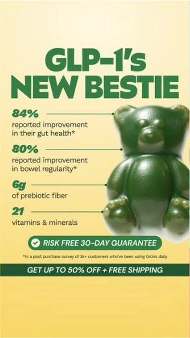 Conversion / PurchaseOne possessive headline turned into a static system: Grüns makes itself the sidekick to the drug rather than a rival to it.
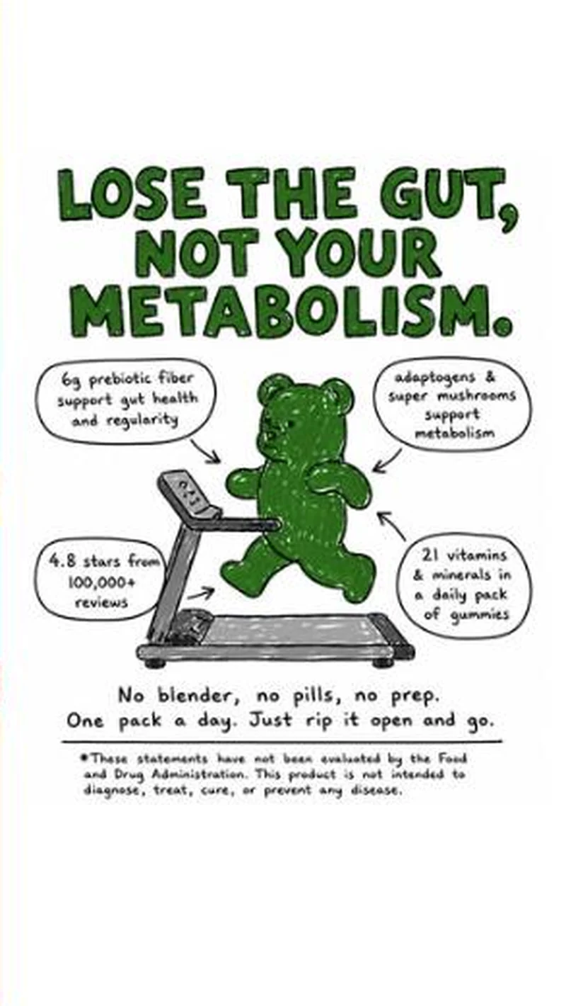 Conversion / PurchaseA hand-drawn bear on a treadmill, four marker callouts, and a men's weight-loss page behind the click.
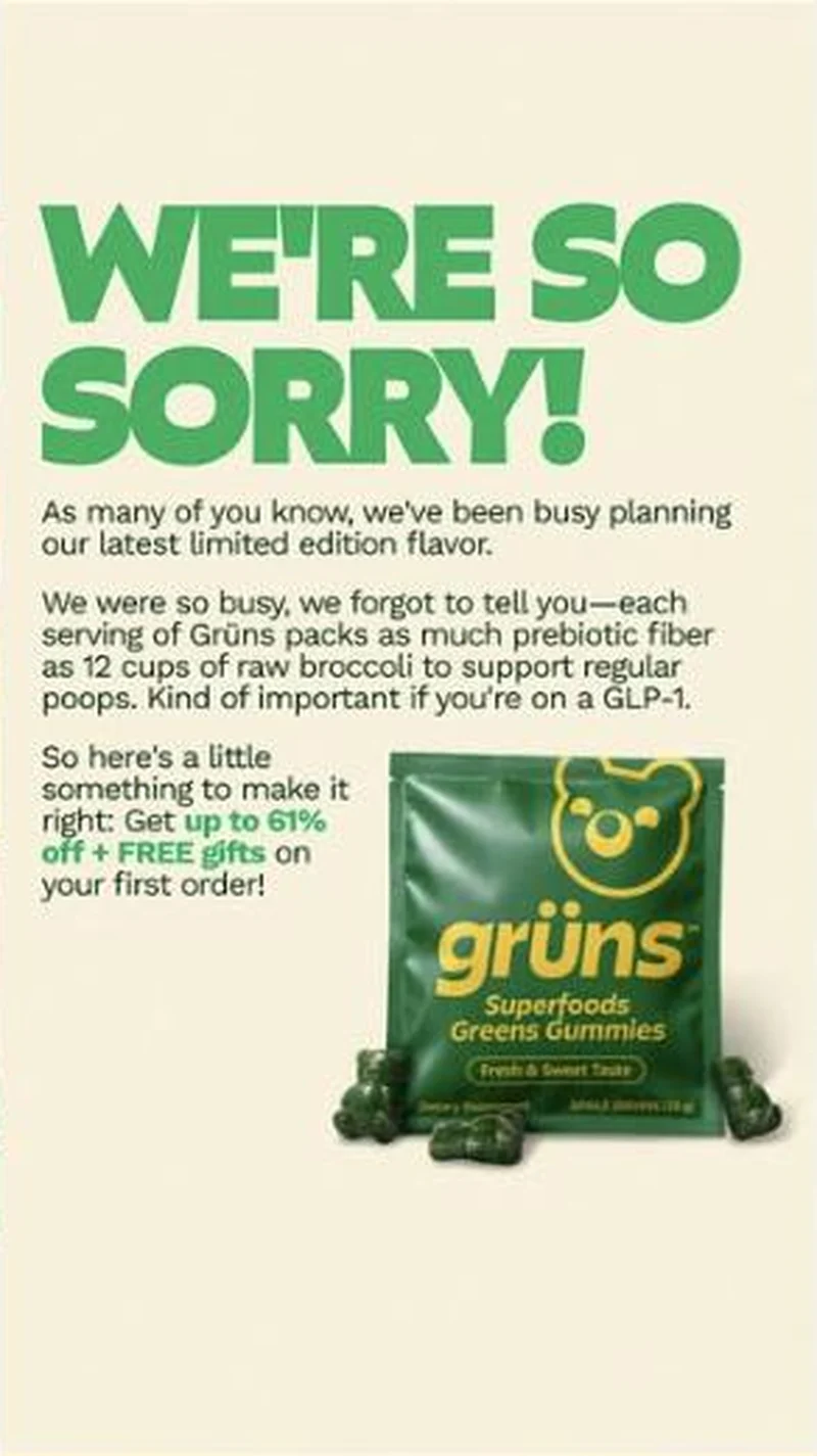 SubscriptionA corporate apology statement that turns out to be an apology for under-selling the per-serving prebiotic fiber, closing on up to 61% off plus free gifts.
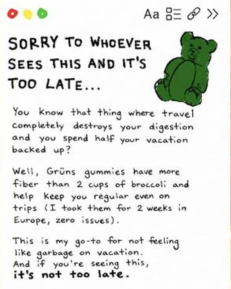 Conversion / PurchaseA fake notes-app screenshot in handwriting, written as a first-person warning about travel constipation, with a hand-drawn gummy bear instead of packaging.
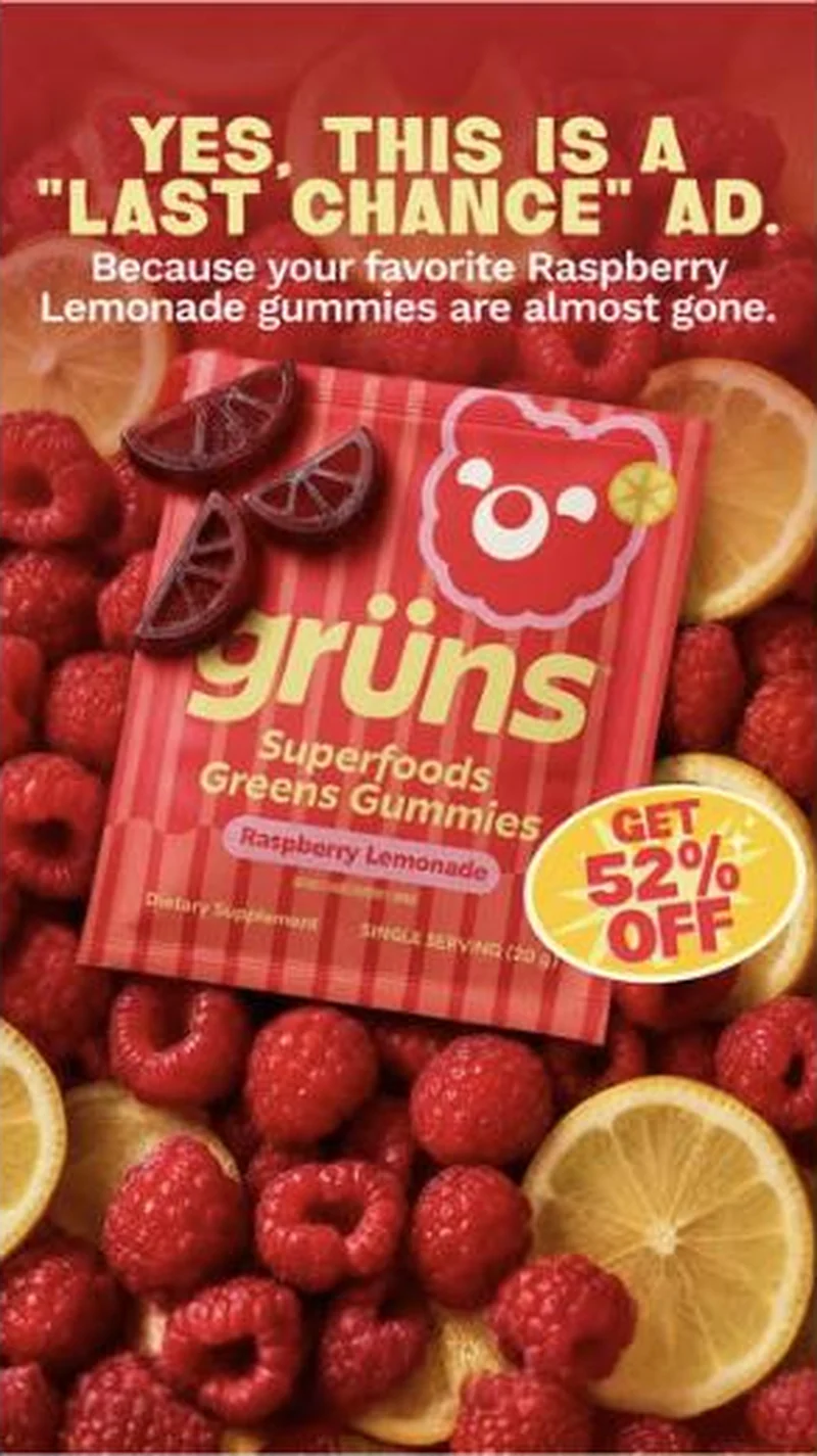 Conversion / PurchaseOffer-led statics that name their own genre out loud, attach urgency to a specific flavour, then route each flavour to its own discount page.
The same play elsewhere
Same curiosity gap, different brands.
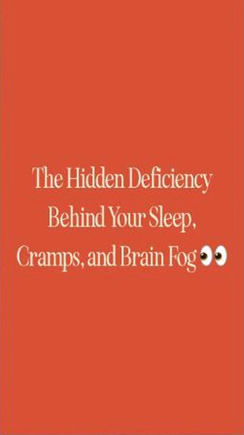 BiOptimizers A flat orange text card promising a hidden deficiency lands on the Magnesium Breakthrough page, which names the mineral in its headline.
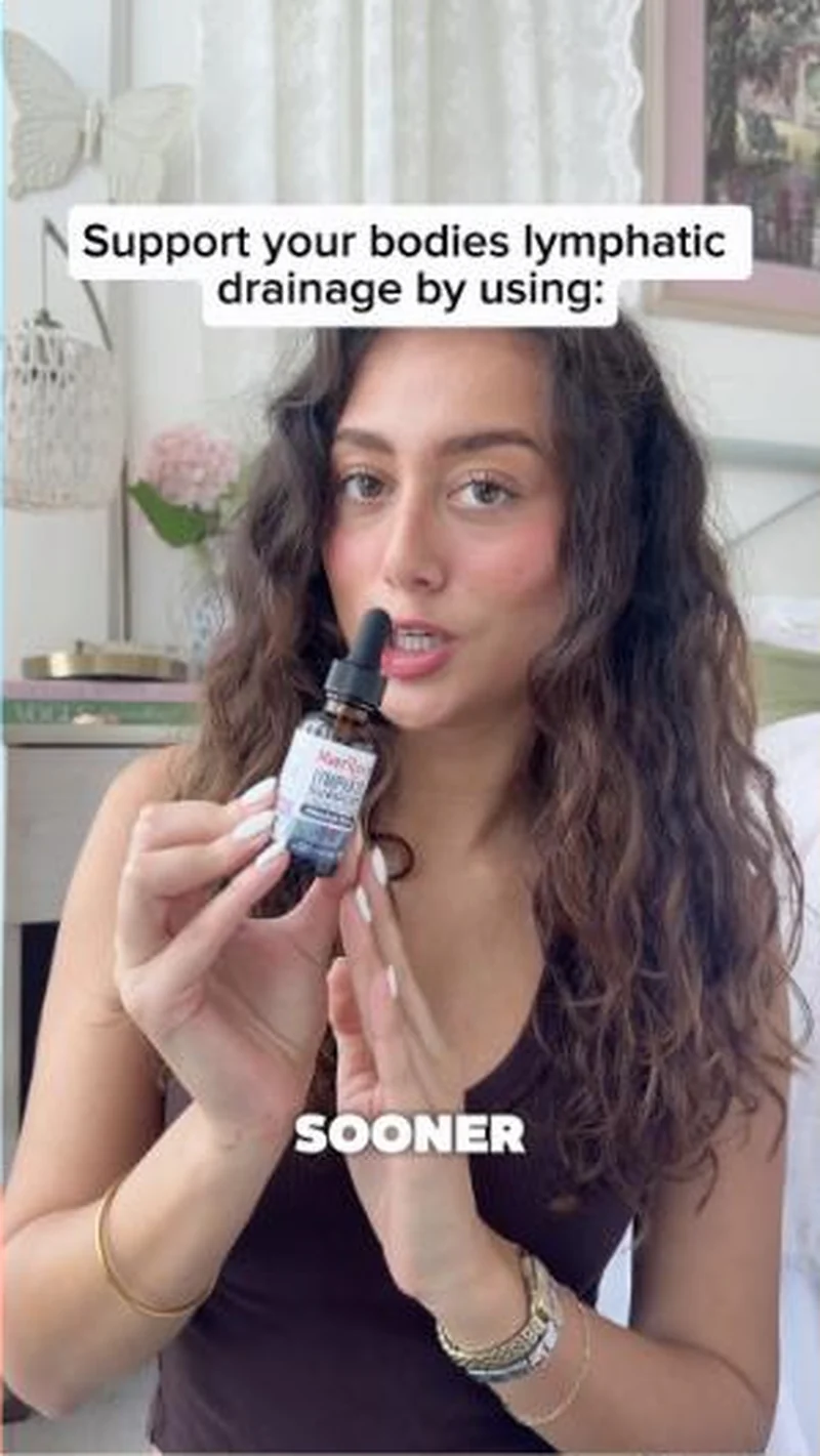 MaryRuth Organics A creator holds up the lymphatic dropper mid-sentence, and the page opens on that exact bottle with its herb list in view.
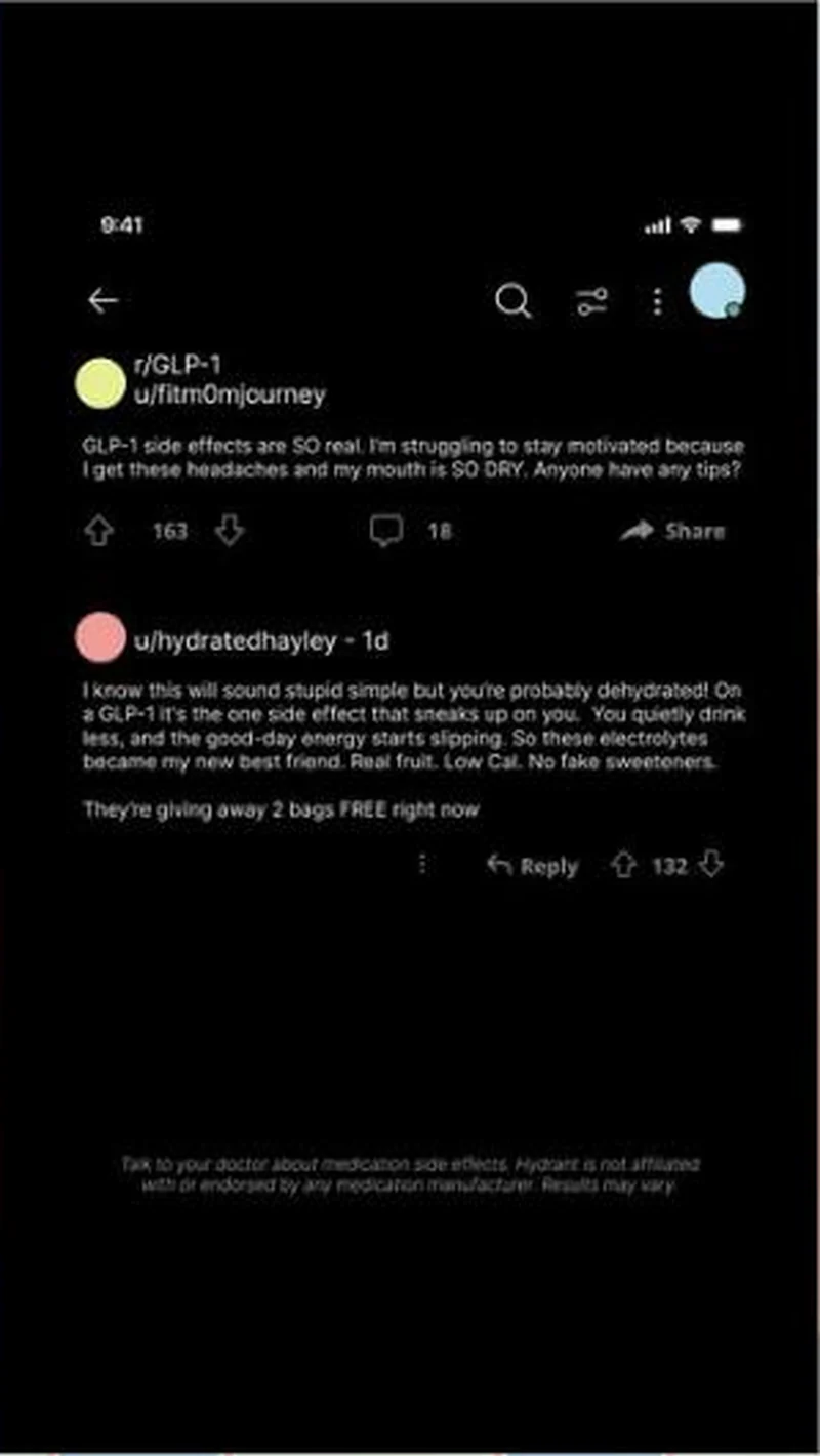 Hydrant Hydrant builds a fabricated Reddit thread to answer a GLP-1 side effect nobody is advertising against, then carries a real medical disclaimer on the fake screenshot.
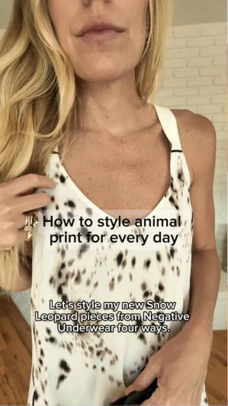 Negative A creator styles Snow Leopard print four ways, then the click lands on the same bra in plain Buff with no animal print in sight.
Does your own handoff survive the click?
This is the same read I run on live funnels: the ad, the page, and the gap between them. Scored, free, no call required.
Audit my store freeNew teardowns as they land, in Commerce Dispatch: the ad, the page it clicked to, and what the gap cost. Same free newsletter as the footer, no separate list.
Back to The Handoff, the full library of 253 teardowns, 226 of them ad and page pairs, filterable by objective, funnel stage, format, placement, category and persuasion mechanic.
Read next: what breaks, across every rated pair, drawn from every pair in this library.
Grüns is named here solely to identify the advertising being analysed. Brand names and marks are the property of their respective owners. No brand shown has any affiliation with, or has endorsed, Taylor Sicard Consulting.