Grüns · Subscription · Cold / prospecting · August 2026 · Handoff: Partial · By Taylor Sicard
Grüns ad teardown: We're so sorry!
A corporate apology statement that turns out to be an apology for under-selling the per-serving prebiotic fiber, closing on up to 61% off plus free gifts.
“WE'RE SO SORRY!”
Handoff: Partial
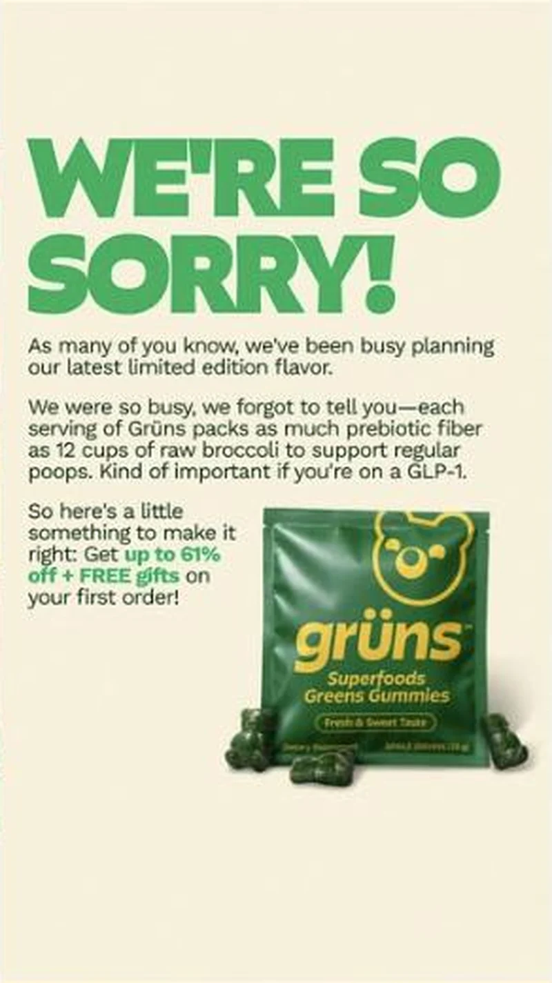
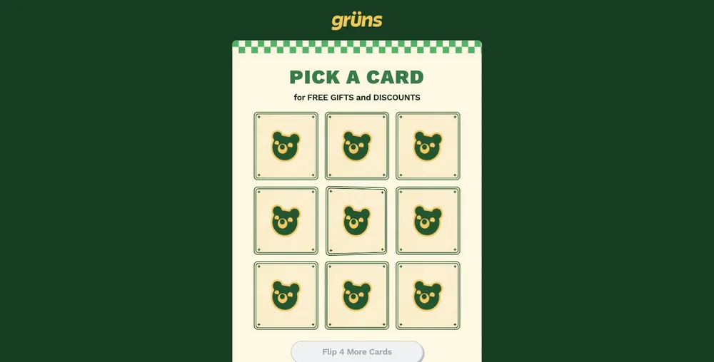
The "WE'RE SO SORRY!" static apologises for burying a fiber claim (as much prebiotic fiber as 12 cups of raw broccoli), shows the Superfoods Greens Gummies pouch, and closes on "up to 61% off + FREE gifts on your first order". The page keeps that offer almost word for word, "PICK A CARD / for FREE GIFTS and DISCOUNTS", but gates it behind a nine-card flip game. The apology conceit, the broccoli line, the limited edition flavour and the product itself are all absent from the first viewport, and the 61% is never stated. The promise survives only as a prize the reader has to play for.
The read
Running since 20 July 2026. The creative borrows the visual grammar of a brand apology post: oversized all-caps headline, no product for the first two thirds, body copy set as a statement rather than ad copy. The apology is fake in the useful sense. Grüns is not sorry for a recall or a shipping delay, it is sorry it was too busy planning a limited edition flavour to mention that, in its own words, each serving packs as much prebiotic fiber as 12 cups of raw broccoli to support regular poops, adding that this is kind of important if you're on a GLP-1. The make-good is the offer: here's a little something to make it right, up to 61% off plus free gifts on a first order.
What the ad does
- The format buys the read. An oversized all-caps "WE'RE SO SORRY!" with no product for the first two thirds reads as news rather than as media, so the eye treats the paragraph underneath it as information. By the time the reader learns nothing actually went wrong, the fiber claim has already landed.
- The thing being apologised for is the benefit. Grüns is sorry it was too busy planning a limited edition flavour to mention that each serving packs as much prebiotic fiber as 12 cups of raw broccoli. Instead of boasting, the brand confesses, and a confession reads as more honest than the identical claim set as a headline.
- Guilt converts into a discount without a coupon frame. Because "up to 61% off + FREE gifts on your first order" is positioned as making it right, it arrives as restitution rather than as a promotion, which softens the discount signal that normally cheapens a supplement brand.
Objective fit
Subscription. The on-creative offer is explicitly a first-order deal, and it points at the GLP-1 gift-with-purchase flip-to-win page rather than a PDP, so the click is aimed at acquisition into the recurring plan with a game layered over the offer.
Grüns ran this subscription creative to the landing page it clicked through to, both captured August 2026. A corporate apology statement that turns out to be an apology for under-selling the per-serving prebiotic fiber, closing on up to 61% off plus free gifts. Read as a pair, the handoff rates partial.
- The format buys the read. An oversized all-caps "WE'RE SO SORRY!" with no product for the first two thirds reads as news rather than as media, so the eye treats the paragraph underneath it as information.
- The thing being apologised for is the benefit. Grüns is sorry it was too busy planning a limited edition flavour to mention that each serving packs as much prebiotic fiber as 12 cups of raw broccoli.
- Guilt converts into a discount without a coupon frame.
- Where the handoff lands: The "WE'RE SO SORRY!" static apologises for burying a fiber claim (as much prebiotic fiber as 12 cups of raw broccoli), shows the Superfoods Greens Gummies pouch, and closes on "up to 61% off + FREE gifts on your first order".
- What to fix: Use manufactured contrition once, and never at a brand with a real quality or safety history.
Ad captured by Taylor Sicard 2026-08-19, landing page 2026-08-20. Screenshots reproduced for commentary and criticism.
Tagged
- Objective
- Subscription
- Funnel
- Cold / prospecting
- Format
- Static imageNative / editorial
- Placement
- Meta feedInstagram stories
- Category
- Supplements & Wellness
- Mechanic
- Native camouflagePattern interruptTwo-sided / admits a flawIngredient calloutScarcity / urgency
- Handoff
- Partial
- Brand
- Grüns
Pattern interrupt is #5 of 21 ranked mechanics, on 41 pairs. See where pattern interrupt ranks
How this was evidenced
- Evidence
- Pair captured The ad and the page it clicked through to were both captured first-hand, and the destination recorded is the page the ad pointed at.
- Ad creative
- Captured August 2026
- Destination
- https://gruns.co/pages/glp-gwp-flip-to-win Captured August 2026. Advertisers change their ads and pages continuously, so the live page may differ from the capture above. That is expected, and the capture is the record.
- Ad Library
- Ad ID 1725626181994219
What to fix
Use manufactured contrition once, and never at a brand with a real quality or safety history. A reader who clicks expecting a recall notice and finds a promotion has been paid in disappointment, and an apology headline in feed can be screenshotted out of context as an admission. Fix the destination as well: the broccoli line, the flavour and the 61% are all absent from the first viewport, which shows nine face-down cards instead.
One of 25 pairs where the offer on the page is not the offer in the ad. See the pattern · See all 25
More from Grüns (7)
 Conversion / PurchaseThe offer-led half of the same account: brand-voiced, discount-first, and aimed at people who already know the product.
 Conversion / PurchaseOne possessive headline turned into a static system: Grüns makes itself the sidekick to the drug rather than a rival to it.
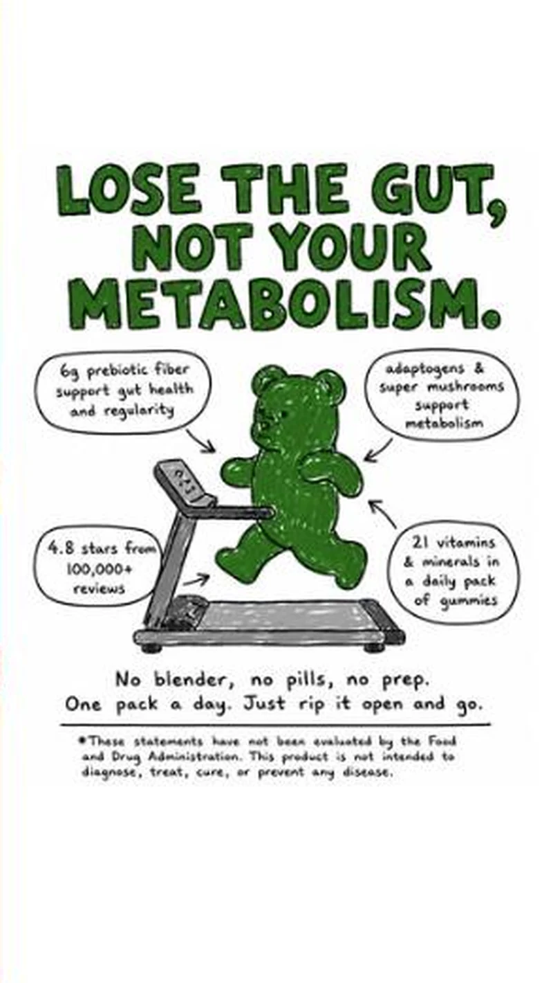 Conversion / PurchaseA hand-drawn bear on a treadmill, four marker callouts, and a men's weight-loss page behind the click.
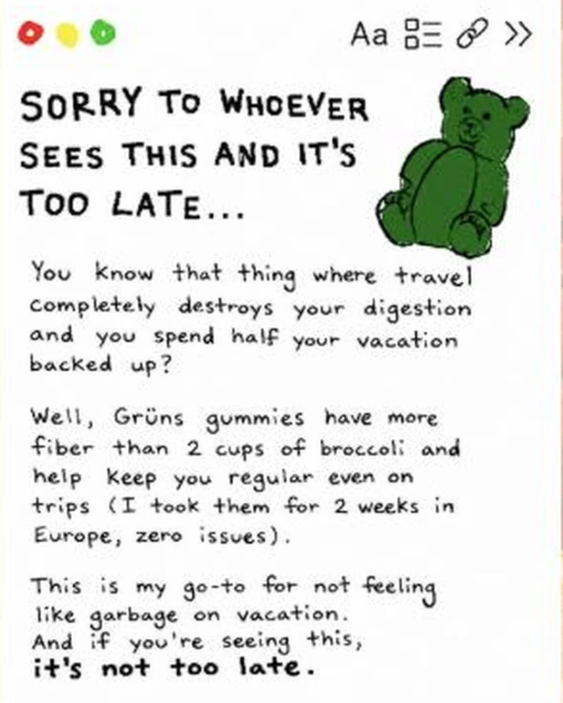 Conversion / PurchaseA fake notes-app screenshot in handwriting, written as a first-person warning about travel constipation, with a hand-drawn gummy bear instead of packaging.
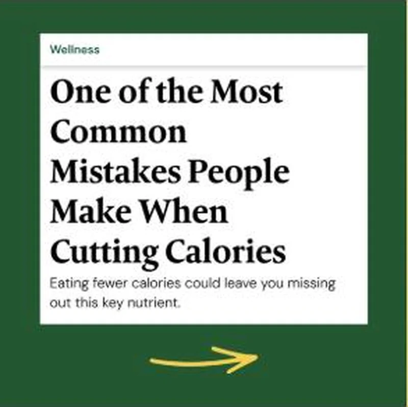 SubscriptionA magazine headline card with a Wellness section kicker, a serif hed and a dek that withholds the nutrient it is teasing.
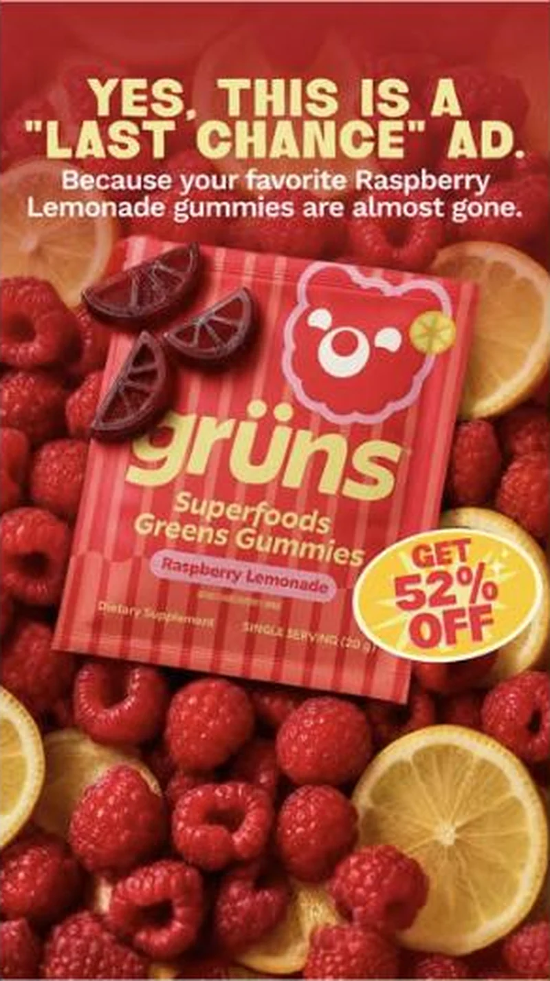 Conversion / PurchaseOffer-led statics that name their own genre out loud, attach urgency to a specific flavour, then route each flavour to its own discount page.
The same play elsewhere
Same ingredient callout, different brands.
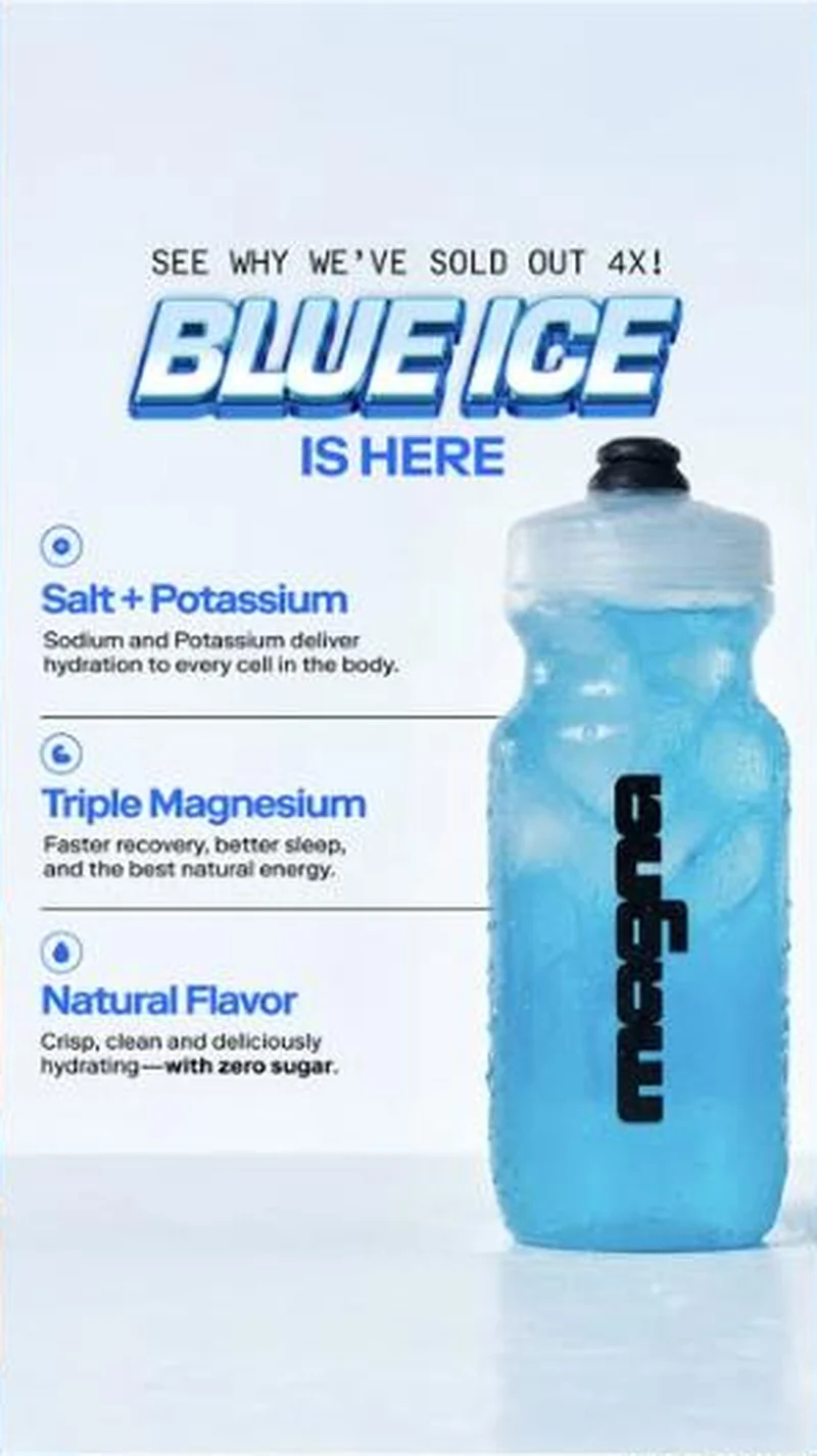 Magna A flavour launch that uses repeat stock-outs as its proof, pointed at a flavour specific URL that does not open on the flavour.
 Plant People A bedroom phone video of someone wide awake hands off to the Wonder Sleep melatonin free gummy page, behind an open and empty cart drawer.
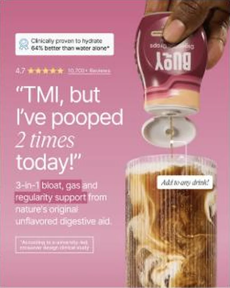 Buoy A blunt customer quote and a five figure review count land on a page showing 996 Reviews and a subscription priced ahead of a one time buy.
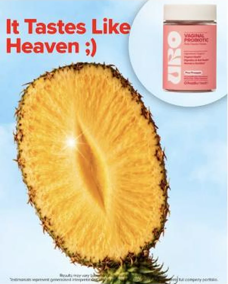 O Positiv A pineapple joke about flavour hands off to a page that answers on flavour once, then argues clinical science for the rest of the fold.
Does your own handoff survive the click?
This is the same read I run on live funnels: the ad, the page, and the gap between them. Scored, free, no call required.
Audit my store freeNew teardowns as they land, in Commerce Dispatch: the ad, the page it clicked to, and what the gap cost. Same free newsletter as the footer, no separate list.
Back to The Handoff, the full library of 253 teardowns, 226 of them ad and page pairs, filterable by objective, funnel stage, format, placement, category and persuasion mechanic.
Read next: how DTC promotions survive the click, drawn from every pair in this library.
Grüns is named here solely to identify the advertising being analysed. Brand names and marks are the property of their respective owners. No brand shown has any affiliation with, or has endorsed, Taylor Sicard Consulting.