Grüns · Conversion / Purchase · Cold / prospecting · August 2026 · Handoff: Continuous · By Taylor Sicard
Grüns ad teardown: Handwritten travel note
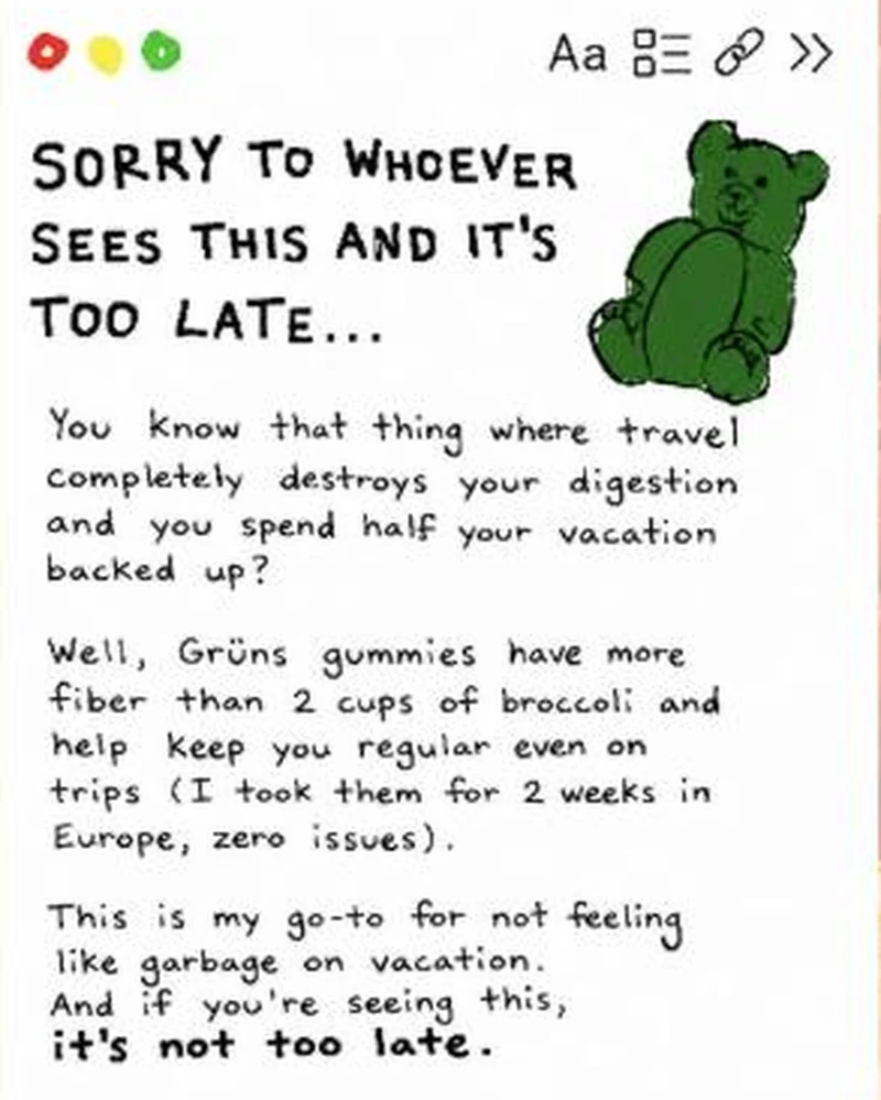
A fake notes-app screenshot in handwriting, written as a first-person warning about travel constipation, with a hand-drawn gummy bear instead of packaging.
“SORRY TO WHOEVER SEES THIS AND IT'S TOO LATE...”
Handoff: Continuous
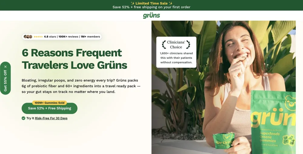
The fake notes-app confession asks "You know that thing where travel completely destroys your digestion and you spend half your vacation backed up?" and the page answers with "6 Reasons Frequent Travelers Love Grüns" over the dek "Bloating, irregular poops, and zero energy every trip?". Same complaint, same audience, same plain wording, and the hero puts a Grüns pouch in a tropical off-duty setting, which is the closest the pairing gets to a product shot, since the ad draws a gummy bear and shows no packaging. The ad carried no price, so the page's "Save 52% + Free Shipping" introduces nothing the creative has to walk back. The only softening is register, from a handwritten personal note to a branded listicle.
The read
Running since 27 July 2026. The whole frame is a notes-app window: three traffic-light dots top left, the text-style, checklist, link and chevron icons top right, and body copy in a handwriting face. There is no logo lockup and no product photography, only a marker-drawn green bear. The copy is first person and confessional, naming the exact scenario, travel completely destroying your digestion and half a vacation spent backed up, then dropping the product in mid-paragraph with a personal receipt: more fiber than 2 cups of broccoli, two weeks in Europe, zero issues. The last block is the softest sell in the set, this is my go-to for not feeling like garbage on vacation, before it resolves the headline in bold: it's not too late.
What the ad does
- Window chrome does the disguising, not the copy. Three traffic light dots sit top left and the text style, checklist, link and chevron icons top right, so the frame resolves as a screenshot somebody took of their own note. No logo lockup, no packaging, only a marker drawn green bear. A feed reader has filed it as a friend before a word is read.
- The proof is a receipt, not a claim. The product arrives mid paragraph behind "more fiber than 2 cups of broccoli" and a personal result, two weeks in Europe, zero issues. That is a person reporting a trip rather than a brand stating a benefit, and the broccoli line is the only number anywhere on the frame.
- The headline opens a loop the last line closes. Too late for what is never stated, and the frame ends by resolving the same words in bold: "it's not too late". Reading top to bottom is the only way to find out, which buys the dwell that no price is buying, since the creative carries no offer, no discount and no urgency at all.
Objective fit
Conversion / Purchase. No price, discount or urgency appears on the creative, so the ad is doing situational persuasion only and hands the offer job entirely to the travel gut-health page. That is a purchase intent play built on problem recognition rather than on a deal.
Grüns ran this conversion creative to the landing page it clicked through to, both captured August 2026. A fake notes-app screenshot in handwriting, written as a first-person warning about travel constipation, with a hand-drawn gummy bear instead of packaging. Read as a pair, the handoff rates continuous.
- Window chrome does the disguising, not the copy. Three traffic light dots sit top left and the text style, checklist, link and chevron icons top right, so the frame resolves as a screenshot somebody took of their own note.
- The proof is a receipt, not a claim. The product arrives mid paragraph behind "more fiber than 2 cups of broccoli" and a personal result, two weeks in Europe, zero issues.
- The headline opens a loop the last line closes. Too late for what is never stated, and the frame ends by resolving the same words in bold: "it's not too late".
- What to fix: Keep the nutrient and the comparator visible in every claim running in parallel.
Ad captured by Taylor Sicard 2026-08-19, landing page 2026-08-20. Screenshots reproduced for commentary and criticism.
Tagged
- Objective
- Conversion / Purchase
- Funnel
- Cold / prospecting
- Format
- Static imageMeme / low-fi
- Placement
- Meta feedInstagram stories
- Category
- Supplements & Wellness
- Mechanic
- Native camouflageCuriosity gapMoment anchoringProblem agitationSpecificity
- Handoff
- Continuous
- Brand
- Grüns
Specificity is #2 of 21 ranked mechanics, on 83 pairs. See where specificity ranks
How this was evidenced
- Evidence
- Pair captured The ad and the page it clicked through to were both captured first-hand, and the destination recorded is the page the ad pointed at.
- Ad creative
- Captured August 2026
- Destination
- https://gruns.co/pages/gut-health-travel Captured August 2026. Advertisers change their ads and pages continuously, so the live page may differ from the capture above. That is expected, and the capture is the record.
- Ad Library
- Ad ID 1634829378647890
What to fix
Keep the nutrient and the comparator visible in every claim running in parallel. This creative says "more fiber than 2 cups of broccoli", a floor, while the apology creative in the same account says as much prebiotic fiber as 12 cups of raw broccoli, a scoped equivalence. Both are consistent, but a reader who meets both in one week reads 2 against 12 and assumes somebody is inflating. Pick one number and stay on it, or print the qualifier both times.
Across every brand: the 6 ways a handoff breaks · persuasion mechanics, ranked by how often the page keeps the promise.
More from Grüns (7)
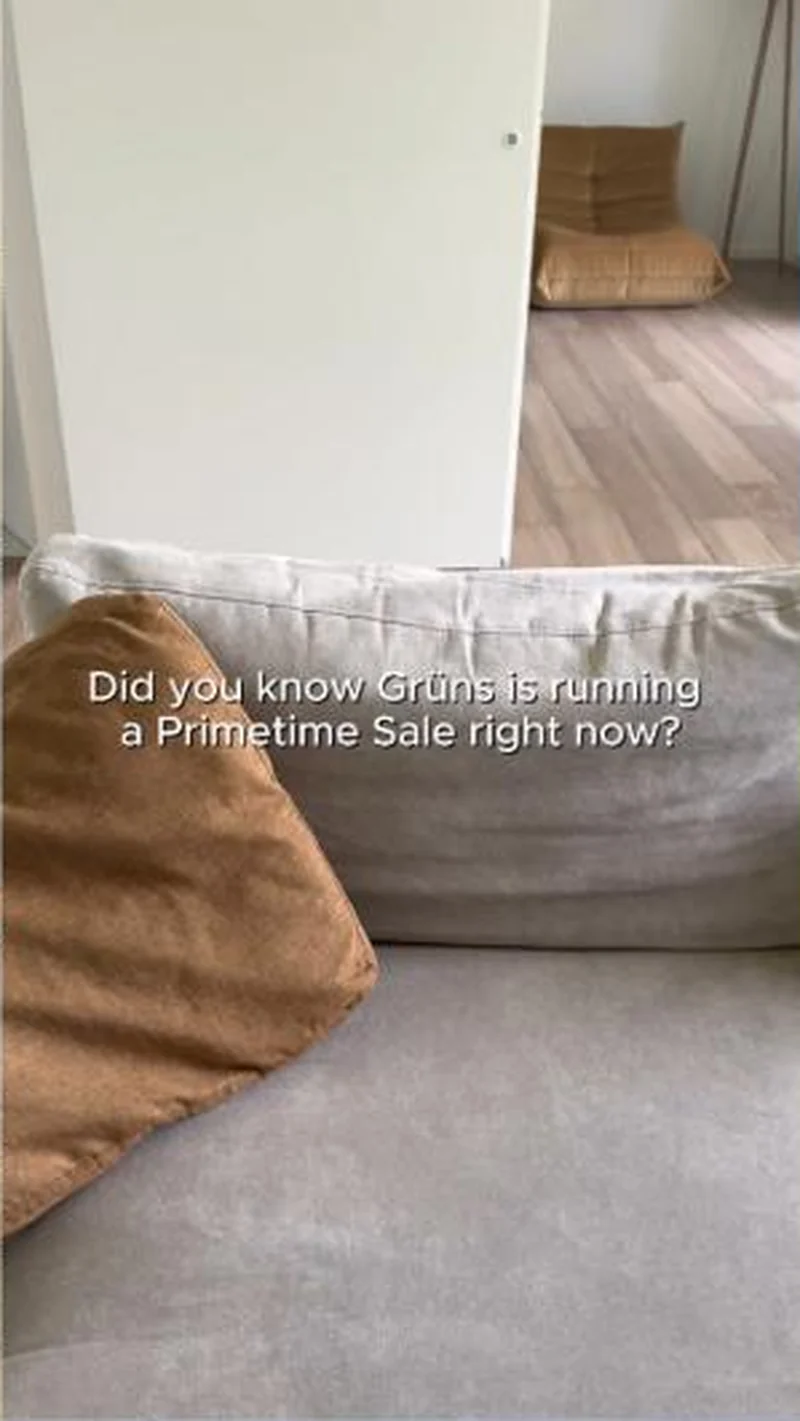 Conversion / PurchaseThe offer-led half of the same account: brand-voiced, discount-first, and aimed at people who already know the product.
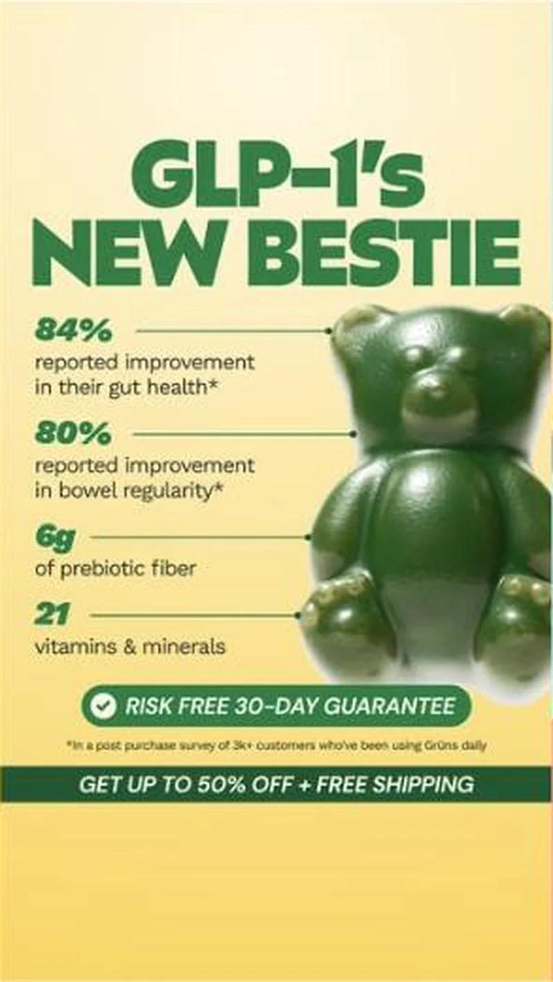 Conversion / PurchaseOne possessive headline turned into a static system: Grüns makes itself the sidekick to the drug rather than a rival to it.
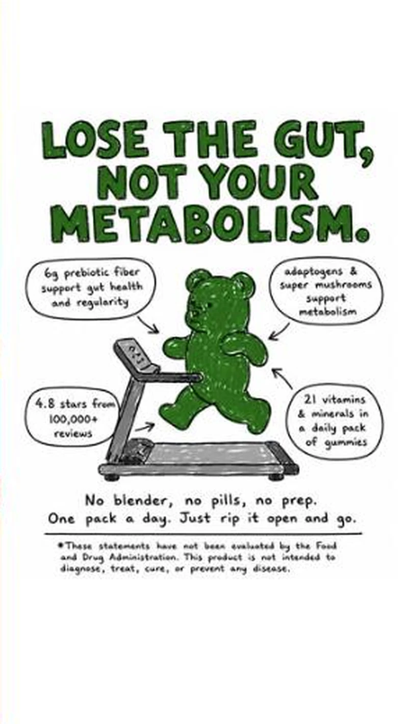 Conversion / PurchaseA hand-drawn bear on a treadmill, four marker callouts, and a men's weight-loss page behind the click.
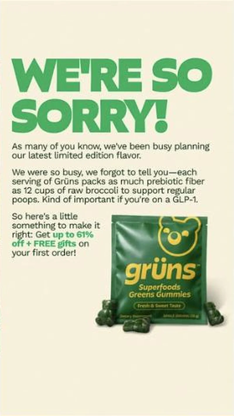 SubscriptionA corporate apology statement that turns out to be an apology for under-selling the per-serving prebiotic fiber, closing on up to 61% off plus free gifts.
 SubscriptionA magazine headline card with a Wellness section kicker, a serif hed and a dek that withholds the nutrient it is teasing.
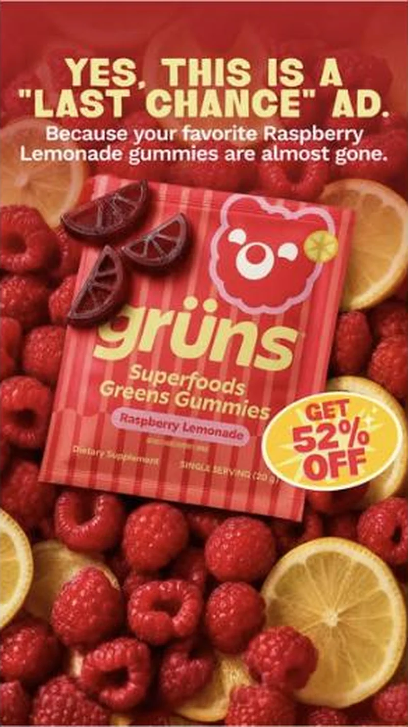 Conversion / PurchaseOffer-led statics that name their own genre out loud, attach urgency to a specific flavour, then route each flavour to its own discount page.
The same play elsewhere
Same curiosity gap, different brands.
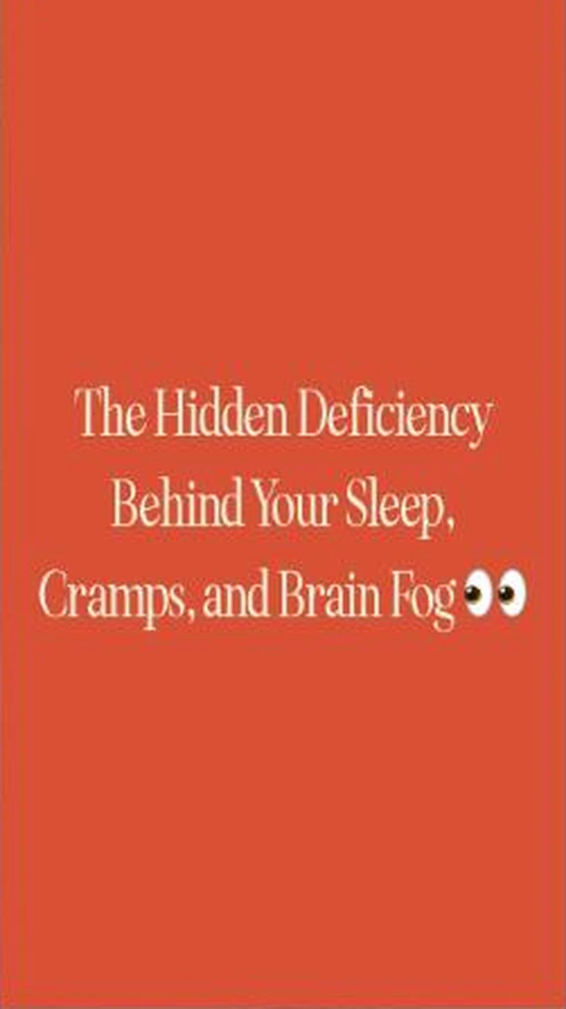 BiOptimizers A flat orange text card promising a hidden deficiency lands on the Magnesium Breakthrough page, which names the mineral in its headline.
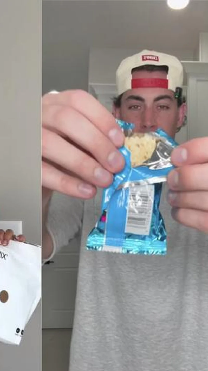 Promix A creator tearing open a Puff Bar routes to a page replaced end to end by a $15 quiz that never shows the bar at all.
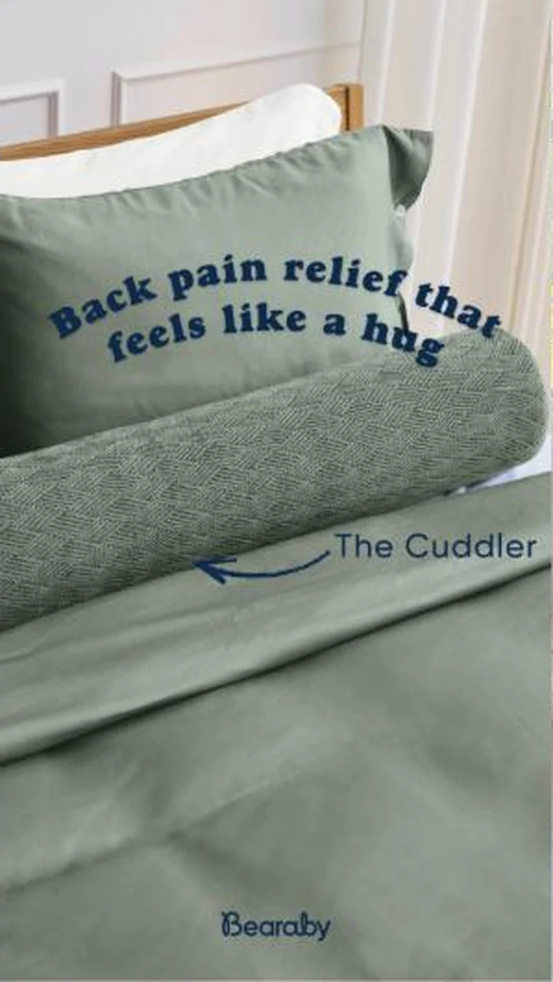 Bearaby A sage bolster arrowed The Cuddler, sold on back pain relief, lands on the right pillow page under a Back to School college essentials panel.
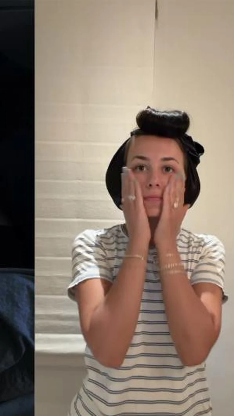 Plant People A bedroom phone video of someone wide awake hands off to the Wonder Sleep melatonin free gummy page, behind an open and empty cart drawer.
Does your own handoff survive the click?
This is the same read I run on live funnels: the ad, the page, and the gap between them. Scored, free, no call required.
Audit my store freeNew teardowns as they land, in Commerce Dispatch: the ad, the page it clicked to, and what the gap cost. Same free newsletter as the footer, no separate list.
Back to The Handoff, the full library of 253 teardowns, 226 of them ad and page pairs, filterable by objective, funnel stage, format, placement, category and persuasion mechanic.
Read next: what the continuous pairs have in common, drawn from every pair in this library.
Grüns is named here solely to identify the advertising being analysed. Brand names and marks are the property of their respective owners. No brand shown has any affiliation with, or has endorsed, Taylor Sicard Consulting.