Promix · Conversion / Purchase · Cold / prospecting · August 2026 · Handoff: Break · By Taylor Sicard
Promix ad teardown: native camouflage into purchase
A creator tearing open a Puff Bar routes to a page replaced end to end by a $15 quiz that never shows the bar at all.
“PROMIX”
Handoff: Break
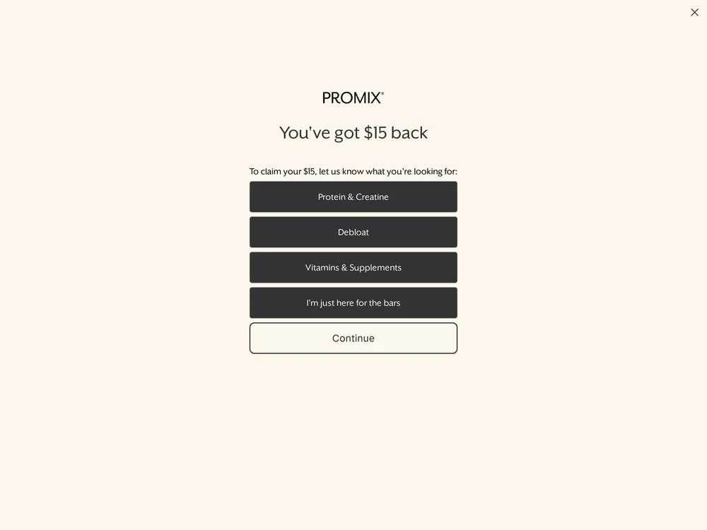
Nothing of the product page renders, at the fold or anywhere down the scroll. The whole viewport is a cream interstitial reading PROMIX, then You've got $15 back, then To claim your $15, let us know what you're looking for, over four buttons: Protein & Creatine, Debloat, Vitamins & Supplements, and I'm just here for the bars, with a Continue button under them. The blue Puff Bar wrapper the creator is opening, the bar itself and the vanilla flavour named in the URL appear nowhere on screen. The quiz even carries a button for people who came for the bars, so the page knows who is arriving and asks them to answer a survey anyway.
The read
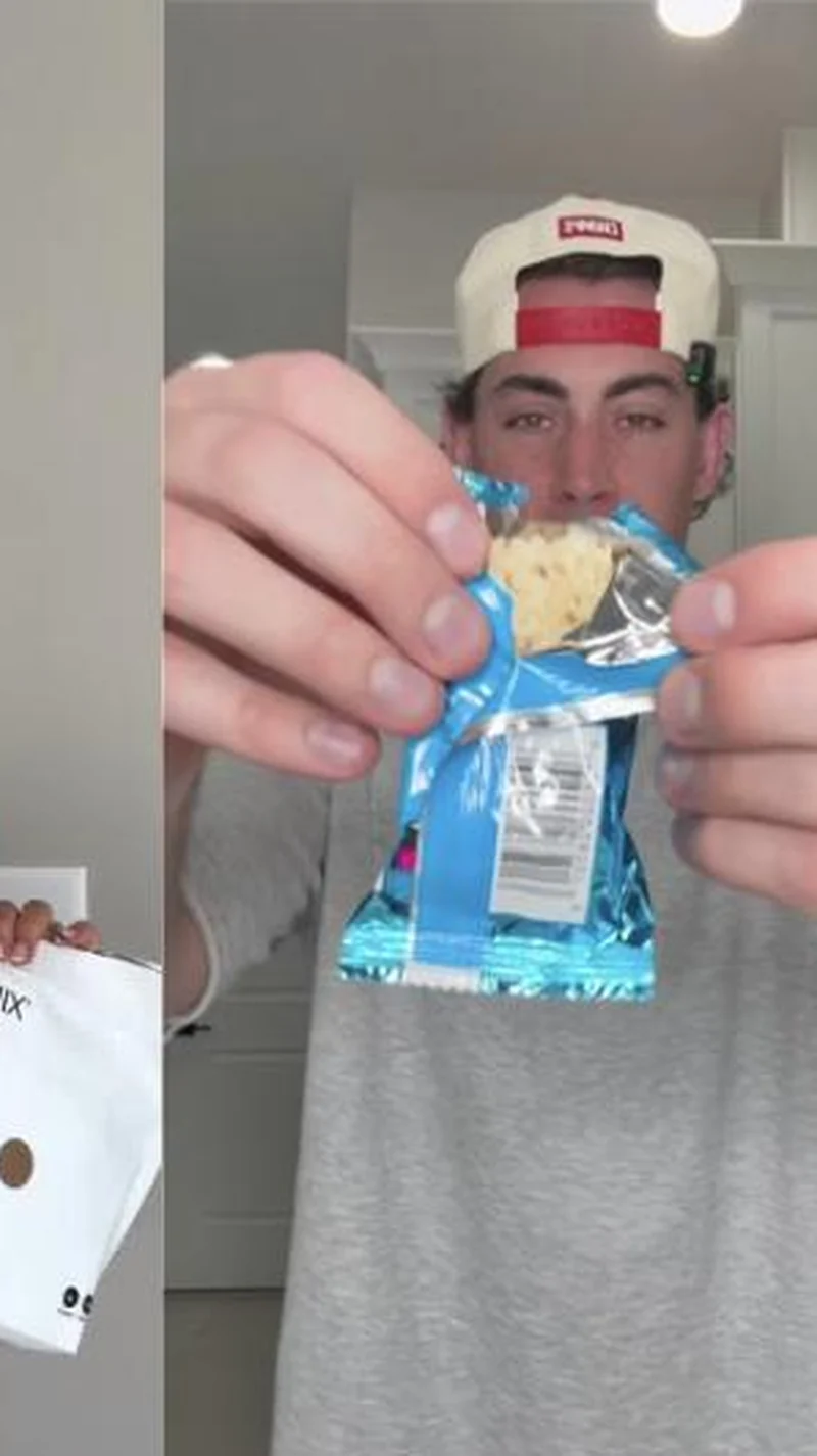
A hand held vertical frame shot in a hallway under a ceiling light, split down the left third by a second frame. In the main frame a young man in a backwards cap and grey sweatshirt holds a torn blue foil wrapper up to the camera at eye level, the bar's puffed interior showing through the tear, the nutrition panel turned toward the lens. In the narrow left strip a hand holds a white Promix pouch, the wordmark cropped at the frame edge. There is no overlay text, no caption card and no on screen price, so the wrapper and the pouch are the only branding in the shot.
What the ad does
- Shot to look like a video someone sent you. Ceiling light, hallway wall, no colour grade, cap on backwards, no overlay text and no on screen price. That is the format organic snack reviews already use, and it buys the attention before the viewer has worked out this is an ad rather than a friend's clip.
- The tear is the demonstration. Opening the blue foil on camera and turning the puffed interior and the nutrition panel to the lens answers the only real question about a protein bar, which is texture. Two hands make that claim more cheaply than copy can, and the page then answers it with a quiz reading "You've got $15 back".
Objective fit
The creative is a purchase unit and it points at a single flavour page, which is the right destination for it. The mismatch is not in the ad: an interstitial quiz turns a purchase click into a survey, so the objective the creative was built for cannot resolve on the page it bought.
Promix ran this conversion creative to the landing page it clicked through to, both captured August 2026. A creator tearing open a Puff Bar routes to a page replaced end to end by a $15 quiz that never shows the bar at all. Read as a pair, the handoff rates break.
- Shot to look like a video someone sent you. Ceiling light, hallway wall, no colour grade, cap on backwards, no overlay text and no on screen price.
- The tear is the demonstration. Opening the blue foil on camera and turning the puffed interior and the nutrition panel to the lens answers the only real question about a protein bar, which is texture.
- Where the handoff lands: Nothing of the product page renders, at the fold or anywhere down the scroll.
- What to fix: Skip the quiz for anyone landing on a product URL from paid.
Ad captured by Taylor Sicard 2026-08-21, landing page 2026-08-29. Screenshots reproduced for commentary and criticism.
Tagged
- Objective
- Conversion / Purchase
- Funnel
- Cold / prospecting
- Format
- Demo / product-in-useCreator-ledMeme / low-fi
- Placement
- Meta feedMeta reelsInstagram storiesTikTok
- Category
- Food & Beverage
- Mechanic
- Native camouflageCuriosity gapSpecificity
- Handoff
- Break
- Brand
- Promix
Specificity is #2 of 21 ranked mechanics, on 83 pairs. See where specificity ranks
How this was evidenced
- Evidence
- Pair captured The ad and the page it clicked through to were both captured first-hand, and the destination recorded is the page the ad pointed at.
- Ad creative
- Captured August 2026
- Destination
- https://promixnutrition.com/products/vanilla-protein-puff-bars Captured August 2026. Advertisers change their ads and pages continuously, so the live page may differ from the capture above. That is expected, and the capture is the record.
- Ad Library
- No permalink. This creative was observed running in-feed; Meta does not issue a stable public URL for a non-political ad, and purges it from the library once it stops running. The capture above is the record.
What to fix
Skip the quiz for anyone landing on a product URL from paid. The entire viewport is a cream interstitial reading "You've got $15 back", then "To claim your $15, let us know what you're looking for", over four buttons, one of which is "I'm just here for the bars". The vanilla Puff Bar named in the URL appears nowhere on screen, so a purchase click is spent on a survey by a page that already knows who arrived.
One of 40 pairs where a popup is the landing page. See the pattern · See all 40
Sources
The same play elsewhere
Same curiosity gap, different brands.
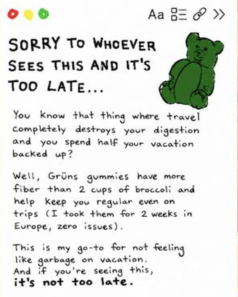 Grüns A fake notes-app screenshot in handwriting, written as a first-person warning about travel constipation, with a hand-drawn gummy bear instead of packaging.
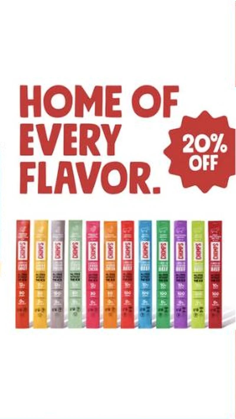 Chomps A brand that lives in checkout lanes uses the one thing a checkout lane cannot stock, the full twelve-flavor range, as the reason to buy online instead.
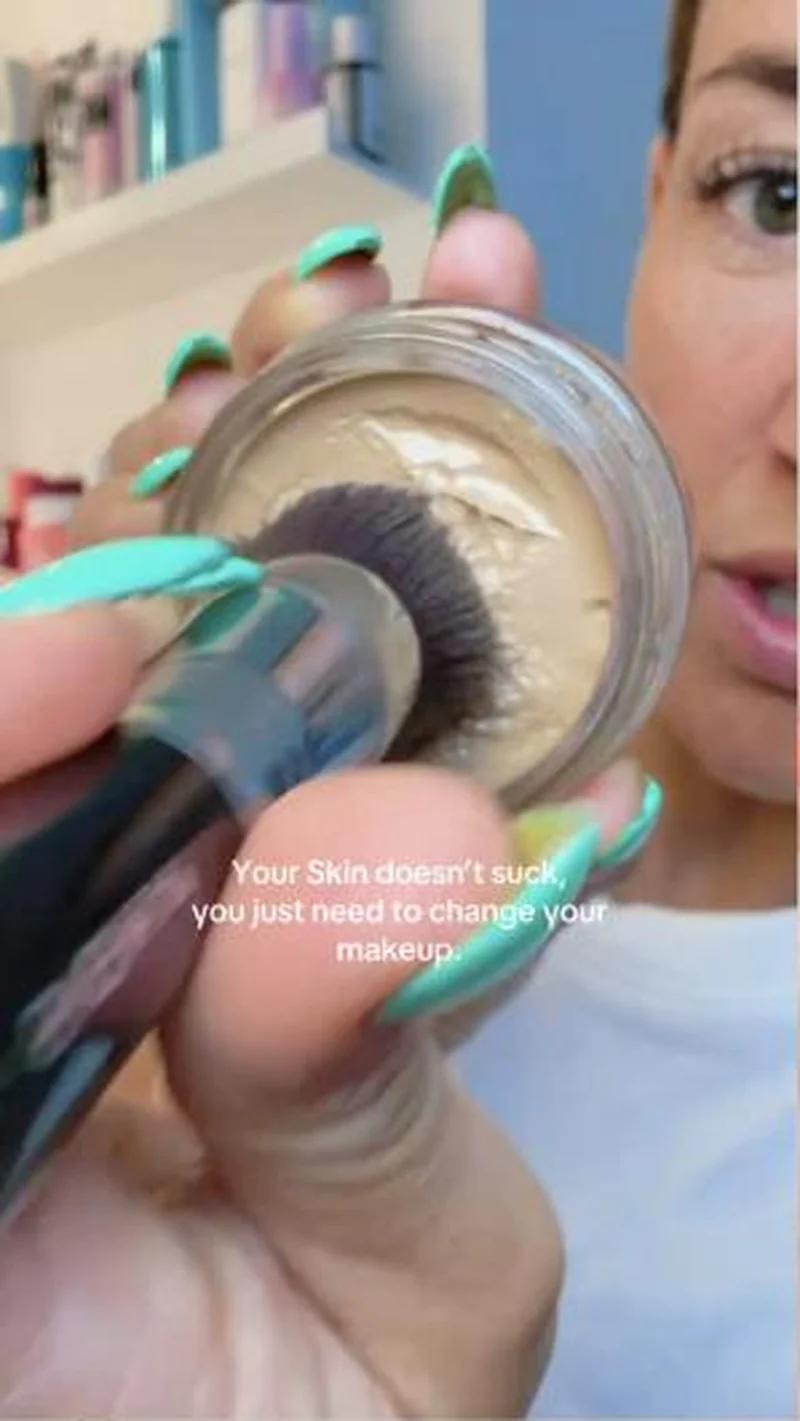 Jones Road Top-of-account by impressions, and the format that replaced scripted UGC.
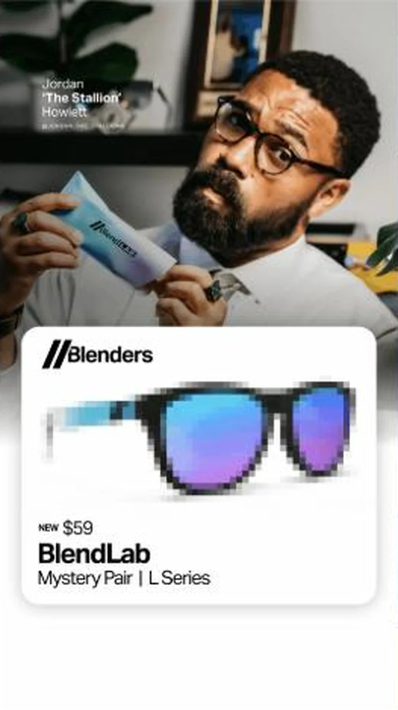 Blenders Eyewear A mystery pair pitched at $59 by Blenders new CCO lands on the exact BlendLab L Series page, behind a cookie banner and an open cart.
Does your own handoff survive the click?
This is the same read I run on live funnels: the ad, the page, and the gap between them. Scored, free, no call required.
Audit my store freeNew teardowns as they land, in Commerce Dispatch: the ad, the page it clicked to, and what the gap cost. Same free newsletter as the footer, no separate list.
Back to The Handoff, the full library of 253 teardowns, 226 of them ad and page pairs, filterable by objective, funnel stage, format, placement, category and persuasion mechanic.
Read next: what breaks, across every rated pair, drawn from every pair in this library.
Promix is named here solely to identify the advertising being analysed. Brand names and marks are the property of their respective owners. No brand shown has any affiliation with, or has endorsed, Taylor Sicard Consulting.