Hiya · Subscription · Warm / consideration · August 2026 · Handoff: Partial · By Taylor Sicard
Hiya ad teardown: Psa for dads
Hiya attacks the gummy format itself, reading a competitor's own ingredient panel out loud rather than claiming anything about its own.
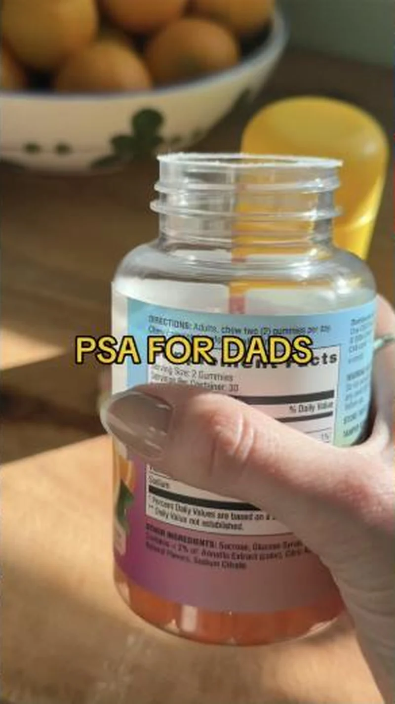
“PSA FOR DADS”
Handoff: Partial
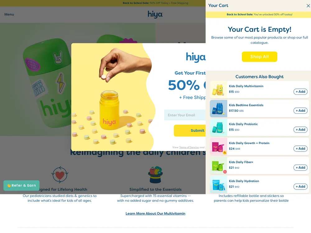
Rated on the first view of hiyahealth.com/products/daily-kids-essential, signed out, captured 2026-08-29. The ad's argument survives the click: the page's own benefit column reads "Supercharged with 15 essential vitamins -- with no added sugar and no gummy additives", which is the same case the creative made by holding a competitor's OTHER INGREDIENTS line up to the lens. What does not survive is the arrival. Two overlays stack on the first view. A centred email capture offers 50% off and free shipping, and an already-open cart drawer reading "Your Cart is Empty!" takes the right third of the screen and stacks six other SKUs under "Customers Also Bought", from Kids Bedtime Essentials at $17.50 to Kids Daily Growth + Protein at $24. No price and no add-to-cart control for the advertised multivitamin is visible anywhere on that first view; the only prices on screen belong to products the ad never mentioned. Partial, not Break: the correct PDP is underneath and the no-gummy-additives claim is legible below the modal. But a format argument made in a sober clinical register arrives on a back-to-school sale with the cart already open, and the reader closes two things before reaching what they clicked for.
The read
A kitchen countertop, a bowl of oranges out of focus, and a hand turning an unbranded competitor gummy bottle so the back label faces the lens. The caption is two words, "PSA FOR DADS", and the argument is whatever the viewer can read on the label: a Supplement Facts panel showing a serving size of 2 gummies and an OTHER INGREDIENTS line beginning Sucrose, Glucose Syrup. Hiya's own yellow bottle sits blurred in the background and is never picked up. Two more cuts run the same argument from different mouths. A woman in purple clinic scrubs holds the yellow bottle under the caption "WHY I CHOOSE CHEWABLE OVER GUMMY VITAMINS EVERY TIME", with body copy explaining that the gummy base needs extra sweeteners and flavourings, which is why a gummy label asks for two and a chewable does not. A third stands open-mouthed in a big-box vitamin aisle in front of a wall of competitor tubs with a 17.99 shelf tag visible.
What the ad does
- The competitor's own packaging is the creative. Nothing is claimed, alleged or compared in copy. A label is held up and read. That is the cheapest possible proof to produce and the hardest to argue with, and it sidesteps the substantiation burden that a written comparison would carry.
- "PSA FOR DADS" is targeting done in the caption. Kids-supplement creative overwhelmingly addresses mothers, so two words buy an underserved audience and a different register at once. It also implies the information is being passed between parents rather than sold, which is why the ad can be this blunt without reading as an attack.
- The clinician cut converts a preference into a mechanism. Sweeteners and a gel base are not a moral failing, they are why a gummy needs two units to deliver one dose. Explaining the format rather than condemning the brand gives the argument somewhere to go after the disgust has worn off.
Objective fit
Subscription, at the consideration stage rather than cold. The creative assumes the viewer already buys a kids vitamin and is arguing about which one, which is why it opens on a competitor's bottle rather than on a problem. Hiya's model is a monthly refill, so winning the format argument once is worth a recurring order.
Hiya ran this subscription creative to the landing page it clicked through to, both captured August 2026. Hiya attacks the gummy format itself, reading a competitor's own ingredient panel out loud rather than claiming anything about its own. Read as a pair, the handoff rates partial.
- The competitor's own packaging is the creative. Nothing is claimed, alleged or compared in copy. A label is held up and read.
- "PSA FOR DADS" is targeting done in the caption. Kids-supplement creative overwhelmingly addresses mothers, so two words buy an underserved audience and a different register at once.
- The clinician cut converts a preference into a mechanism. Sweeteners and a gel base are not a moral failing, they are why a gummy needs two units to deliver one dose.
- Where the handoff lands: Rated on the first view of hiyahealth.com/products/daily-kids-essential, signed out, captured 2026-08-29.
- What to fix: Two things to watch. The teardown depends on the competitor bottle staying unbranded: identify it and the ad becomes a comparative claim that needs substantiating and invites a response.
Ad captured by Taylor Sicard 2026-08-20, landing page 2026-08-29. Screenshots reproduced for commentary and criticism.
Tagged
- Objective
- Subscription
- Funnel
- Warm / consideration
- Format
- UGC videoComparison staticTalking headDemo / product-in-use
- Placement
- Meta feedMeta reelsInstagram stories
- Category
- Baby & Kids
- Mechanic
- Comparison / us-vs-themIngredient calloutAuthority / expertMechanism reveal
- Handoff
- Partial
- Brand
- Hiya
Mechanism reveal is #4 of 21 ranked mechanics, on 44 pairs. See where mechanism reveal ranks
How this was evidenced
- Evidence
- Pair captured The ad and the page it clicked through to were both captured first-hand, and the destination recorded is the page the ad pointed at.
- Ad creative
- Captured August 2026
- Destination
- Removed since capture. Destination no longer resolves to the page this teardown is about.
- Ad Library
- Ad ID 1392708322959101
Variants of the same system (1)
The same anti-gummy argument also runs as native editorial rather than as an ad. A marble-countertop still captioned "Read this before buying Hiya vitamins" routes through a redirect subdomain instead of the PDP, which is the advertorial lane of the identical claim. Observed 2026-08-20.
What to fix
Two things to watch. The teardown depends on the competitor bottle staying unbranded: identify it and the ad becomes a comparative claim that needs substantiating and invites a response. Separately, this set exposes a routing untidiness worth catching before you copy the structure. Hiya runs both hiyahealth.com/products/kids-daily-essential and hiyahealth.com/products/daily-kids-essential across the same campaign, two near-identical URLs for the same multivitamin, which splits reporting on the single most important page the brand owns.
One of 40 pairs where a popup is the landing page. See the pattern · See all 40
Sources
More from Hiya (2)
The same play elsewhere
Same comparison / us-vs-them, different brands.
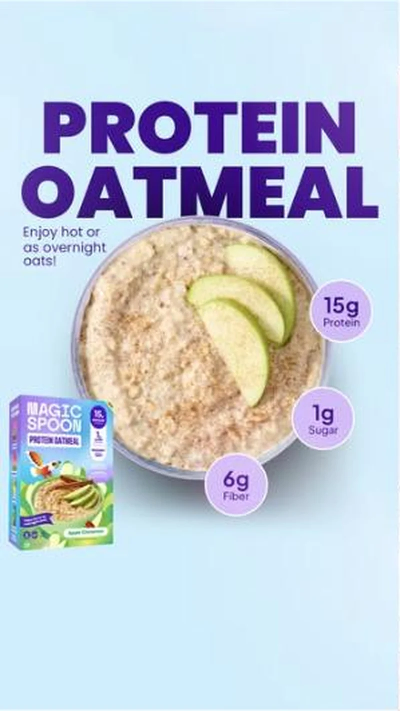 Magic Spoon A single-template portfolio, betting concentration beats variety.SubscriptionARMRA Splits an unfamiliar mechanism across several creators, each taking one angle rather than all of it.
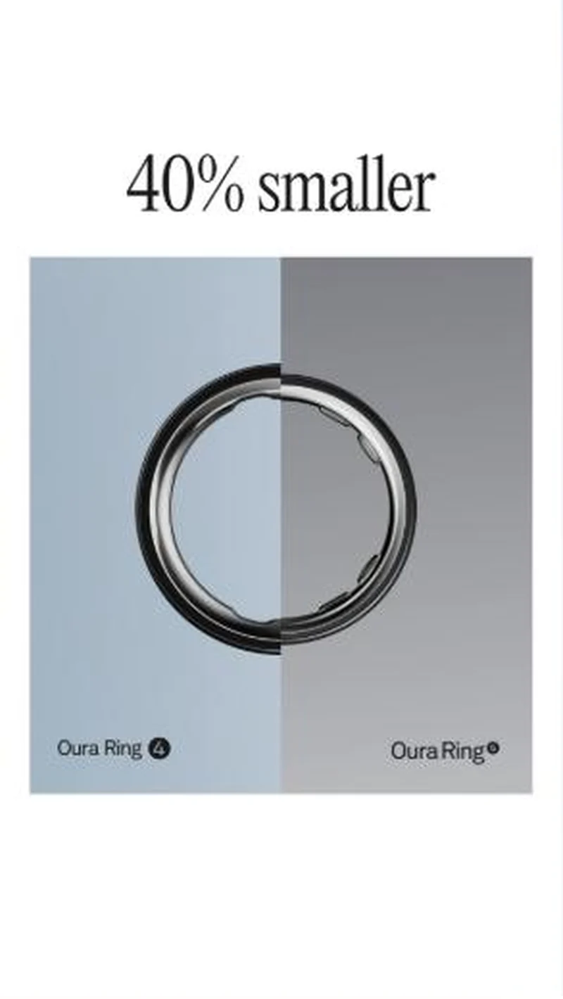 Oura Oura launches Ring 5 by arguing against the smartwatch on comfort, then illustrates its own size claim with an image that does not show it.
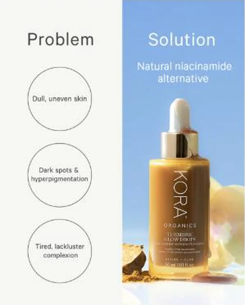 Kora Organics Positions against an ingredient the buyer is already searching for, rather than against a competing brand.
Does your own handoff survive the click?
This is the same read I run on live funnels: the ad, the page, and the gap between them. Scored, free, no call required.
Audit my store freeNew teardowns as they land, in Commerce Dispatch: the ad, the page it clicked to, and what the gap cost. Same free newsletter as the footer, no separate list.
Back to The Handoff, the full library of 253 teardowns, 226 of them ad and page pairs, filterable by objective, funnel stage, format, placement, category and persuasion mechanic.
Read next: what breaks, across every rated pair, drawn from every pair in this library.
Hiya is named here solely to identify the advertising being analysed. Brand names and marks are the property of their respective owners. No brand shown has any affiliation with, or has endorsed, Taylor Sicard Consulting.