Oura · Conversion / Purchase · Warm / consideration · August 2026 · Handoff: Partial · By Taylor Sicard
Oura ad teardown: Ring 5 forty percent smaller
Oura launches Ring 5 by arguing against the smartwatch on comfort, then illustrates its own size claim with an image that does not show it.
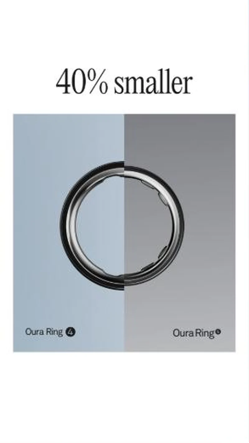
“40% smaller”
Handoff: Partial
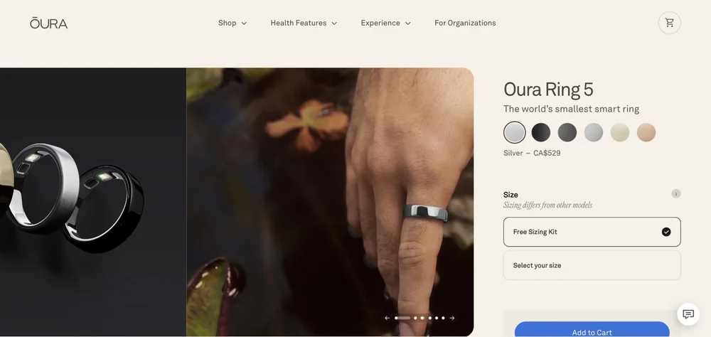
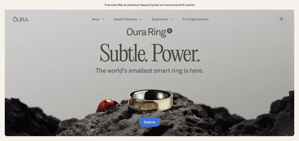
The ad's headline "40% smaller" sits over a split panel labelled "Oura Ring 4" on the pale blue left and "Oura Ring 5" on the grey right, and the page does land on the right product, H1 "Oura Ring 5" in the silver finish with the swatch selected. What weakens is the claim itself: the page never prints 40% anywhere in frame, substituting the superlative "The world's smallest smart ring", so the specific comparison the ad sold is downgraded to a general boast. The gallery does not settle it either, showing the silver and black rings floating against black and a hand in water with no earlier generation or reference object beside them, which repeats the ad's own problem of illustrating a size claim with an image that shows one ring. Price reads "Silver - CA$529"; this capture session geo-resolved to Canada, so the CAD figure is a capture artefact rather than a brand inconsistency.
The read
A white frame, the serif headline "40% smaller", and below it a single ring split down the middle across two tinted panels labelled "Oura Ring 4" on the pale blue left and "Oura Ring 5" on the grey right. The launch set stacks specifics: a black card listing 40% smaller, tougher to scratch, fully waterproof and one week of battery life; a beige tile reading "Big changes start small" over "The world's smallest smart ring"; a grey tile reading "50+ health metrics. One smart ring." The positioning cut is blunter. A vertical split labels the left panel "Other wearables" over "Big, bulky, heavy" with a smartwatch deliberately thrown out of focus, and the right panel "Oura Ring" over "Small, comfortable, light" with a single ring rendered sharp. Body copy states the position without hedging: "No clunky watch. No complicated dashboards."
What the ad does
- The picture cannot show the number. "40% smaller" sits over a single ring split down the middle between panels labelled "Oura Ring 4" and "Oura Ring 5", drawn at effectively the same outer diameter. A reduction in volume or thickness will not read face on, so the strongest claim in the launch is illustrated by the one composition that quietly undercuts it.
- The competitor is a category, not a brand. "Other wearables" over "Big, bulky, heavy" against "Oura Ring" over "Small, comfortable, light", with the smartwatch thrown deliberately out of focus. Blurring it is the trick: it reads as bulk rather than as a rival product, which lands the comparison without naming anyone who could answer back.
- Comfort is the churn argument. A sleep tracker only works if it is worn to bed, and the black card spends its four lines on 40% smaller, tougher to scratch, fully waterproof and one week of battery life rather than on "50+ health metrics. One smart ring." Leading on wearability targets the reason these devices end up in a drawer.
Objective fit
Conversion / Purchase at consideration stage. Nothing in the launch set carries an offer, a deadline or a price, which is what distinguishes it from the preferred-pricing lane running alongside. The job here is to justify a full-price hardware purchase on specification, and the destination is the silver Ring 5 product page rather than a landing page.
Oura ran this conversion creative to the landing page it clicked through to, both captured August 2026. Oura launches Ring 5 by arguing against the smartwatch on comfort, then illustrates its own size claim with an image that does not show it. Read as a pair, the handoff rates partial.
- The picture cannot show the number. "40% smaller" sits over a single ring split down the middle between panels labelled "Oura Ring 4" and "Oura Ring 5", drawn at effectively the same outer diameter.
- The competitor is a category, not a brand. "Other wearables" over "Big, bulky, heavy" against "Oura Ring" over "Small, comfortable, light", with the smartwatch thrown deliberately out of focus.
- Comfort is the churn argument. A sleep tracker only works if it is worn to bed, and the black card spends its four lines on 40% smaller, tougher to scratch, fully waterproof and one week of battery life rather than on "50+ health metrics.
- What to fix: Print the figure on the page the launch points at.
Ad captured by Taylor Sicard 2026-08-20, landing page 2026-08-20. Screenshots reproduced for commentary and criticism.
Tagged
- Objective
- Conversion / Purchase
- Funnel
- Warm / consideration
- Format
- Comparison staticStatic imageHigh-production videoBrand film
- Placement
- Meta feedInstagram storiesYouTube shorts
- Category
- Fitness & Equipment
- Mechanic
- Comparison / us-vs-themSpecificityMechanism revealIdentity appeal
- Handoff
- Partial
- Brand
- Oura
Identity appeal is #1 of 21 ranked mechanics, on 110 pairs. See where identity appeal ranks
How this was evidenced
- Evidence
- Pair captured The ad and the page it clicked through to were both captured first-hand, and the destination recorded is the page the ad pointed at.
- Ad creative
- Captured August 2026
- Destination
- https://ouraring.com/store/rings/oura-ring-5/silver Captured August 2026. Advertisers change their ads and pages continuously, so the live page may differ from the capture above. That is expected, and the capture is the record.
- Ad Library
- Ad ID 2133709877558363
Variants of the same system (3)
The launch set splits its destinations by finish and by generation. Most cuts run to the silver Ring 5 page, the brand-film title cards run to the unsuffixed Ring 5 page, the gold hero runs to the gold page, and the comparison statics that name Ring 4 run to the homepage. Observed 2026-08-20.
What to fix
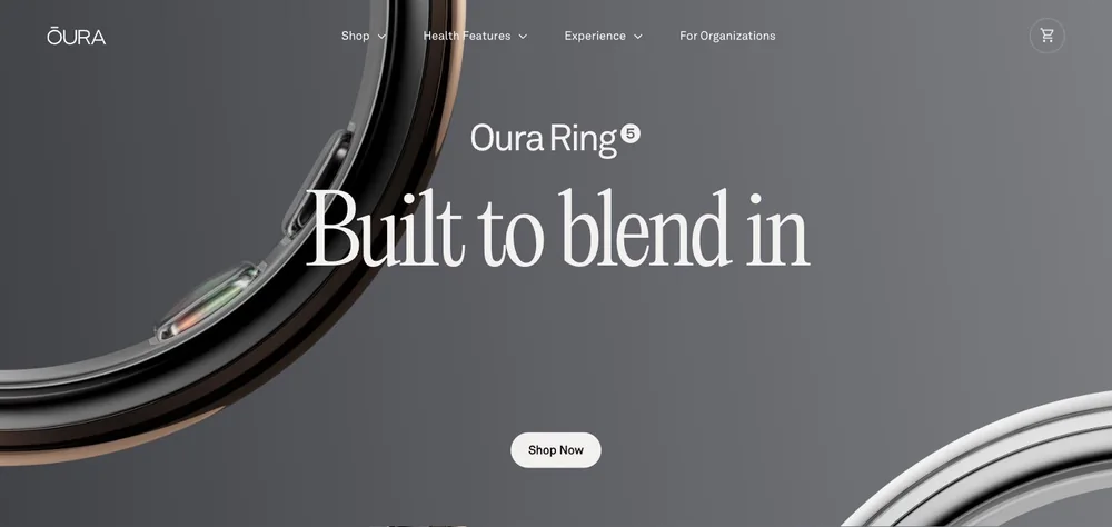
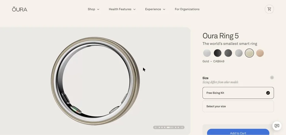
Print the figure on the page the launch points at. The Ring 5 product page never shows 40% anywhere in frame, substituting the superlative "The world's smallest smart ring", and its gallery floats one ring against black with no earlier generation beside it. A launch bought on one number needs that number to survive the click, ideally as the same "Oura Ring 4" to "Oura Ring 5" comparison the creative already drew.
One of 44 pairs where the page drops the argument that earned the click. See the pattern · See all 44
Sources
More from Oura (2)
The same play elsewhere
Same identity appeal, different brands.
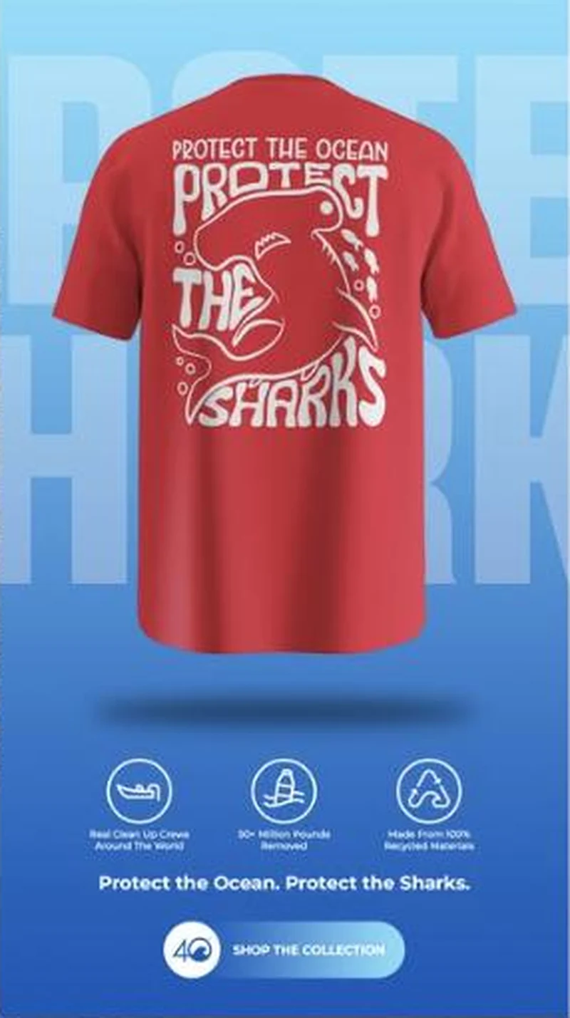 4ocean A red shark tee under a shop the collection button lands on a single product page whose hero, and its preset colour, is white.
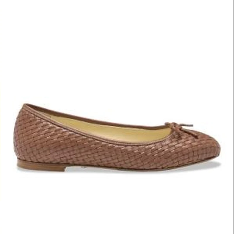 Sarah Flint A wordless product shot lands on its own page, where a 20 percent welcome offer greets a shoe that is excluded from discounts.
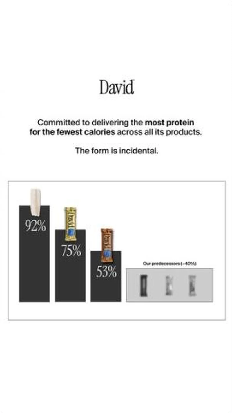 David Protein A bar chart that ranks David's own products against each other first, and the rest of the category second, so the brand ends up owning a metric instead of a flavour.
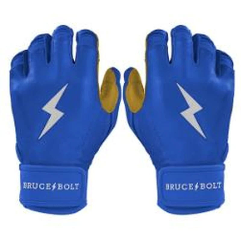 Bruce Bolt A flat pair of royal blue batting gloves in the ad, the same pair on the page at $65, under a cookie banner parked across the buy zone.
Does your own handoff survive the click?
This is the same read I run on live funnels: the ad, the page, and the gap between them. Scored, free, no call required.
Audit my store freeNew teardowns as they land, in Commerce Dispatch: the ad, the page it clicked to, and what the gap cost. Same free newsletter as the footer, no separate list.
Back to The Handoff, the full library of 253 teardowns, 226 of them ad and page pairs, filterable by objective, funnel stage, format, placement, category and persuasion mechanic.
Read next: what breaks, across every rated pair, drawn from every pair in this library.
Oura is named here solely to identify the advertising being analysed. Brand names and marks are the property of their respective owners. No brand shown has any affiliation with, or has endorsed, Taylor Sicard Consulting.