Sarah Flint · Conversion / Purchase · Cold / prospecting · August 2026 · Handoff: Partial · By Taylor Sicard
Sarah Flint ad teardown: specificity into purchase
A wordless product shot lands on its own page, where a 20 percent welcome offer greets a shoe that is excluded from discounts.
Handoff: Partial
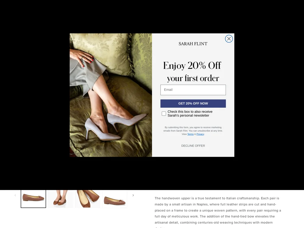
The shoe is the same shoe. The first thumbnail on the page is the identical side on shot of the tan handwoven upper with the hand tied bow, and three more thumbnails show it worn. The page then names the ad's own claims back in a strip headed IT'S ALL IN THE DETAILS: HAND-FINISHED BOW, ARCH SUPPORT, SACCHETTO CONSTRUCTION, PERFECT INSOLE. What breaks the tone is money. The fold is covered by an Enjoy 20% Off your first order modal with a GET 20% OFF NOW button, and the product copy under it reads: This style is only eligible for loyalty point redemption. It is not eligible for discounts or promotional offers. The row below runs pumps at END OF SEASON SALE with a code the flat cannot use.
The read
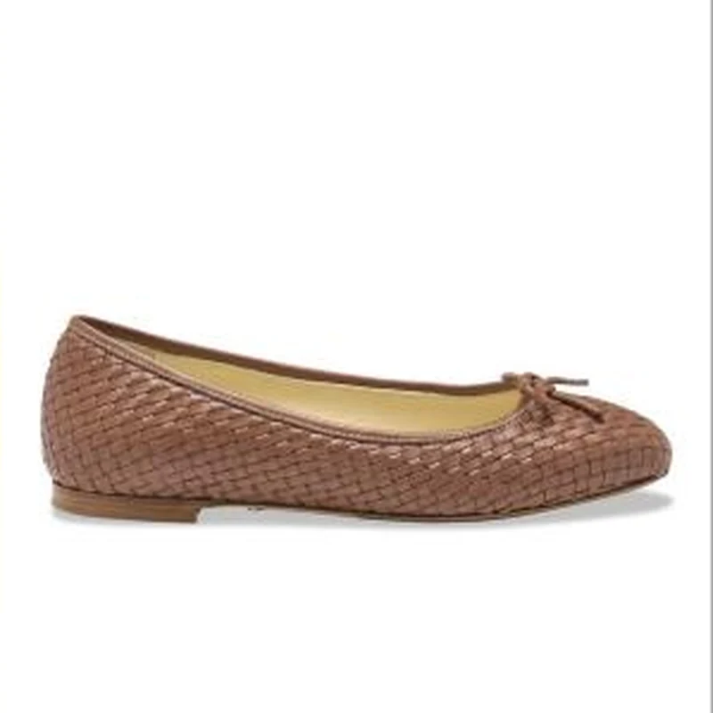
A square static with no text in it at all. One tan handwoven leather ballet flat sits side on, centred on white, lit flat, no shadow beyond a thin contact line, no model, no scale reference, no badge, no price and no call to action. The weave, the tonal hand tied bow and the low stacked heel are the only information in the frame. Every claim the unit makes, the memory foam insole, the arch support and the Italian finishing, lives in the caption; the line quoted above is that caption's opening, not burned in copy, because there is no burned in copy to quote.
What the ad does
- The silhouette does the qualifying. One tan handwoven leather ballet flat, side on, centred on white, no model, no scale reference, no badge, no price and no call to action. A shape that legible needs no headline to sort the person who buys ballet flats from everyone else, which is the only targeting a frame this empty can perform.
- Claims that cannot be photographed sit in the caption. The memory foam insole, the arch support and the Italian finishing are all text, leaving the image to carry desirability alone. That split is why the page's detail strip matters: HAND-FINISHED BOW, ARCH SUPPORT, SACCHETTO CONSTRUCTION and PERFECT INSOLE are the first point at which the promise becomes visible rather than merely read.
- A silent creative inherits whatever tone greets the click. With no offer, no urgency and no copy in the frame, the ad sets a quiet premium register and the destination writes the second half of the sentence. Here that is a "GET 20% OFF NOW" modal across the fold, a louder voice than the ad chose and one this shoe cannot honour.
Objective fit
It fits a purchase objective for a considered item. The product is shown clearly enough to be recognised on the page, and the page opens on the same colourway, which is most of what a clean handoff needs.
Sarah Flint ran this conversion creative to the landing page it clicked through to, both captured August 2026. A wordless product shot lands on its own page, where a 20 percent welcome offer greets a shoe that is excluded from discounts. Read as a pair, the handoff rates partial.
- The silhouette does the qualifying. One tan handwoven leather ballet flat, side on, centred on white, no model, no scale reference, no badge, no price and no call to action.
- Claims that cannot be photographed sit in the caption. The memory foam insole, the arch support and the Italian finishing are all text, leaving the image to carry desirability alone.
- A silent creative inherits whatever tone greets the click. With no offer, no urgency and no copy in the frame, the ad sets a quiet premium register and the destination writes the second half of the sentence.
- Where the handoff lands: The shoe is the same shoe. The first thumbnail on the page is the identical side on shot of the tan handwoven upper with the hand tied bow, and three more thumbnails show it worn.
- What to fix: Suppress the welcome offer on a page that cannot honour it. A visitor is shown 20% off, then told the style is only eligible for loyalty point redemption, then given a row of pumps at END OF SEASON SALE that do take a code.
Ad captured by Taylor Sicard 2026-08-21, landing page 2026-08-29. Screenshots reproduced for commentary and criticism.
Tagged
- Objective
- Conversion / Purchase
- Funnel
- Cold / prospecting
- Format
- Static image
- Placement
- Meta feedInstagram storiesPinterest
- Category
- Footwear
- Mechanic
- SpecificityMechanism revealIdentity appeal
- Handoff
- Partial
- Brand
- Sarah Flint
Identity appeal is #1 of 21 ranked mechanics, on 110 pairs. See where identity appeal ranks
How this was evidenced
- Evidence
- Pair captured The ad and the page it clicked through to were both captured first-hand, and the destination recorded is the page the ad pointed at.
- Ad creative
- Captured August 2026
- Destination
- https://www.sarahflint.com/products/perfect-ballet-flat-saddle-woven-calf Captured August 2026. Advertisers change their ads and pages continuously, so the live page may differ from the capture above. That is expected, and the capture is the record.
- Ad Library
- No permalink. This creative was observed running in-feed; Meta does not issue a stable public URL for a non-political ad, and purges it from the library once it stops running. The capture above is the record.
What to fix
Suppress the welcome offer on a page that cannot honour it. A visitor is shown 20% off, then told the style is only eligible for loyalty point redemption, then given a row of pumps at END OF SEASON SALE that do take a code. If a hero style is excluded from promotions, kill the modal for that page or state the exclusion inside it, because finding out after claiming the code is a worse moment than never seeing one.
One of 25 pairs where the offer on the page is not the offer in the ad. See the pattern · See all 25
Sources
The same play elsewhere
Same identity appeal, different brands.
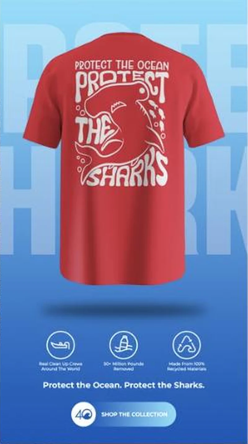 4ocean A red shark tee under a shop the collection button lands on a single product page whose hero, and its preset colour, is white.
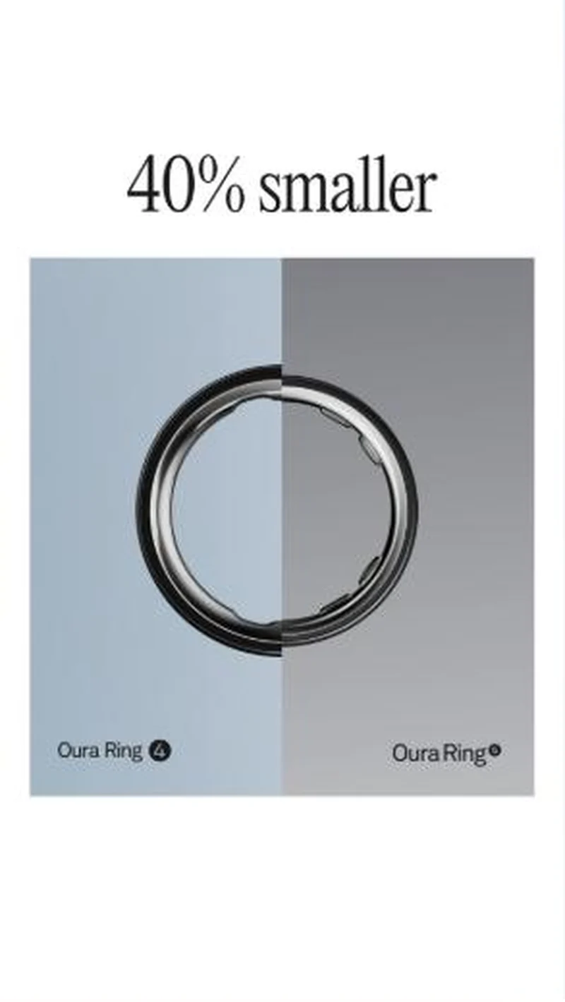 Oura Oura launches Ring 5 by arguing against the smartwatch on comfort, then illustrates its own size claim with an image that does not show it.
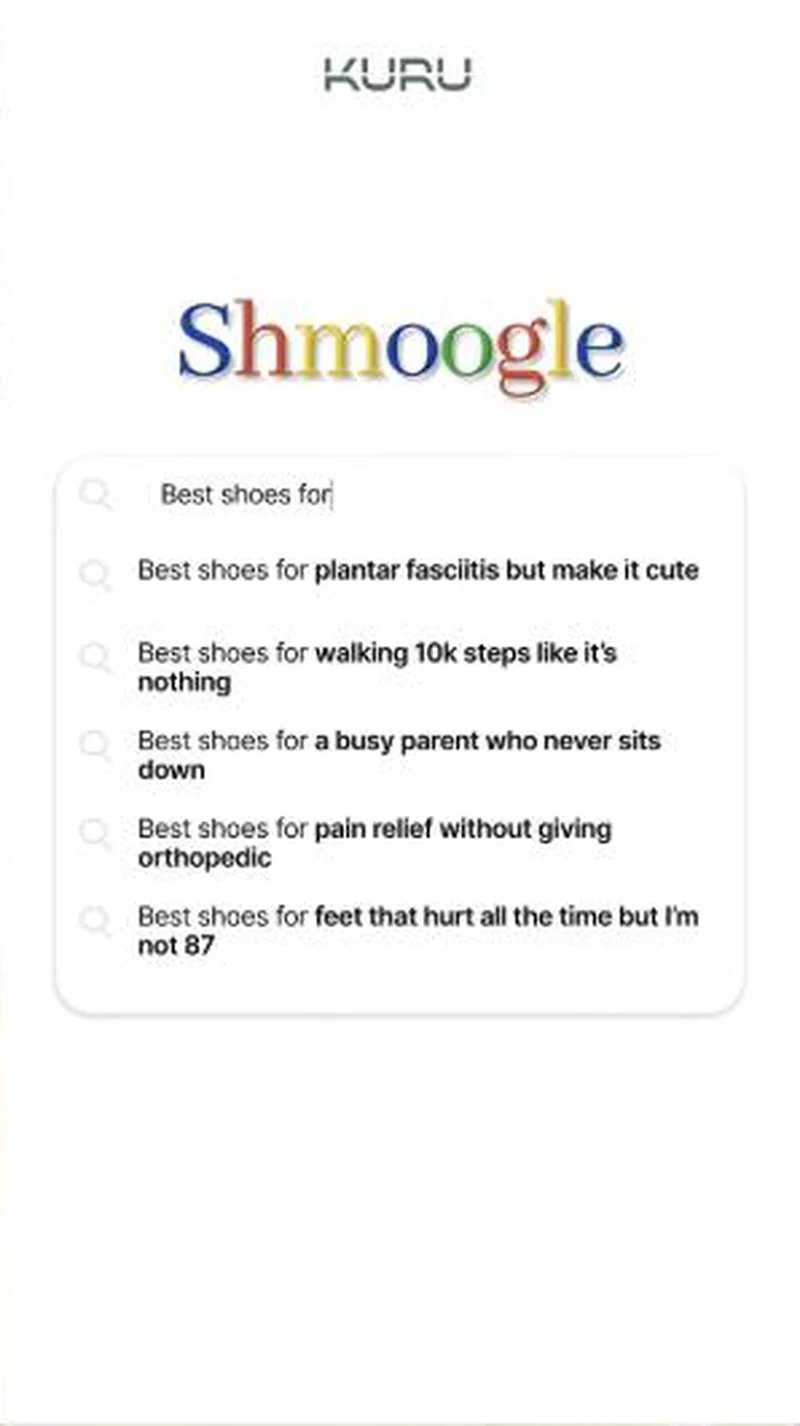 Kuru Sells plantar fasciitis relief, and only afterwards mentions that the relief is a shoe.
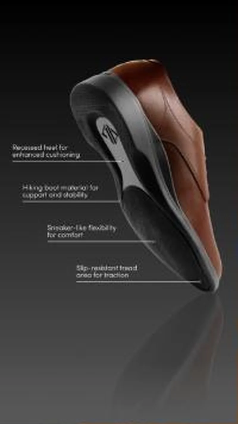 Amberjack An annotated outsole diagram sells the engineering, then the page opens with a scratch to win game before any of it appears.
Does your own handoff survive the click?
This is the same read I run on live funnels: the ad, the page, and the gap between them. Scored, free, no call required.
Audit my store freeNew teardowns as they land, in Commerce Dispatch: the ad, the page it clicked to, and what the gap cost. Same free newsletter as the footer, no separate list.
Back to The Handoff, the full library of 253 teardowns, 226 of them ad and page pairs, filterable by objective, funnel stage, format, placement, category and persuasion mechanic.
Read next: what breaks, across every rated pair, drawn from every pair in this library.
Sarah Flint is named here solely to identify the advertising being analysed. Brand names and marks are the property of their respective owners. No brand shown has any affiliation with, or has endorsed, Taylor Sicard Consulting.