4ocean · Conversion / Purchase · Cold / prospecting · August 2026 · Handoff: Break · By Taylor Sicard
4ocean ad teardown: Protect the Ocean. Protect the Sharks
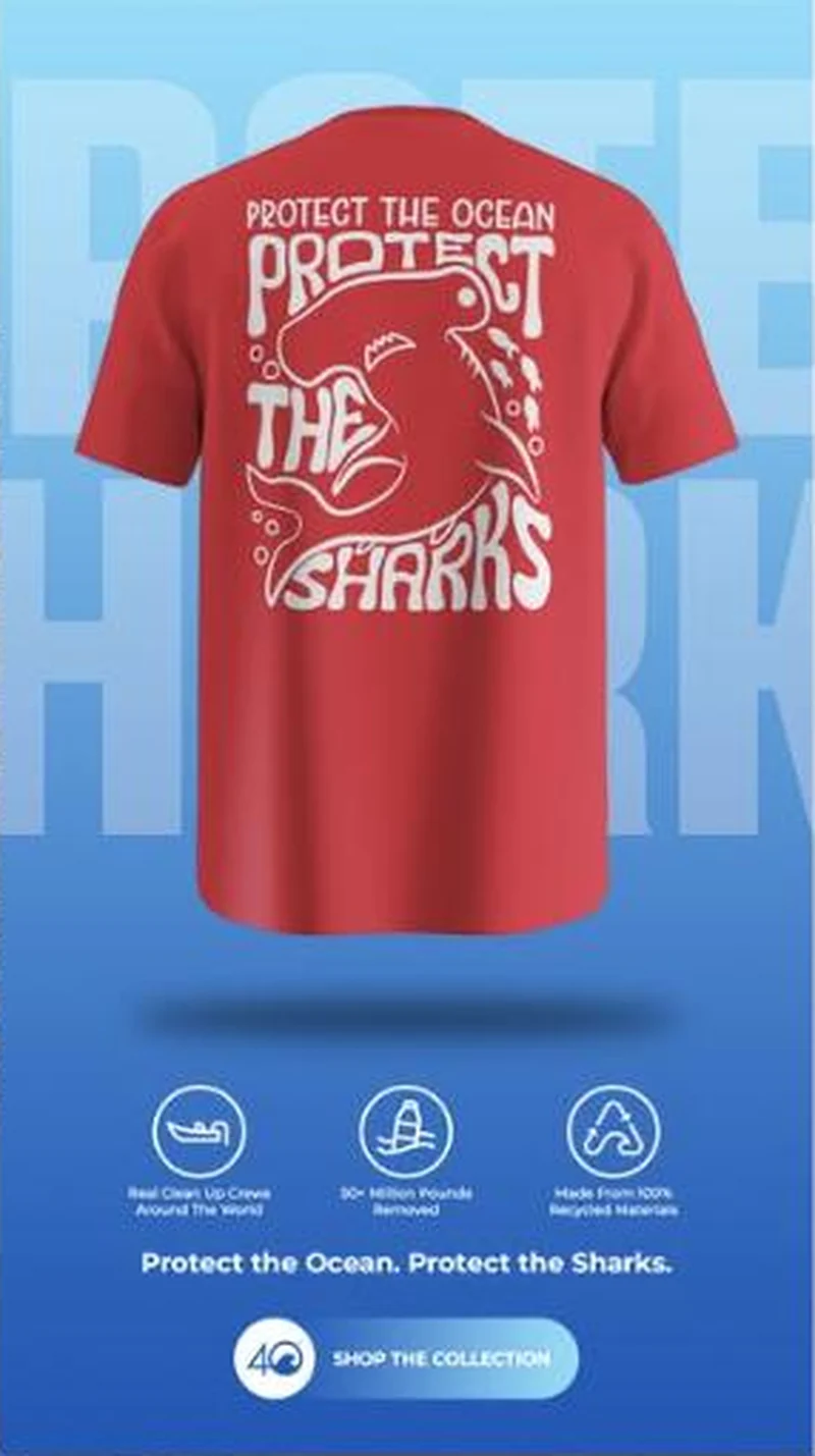
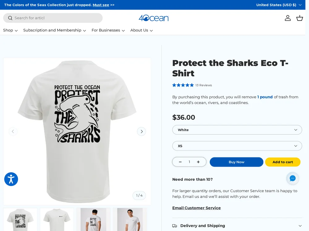
A red shark tee under a shop the collection button lands on a single product page whose hero, and its preset colour, is white.
“Protect the Ocean. Protect the Sharks.”
Handoff: Break
The artwork survives the click and nothing else does. In the ad a red tee fills two thirds of the frame carrying the hammerhead print in white, under a button reading SHOP THE COLLECTION. The page is one product, Protect the Sharks Eco T-Shirt, and its hero is a white tee with the same print in black, as are all four thumbnails, with the colour field preset to White and the size preset to XS. No collection appears at any point on the scroll. The Description then adds that this is a print on demand item shipping in two to four weeks and exempt from the standard returns policy, which is the first the visitor hears of either.
The read
A vertical gradient frame from pale to deep blue, with the words PROTECT THE SHARKS set oversized and translucent behind everything. A red short sleeve tee floats centred in the upper two thirds, back facing, printed in white with a hammerhead shark drawn in loose hand lettering that reads PROTECT THE OCEAN, PROTECT THE SHARKS. Below it sit three circular line icons with small captions about cleanup crews, pounds of plastic removed and recycled materials, then the line Protect the Ocean. Protect the Sharks. and a pale rounded button reading SHOP THE COLLECTION beside the 4ocean logo.
What the ad does
- The garment is the poster. The print is the message, so shooting the back of the red tee flat and large puts the product and the cause argument in the same pixels. The page then opens on a white tee with the print in black, and all four thumbnails agree with the page rather than with the ad.
- The button promises a collection and the page is one item. "SHOP THE COLLECTION" sets up a browse, and the click resolves on Protect the Sharks Eco T-Shirt with the colour field preset to White and the size preset to XS. No collection appears at any point on the scroll.
Objective fit
A cause tee is an impulse purchase and a product page is the right destination, but the ad's own button promises a collection and the page delivers a single item. The purchase it does offer opens in a colour and print the ad never showed.
4ocean ran this conversion creative to the landing page it clicked through to, both captured August 2026. A red shark tee under a shop the collection button lands on a single product page whose hero, and its preset colour, is white. Read as a pair, the handoff rates break.
- The garment is the poster. The print is the message, so shooting the back of the red tee flat and large puts the product and the cause argument in the same pixels.
- The button promises a collection and the page is one item. "SHOP THE COLLECTION" sets up a browse, and the click resolves on Protect the Sharks Eco T-Shirt with the colour field preset to White and the size preset to XS.
- Where the handoff lands: The artwork survives the click and nothing else does. In the ad a red tee fills two thirds of the frame carrying the hammerhead print in white, under a button reading SHOP THE COLLECTION.
- What to fix: Send the colour named creative to the matching variant URL so the hero is the red tee the ad showed, and either point "SHOP THE COLLECTION" at a real collection or change the button.
Ad captured by Taylor Sicard 2026-08-21, landing page 2026-08-29. Screenshots reproduced for commentary and criticism.
Tagged
- Objective
- Conversion / Purchase
- Funnel
- Cold / prospecting
- Format
- Static image
- Placement
- Meta reelsInstagram storiesMeta feed
- Category
- Apparel & Accessories
- Mechanic
- Identity appealMechanism revealSpecificity
- Handoff
- Break
- Brand
- 4ocean
Identity appeal is #1 of 21 ranked mechanics, on 110 pairs. See where identity appeal ranks
How this was evidenced
- Evidence
- Pair captured The ad and the page it clicked through to were both captured first-hand, and the destination recorded is the page the ad pointed at.
- Ad creative
- Captured August 2026
- Destination
- https://www.4ocean.com/products/protect-the-sharks-eco-t-shirt Captured August 2026. Advertisers change their ads and pages continuously, so the live page may differ from the capture above. That is expected, and the capture is the record.
- Ad Library
- No permalink. This creative was observed running in-feed; Meta does not issue a stable public URL for a non-political ad, and purges it from the library once it stops running. The capture above is the record.
What to fix
Send the colour named creative to the matching variant URL so the hero is the red tee the ad showed, and either point "SHOP THE COLLECTION" at a real collection or change the button. Move the print on demand lead time of two to four weeks and the returns exemption above the fold, where a first time buyer will read them, rather than leaving both in the Description.
One of 14 pairs where the right page opens on the wrong version. See the pattern · See all 14
Sources
The same play elsewhere
Same specificity, different brands.
 Body Candy A bare catalogue packshot carrying no price and no logo lands on a $104.99 nose ring page whose countdown bar sells a different discount.
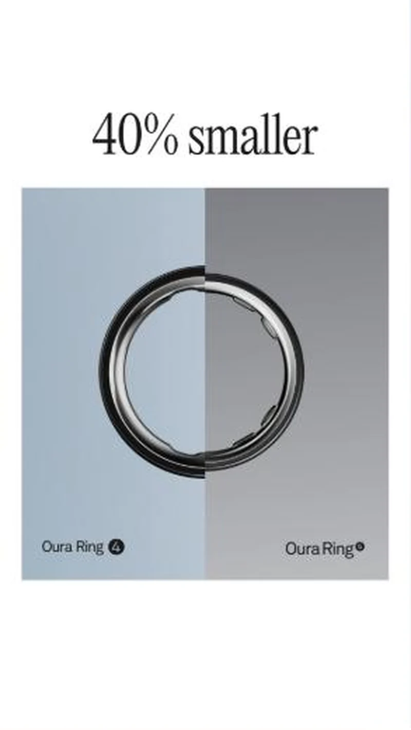 Oura Oura launches Ring 5 by arguing against the smartwatch on comfort, then illustrates its own size claim with an image that does not show it.
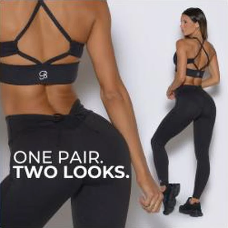 Bombshell Sportswear A split frame selling one legging styled two ways lands on the right product page, where the styling mechanic sits inside a closed accordion.
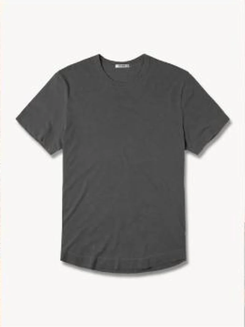 Buck Mason A bare tee cutout with no copy on it lands on the PDP whose lead image is that same cutout, in the Coal Venice Wash colourway.
Does your own handoff survive the click?
This is the same read I run on live funnels: the ad, the page, and the gap between them. Scored, free, no call required.
Audit my store freeNew teardowns as they land, in Commerce Dispatch: the ad, the page it clicked to, and what the gap cost. Same free newsletter as the footer, no separate list.
Back to The Handoff, the full library of 253 teardowns, 226 of them ad and page pairs, filterable by objective, funnel stage, format, placement, category and persuasion mechanic.
Read next: what breaks, across every rated pair, drawn from every pair in this library.
4ocean is named here solely to identify the advertising being analysed. Brand names and marks are the property of their respective owners. No brand shown has any affiliation with, or has endorsed, Taylor Sicard Consulting.