David Protein · Conversion / Purchase · Cold / prospecting · August 2026 · Handoff: Continuous · By Taylor Sicard
David Protein ad teardown: Form is incidental chart
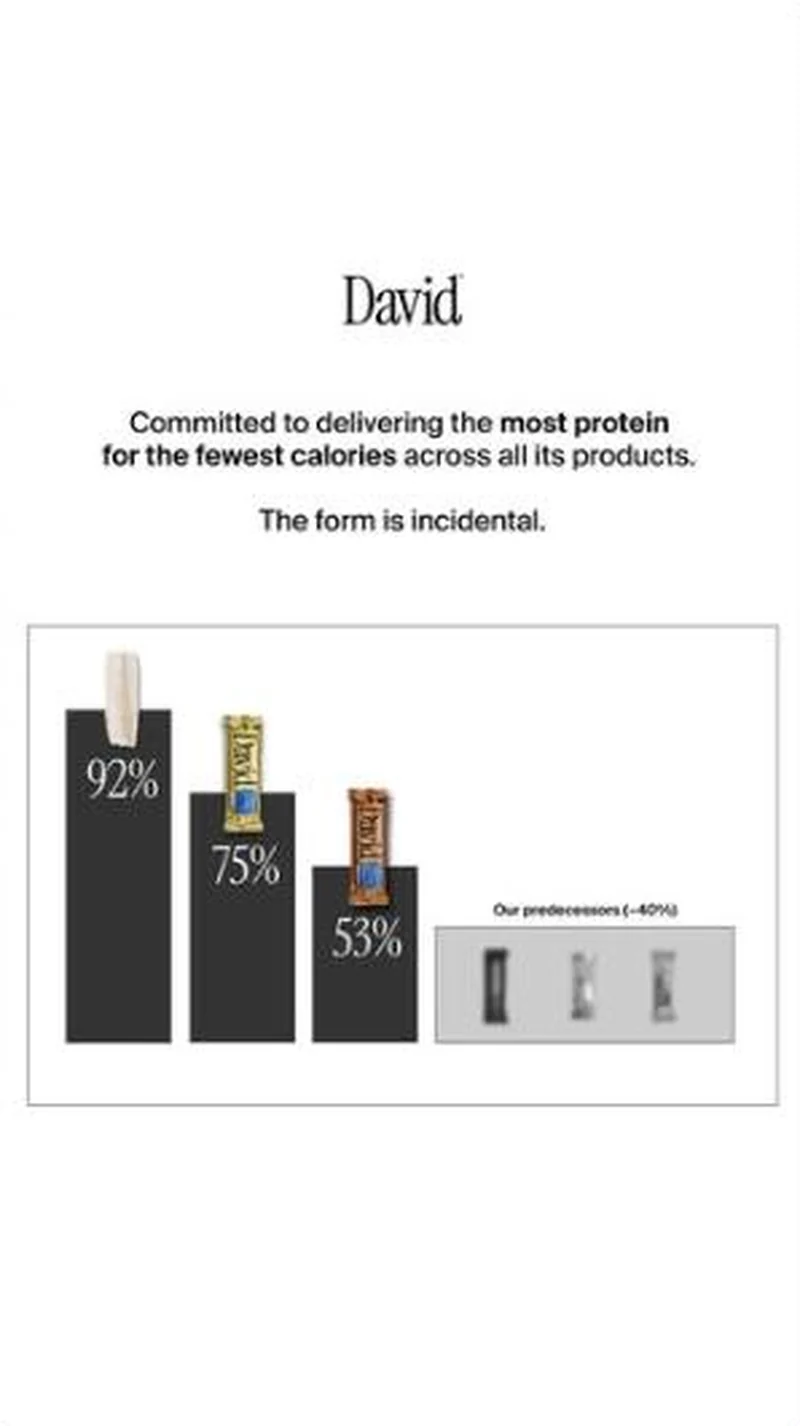
A bar chart that ranks David's own products against each other first, and the rest of the category second, so the brand ends up owning a metric instead of a flavour.
“Committed to delivering the most protein for the fewest calories across all its products.”
Handoff: Continuous
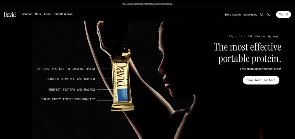
The ad's claim, "Committed to delivering the most protein for the fewest calories across all its products", is restated twice on arrival, in the eyebrow "28g protein. 150 calories. 0g sugar." and the headline "The most effective portable protein." The gold-foil bar sitting in the 75% column of the chart is the same bar held in the hero photograph, and the callouts "OPTIMAL PROTEIN TO CALORIE RATIO" and "THIRD PARTY TESTED FOR QUALITY" keep the ad's data register. The one visible shift is treatment, from a stark white chart to a dark studio portrait, with no chart anywhere in the captured frame. Neither side quotes a price.
The read
A white, almost clinical static live since 25 March 2026. The David wordmark sits alone at the top, then two lines of black sans: Committed to delivering the most protein for the fewest calories across all its products, followed by The form is incidental. Below that is a thin-ruled box holding a four-bar chart. Three black descending bars are labelled 92%, 75% and 53%, each topped with the David product it represents, a protein pop, a gold bar and a bronze bar. A fourth grey block sits to the right under the tiny label Our predecessors (~40%), holding three desaturated competitor packs with the branding scrubbed out. Body copy repeats the brand's standing claim, that at 75% calories from protein David delivers the highest protein-to-calorie ratio of any leading bar on the market, an on-creative claim quoted here as printed. The click goes to the Gold collection page.
What the ad does
- It ranks its own shelf in public. Three descending black bars labelled 92%, 75% and 53% put a protein pop first and the bronze bar last, so Bronze is publicly the least efficient thing David sells. Most brands would never print the bar that makes their newest product look worst, and submitting to the metric is what makes the metric believable.
- "The form is incidental" does the strategic work. Four words convert a product range into a single argument, so a bar, a pop and a carton stop competing for the same buyer and become three shapes of one commitment. It is also the licence to launch any future format without renegotiating the positioning.
- The competitor set is deliberately a shadow. "Our predecessors (~40%)" is unnamed, undated, desaturated and set in the smallest type on the creative, over three packs with the branding scrubbed out. The reader gets a category verdict with no brand to fact-check, and the tilde does the hedging.
Objective fit
Conversion / Purchase, run cold. Nothing here is a discount or a call to remember the brand later. The chart is a one-frame reason to believe aimed at a shopper who has never heard of David, and it lands on the Gold collection page rather than a single product, which matches an ad that argues for a portfolio rather than a flavour.
David Protein ran this conversion creative to the landing page it clicked through to, both captured August 2026. A bar chart that ranks David's own products against each other first, and the rest of the category second, so the brand ends up owning a metric instead of a flavour. Read as a pair, the handoff rates continuous.
- It ranks its own shelf in public. Three descending black bars labelled 92%, 75% and 53% put a protein pop first and the bronze bar last, so Bronze is publicly the least efficient thing David sells.
- "The form is incidental" does the strategic work. Four words convert a product range into a single argument, so a bar, a pop and a carton stop competing for the same buyer and become three shapes of one commitment.
- The competitor set is deliberately a shadow. "Our predecessors (~40%)" is unnamed, undated, desaturated and set in the smallest type on the creative, over three packs with the branding scrubbed out.
- Where the handoff lands: The ad's claim, "Committed to delivering the most protein for the fewest calories across all its products", is restated twice on arrival, in the eyebrow "28g protein. 150 calories.
- What to fix: Test this at thumbnail size before committing budget.
Ad captured by Taylor Sicard 2026-08-19, landing page 2026-08-20. Screenshots reproduced for commentary and criticism.
Tagged
- Objective
- Conversion / Purchase
- Funnel
- Cold / prospecting
- Format
- Comparison staticStatic image
- Placement
- Meta feedInstagram storiesMeta reels
- Category
- Food & Beverage
- Mechanic
- Comparison / us-vs-themCategory educationSpecificityMechanism reveal
- Handoff
- Continuous
- Brand
- David Protein
Specificity is #2 of 21 ranked mechanics, on 83 pairs. See where specificity ranks
How this was evidenced
- Evidence
- Pair captured The ad and the page it clicked through to were both captured first-hand, and the destination recorded is the page the ad pointed at.
- Ad creative
- Captured August 2026
- Destination
- https://davidprotein.com/pages/meet-david-gold Captured August 2026. Advertisers change their ads and pages continuously, so the live page may differ from the capture above. That is expected, and the capture is the record.
- Ad Library
- Ad ID 1752396625721521
Variants of the same system (4)
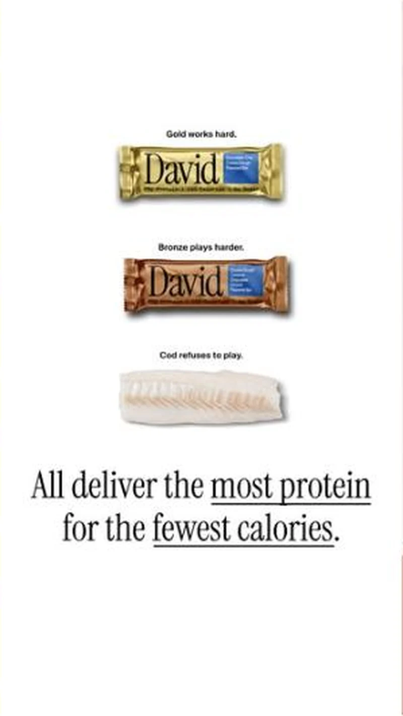
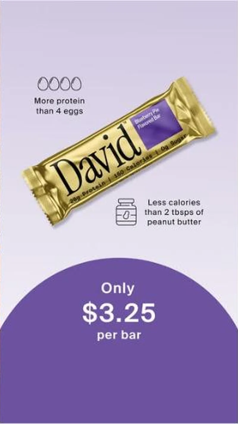
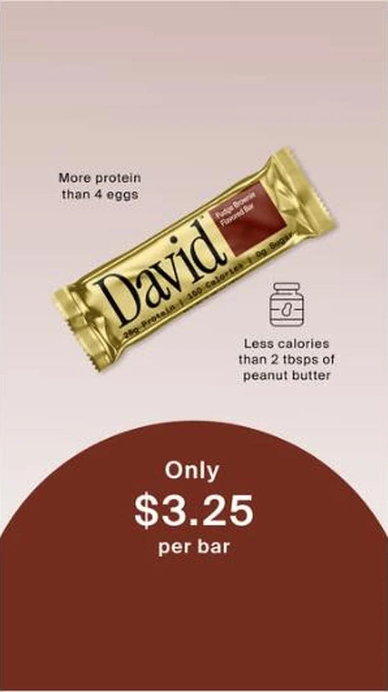
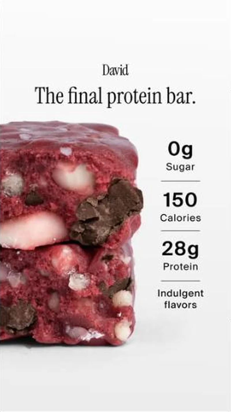
One claim, most protein for the fewest calories, rendered at three different reading levels. The chart is the analyst version. The cod unit is the joke version and lands the identical underlined line, All deliver the most protein for the fewest calories, by ranking Gold, Bronze and a raw cod fillet in a straight face. The egg and peanut butter units are the grocery version, translating the same ratio into food a shopper already has a price and a calorie count for, then closing on Only $3.25 per bar. Same argument, three comprehension speeds. Observed 2026-08-19.
What to fix
Test this at thumbnail size before committing budget. On a phone the "Our predecessors (~40%)" label and the three scrubbed packs disappear, and the unit collapses into descending black rectangles with 92%, 75% and 53% floating over nothing. Keep the substantiation file with it too, because an unnamed category average is the kind of superiority claim a competitor takes to NAD, and the page the click lands on carries no chart at all.
Across every brand: the 6 ways a handoff breaks · persuasion mechanics, ranked by how often the page keeps the promise.
Sources
More from David Protein (1)
The same play elsewhere
Same category education, different brands.
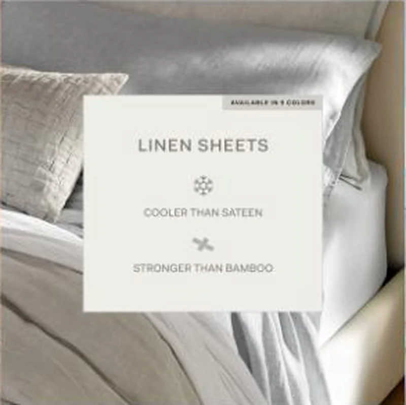 Boll & Branch A card claiming linen cooler than sateen and stronger than bamboo lands on the Linen Sheet Set page, which answers only the cooling half.
 Moment A vertical product shot promises Moment's longest reaching phone lens, then lands on the right product page where the lens is on back order.
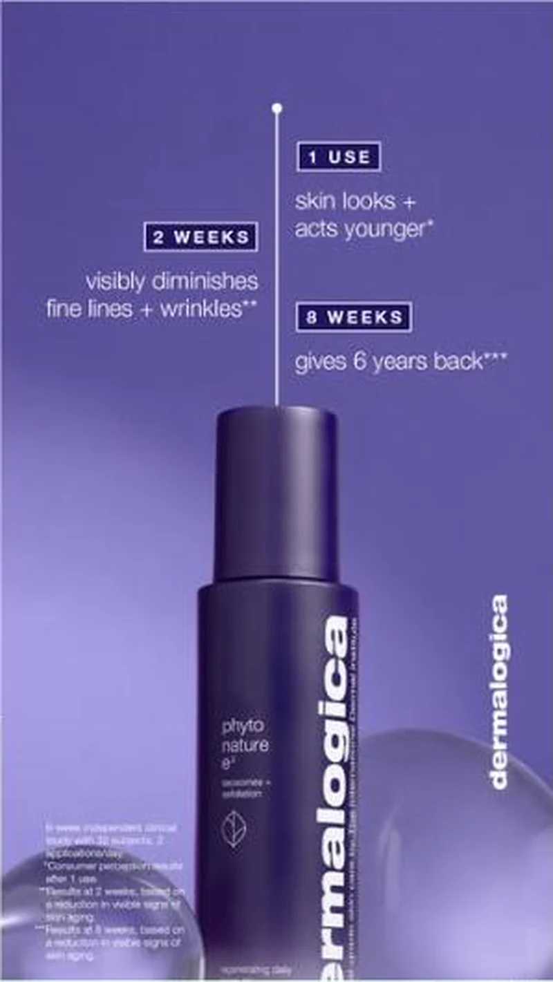 Dermalogica Eleven of thirty-seven live creatives point at one exosome serum, and the whole block argues from a dated clinical timeline rather than from a promise.
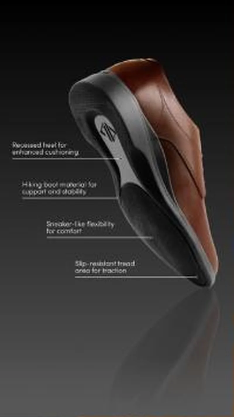 Amberjack An annotated outsole diagram sells the engineering, then the page opens with a scratch to win game before any of it appears.
Does your own handoff survive the click?
This is the same read I run on live funnels: the ad, the page, and the gap between them. Scored, free, no call required.
Audit my store freeNew teardowns as they land, in Commerce Dispatch: the ad, the page it clicked to, and what the gap cost. Same free newsletter as the footer, no separate list.
Back to The Handoff, the full library of 253 teardowns, 226 of them ad and page pairs, filterable by objective, funnel stage, format, placement, category and persuasion mechanic.
Read next: what the continuous pairs have in common, drawn from every pair in this library.
David Protein is named here solely to identify the advertising being analysed. Brand names and marks are the property of their respective owners. No brand shown has any affiliation with, or has endorsed, Taylor Sicard Consulting.