Everyday Dose · Conversion / Purchase · Cold / prospecting · August 2026 · Handoff: Continuous · By Taylor Sicard
Everyday Dose ad teardown: Cortisol symptom stack
A four-line symptom stack that never says coffee, pointed at a dedicated cortisol landing page rather than the product page every other ad in the account uses.
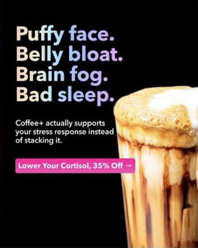
“Puffy face. Belly bloat. Brain fog. Bad sleep.”
Handoff: Continuous
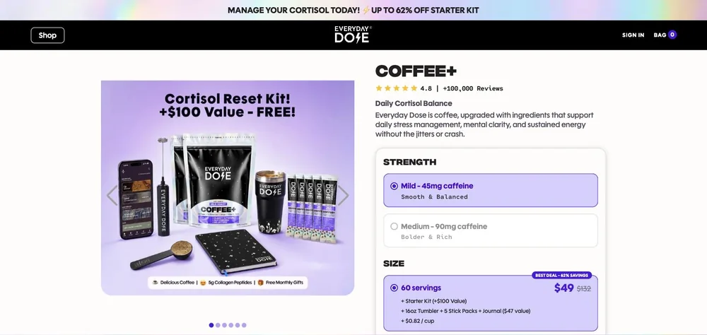
The ad stacks four symptoms, "Puffy face. Belly bloat. Brain fog. Bad sleep.", explains that "Coffee+ actually supports your stress response instead of stacking it", and buttons out on "Lower Your Cortisol, 35% Off". The page picks the cortisol thread up twice before it explains anything, in the bar "MANAGE YOUR CORTISOL TODAY! UP TO 62% OFF STARTER KIT" and in the subhead "Daily Cortisol Balance" under the title COFFEE+. The two figures are not the same number, 35% off in the ad against UP TO 62% OFF on the page, but they reconcile rather than contradict: the 60 serving option shows $49 struck from $132 with a "BEST DEAL - 62% SAVINGS" flag, captured 2026-08-20. Same product, same frame, and the deal is larger on arrival rather than smaller.
The read
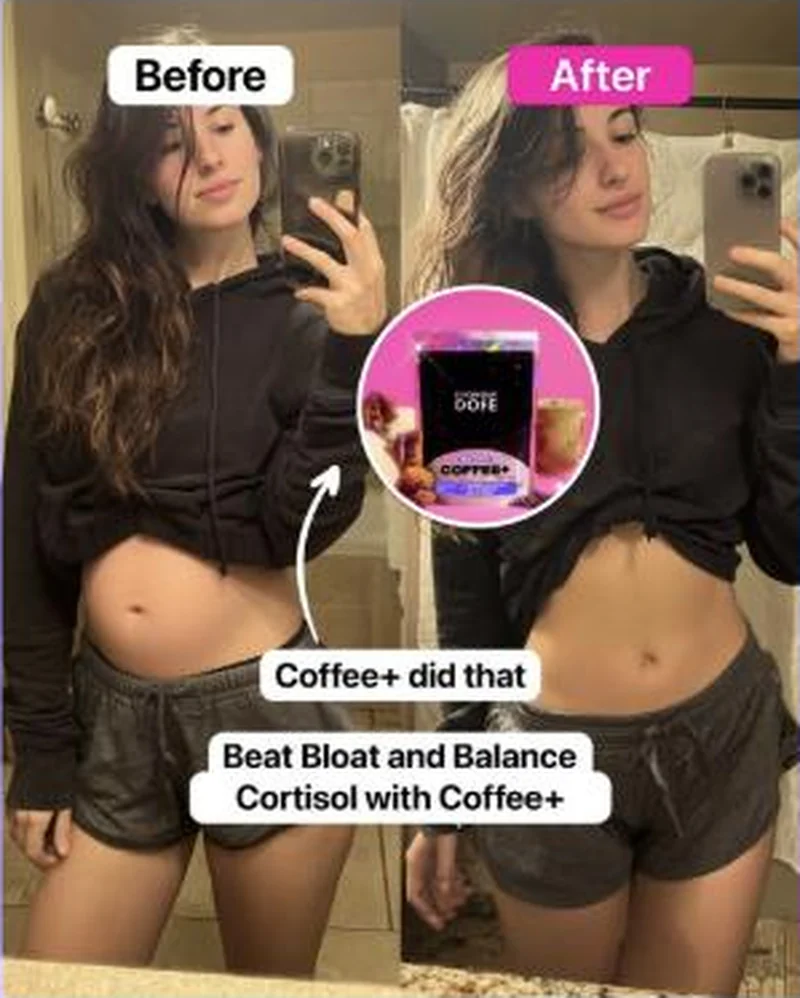
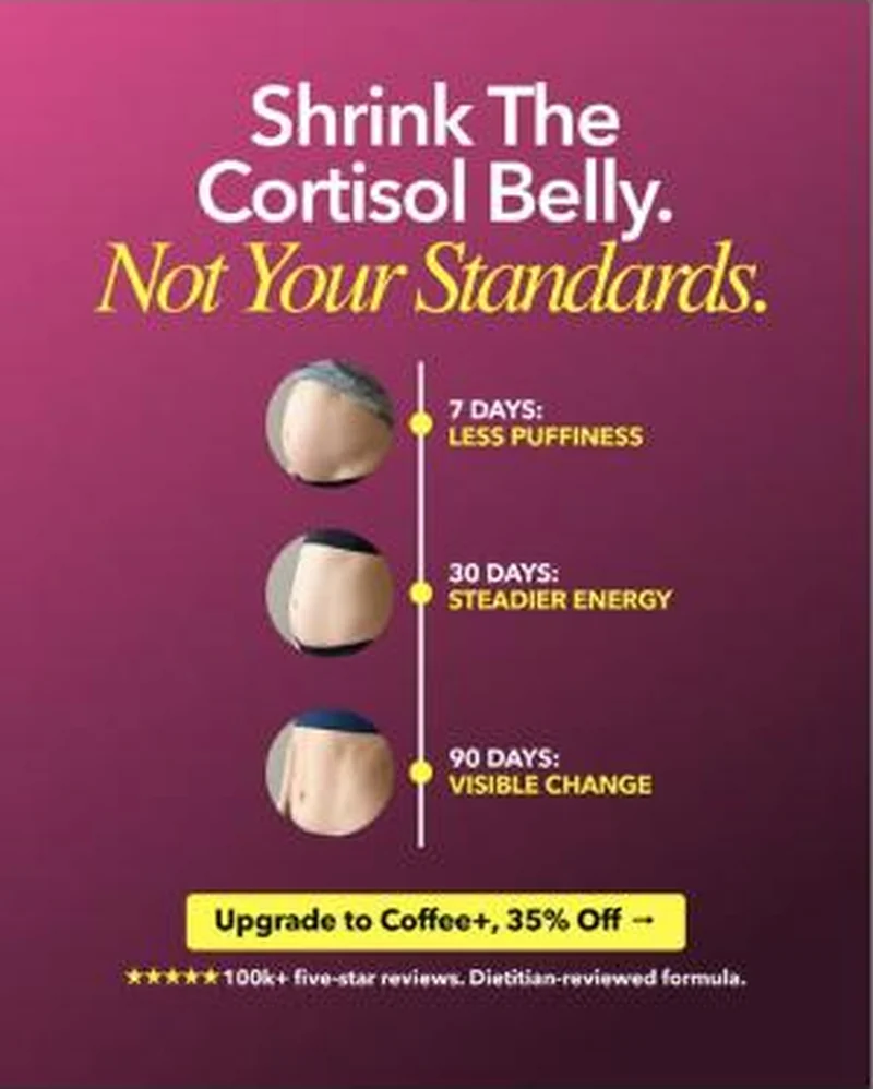
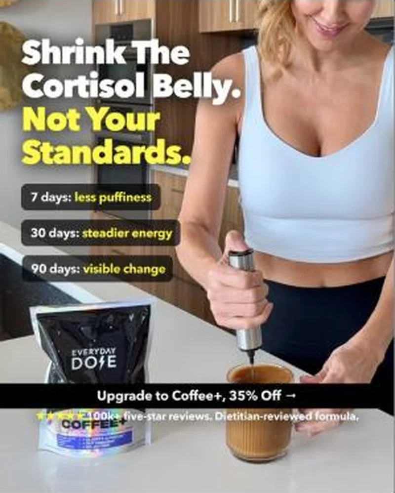
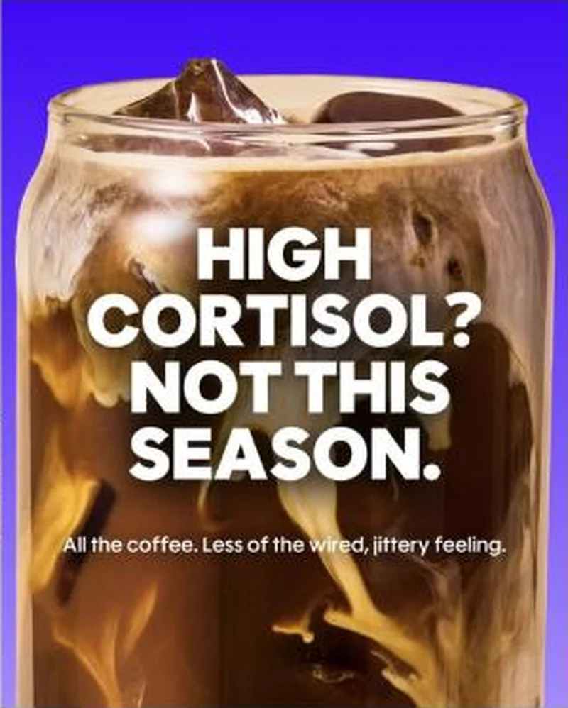
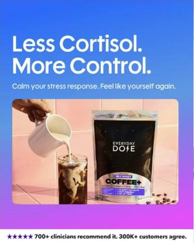
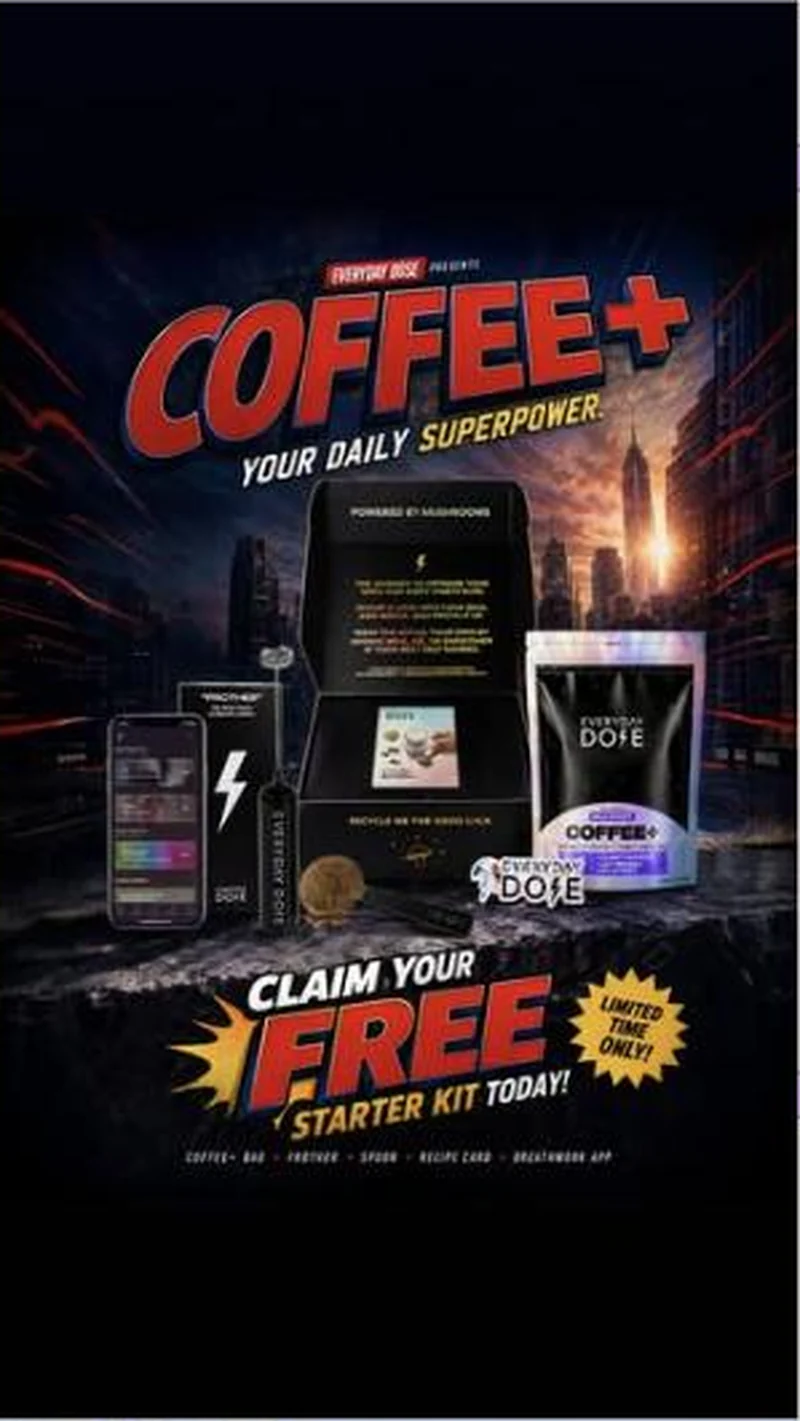
Six creatives launched between 11 and 14 August, all pointing at /products/cortisol while the rest of the account points at the standard 30-serving product page. The lead tile is black, split down the middle, with four symptoms stacked in pastel type on the left and a frothy iced latte photographed on the right. The product does not appear in the headline at all. Below the stack sits one line of mechanism, Coffee+ actually supports your stress response instead of stacking it, and a hot pink button reading Lower Your Cortisol, 35% Off. The rest of the cluster ladders the same argument through different formats: a UGC-style split mirror selfie captioned Coffee+ did that and Beat Bloat and Balance Cortisol with Coffee+, a magenta results card headed Shrink The Cortisol Belly. Not Your Standards. with a 7, 30 and 90 day timeline, a lifestyle version of that same timeline shot at a kitchen counter, an electric blue close-up reading HIGH CORTISOL? NOT THIS SEASON., and a gradient card reading Less Cortisol. More Control. whose footer claims 700+ clinicians recommend it and 300K+ customers agree. One outlier, a comic-book superhero creative with no cortisol content whatsoever, also lands on the same page.
What the ad does
- The product is missing from the hook. "Puffy face. Belly bloat. Brain fog. Bad sleep." runs in pastel type on black with no coffee, no mushrooms and no brand mark. The reader qualifies themselves before they know what is being sold, which is what earns the stop on a cold audience that has already scrolled past a hundred product shots.
- A page built for the angle, not a shared product page. Six creatives launched between 11 and 14 August point at /products/cortisol while the rest of the account points at the standard 30-serving page. Keeping the symptom language running after the click lets the brand test a health-concern audience without contaminating the main listing.
- The timeline gives the buyer something to check. 7 days less puffiness, 30 days steadier energy, 90 days visible change. That is a retention instruction as much as an acquisition promise, because it tells a first-time subscriber how long to stay before judging the product.
Objective fit
Conversion / Purchase. Every creative in the cluster closes on a priced CTA, either Lower Your Cortisol, 35% Off or Upgrade to Coffee+, 35% Off. Nothing here is soft education, the symptom framing exists to earn a discounted first order on a dedicated page.
Everyday Dose ran this conversion creative to the landing page it clicked through to, both captured August 2026. A four-line symptom stack that never says coffee, pointed at a dedicated cortisol landing page rather than the product page every other ad in the account uses. Read as a pair, the handoff rates continuous.
- The product is missing from the hook. "Puffy face. Belly bloat. Brain fog. Bad sleep." runs in pastel type on black with no coffee, no mushrooms and no brand mark.
- A page built for the angle, not a shared product page. Six creatives launched between 11 and 14 August point at /products/cortisol while the rest of the account points at the standard 30-serving page.
- The timeline gives the buyer something to check. 7 days less puffiness, 30 days steadier energy, 90 days visible change.
- Where the handoff lands: The ad stacks four symptoms, "Puffy face. Belly bloat. Brain fog. Bad sleep.", explains that "Coffee+ actually supports your stress response instead of stacking it", and buttons out on "Lower Your Cortisol, 35% Off".
- What to fix: Get the before-and-after reviewed before this ships, and put the substantiation on the page it lands on.
Ad captured by Taylor Sicard 2026-08-19, landing page 2026-08-20. Screenshots reproduced for commentary and criticism.
Tagged
- Objective
- Conversion / Purchase
- Funnel
- Cold / prospecting
- Format
- Static imageListicle staticBefore / after
- Placement
- Meta feedMeta reelsInstagram stories
- Category
- Food & Beverage
- Mechanic
- Problem agitationBefore / after transformationSpecificitySocial proof stack
- Handoff
- Continuous
- Brand
- Everyday Dose
Specificity is #2 of 21 ranked mechanics, on 83 pairs. See where specificity ranks
How this was evidenced
- Evidence
- Pair captured The ad and the page it clicked through to were both captured first-hand, and the destination recorded is the page the ad pointed at.
- Ad creative
- Captured August 2026
- Destination
- https://www.everydaydose.com/products/cortisol Captured August 2026. Advertisers change their ads and pages continuously, so the live page may differ from the capture above. That is expected, and the capture is the record.
- Ad Library
- Ad ID 1392684886260849
Variants of the same system (6)
Six creatives point at /products/cortisol. The argument is identical across all of them, the format is what changes: editorial symptom stack, UGC mirror selfie, results timeline, studio close-up, lifestyle timeline, and one superhero creative that appears to be misrouted. Observed 2026-08-19.
What to fix
Get the before-and-after reviewed before this ships, and put the substantiation on the page it lands on. A mirror selfie pair captioned "Coffee+ did that" reads as a body-composition claim whatever the body copy says, and "Shrink The Cortisol Belly. Not Your Standards." attaches a physiological mechanism to a coffee blend with the word supports doing all the hedging. Fix the routing too: a superhero creative with no cortisol content lands on the same page.
Across every brand: the 6 ways a handoff breaks · persuasion mechanics, ranked by how often the page keeps the promise.
More from Everyday Dose (2)
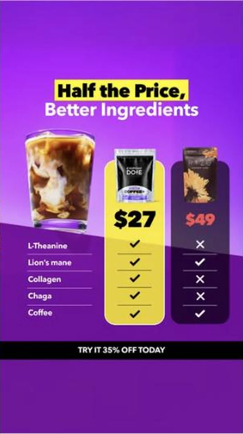 Conversion / PurchaseA five-row tick chart that names Ryze on pack, prices Everyday Dose at $27 against $49, and deliberately lets the competitor win two of the five rows.
 Conversion / PurchaseOne value-stack layout, struck-through total, big discounted price, kit photographed with a FREE flag on every bonus item, re-skinned for whichever holiday is closest.
The same play elsewhere
Same before / after transformation, different brands.
 Topicals A two week before and after on one forehead spot lands on the right product page, behind a scratch card popup that dims the whole fold.SubscriptionObvi Owns before-and-after in a category where the format usually reads as predatory.
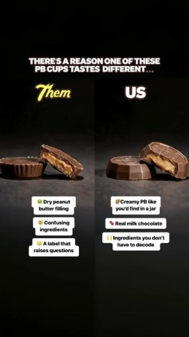 Feastables A cross-sectioned competitor cup labelled Them beside a Feastables cup labelled US, with the ingredient argument stuck on as callouts.
 Alen A sleep score comparison of 100 against 65 hands off to a sale page whose first four cards are all buy two, save more bundles.
Does your own handoff survive the click?
This is the same read I run on live funnels: the ad, the page, and the gap between them. Scored, free, no call required.
Audit my store freeNew teardowns as they land, in Commerce Dispatch: the ad, the page it clicked to, and what the gap cost. Same free newsletter as the footer, no separate list.
Back to The Handoff, the full library of 253 teardowns, 226 of them ad and page pairs, filterable by objective, funnel stage, format, placement, category and persuasion mechanic.
Read next: what the continuous pairs have in common, drawn from every pair in this library.
Everyday Dose is named here solely to identify the advertising being analysed. Brand names and marks are the property of their respective owners. No brand shown has any affiliation with, or has endorsed, Taylor Sicard Consulting.