Everyday Dose · Conversion / Purchase · Warm / consideration · August 2026 · Handoff: Partial · By Taylor Sicard
Everyday Dose ad teardown: Ryze price comparison
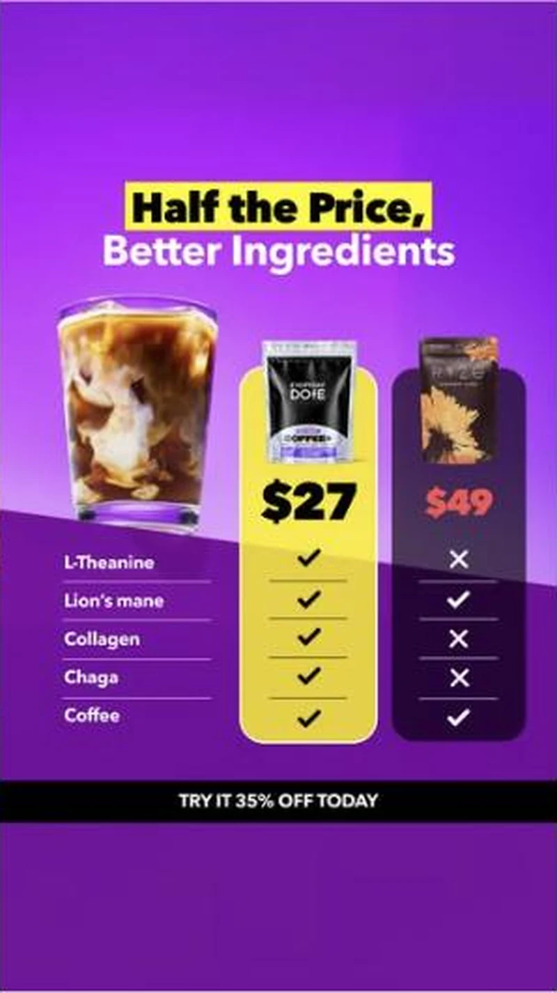
A five-row tick chart that names Ryze on pack, prices Everyday Dose at $27 against $49, and deliberately lets the competitor win two of the five rows.
“Half the Price, Better Ingredients”
Handoff: Partial
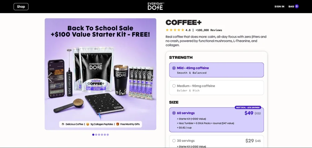
The ad prices Everyday Dose at $27 against a named RYZE pouch at $49 and closes with a black bar reading TRY IT 35% OFF TODAY. The page sells the right product, COFFEE+ in the same mild roast pouch, but names no competitor and prints $49 as its own preselected BEST DEAL - 62% SAVINGS on 60 servings, so the number the ad taught you to reject is the page's headline price. The advertised $27 appears nowhere; the closest thing is 30 servings at $29 struck from $45, roughly the ad's 35% off, sitting second and unselected. Captured 2026-08-20, the visitor has to deselect the default to reach the offer they clicked.
The read
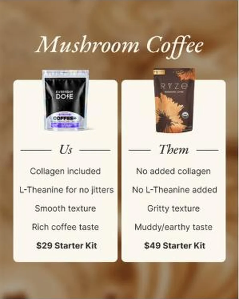
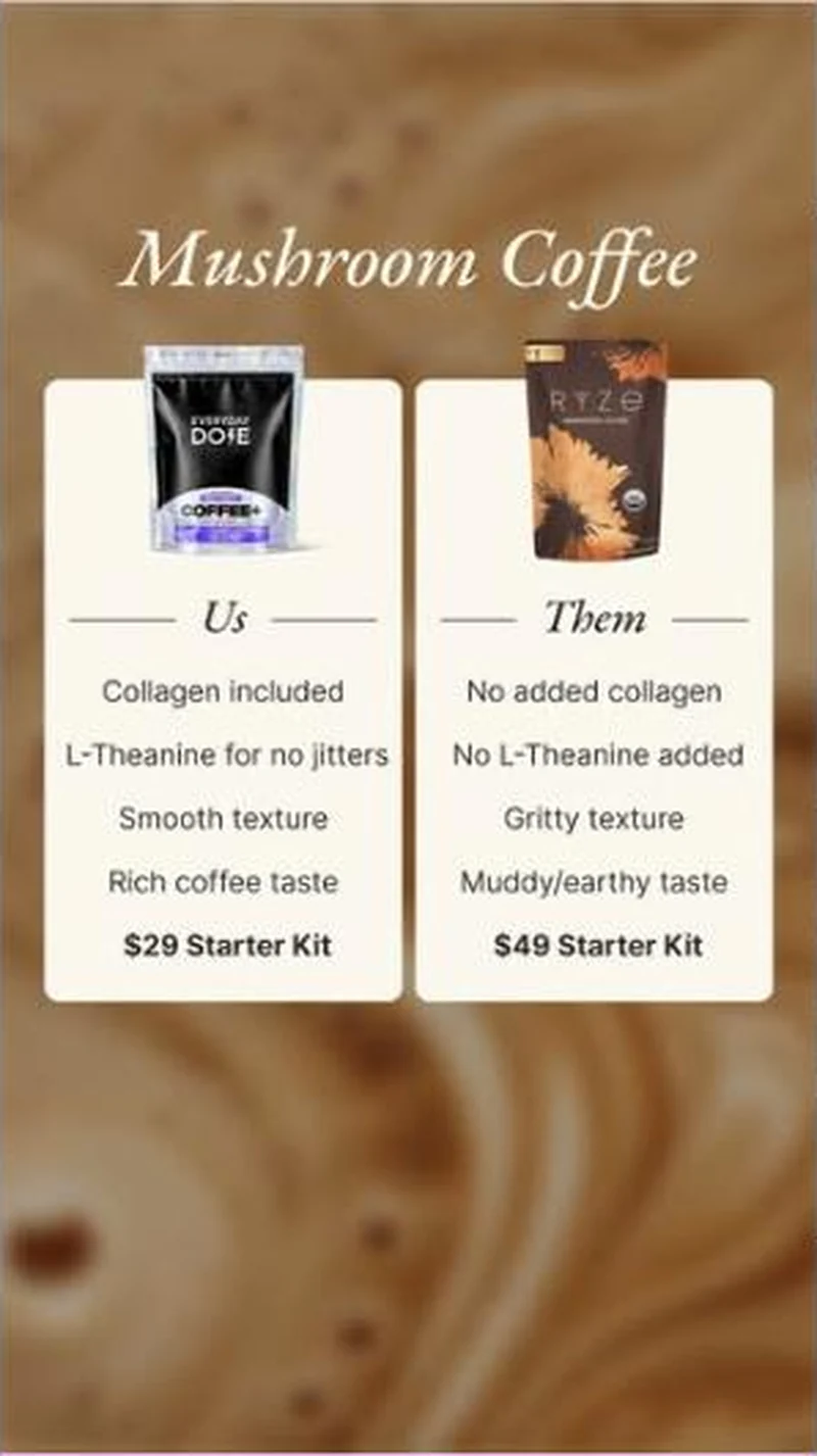
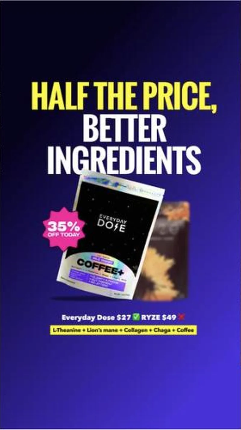
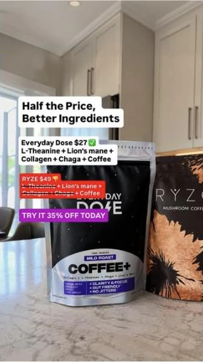
Five creatives run this comparison, and the account has been sharpening it since early August. The earliest version, from 4 August, is a soft cream card headed Mushroom Coffee over a latte-art background, comparing on collagen, L-Theanine, texture and taste, closing on $29 Starter Kit versus $49 Starter Kit. A 9:16 cut of the same card followed on 7 August. By 17 August the argument has hardened into the creative captured here: purple gradient, a yellow highlighter block on Half the Price, an iced coffee glass, then a yellow $27 column for Everyday Dose against a dark $49 column for Ryze with the Ryze price struck in red. Five ingredient rows run underneath, L-Theanine, Lion's mane, Collagen, Chaga and Coffee. Everyday Dose ticks all five. Ryze takes a red cross on L-Theanine, Collagen and Chaga, and a green tick on Lion's mane and Coffee. Footer bar reads TRY IT 35% OFF TODAY. Two more versions launched the same day, a deep blue gradient with the two pouches angled against each other, and a phone-shot kitchen counter photo of the two bags on a marble worktop with social-sticker text laid over it. The shared body copy carries the same attack in words, naming fake myceliated grain mushroom and misleading natural flavours. Every one of these clicks through to the standard 30-serving product page.
What the ad does
- It concedes two rows. Ryze takes a green tick on lion's mane and on coffee, and a red cross on L-Theanine, Collagen and Chaga. A chart where the rival loses every line reads as an advertisement; the two ticks are what make the three crosses credible, and most brands are too nervous to give them up.
- Price and ingredients are settled in one frame. Cheaper normally implies less. A yellow $27 column stacked directly against a dark $49 column with the Ryze price struck in red, above a tick count that runs the other way, kills that inference before the reader has time to form it.
- The winning chart gets re-shot as a phone photo. The newest cut is the two pouches on a marble kitchen worktop with social-sticker text laid over the top, same argument, same numbers, native packaging. That is how a comparison keeps running in feeds where the studio version is read as a paid ad on sight.
Objective fit
Conversion / Purchase, warm rather than cold. A tick chart against a named rival only works on someone already shopping the category, and the CTA is a priced one at 35% off. The job is to convert a Ryze consideration into an Everyday Dose first order, not to introduce mushroom coffee.
Everyday Dose ran this conversion creative to the landing page it clicked through to, both captured August 2026. A five-row tick chart that names Ryze on pack, prices Everyday Dose at $27 against $49, and deliberately lets the competitor win two of the five rows. Read as a pair, the handoff rates partial.
- It concedes two rows. Ryze takes a green tick on lion's mane and on coffee, and a red cross on L-Theanine, Collagen and Chaga.
- Price and ingredients are settled in one frame. Cheaper normally implies less.
- The winning chart gets re-shot as a phone photo. The newest cut is the two pouches on a marble kitchen worktop with social-sticker text laid over the top, same argument, same numbers, native packaging.
- Where the handoff lands: The ad prices Everyday Dose at $27 against a named RYZE pouch at $49 and closes with a black bar reading TRY IT 35% OFF TODAY.
- What to fix: Reconcile the number on the chart with the number at checkout before the next flight.
Ad captured by Taylor Sicard 2026-08-19, landing page 2026-08-20. Screenshots reproduced for commentary and criticism.
Tagged
- Objective
- Conversion / Purchase
- Funnel
- Warm / consideration
- Format
- Comparison staticStatic image
- Placement
- Meta feedMeta reelsInstagram stories
- Category
- Food & Beverage
- Mechanic
- Comparison / us-vs-themPrice anchoringIngredient calloutPrice objection handling
- Handoff
- Partial
- Brand
- Everyday Dose
Price anchoring is #11 of 21 ranked mechanics, on 33 pairs. See where price anchoring ranks
How this was evidenced
- Evidence
- Pair captured The ad and the page it clicked through to were both captured first-hand, and the destination recorded is the page the ad pointed at.
- Ad creative
- Captured August 2026
- Destination
- https://www.everydaydose.com/products/30-servings-of-mushroom-coffee-standard Captured August 2026. Advertisers change their ads and pages continuously, so the live page may differ from the capture above. That is expected, and the capture is the record.
- Ad Library
- Ad ID 1596225042222093
Variants of the same system (4)
One argument, five executions, all landing on the same product page. The progression runs from a polished lifestyle card to a hard tick chart to a phone-shot native version in under two weeks. The same product page also receives a separate family of price-poster, fantasy-poster and apology creatives, which is a different system and worth reading on its own. Observed 2026-08-19.
What to fix
Reconcile the number on the chart with the number at checkout before the next flight. The card moved its own figure from $29 on 4 August to $27 on 17 August while Ryze stayed pinned at $49, and the page the click lands on preselects 60 servings at $49, the exact figure the ad taught the reader to reject. Every cross also has to be true of the pictured Ryze pouch on the day it runs.
One of 25 pairs where the offer on the page is not the offer in the ad. See the pattern · See all 25
More from Everyday Dose (2)
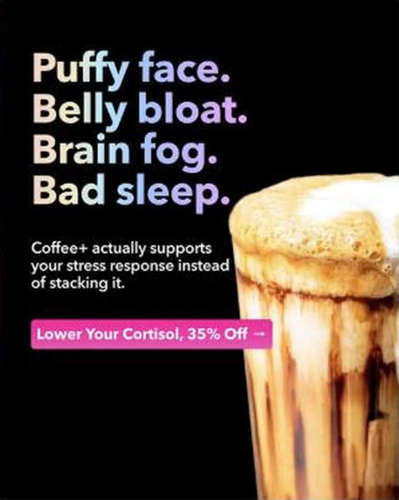 Conversion / PurchaseA four-line symptom stack that never says coffee, pointed at a dedicated cortisol landing page rather than the product page every other ad in the account uses.
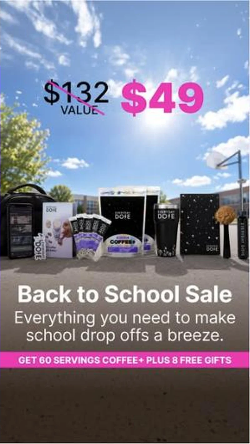 Conversion / PurchaseOne value-stack layout, struck-through total, big discounted price, kit photographed with a FREE flag on every bonus item, re-skinned for whichever holiday is closest.
The same play elsewhere
Same comparison / us-vs-them, different brands.
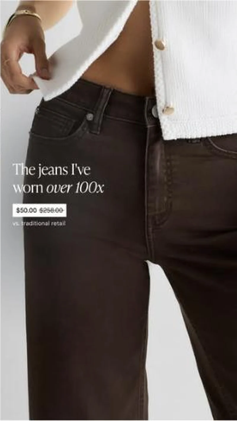 Quince A wearer testimonial sits directly above a struck-through price chip reading $50.00 against $258.00, so the argument is settled before the click.
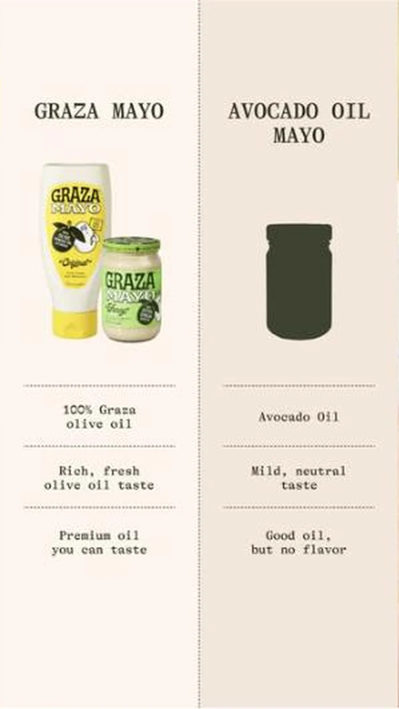 Graza Graza enters mayonnaise by comparing itself to an unnamed rival it renders as an empty silhouette, then concedes that rival is fine.
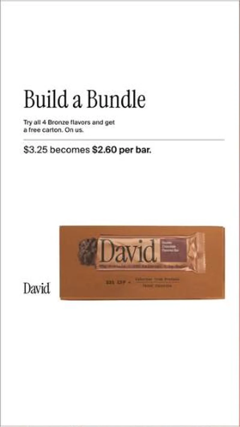 David Protein A free-carton bundle offer that shows its working in per-bar cents, priced and typeset like editorial rather than like a sale.Conversion / PurchaseDRMTLGY A portfolio built on hooks that survived long enough to stop being tests.
Does your own handoff survive the click?
This is the same read I run on live funnels: the ad, the page, and the gap between them. Scored, free, no call required.
Audit my store freeNew teardowns as they land, in Commerce Dispatch: the ad, the page it clicked to, and what the gap cost. Same free newsletter as the footer, no separate list.
Back to The Handoff, the full library of 253 teardowns, 226 of them ad and page pairs, filterable by objective, funnel stage, format, placement, category and persuasion mechanic.
Read next: how DTC promotions survive the click, drawn from every pair in this library.
Everyday Dose is named here solely to identify the advertising being analysed. Brand names and marks are the property of their respective owners. No brand shown has any affiliation with, or has endorsed, Taylor Sicard Consulting.