Feastables · Conversion / Purchase · Cold / prospecting · August 2026 · Handoff: Partial · By Taylor Sicard
Feastables ad teardown: Them vs us pb cup
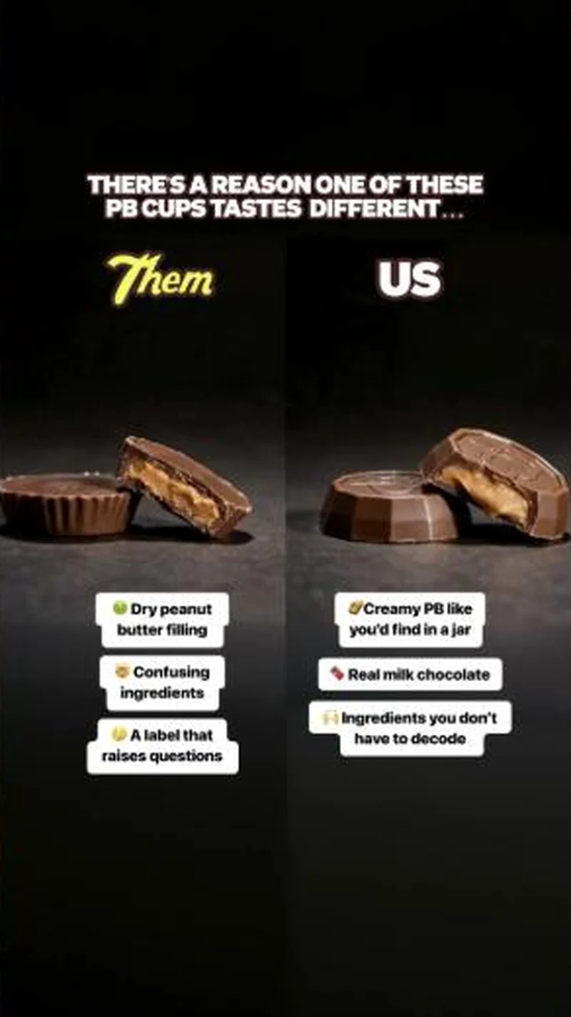
A cross-sectioned competitor cup labelled Them beside a Feastables cup labelled US, with the ingredient argument stuck on as callouts.
“THERE'S A REASON ONE OF THESE PB CUPS TASTES DIFFERENT...”
Handoff: Partial
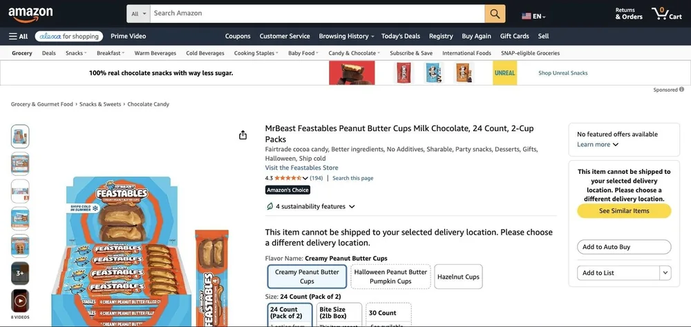
The ad stages a Them versus US cross-section with callouts, Creamy PB like you'd find in a jar and Ingredients you don't have to decode against Dry peanut butter filling and A label that raises questions. The listing is the right product, MrBeast Feastables Peanut Butter Cups Milk Chocolate, 24 Count, 2-Cup Packs, and the main image even shows the same cut-through cup, but the argument shrinks to a keyword string, Better ingredients, No Additives. The frame belongs to Amazon, complete with a sponsored Unreal Snacks strip above the listing reading 100% real chocolate snacks with way less sugar, which is a rival making the same case one row higher. The buy box reads No featured offers available with a shipping block, most likely the Canadian capture session on 2026-08-20 rather than the listing's normal state.
The read
A black studio split, running since 10 August 2026. Two peanut butter cups are cut open and set side by side under Them in the competitor's yellow script and US in Feastables sans. Sticker callouts do the arguing: dry peanut butter filling, confusing ingredients, and a label that raises questions on the left; creamy PB like you'd find in a jar, real milk chocolate, and ingredients you don't have to decode on the right. Feastables runs this frame in at least seven executions across the sweep, rendered in 3D, shot in a studio, held in hand on a gravel driveway, and flattened into a pure ingredient list. Roughly 35 of the 50 ads in this sweep are video and were captured here as poster frames, so the comparison holds up as a still by design.
What the ad does
- The competitor is named without being named. The yellow script and the ribbed cup shape identify the incumbent to anyone who has stood in a candy aisle, while the creative only ever labels the column "Them". That is the legally cheap way to run comparative advertising against the brand that owns the shelf.
- Cutting the product open is the whole argument. Chocolate is bought on taste, which cannot be shown. Two cross-sectioned cups convert an unprovable taste claim into a visible texture difference, "dry peanut butter filling" against "creamy PB like you'd find in a jar", and texture is a proxy a viewer can judge in one second.
- The buyer is the parent, not the eater. "ingredients you don't have to decode" is not a flavour claim, it is a permission claim aimed at whoever fills the cart. The kid supplies the demand and the parent makes the purchase, and every callout on the frame argues with the parent.
Objective fit
Conversion / Purchase. Every execution in this cluster points at a single peanut butter cup product page, and the ask is a switch from an existing purchase rather than a new category habit, so intent already exists and the ad only has to redirect it.
Feastables ran this conversion creative to the landing page it clicked through to, both captured August 2026. A cross-sectioned competitor cup labelled Them beside a Feastables cup labelled US, with the ingredient argument stuck on as callouts. Read as a pair, the handoff rates partial.
- The competitor is named without being named. The yellow script and the ribbed cup shape identify the incumbent to anyone who has stood in a candy aisle, while the creative only ever labels the column "Them".
- Cutting the product open is the whole argument. Chocolate is bought on taste, which cannot be shown.
- The buyer is the parent, not the eater. "ingredients you don't have to decode" is not a flavour claim, it is a permission claim aimed at whoever fills the cart.
- Where the handoff lands: The ad stages a Them versus US cross-section with callouts, Creamy PB like you'd find in a jar and Ingredients you don't have to decode against Dry peanut butter filling and A label that raises questions.
- What to fix: Check your own label before attacking somebody else's.
Ad captured by Taylor Sicard 2026-08-19, landing page 2026-08-20. Screenshots reproduced for commentary and criticism.
Tagged
- Objective
- Conversion / Purchase
- Funnel
- Cold / prospecting
- Format
- Comparison staticStatic imageDemo / product-in-use
- Placement
- Meta feedMeta reelsInstagram stories
- Category
- Food & Beverage
- Mechanic
- Comparison / us-vs-themIngredient calloutProblem agitationSpecificityPattern interrupt
- Handoff
- Partial
- Brand
- Feastables
Specificity is #2 of 21 ranked mechanics, on 83 pairs. See where specificity ranks
How this was evidenced
- Evidence
- Pair captured The ad and the page it clicked through to were both captured first-hand, and the destination recorded is the page the ad pointed at.
- Ad creative
- Captured August 2026
- Destination
- https://www.amazon.com/dp/B0F466CR9M Captured August 2026. Advertisers change their ads and pages continuously, so the live page may differ from the capture above. That is expected, and the capture is the record.
- Ad Library
- Ad ID 976816591730721
Variants of the same system (7)
One comparison frame, rendered every way the production pipeline allows: 3D product renders, a black studio still life, hands snapping cups open on a gravel driveway, and a flat ingredient list graphic. The Them and US labels and the dry versus creamy contrast are constant across all of them, and all of them land on the same Amazon product page. Observed 2026-08-19.
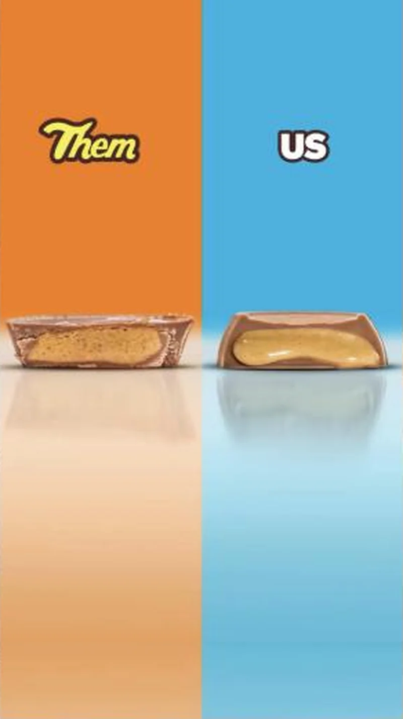 3D render, Them against US
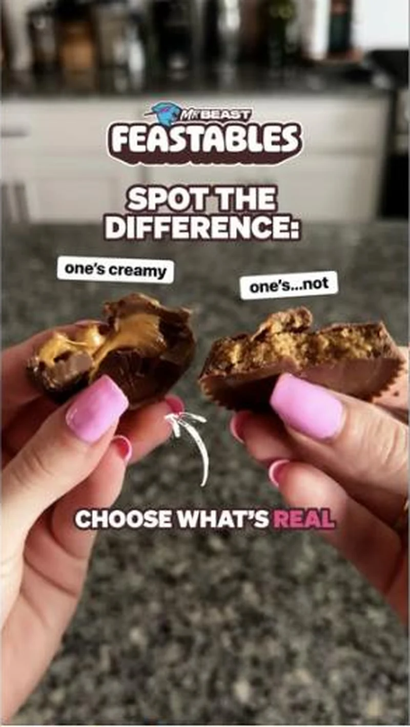 Hands pulling apart both cups, SPOT THE DIFFERENCE
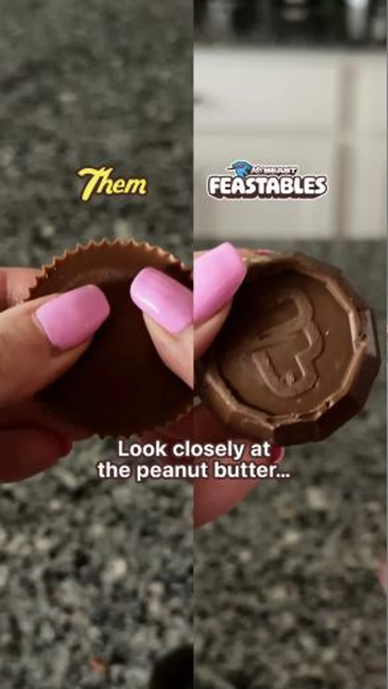 Gravel driveway split screen, Look closely at the peanut butter
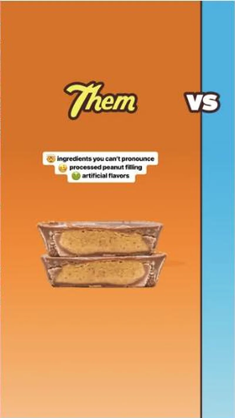 Ingredient list graphic, artificial fillers
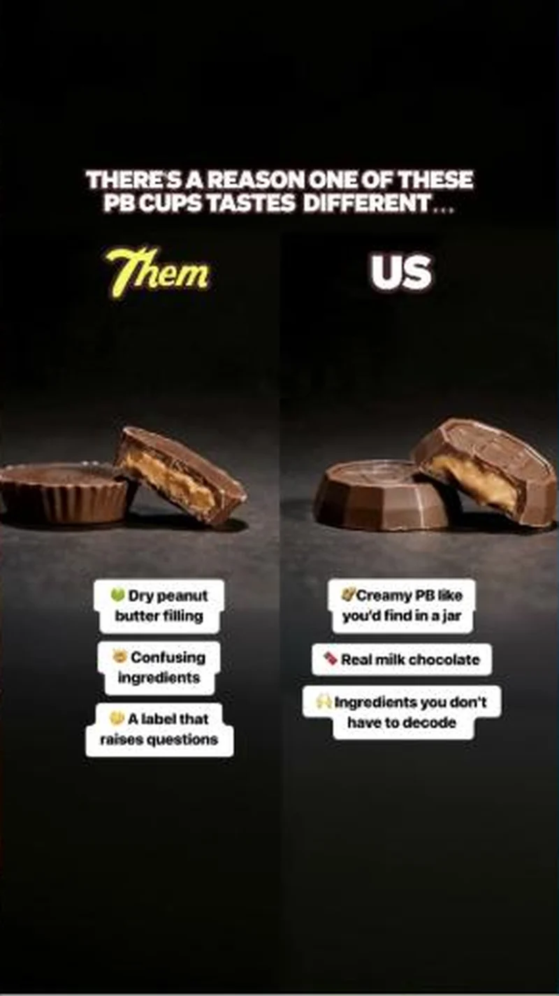 Studio split with sticker callouts
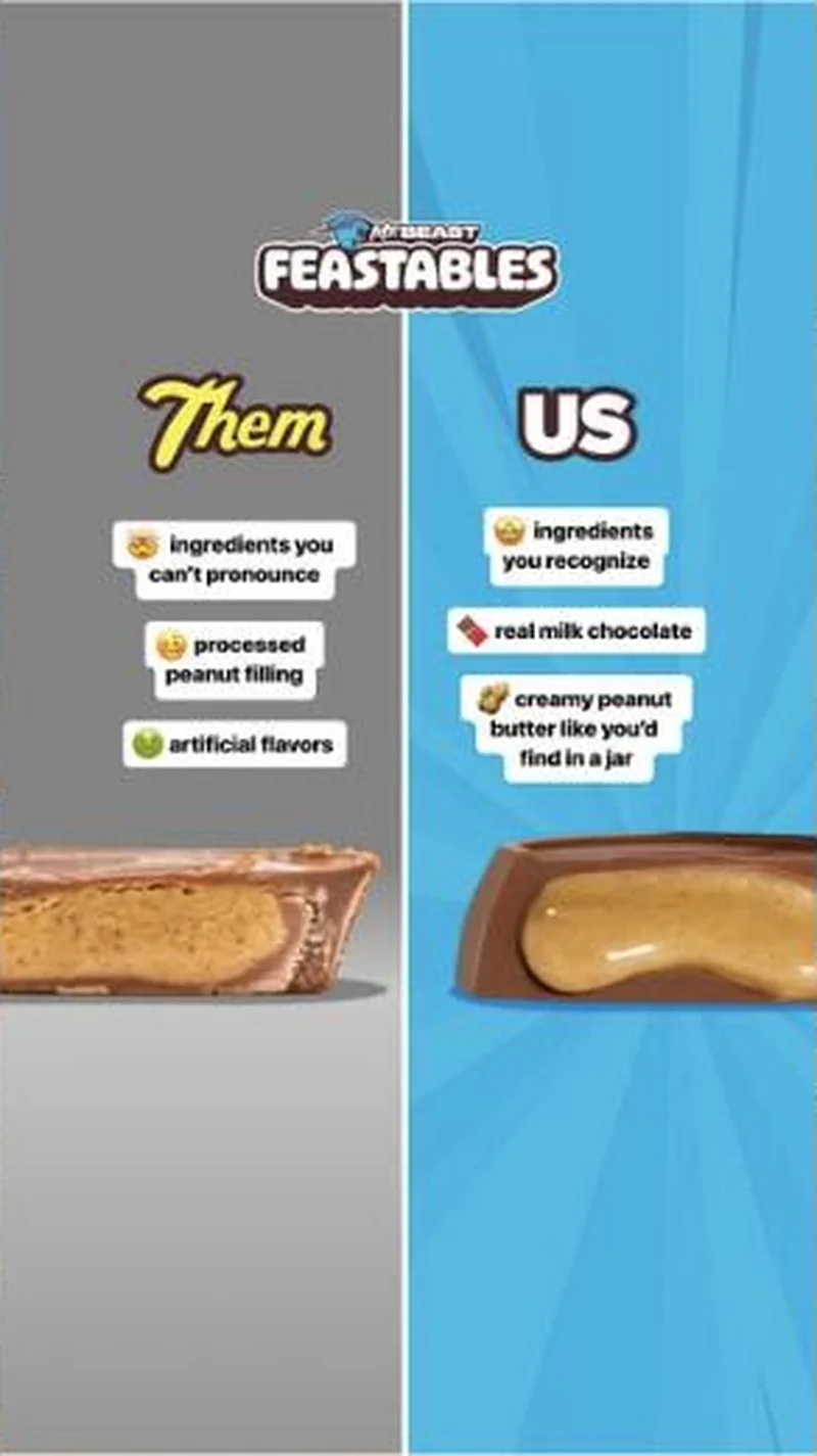 Grey against blue split, Them and US sticker lists
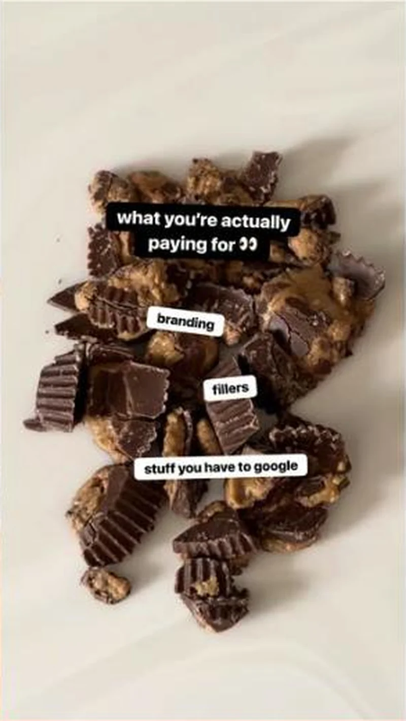 Plate of chopped competitor cups, What You're Paying For
What to fix
Check your own label before attacking somebody else's. An ingredients attack on a category leader collapses the moment a reader compares sugar loads, and the destination already shows what that looks like: a sponsored Unreal Snacks strip sits one row above the listing reading "100% real chocolate snacks with way less sugar", making the same case against you. Do not copy this without a formulation difference you can photograph.
One of 44 pairs where the page drops the argument that earned the click. See the pattern · See all 44
More from Feastables (1)
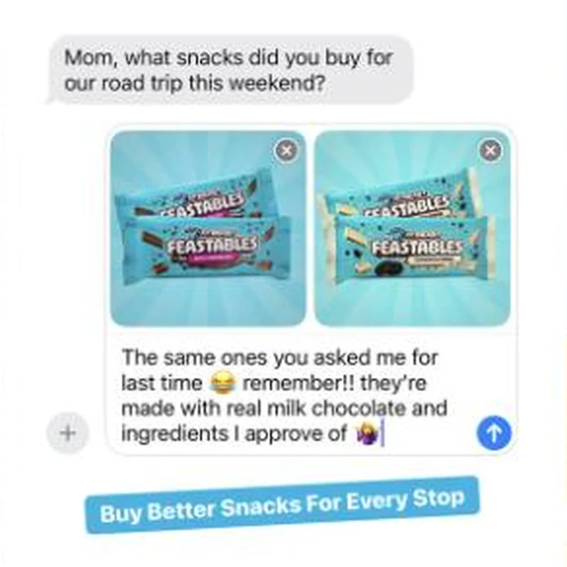
The same play elsewhere
Same ingredient callout, different brands.
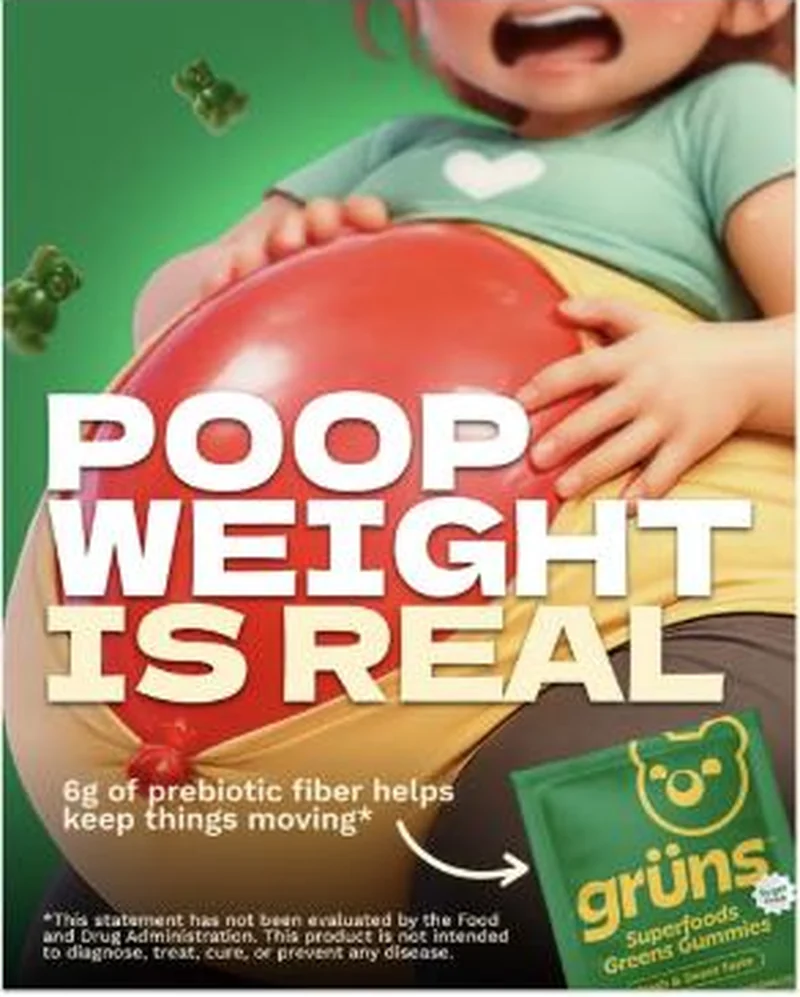 Grüns A blunt gut health static that says the word nobody else in the feed will say, then hands the claim to one fibre number.
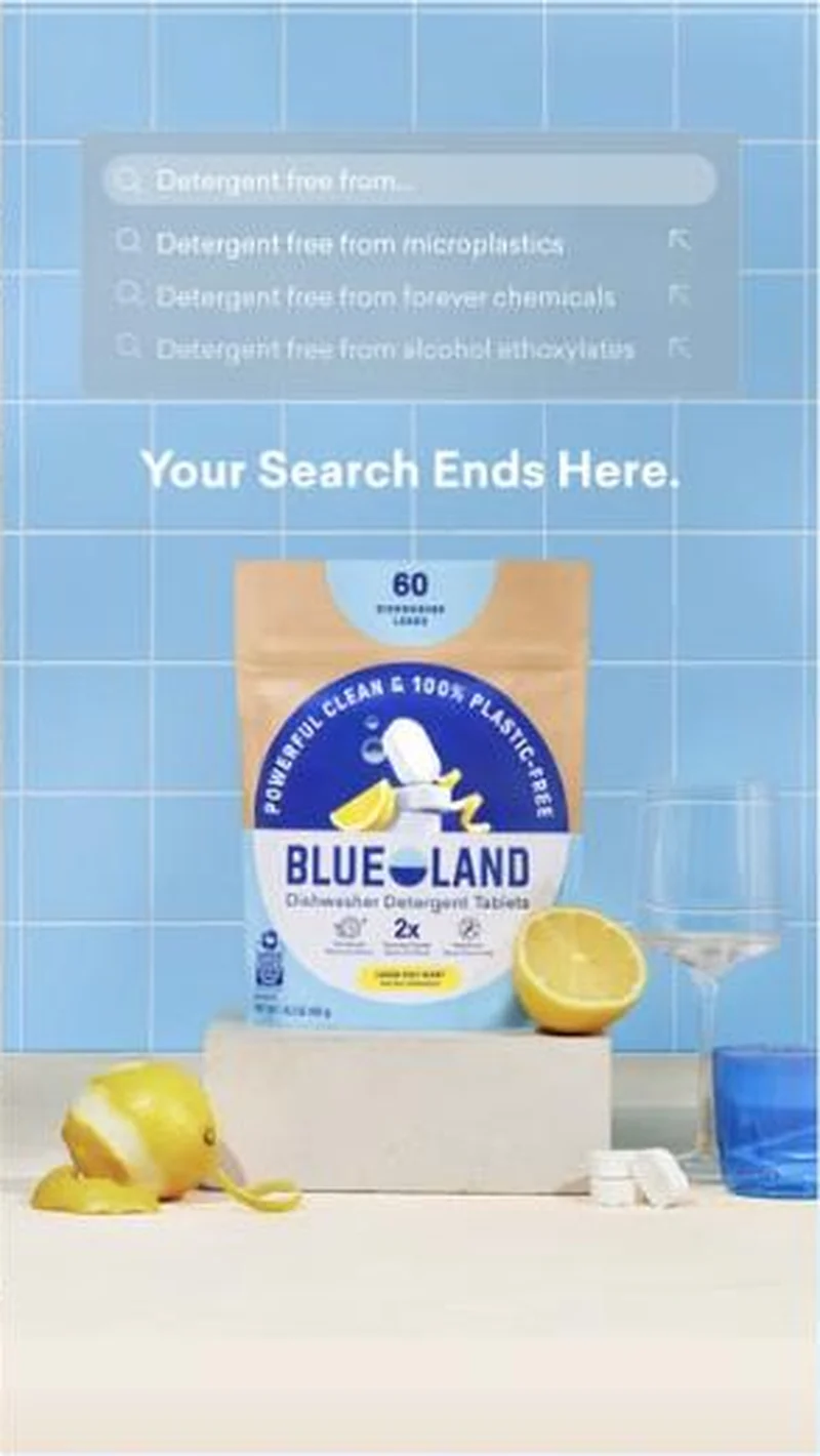 Blueland A simulated autocomplete dropdown puts an unfinished query in the reader's head, then completes it three times with named chemicals, and sends the click to a page called fb-microplastic.
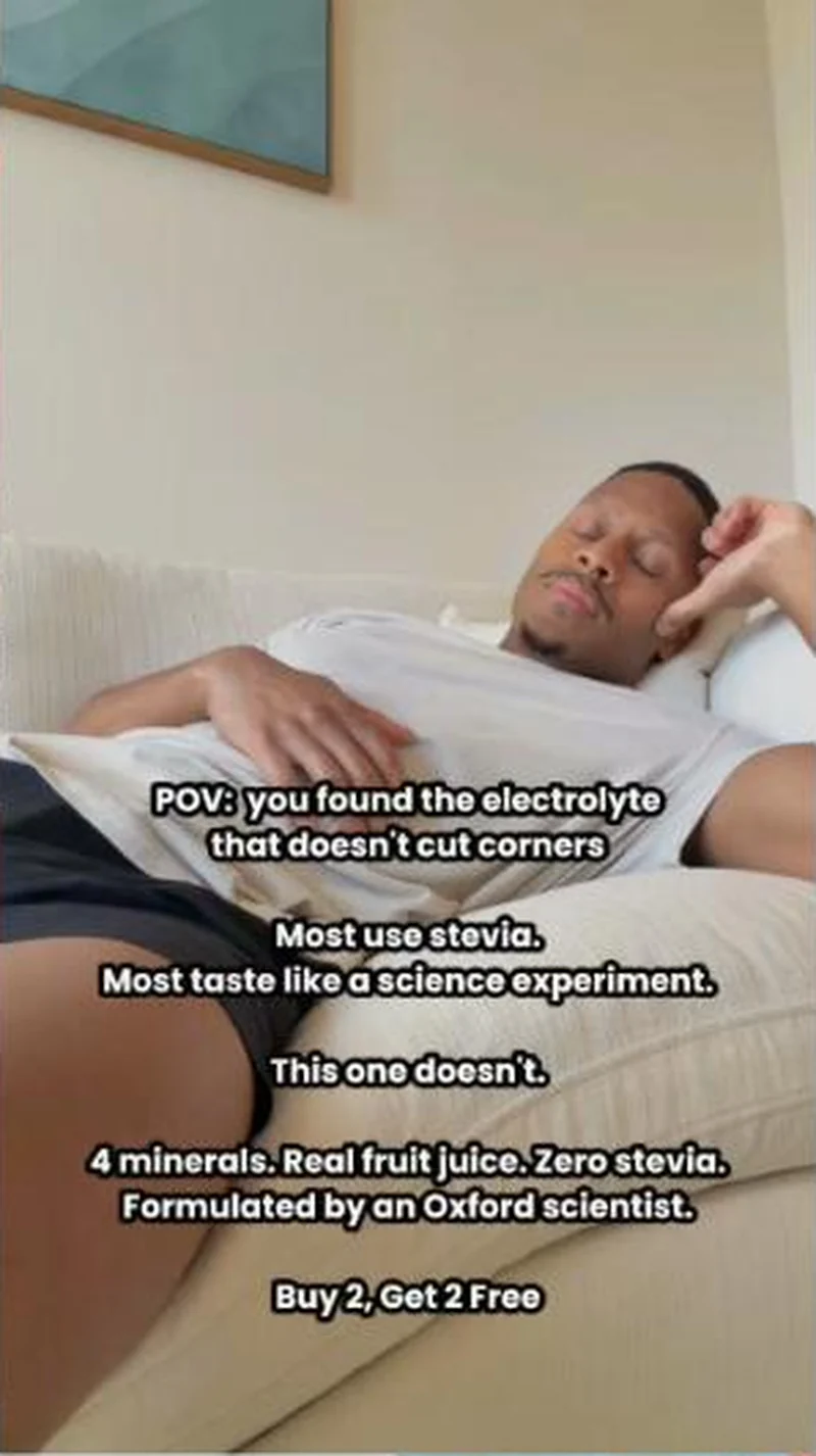 Hydrant Hydrant has reduced its entire prospecting argument to one absent ingredient, and it says stevia more often than it says hydration.
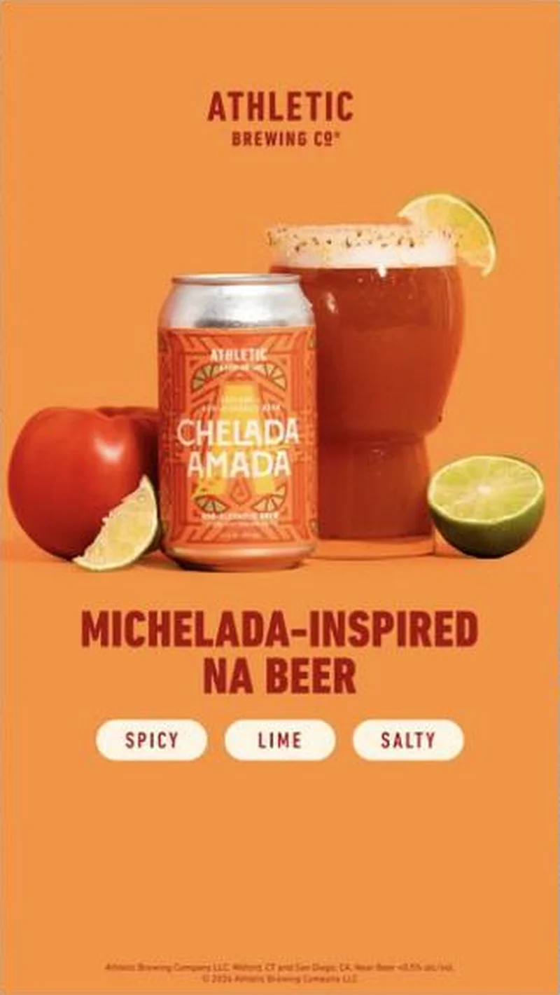 Athletic Brewing A can, a rimmed glass and three flavour chips set the expectation, and the product page repeats the same three words back word for word.
Does your own handoff survive the click?
This is the same read I run on live funnels: the ad, the page, and the gap between them. Scored, free, no call required.
Audit my store freeNew teardowns as they land, in Commerce Dispatch: the ad, the page it clicked to, and what the gap cost. Same free newsletter as the footer, no separate list.
Back to The Handoff, the full library of 253 teardowns, 226 of them ad and page pairs, filterable by objective, funnel stage, format, placement, category and persuasion mechanic.
Read next: what breaks, across every rated pair, drawn from every pair in this library.
Feastables is named here solely to identify the advertising being analysed. Brand names and marks are the property of their respective owners. No brand shown has any affiliation with, or has endorsed, Taylor Sicard Consulting.