Chomps · Conversion / Purchase · Cold / prospecting · August 2026 · Handoff: Partial · By Taylor Sicard
Chomps ad teardown: Back to school routine chassis
One blue template, one offer, one landing page, and nineteen live creatives that differ mainly in the headline and the picture in the middle.
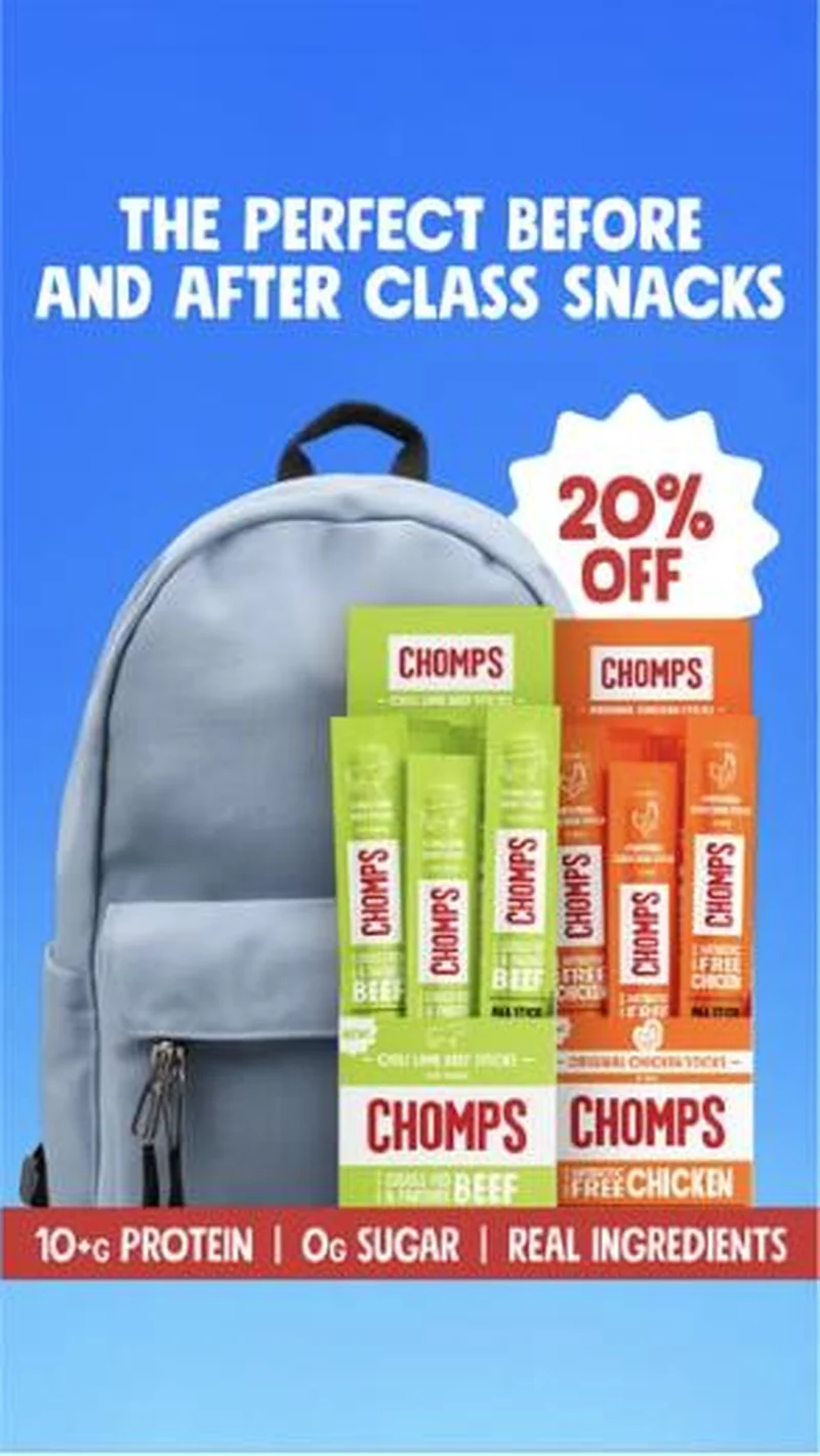
“THE PERFECT BEFORE AND AFTER CLASS SNACKS”
Handoff: Partial
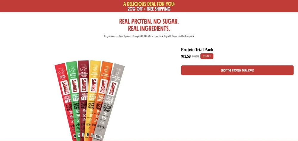
The ad's footer band, "10+G PROTEIN | 0G SUGAR | REAL INGREDIENTS", becomes the page headline almost verbatim, "REAL PROTEIN. NO SUGAR. REAL INGREDIENTS.", and the 20% OFF starburst resolves exactly at "A DELICIOUS DEAL FOR YOU: 20% OFF + FREE SHIPPING" with the Protein Trial Pack at $13.59 struck from $16.99, captured 2026-08-20. The occasion does not survive the click. Nothing on the page says school, class, backpack or routine, and the ad's Chili Lime Beef and Original Chicken multipacks are replaced by a fan of six single sticks. The ad sold a moment in a schoolday and the page sells a starter SKU.
The read
A back-to-school flight that went live on 15 July 2026 and was still running on 19 August. The chassis never moves: a flat blue field, a white all-caps headline at the top, a rounded photo card or a product mosaic in the middle, a 20% OFF starburst or angular flag in the upper right, and a red footer bar reading 10+G PROTEIN | 0G SUGAR | REAL INGREDIENTS. Everything else is a slot. Four headlines rotate across the set, THE PERFECT BEFORE AND AFTER CLASS SNACKS, A NEW ROUTINE STARTS WITH NEW SNACKS, ADD BETTER SNACKS TO YOUR ROUTINE and NEED ROUTINE MAINTENANCE?, with STOCK UP BEFORE SCHOOL STARTS! added as the seasonal deadline version. The interior image rotates too, across a grey backpack with cartons stacked out of the top, a tiled colour-block grid of multipack cartons, a school flat-lay, a belt bag, a snack still life and a woman loading sticks into a coral backpack. Body copy is shared word for word inside each sub-group, either the school-days line or the stock-up line offering 20% off plus an extra 10% on subscription. Nearly all of it lands on get.chomps.com/fuel-your-day. The same discipline ran in July under a summer skin: three split-frame ads with a coloured type panel on the left and a lifestyle photo on the right, all carrying identical body copy about beach bags, backpacks and pockets, with only the moment and the model swapped.
What the ad does
- Only one thing moves at a time. The grey backpack visual carries three headlines and the carton mosaic carries four, on a chassis that never changes: a flat blue field, a white all-caps headline, a 20% OFF starburst in the upper right and a red footer bar. The read on headline is clean and the read on image is clean, which most accounts give up by shipping five changes at once.
- The claims bar never negotiates. 10+G PROTEIN | 0G SUGAR | REAL INGREDIENTS sits in the same red strip at the same size on every execution, so the headline can chase a season while the reason to buy stays fixed. The page picks it up almost verbatim as REAL PROTEIN. NO SUGAR. REAL INGREDIENTS.
- The occasion does not survive the click. Nothing on the landing page says school, class, backpack or routine, and the Chili Lime Beef and Original Chicken multipacks in the creative are replaced by a fan of six single sticks with the Protein Trial Pack at $13.59 struck from $16.99. The ad sold a moment in a schoolday and the page sells a starter SKU.
Objective fit
Conversion / Purchase. Every execution carries a 20% off badge and a discount landing page rather than a content or quiz destination, and the body copy stacks an extra 10% for subscribing on top. The creative is a coupon with an occasion wrapped around it.
Chomps ran this conversion creative to the landing page it clicked through to, both captured August 2026. One blue template, one offer, one landing page, and nineteen live creatives that differ mainly in the headline and the picture in the middle. Read as a pair, the handoff rates partial.
- Only one thing moves at a time. The grey backpack visual carries three headlines and the carton mosaic carries four, on a chassis that never changes: a flat blue field, a white all-caps headline, a 20% OFF starburst in the upper right and a red footer bar.
- The claims bar never negotiates. 10+G PROTEIN | 0G SUGAR | REAL INGREDIENTS sits in the same red strip at the same size on every execution, so the headline can chase a season while the reason to buy stays fixed.
- The occasion does not survive the click.
- Where the handoff lands: The ad's footer band, "10+G PROTEIN | 0G SUGAR | REAL INGREDIENTS", becomes the page headline almost verbatim, "REAL PROTEIN. NO SUGAR.
- What to fix: Break the chassis on purpose before it breaks on you. Nineteen creatives sharing one blue layout means fatigue arrives across the whole flight at once, and the account only ever learns which of four routine headlines wins.
Ad captured by Taylor Sicard 2026-08-19, landing page 2026-08-20. Screenshots reproduced for commentary and criticism.
Tagged
- Objective
- Conversion / Purchase
- Funnel
- Cold / prospecting
- Format
- Static image
- Placement
- Meta feedInstagram stories
- Category
- Food & Beverage
- Mechanic
- Moment anchoringIdentity appealSpecificity
- Handoff
- Partial
- Brand
- Chomps
Identity appeal is #1 of 21 ranked mechanics, on 110 pairs. See where identity appeal ranks
How this was evidenced
- Evidence
- Pair captured The ad and the page it clicked through to were both captured first-hand, and the destination recorded is the page the ad pointed at.
- Ad creative
- Captured August 2026
- Destination
- https://get.chomps.com/fuel-your-day Captured August 2026. Advertisers change their ads and pages continuously, so the live page may differ from the capture above. That is expected, and the capture is the record.
- Ad Library
- Ad ID 1850726315892537
Variants of the same system (18)
Held constant across the whole set: the blue field, the white all-caps headline slot, the 20% off badge, the red claims footer and the get.chomps.com/fuel-your-day destination. What changes: the headline, and separately the interior image. The grey backpack visual runs under three headlines, the carton mosaic under four, and the rounded photo card under two, which makes this a headline test on a fixed layout rather than a set of distinct concepts. Two later versions were pushed to get.chomps.com/fb-try-chomps-20 instead. The final five entries are the July summer flight, the same template logic under a split-frame skin with one shared body copy across swapped occasions. Observed 2026-08-19.
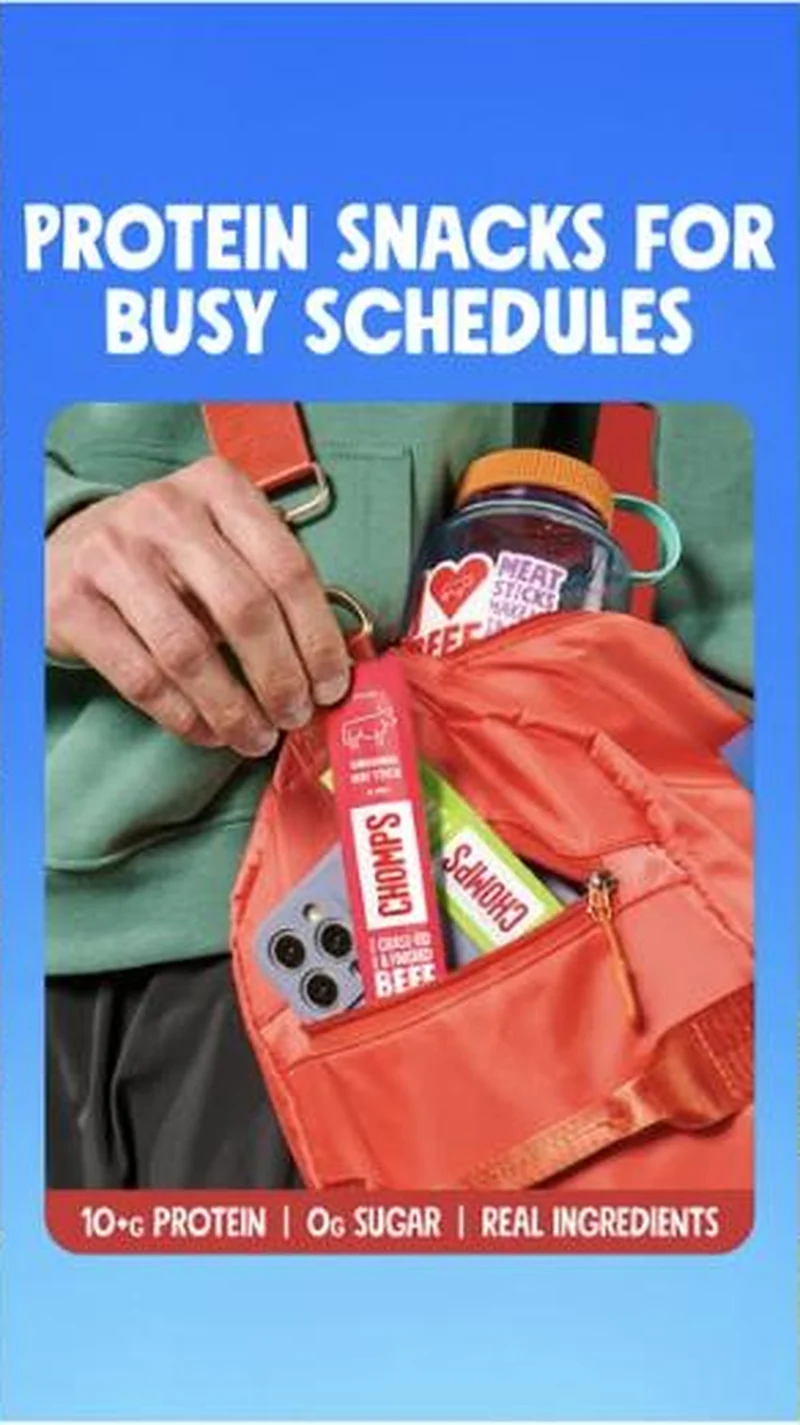 PROTEIN SNACKS FOR BUSY SCHEDULES, belt bag photo card
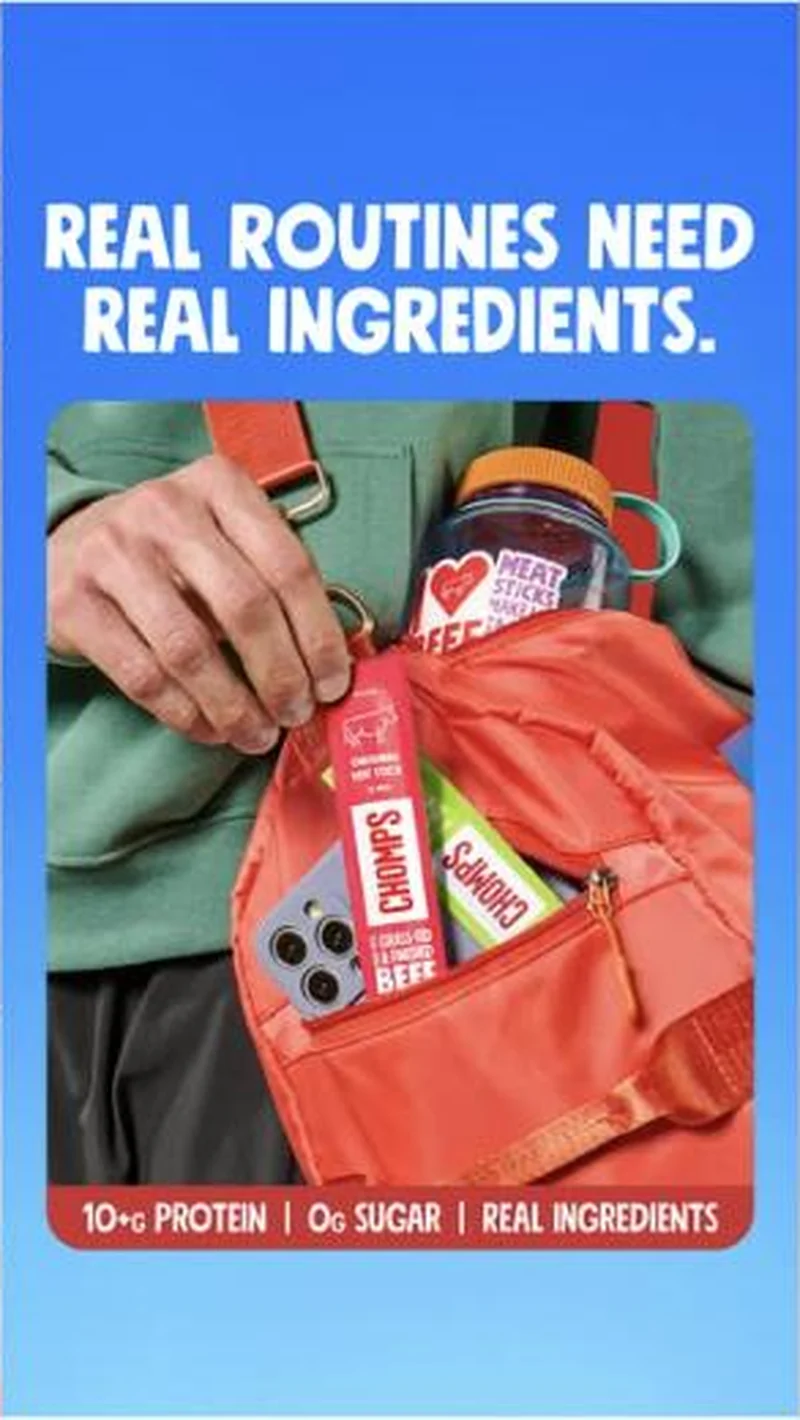 REAL ROUTINES NEED REAL INGREDIENTS., same belt bag photo card
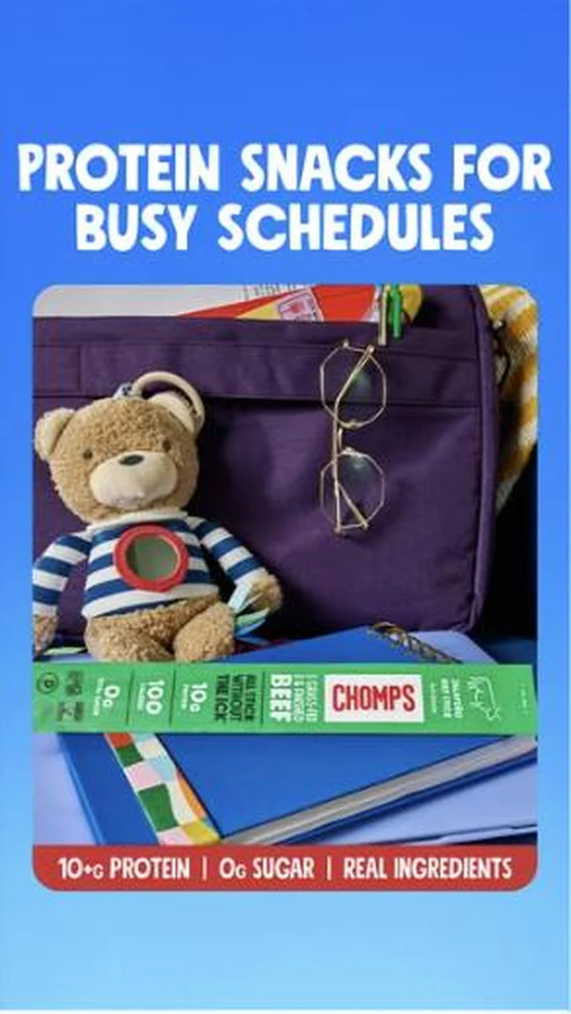 PROTEIN SNACKS FOR BUSY SCHEDULES, school flat-lay
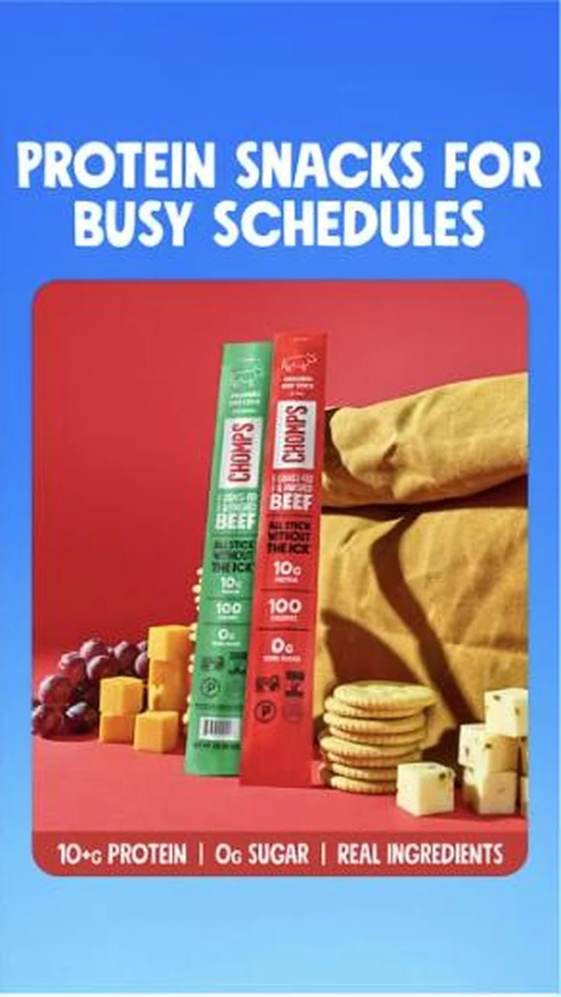 PROTEIN SNACKS FOR BUSY SCHEDULES, snack board still life
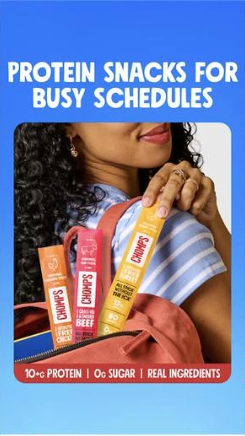 PROTEIN SNACKS FOR BUSY SCHEDULES, coral backpack load-in
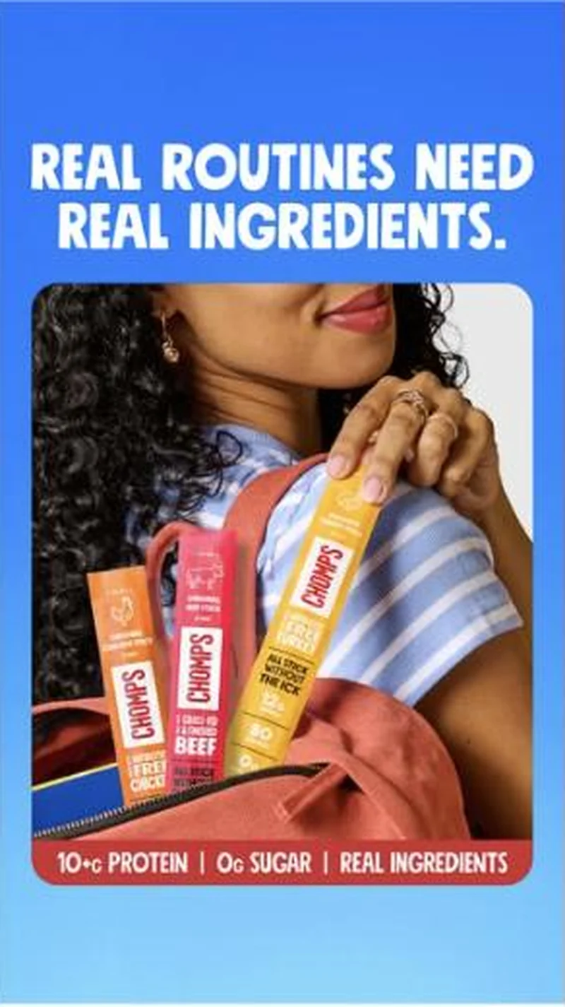 REAL ROUTINES NEED REAL INGREDIENTS., same coral backpack load-in
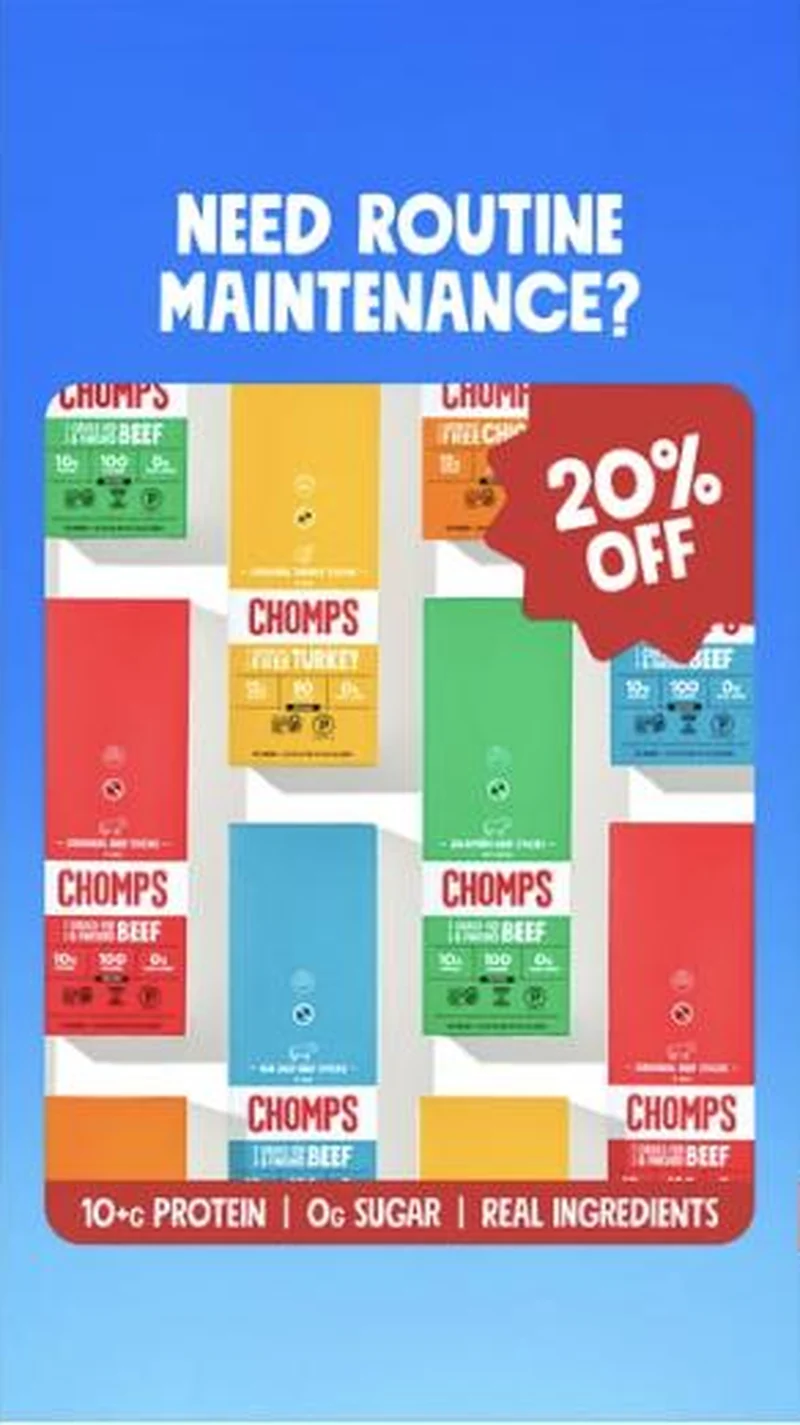 NEED ROUTINE MAINTENANCE?, carton mosaic
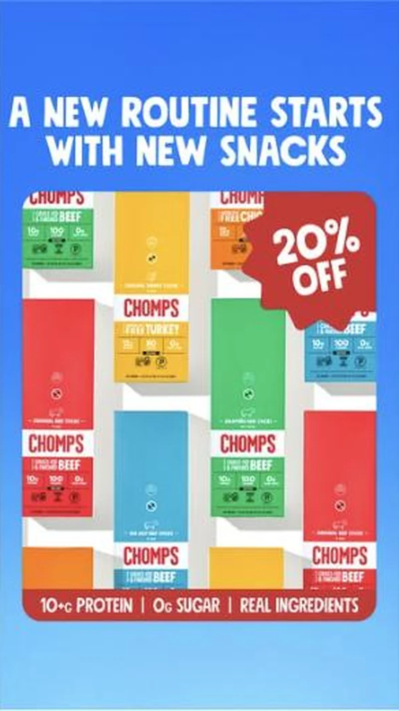 A NEW ROUTINE STARTS WITH NEW SNACKS, same carton mosaic
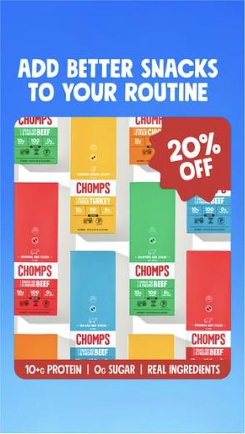 ADD BETTER SNACKS TO YOUR ROUTINE, same carton mosaic
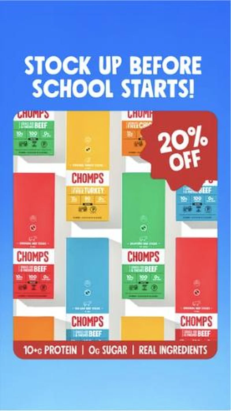 STOCK UP BEFORE SCHOOL STARTS!, same carton mosaic, pushed to the FB offer page
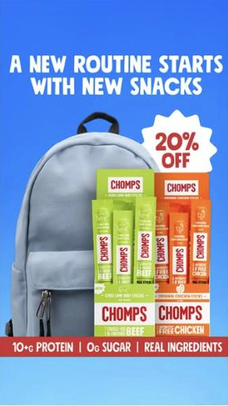 A NEW ROUTINE STARTS WITH NEW SNACKS, grey backpack
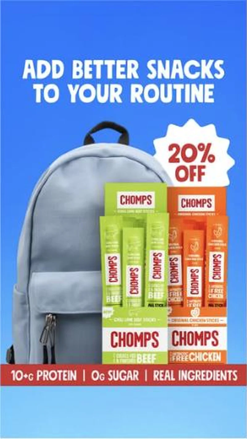 ADD BETTER SNACKS TO YOUR ROUTINE, grey backpack, pushed to the FB offer page
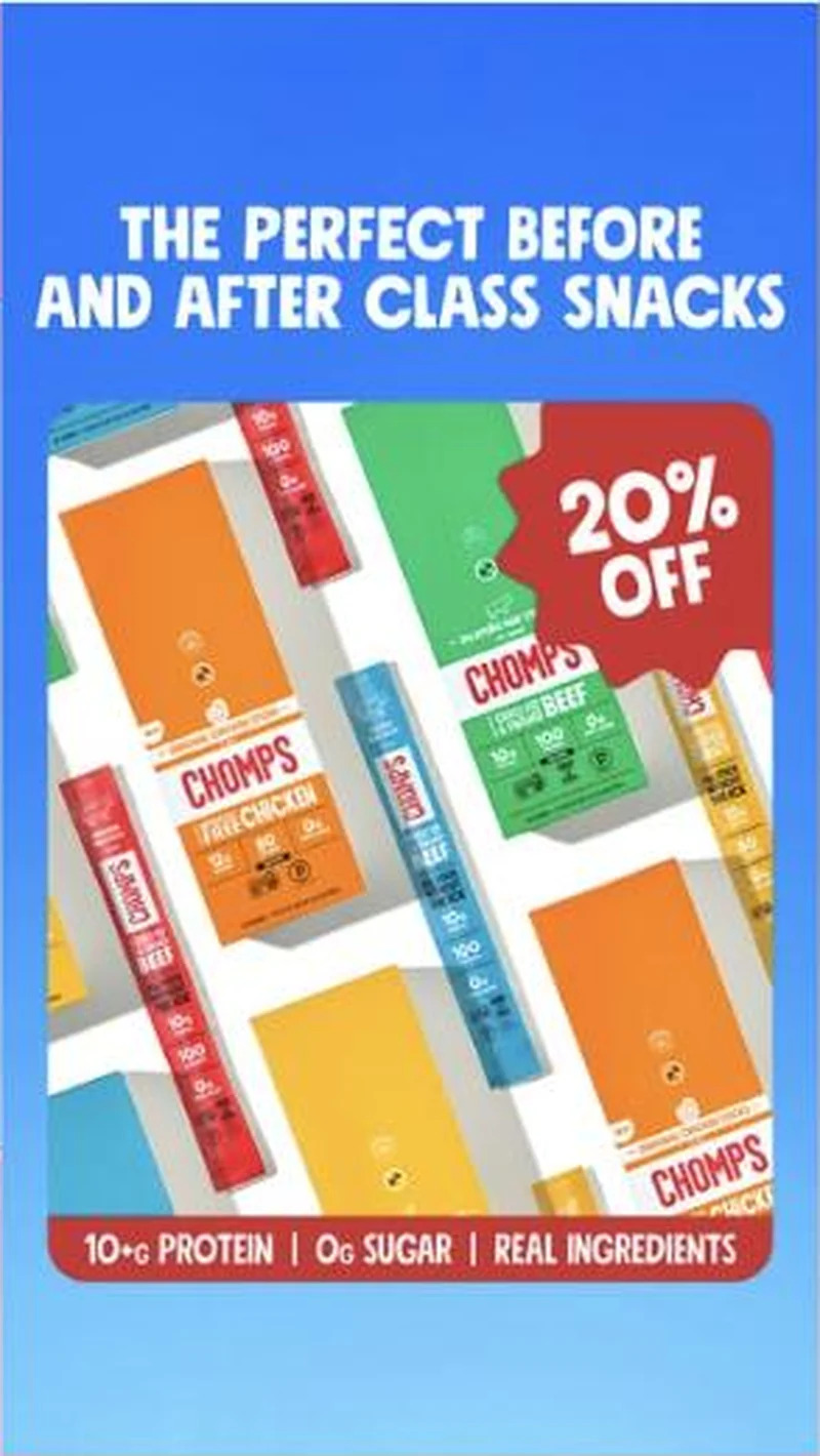 THE PERFECT BEFORE AND AFTER CLASS SNACKS, loose carton collage
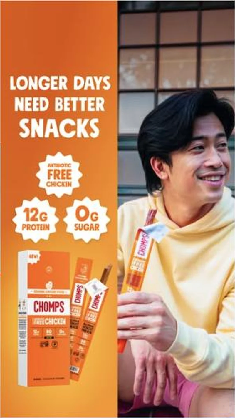 Summer flight: LONGER DAYS NEED BETTER SNACKS, split frame, cafe
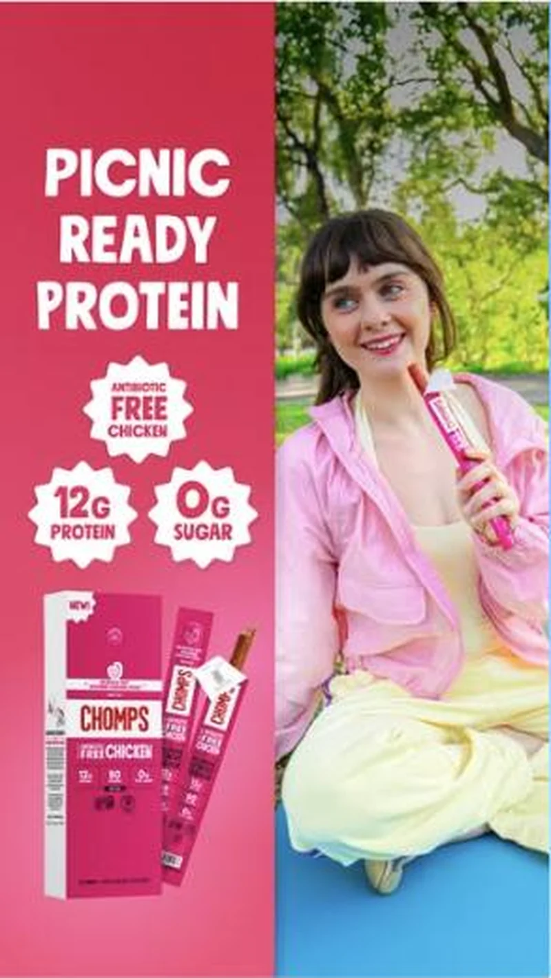 Summer flight: PICNIC READY PROTEIN, split frame, park
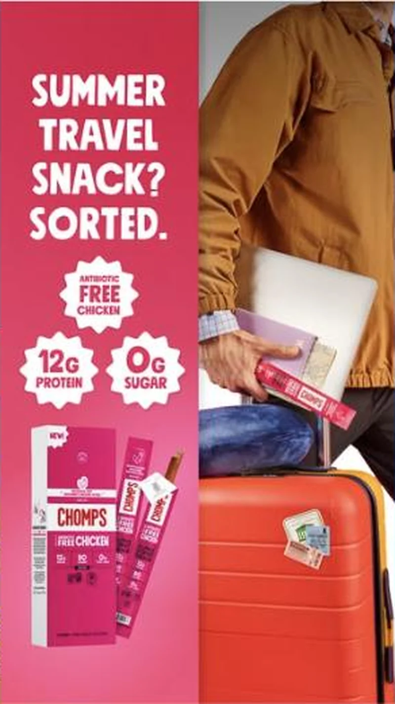 Summer flight: SUMMER TRAVEL SNACK? SORTED., split frame, travel
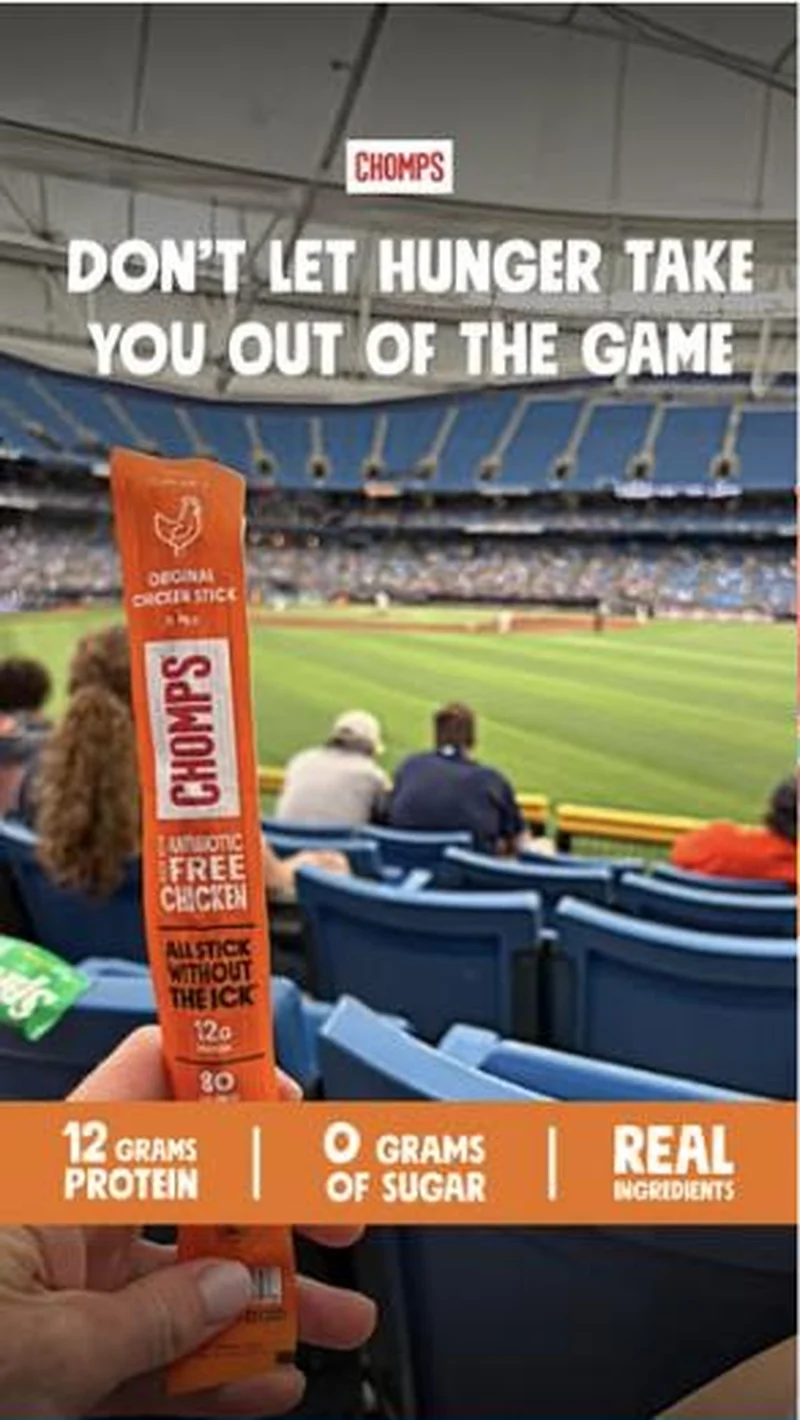 Summer flight: DON'T LET HUNGER TAKE YOU OUT OF THE GAME, stadium
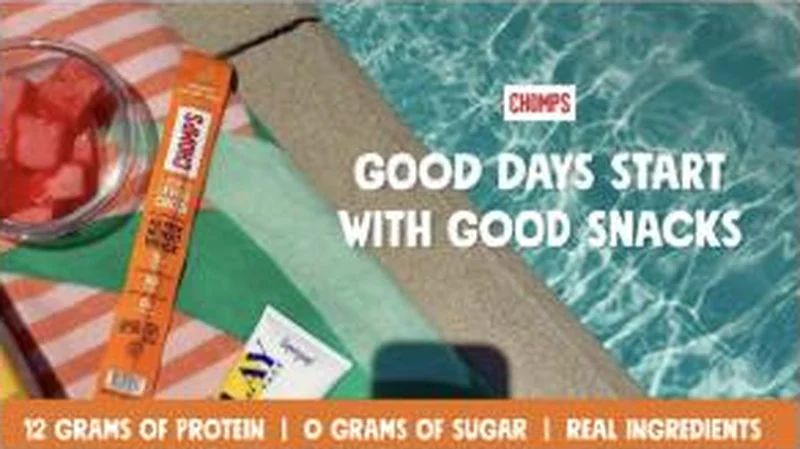 Summer flight: GOOD DAYS START WITH GOOD SNACKS, poolside 16:9 cutdown
What to fix
Break the chassis on purpose before it breaks on you. Nineteen creatives sharing one blue layout means fatigue arrives across the whole flight at once, and the account only ever learns which of four routine headlines wins. Put one different format, a person on camera or a price test into the same flight. Then reconcile the offer, because the creative promises 20% off, the body copy adds an extra 10% on subscription, and the page has to resolve both.
One of 44 pairs where the page drops the argument that earned the click. See the pattern · See all 44
More from Chomps (2)
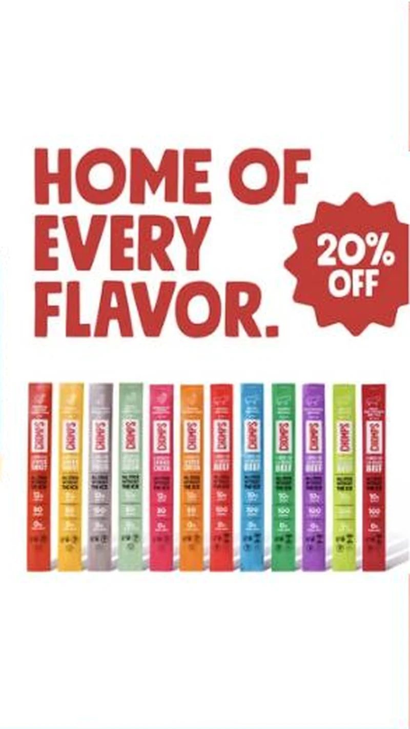 Conversion / PurchaseA brand that lives in checkout lanes uses the one thing a checkout lane cannot stock, the full twelve-flavor range, as the reason to buy online instead.
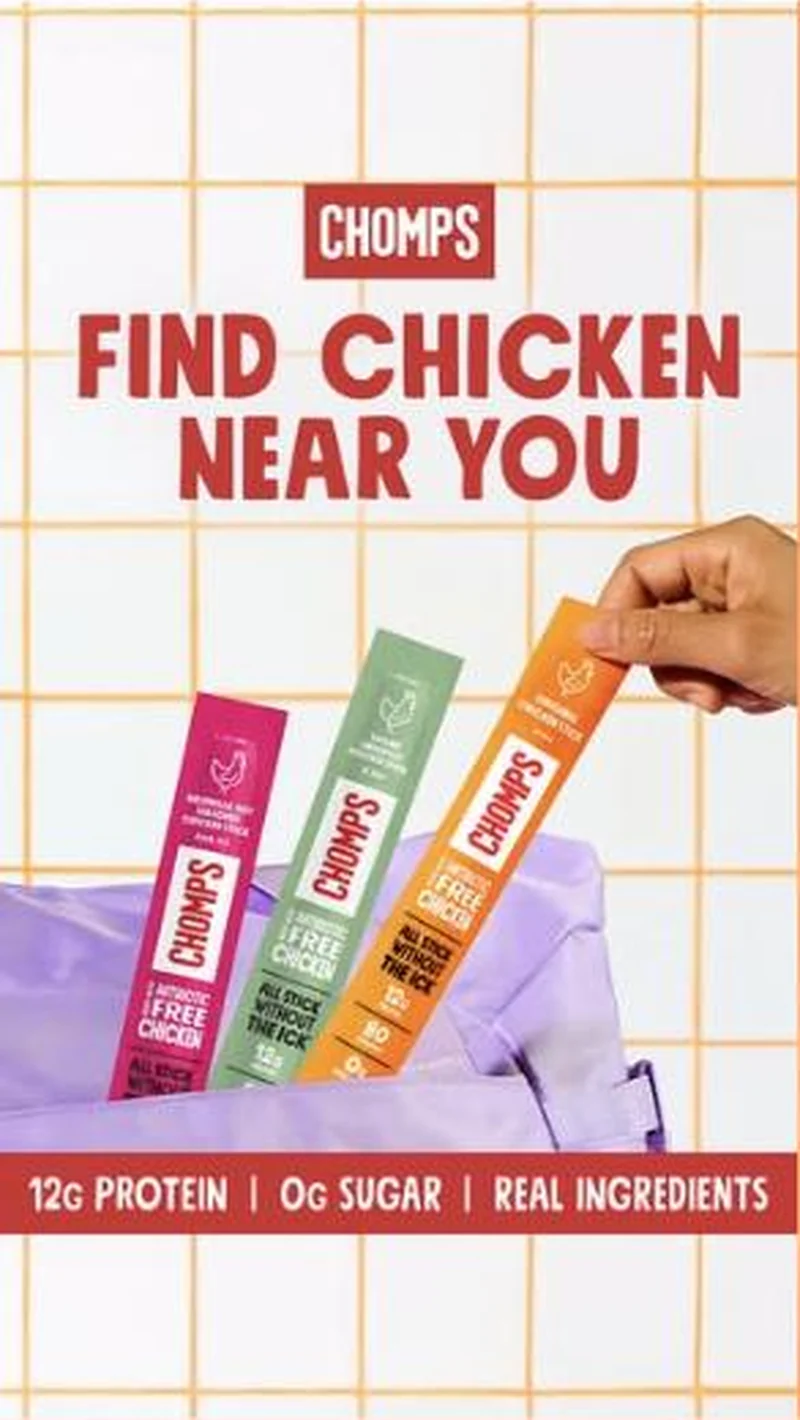 Traffic / ClicksThe one ad in the account that does not want your order, it wants you to walk into Target, and it hands the click and the customer to the retailer.
The same play elsewhere
Same identity appeal, different brands.
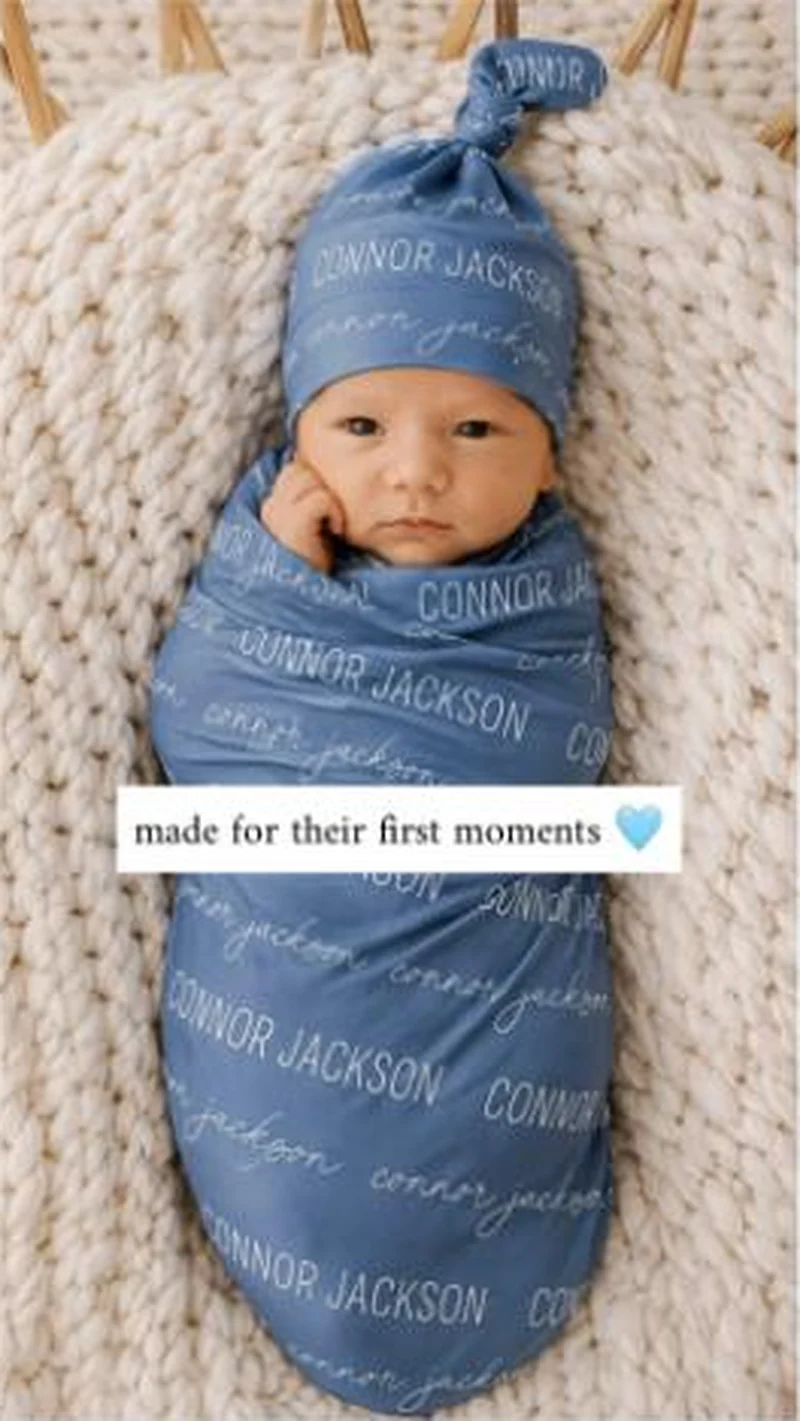 Caden Lane A newborn wrapped in a swaddle printed CONNOR JACKSON, landing on a 211 product best sellers grid that opens on a nightgown and a diaper bag.
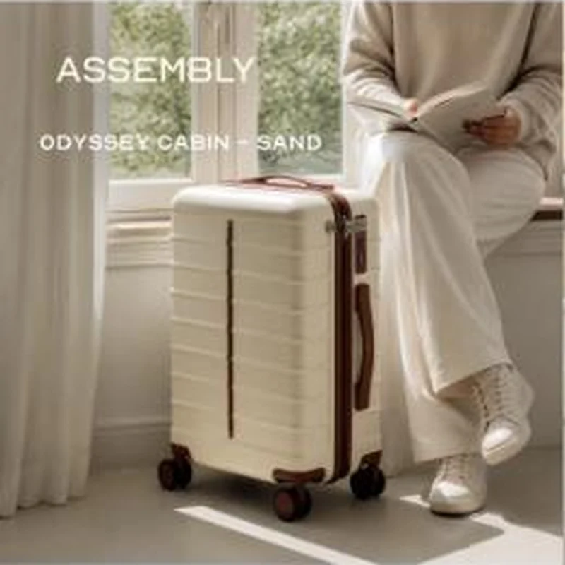 Assembly A named cream colourway sells the calm pre-trip moment, then the collection page opens on the forest green cabin case instead.
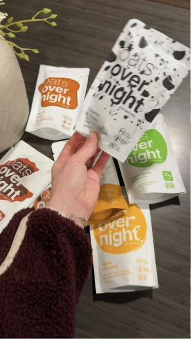 Oats Overnight Establishes the moment with dark kitchens and gym bags instead of announcing who the product is for.
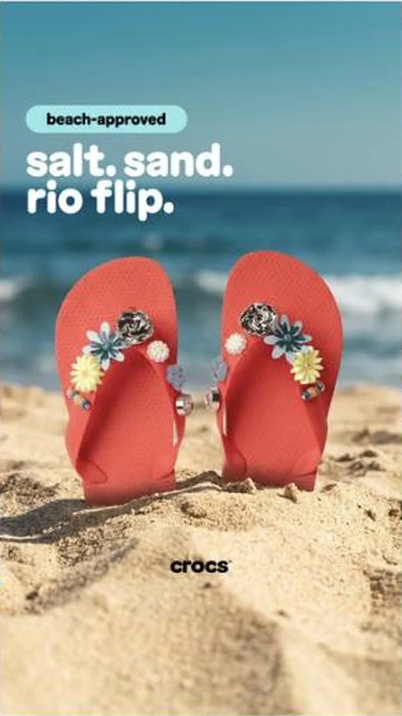 Crocs One poster template, swapped occasion by occasion: a two-word badge, a short lowercase headline, one product on a themed set, and never a price.
Does your own handoff survive the click?
This is the same read I run on live funnels: the ad, the page, and the gap between them. Scored, free, no call required.
Audit my store freeNew teardowns as they land, in Commerce Dispatch: the ad, the page it clicked to, and what the gap cost. Same free newsletter as the footer, no separate list.
Back to The Handoff, the full library of 253 teardowns, 226 of them ad and page pairs, filterable by objective, funnel stage, format, placement, category and persuasion mechanic.
Read next: what breaks, across every rated pair, drawn from every pair in this library.
Chomps is named here solely to identify the advertising being analysed. Brand names and marks are the property of their respective owners. No brand shown has any affiliation with, or has endorsed, Taylor Sicard Consulting.