Assembly · Conversion / Purchase · Cold / prospecting · August 2026 · Handoff: Partial · By Taylor Sicard
Assembly ad teardown: Odyssey cabin - sand
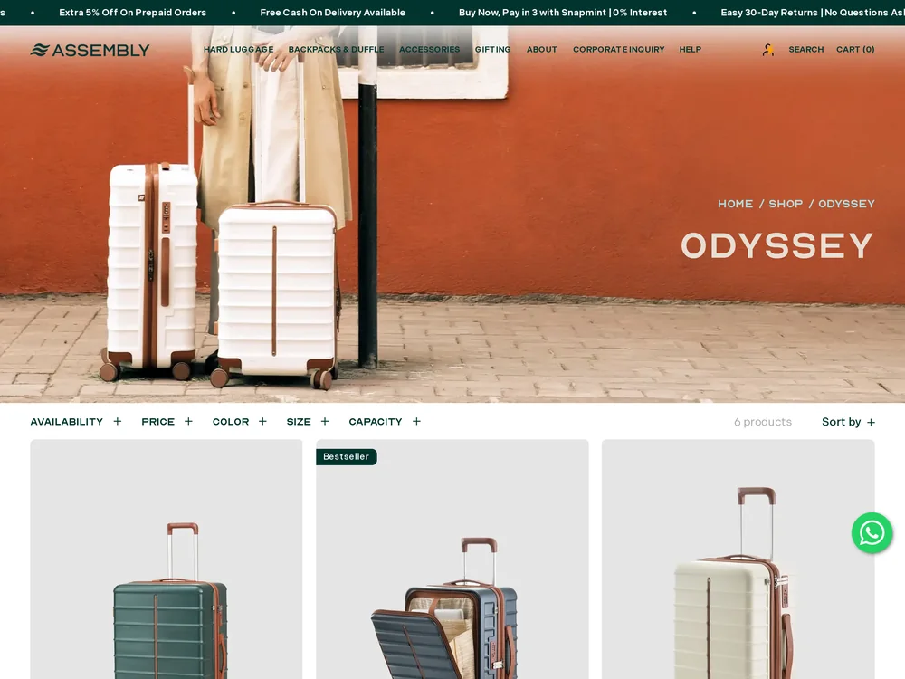
A named cream colourway sells the calm pre-trip moment, then the collection page opens on the forest green cabin case instead.
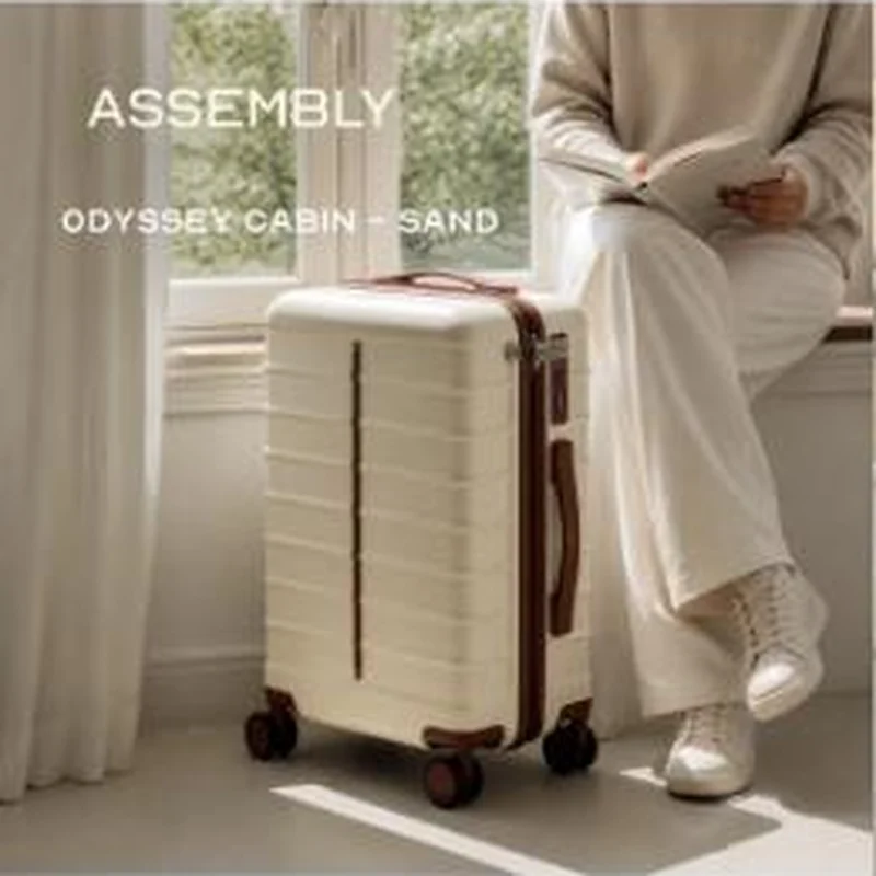
“ODYSSEY CABIN - SAND”
Handoff: Partial
The ad burns ODYSSEY CABIN - SAND into the frame over a cream case with tan leather trim, so the click carries both a size and a colour. The page is the right collection and the cream finish is a swatch on the first card, but that card renders as Odyssey Forest Cabin Hard Luggage in dark green at 4,499 rupees, and the only cream product shot on the page is Odyssey Sand Medium at 5,499. The visitor who came for the sand cabin has to recognise the fifth swatch chip to get back to what they clicked.
The read
This is a colourway launch dressed as a mood piece: window light, a book, wide cream trousers, nothing to do yet. The only selling text is the wordmark and the product line, so the image is doing the entire job of naming the thing. That works because the case is the brightest object in a frame otherwise made of beige, which is a disciplined way to run a lifestyle shot without losing the product.
What the ad does
- The label is the headline. With no claims and no offer anywhere on the creative, ODYSSEY CABIN - SAND is the whole proposition, which sets a very specific expectation: one size and one colour. The case is also the brightest object in a frame otherwise made of beige, which is a disciplined way to run a lifestyle shot without losing the product.
- Colour is the product and the sort order loses it. Sand is the reason this ad exists, and the first card renders as Odyssey Forest Cabin Hard Luggage in dark green at 4,499 rupees. The only cream product shot on the page is Odyssey Sand Medium at 5,499, a different size, so the visitor has to recognise the fifth swatch chip to get back.
Objective fit
Direct response to a purchasable collection with prices and struck-through anchors visible above the fold, so this is buying carts rather than building awareness.
Assembly ran this conversion creative to the landing page it clicked through to, both captured August 2026. A named cream colourway sells the calm pre-trip moment, then the collection page opens on the forest green cabin case instead. Read as a pair, the handoff rates partial.
- The label is the headline. With no claims and no offer anywhere on the creative, ODYSSEY CABIN - SAND is the whole proposition, which sets a very specific expectation: one size and one colour.
- Colour is the product and the sort order loses it. Sand is the reason this ad exists, and the first card renders as Odyssey Forest Cabin Hard Luggage in dark green at 4,499 rupees.
- Where the handoff lands: The ad burns ODYSSEY CABIN - SAND into the frame over a cream case with tan leather trim, so the click carries both a size and a colour.
- What to fix: Point a colourway ad at a colour filtered collection URL, or at the sand cabin product page, rather than a mixed collection that inherits whatever the default sort shows.
Ad captured by Taylor Sicard 2026-08-21, landing page 2026-08-29. Screenshots reproduced for commentary and criticism.
Tagged
- Objective
- Conversion / Purchase
- Funnel
- Cold / prospecting
- Format
- Static image
- Placement
- Meta feed
- Category
- Apparel & Accessories
- Mechanic
- Identity appealMoment anchoringSpecificity
- Handoff
- Partial
- Brand
- Assembly
Identity appeal is #1 of 21 ranked mechanics, on 110 pairs. See where identity appeal ranks
How this was evidenced
- Evidence
- Pair captured The ad and the page it clicked through to were both captured first-hand, and the destination recorded is the page the ad pointed at.
- Ad creative
- Captured August 2026
- Destination
- https://assemblytravel.com/collections/odyssey Captured August 2026. Advertisers change their ads and pages continuously, so the live page may differ from the capture above. That is expected, and the capture is the record.
- Ad Library
- No permalink. This creative was observed running in-feed; Meta does not issue a stable public URL for a non-political ad, and purges it from the library once it stops running. The capture above is the record.
What to fix
Point a colourway ad at a colour filtered collection URL, or at the sand cabin product page, rather than a mixed collection that inherits whatever the default sort shows. As it stands the creative names both a size and a colour and the first card delivers neither, so the recognition the frame paid for is spent hunting a swatch chip.
One of 14 pairs where the right page opens on the wrong version. See the pattern · See all 14
Sources
The same play elsewhere
Same identity appeal, different brands.
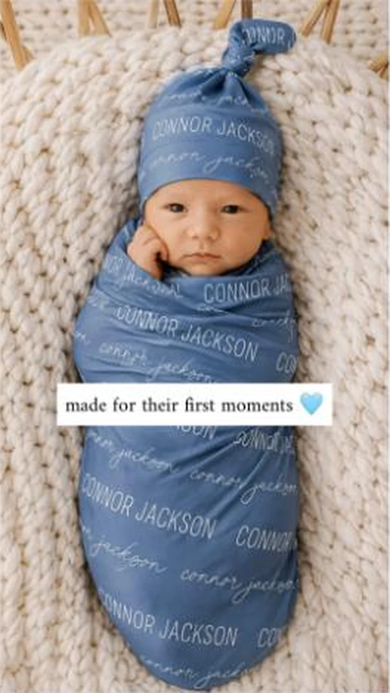 Caden Lane A newborn wrapped in a swaddle printed CONNOR JACKSON, landing on a 211 product best sellers grid that opens on a nightgown and a diaper bag.
 Chomps One blue template, one offer, one landing page, and nineteen live creatives that differ mainly in the headline and the picture in the middle.
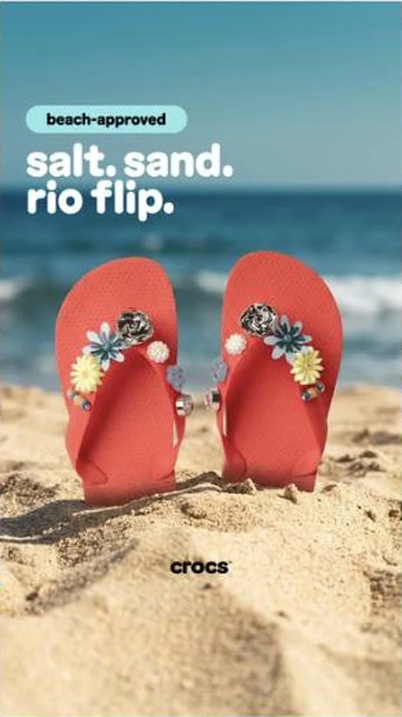 Crocs One poster template, swapped occasion by occasion: a two-word badge, a short lowercase headline, one product on a themed set, and never a price.
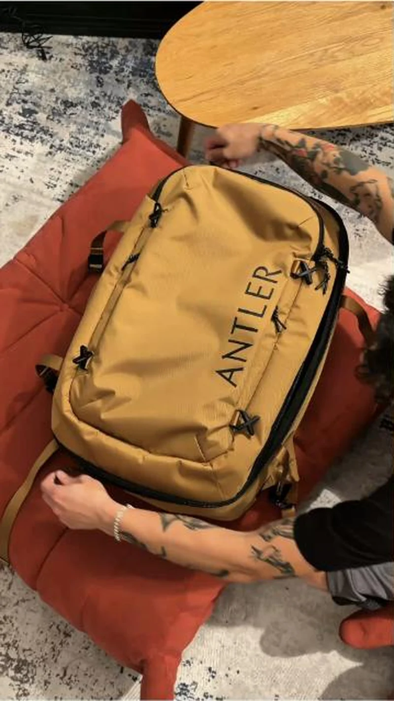 Antler A tan Discovery backpack packed at home; the collection opens behind two overlays and leads with black and green, tan two rows down.
Does your own handoff survive the click?
This is the same read I run on live funnels: the ad, the page, and the gap between them. Scored, free, no call required.
Audit my store freeNew teardowns as they land, in Commerce Dispatch: the ad, the page it clicked to, and what the gap cost. Same free newsletter as the footer, no separate list.
Back to The Handoff, the full library of 253 teardowns, 226 of them ad and page pairs, filterable by objective, funnel stage, format, placement, category and persuasion mechanic.
Read next: what breaks, across every rated pair, drawn from every pair in this library.
Assembly is named here solely to identify the advertising being analysed. Brand names and marks are the property of their respective owners. No brand shown has any affiliation with, or has endorsed, Taylor Sicard Consulting.