Antler · Conversion / Purchase · Cold / prospecting · August 2026 · Handoff: Partial · By Taylor Sicard
Antler ad teardown: moment anchoring into purchase
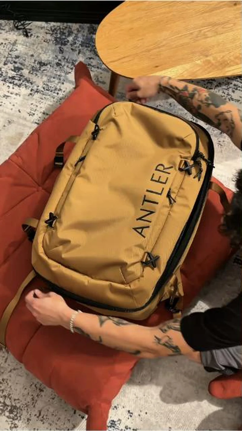
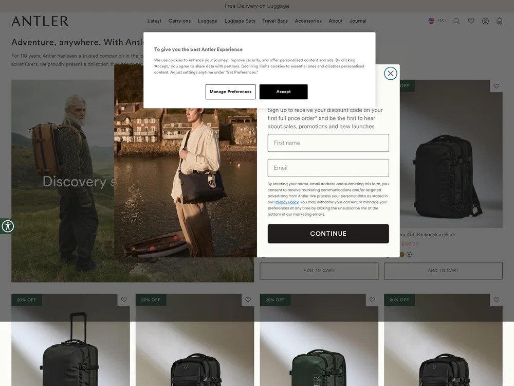
A tan Discovery backpack packed at home; the collection opens behind two overlays and leads with black and green, tan two rows down.
Handoff: Partial
The ad is a top down shot of a mustard tan Antler backpack being packed on a red floor cushion, wordmark running clearly across the panel. The page is the right collection, Discovery, and the same bag is in it, but the first four tiles are the Discovery Wheeled Duffel in Black, the 28L Backpack in Black, the 45L in Dark Forest Green and the 28L in Antler Green, with tan reduced to a swatch dot. Discovery 45L Backpack in Mustard Yellow does appear, two rows further down. Before any of that, a cookie notice and an email capture asking for a first name sit over the hero, and every tile carries a 20 percent off badge the ad never mentioned.
The read
Filmed from above with the bag flat and both hands in frame, so the shot is about capacity rather than styling. There is no overlay text and no offer, just the pack, the zips and the compression straps read at close range. The setting, a cushion on a rug under a table, places it at the packing stage of a trip rather than the trip itself.
What the ad does
- Colour is the only differentiator in the frame. A mustard tan bag in a category of black nylon is what stops the scroll, and with no overlay text and no offer, brand recognition rests entirely on the wordmark running across the panel. The top down shot with both hands in frame is about capacity rather than styling.
- The grid buries the colour that did the work. The first four tiles are the Discovery Wheeled Duffel in Black, the 28L Backpack in Black, the 45L in Dark Forest Green and the 28L in Antler Green, with tan reduced to a swatch dot. Discovery 45L Backpack in Mustard Yellow appears two rows further down.
Objective fit
A collection level click rather than a product one, so the ad is buying category consideration and letting the grid choose the bag.
Antler ran this conversion creative to the landing page it clicked through to, both captured August 2026. A tan Discovery backpack packed at home; the collection opens behind two overlays and leads with black and green, tan two rows down. Read as a pair, the handoff rates partial.
- Colour is the only differentiator in the frame. A mustard tan bag in a category of black nylon is what stops the scroll, and with no overlay text and no offer, brand recognition rests entirely on the wordmark running across the panel.
- The grid buries the colour that did the work. The first four tiles are the Discovery Wheeled Duffel in Black, the 28L Backpack in Black, the 45L in Dark Forest Green and the 28L in Antler Green, with tan reduced to a swatch dot.
- Where the handoff lands: The ad is a top down shot of a mustard tan Antler backpack being packed on a red floor cushion, wordmark running clearly across the panel.
- What to fix: If tan is the creative, open the landing view on tan rather than two rows below black, which a colour filtered collection URL will do.
Ad captured by Taylor Sicard 2026-08-21, landing page 2026-08-29. Screenshots reproduced for commentary and criticism.
Tagged
- Objective
- Conversion / Purchase
- Funnel
- Cold / prospecting
- Format
- Creator-ledDemo / product-in-use
- Placement
- Meta reelsInstagram stories
- Category
- Apparel & Accessories
- Mechanic
- Moment anchoringIdentity appeal
- Handoff
- Partial
- Brand
- Antler
Identity appeal is #1 of 21 ranked mechanics, on 110 pairs. See where identity appeal ranks
How this was evidenced
- Evidence
- Pair captured The ad and the page it clicked through to were both captured first-hand, and the destination recorded is the page the ad pointed at.
- Ad creative
- Captured August 2026
- Destination
- https://www.antler.com/collections/discovery-collection Captured August 2026. Advertisers change their ads and pages continuously, so the live page may differ from the capture above. That is expected, and the capture is the record.
- Ad Library
- No permalink. This creative was observed running in-feed; Meta does not issue a stable public URL for a non-political ad, and purges it from the library once it stops running. The capture above is the record.
What to fix
If tan is the creative, open the landing view on tan rather than two rows below black, which a colour filtered collection URL will do. Then clear the cookie notice and the first name email capture off the hero, because on arrival both sit over it and every tile carries a 20 percent off badge the ad never mentioned.
One of 38 pairs where the ad sold one thing, the page shows the whole shop. See the pattern · See all 38
Sources
The same play elsewhere
Same identity appeal, different brands.
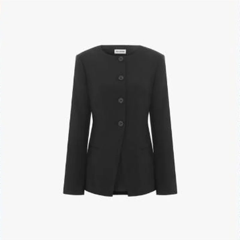 ALIGNE A bare packshot of a black button-front blazer, no text on the frame, opens the exact product: Daphne Waisted Blazer in black at $265.
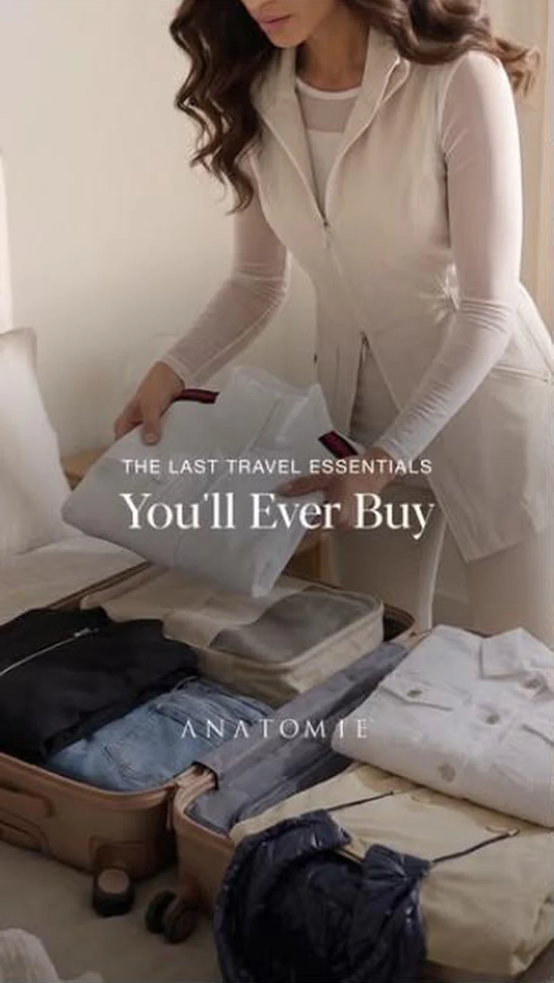 Anatomie A packing scene promises travel clothes you buy once, and the Essentials grid backs it with wrinkle-resistant copy and buy-once prices.
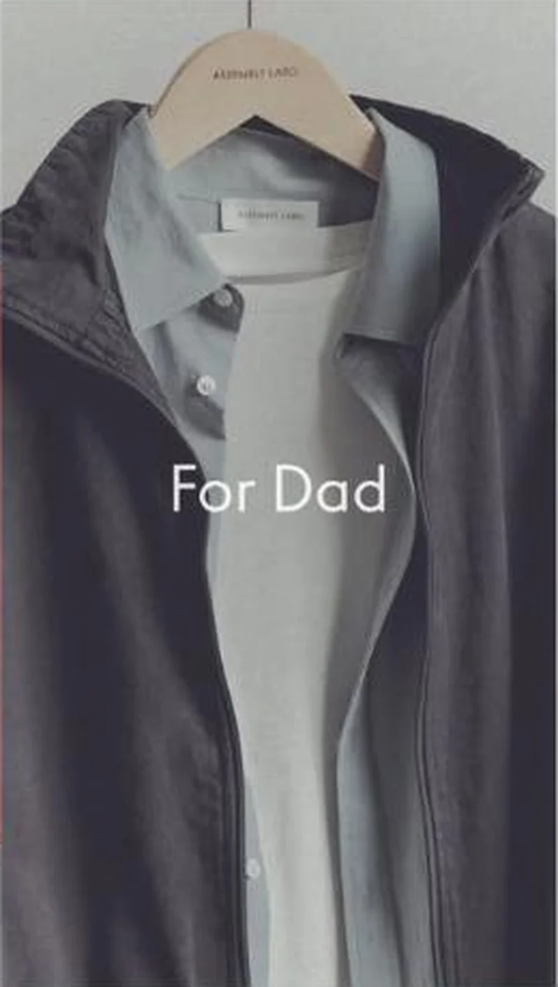 Assembly Label A For Dad hanger shot hands off to the Father's Day Gift Edit itself, though the click resolves on the international store in USD.
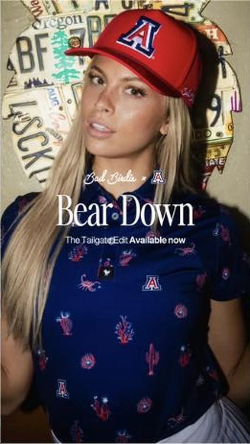 Bad Birdie An Arizona polo and cap sell the tailgate; the collection loads behind a mystery discount modal and a cookie bar, hero unread.
Does your own handoff survive the click?
This is the same read I run on live funnels: the ad, the page, and the gap between them. Scored, free, no call required.
Audit my store freeNew teardowns as they land, in Commerce Dispatch: the ad, the page it clicked to, and what the gap cost. Same free newsletter as the footer, no separate list.
Back to The Handoff, the full library of 253 teardowns, 226 of them ad and page pairs, filterable by objective, funnel stage, format, placement, category and persuasion mechanic.
Read next: what breaks, across every rated pair, drawn from every pair in this library.
Antler is named here solely to identify the advertising being analysed. Brand names and marks are the property of their respective owners. No brand shown has any affiliation with, or has endorsed, Taylor Sicard Consulting.