Cadence · Conversion / Purchase · Cold / prospecting · August 2026 · Handoff: Partial · By Taylor Sicard
Cadence ad teardown: mechanism reveal into purchase
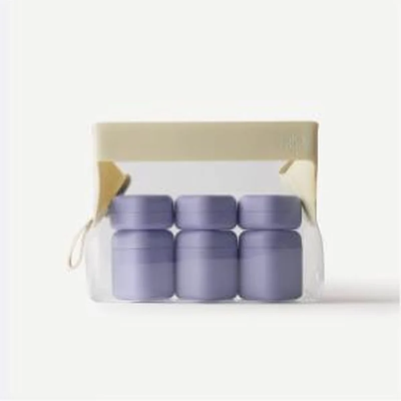
A lavender six capsule set shot on white lands on the Discovery Set page, where the preset colour is pink and the price is $182.
Handoff: Partial
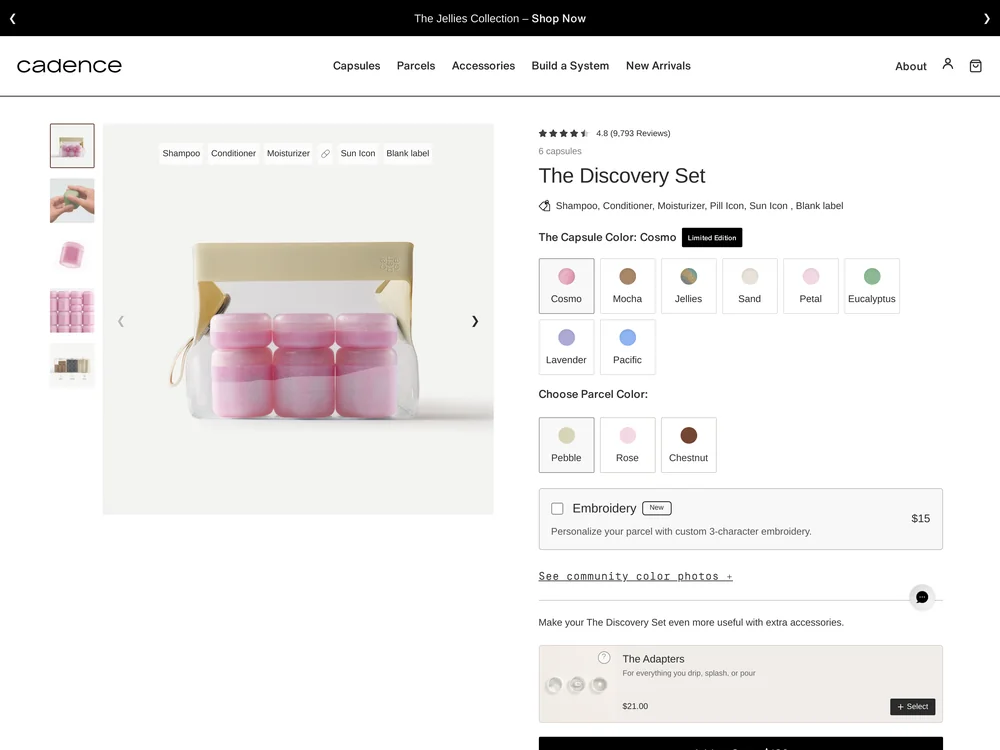
The product resolves cleanly: six lavender capsules in a clear parcel with a cream lid and a wrist loop in the ad, and a page titled The Discovery Set that reads 6 capsules and lists three small and three medium capsules plus one medium parcel. What does not carry is the colour. The page opens with The Capsule Color set to Cosmo and a hero image of pink capsules in the same parcel, with Lavender sitting seventh in a grid of eight swatches. The $182 total and the Pebble parcel default are both new information at this point, so the visitor arrives to reselect rather than to confirm.
The read
A square packshot on a pale grey studio backdrop, lit flat with almost no shadow. Six matte lavender capsules sit in two rows of three inside a clear pouch with a cream top band and a small cream wrist loop hanging off the left side. There is no model, no hand, no room and no text of any kind in the frame, so the whole ad is the object and the arrangement.
What the ad does
- The grid explains the system in one glance. Six matte lavender capsules in two rows of three inside a clear pouch with a cream top band and a small cream wrist loop. Modular parts, one carrier, everything visible. The page needs a whole line to say the same thing: 6 capsules, three small and three medium plus one medium parcel.
- Clear plastic is the proof. You can see what is inside the bag without opening it, which is the exact anxiety this category creates. With no model, no hand, no room and no text in frame, the material choice in the shot is the only thing making the organisation argument.
- A silent creative hands the page three new decisions. With nothing burned in, the destination has to introduce colour, parcel and price at once. The Capsule Color opens on Cosmo over a hero of pink capsules, Lavender sits seventh in a grid of eight swatches, the parcel defaults to Pebble and the total reads $182.
Objective fit
This is a purchase unit pointed at the correct product detail page, which is right for a set at this price. The gap is that a silent creative hands the page nothing to echo, so the page has to introduce colour, parcel and price all at once.
Cadence ran this conversion creative to the landing page it clicked through to, both captured August 2026. A lavender six capsule set shot on white lands on the Discovery Set page, where the preset colour is pink and the price is $182. Read as a pair, the handoff rates partial.
- The grid explains the system in one glance. Six matte lavender capsules in two rows of three inside a clear pouch with a cream top band and a small cream wrist loop. Modular parts, one carrier, everything visible.
- Clear plastic is the proof. You can see what is inside the bag without opening it, which is the exact anxiety this category creates.
- A silent creative hands the page three new decisions. With nothing burned in, the destination has to introduce colour, parcel and price at once.
- What to fix: Land on the advertised colourway. A URL variant that preselects Lavender and Pebble turns the page into a continuation rather than a configurator, and it costs one parameter.
Ad captured by Taylor Sicard 2026-08-21, landing page 2026-08-29. Screenshots reproduced for commentary and criticism.
Tagged
- Objective
- Conversion / Purchase
- Funnel
- Cold / prospecting
- Format
- Static imageDemo / product-in-use
- Placement
- Meta feedInstagram stories
- Category
- Home & Household
- Mechanic
- Mechanism revealSpecificity
- Handoff
- Partial
- Brand
- Cadence
Specificity is #2 of 21 ranked mechanics, on 83 pairs. See where specificity ranks
How this was evidenced
- Evidence
- Pair captured The ad and the page it clicked through to were both captured first-hand, and the destination recorded is the page the ad pointed at.
- Ad creative
- Captured August 2026
- Destination
- https://keepyourcadence.com/products/the-discovery-set Captured August 2026. Advertisers change their ads and pages continuously, so the live page may differ from the capture above. That is expected, and the capture is the record.
- Ad Library
- No permalink. This creative was observed running in-feed; Meta does not issue a stable public URL for a non-political ad, and purges it from the library once it stops running. The capture above is the record.
What to fix
Land on the advertised colourway. A URL variant that preselects Lavender and Pebble turns the page into a continuation rather than a configurator, and it costs one parameter. As it stands a lavender ad opens on Cosmo with a pink hero, Lavender is seventh of eight swatches, and $182 is new information arriving in the same moment, so the visitor's first act is to reselect instead of confirm.
One of 14 pairs where the right page opens on the wrong version. See the pattern · See all 14
Sources
The same play elsewhere
Same mechanism reveal, different brands.
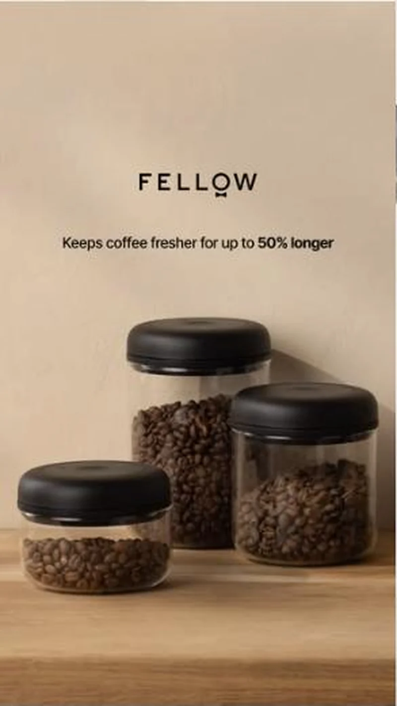 Fellow The ad promises fresher for up to 50% longer; the page highlight says Fresh 2x Longer, under a 10% off modal covering the Add to Cart.
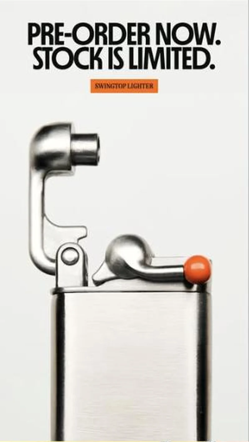 Craighill A hard pre order scarcity ad for one lighter lands on the right page, then a full screen mystery offer quiz covers the price and the button.
 Loop Earplugs Same script, two genuinely different visual treatments, so the algorithm reads them as separate variations.
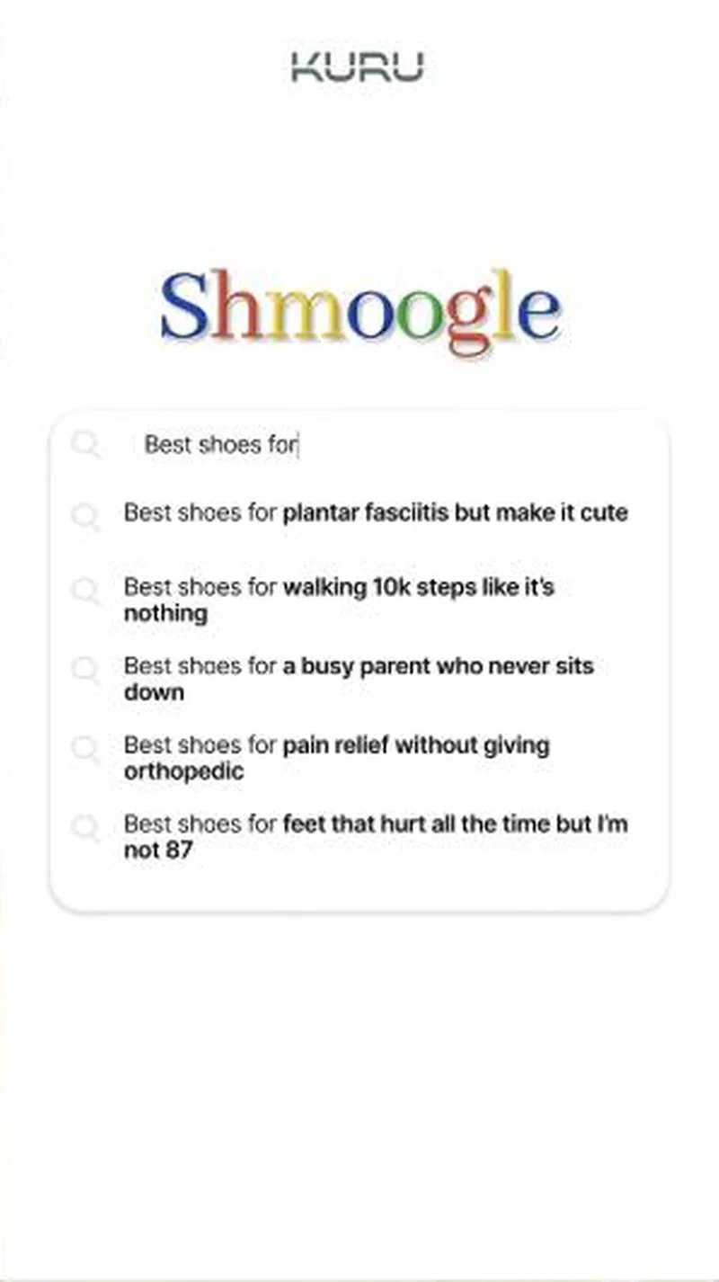 Kuru Sells plantar fasciitis relief, and only afterwards mentions that the relief is a shoe.
Does your own handoff survive the click?
This is the same read I run on live funnels: the ad, the page, and the gap between them. Scored, free, no call required.
Audit my store freeNew teardowns as they land, in Commerce Dispatch: the ad, the page it clicked to, and what the gap cost. Same free newsletter as the footer, no separate list.
Back to The Handoff, the full library of 253 teardowns, 226 of them ad and page pairs, filterable by objective, funnel stage, format, placement, category and persuasion mechanic.
Read next: what breaks, across every rated pair, drawn from every pair in this library.
Cadence is named here solely to identify the advertising being analysed. Brand names and marks are the property of their respective owners. No brand shown has any affiliation with, or has endorsed, Taylor Sicard Consulting.