BRUNT Workwear · Conversion / Purchase · Cold / prospecting · August 2026 · Handoff: Continuous · By Taylor Sicard
BRUNT Workwear ad teardown: Limited edition light grey marin
A limited edition boot ad hands off to the exact Light Grey Marin page, where the scarcity line is repeated on the cart button.
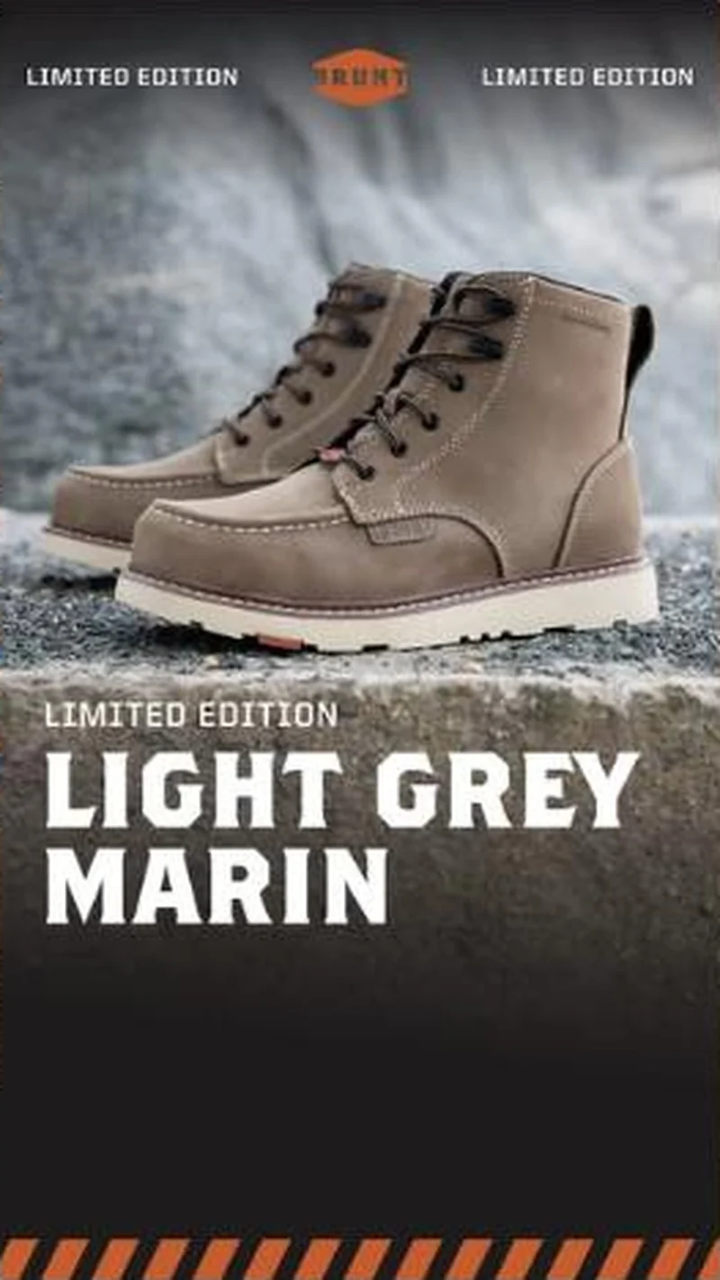
“LIMITED EDITION LIGHT GREY MARIN”
Handoff: Continuous
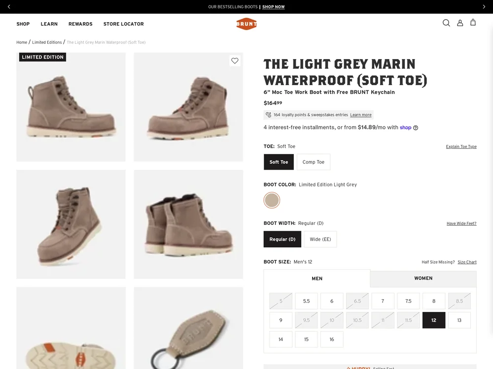
One boot, one name, one page. The ad's pair of light grey moc toe boots with the cream wedge sole and the orange heel flash is the pair in every tile of the product gallery, and the page title reads THE LIGHT GREY MARIN WATERPROOF (SOFT TOE) with the breadcrumb Home / Limited Editions / The Light Grey Marin. The LIMITED EDITION line the ad repeats three times comes back as a badge on the first gallery tile, as HURRY! Selling Fast above the button, and inside the button itself, which reads GET IT BEFORE IT'S GONE - $164.99. The boot colour is preselected as Limited Edition Light Grey, so nobody has to find it.
The read
A vertical frame with a pair of light grey suede moc toe work boots standing on a concrete ledge, wet stone and cold water blurred behind them, cream wedge soles and a small orange tab at the heel catching the light. Across the top, LIMITED EDITION runs left and right of the orange BRUNT hex mark. Below the ledge the frame goes black and carries LIMITED EDITION in small caps over LIGHT GREY MARIN in tall condensed capitals, with an orange and black hazard stripe closing the bottom edge.
What the ad does
- The colourway is the whole offer. The Marin already exists, so the ad only has to sell grey, and LIGHT GREY MARIN runs in tall condensed capitals with LIMITED EDITION above it. The page preselects Limited Edition Light Grey under the title THE LIGHT GREY MARIN WATERPROOF (SOFT TOE), so the next tap after the click is a size rather than a search, against a button carrying the $164.99.
- Wet concrete is the waterproof claim. The boots stand on a concrete ledge with wet stone and cold water blurred behind them, which demonstrates the feature the page later spells out in its own title. The orange and black hazard stripe and the BRUNT hex mark screen the audience in the same frame, because nobody outside the trades reads that language as neutral.
Objective fit
A purchase unit for one colourway pointed at that colourway's page with the variant preselected and the size grid at the fold. The next tap after the click is a size, not a search.
BRUNT Workwear ran this conversion creative to the landing page it clicked through to, both captured August 2026. A limited edition boot ad hands off to the exact Light Grey Marin page, where the scarcity line is repeated on the cart button. Read as a pair, the handoff rates continuous.
- The colourway is the whole offer. The Marin already exists, so the ad only has to sell grey, and LIGHT GREY MARIN runs in tall condensed capitals with LIMITED EDITION above it.
- Wet concrete is the waterproof claim. The boots stand on a concrete ledge with wet stone and cold water blurred behind them, which demonstrates the feature the page later spells out in its own title.
- Where the handoff lands: One boot, one name, one page.
- What to fix: Let the greyed out sizes carry the scarcity and drop one of the three urgency lines. LIMITED EDITION already appears as a badge on the first gallery tile, as HURRY!
Ad captured by Taylor Sicard 2026-08-21, landing page 2026-08-29. Screenshots reproduced for commentary and criticism.
Tagged
- Objective
- Conversion / Purchase
- Funnel
- Cold / prospecting
- Format
- Static image
- Placement
- Meta feedInstagram storiesMeta reels
- Category
- Footwear
- Mechanic
- Scarcity / urgencyIdentity appealSpecificity
- Handoff
- Continuous
- Brand
- BRUNT Workwear
Identity appeal is #1 of 21 ranked mechanics, on 110 pairs. See where identity appeal ranks
How this was evidenced
- Evidence
- Pair captured The ad and the page it clicked through to were both captured first-hand, and the destination recorded is the page the ad pointed at.
- Ad creative
- Captured August 2026
- Destination
- https://bruntworkwear.com/products/the-light-grey-marin-waterproof-soft-toe Captured August 2026. Advertisers change their ads and pages continuously, so the live page may differ from the capture above. That is expected, and the capture is the record.
- Ad Library
- No permalink. This creative was observed running in-feed; Meta does not issue a stable public URL for a non-political ad, and purges it from the library once it stops running. The capture above is the record.
What to fix
Let the greyed out sizes carry the scarcity and drop one of the three urgency lines. LIMITED EDITION already appears as a badge on the first gallery tile, as HURRY! Selling Fast above the button, and inside the button itself, which reads GET IT BEFORE IT'S GONE - $164.99. The stock state in the size grid proves the same thing honestly, so asserting it three times reads as pressure rather than as fact.
Across every brand: the 6 ways a handoff breaks · persuasion mechanics, ranked by how often the page keeps the promise.
Sources
The same play elsewhere
Same identity appeal, different brands.
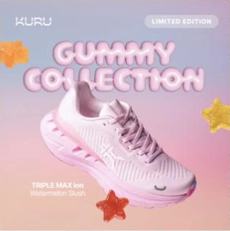 Kuru The ad names Triple Max Ion in Watermelon Slush, and the collection page shows that exact shoe marked sold out at $189.
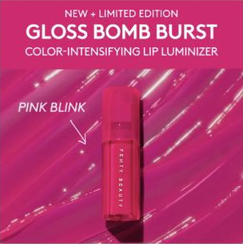 Fenty Beauty Fourteen of sixteen live statics route to a product page, and the Gloss Bomb Burst pair proves the routing is set at shade level, not product level.
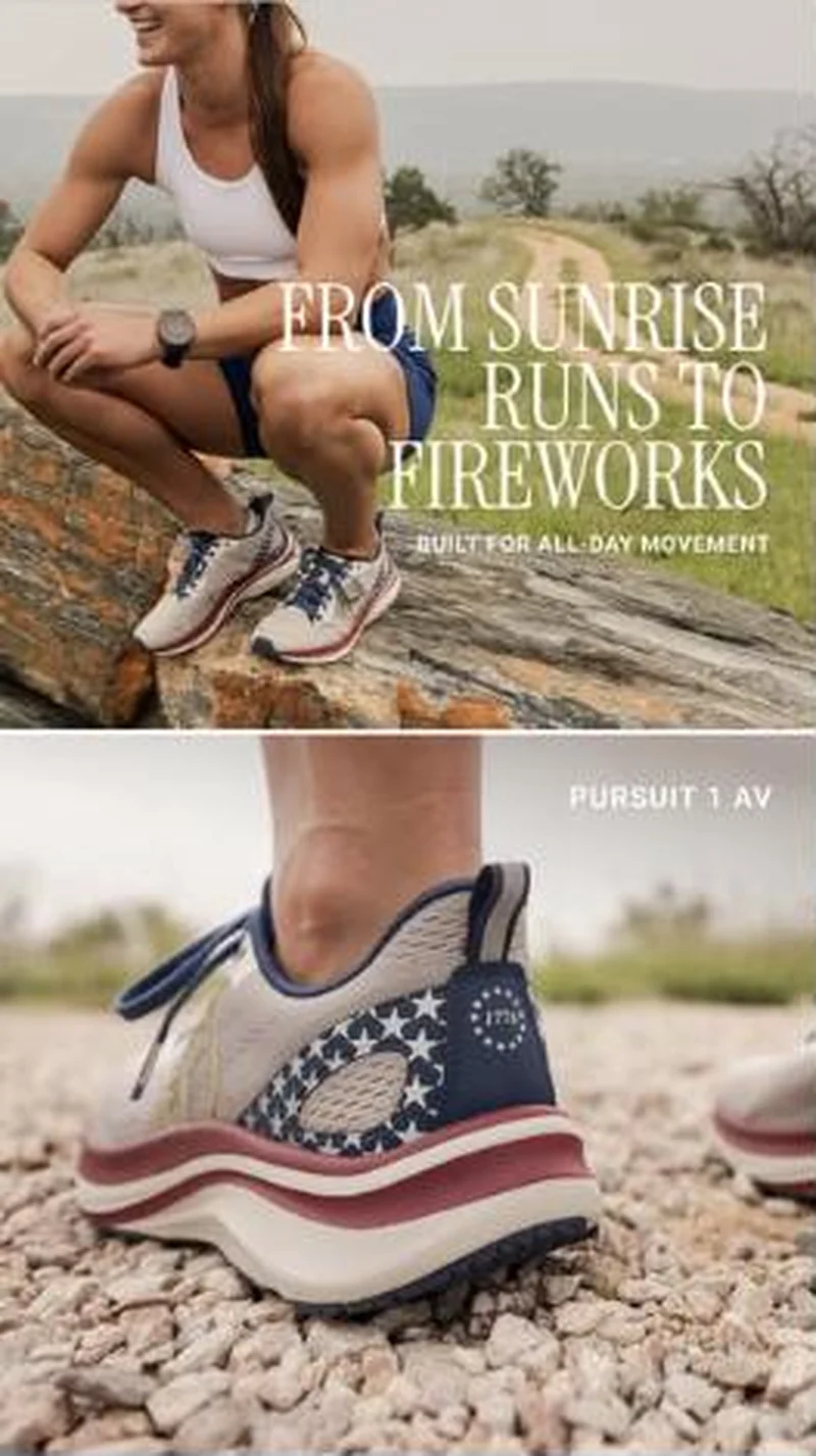 Born Primitive An Independence Day colorway ad lands on exactly the right shoe, under a red Labor Day bar that has already cut it 25 percent.
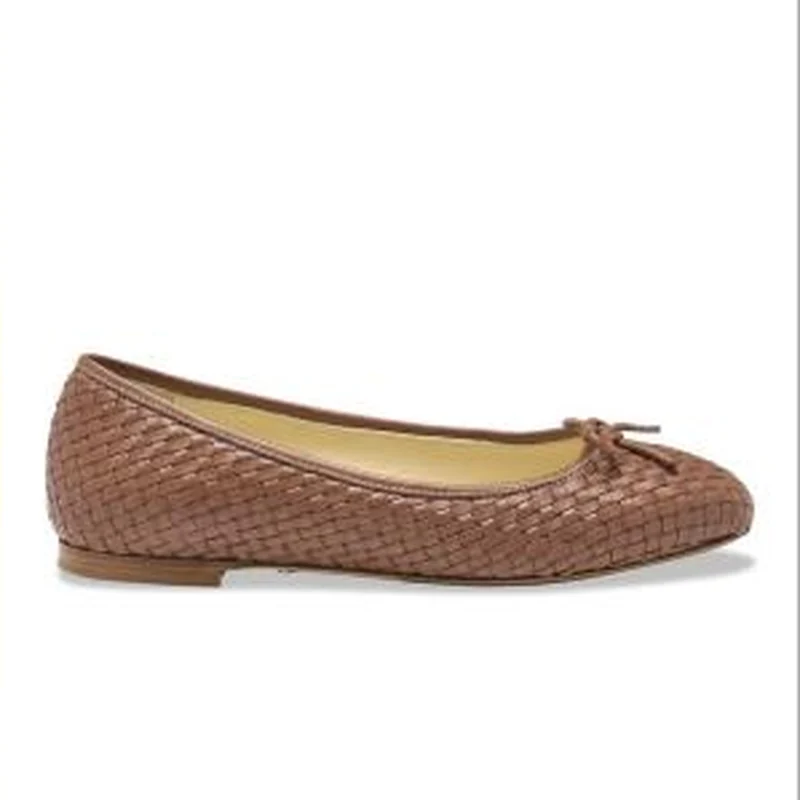 Sarah Flint A wordless product shot lands on its own page, where a 20 percent welcome offer greets a shoe that is excluded from discounts.
Does your own handoff survive the click?
This is the same read I run on live funnels: the ad, the page, and the gap between them. Scored, free, no call required.
Audit my store freeNew teardowns as they land, in Commerce Dispatch: the ad, the page it clicked to, and what the gap cost. Same free newsletter as the footer, no separate list.
Back to The Handoff, the full library of 253 teardowns, 226 of them ad and page pairs, filterable by objective, funnel stage, format, placement, category and persuasion mechanic.
Read next: how DTC promotions survive the click, drawn from every pair in this library.
BRUNT Workwear is named here solely to identify the advertising being analysed. Brand names and marks are the property of their respective owners. No brand shown has any affiliation with, or has endorsed, Taylor Sicard Consulting.