Branch · Conversion / Purchase · Cold / prospecting · August 2026 · Handoff: Break · By Taylor Sicard
Branch ad teardown: identity appeal into purchase
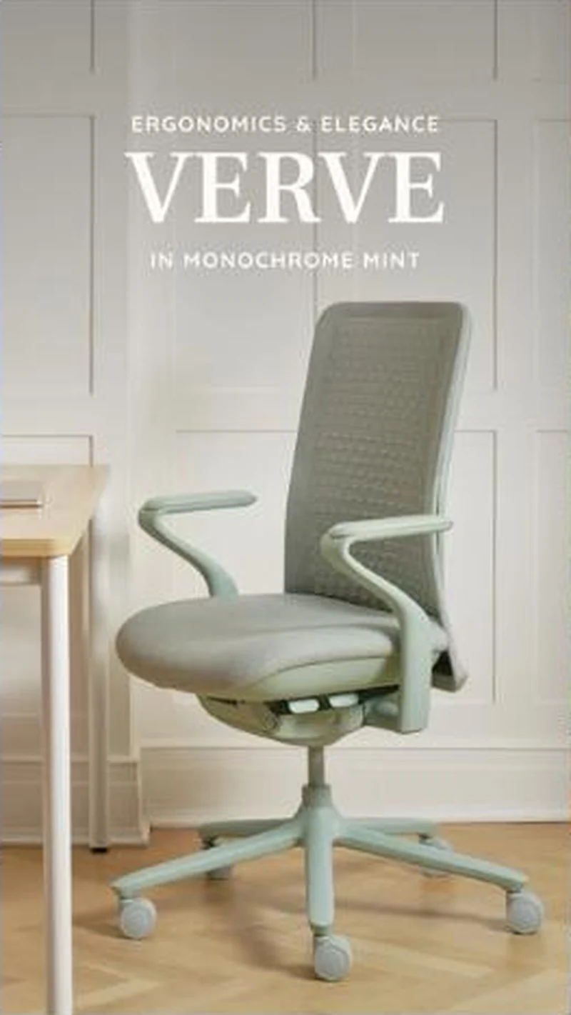
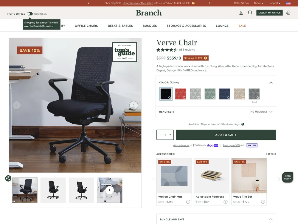
The ad names the colourway in its own headline, then the Verve page opens on Galaxy black in the hero and in all four thumbnails.
“ERGONOMICS & ELEGANCE VERVE IN MONOCHROME MINT”
Handoff: Break
The ad burns the colourway into the frame, IN MONOCHROME MINT under the word VERVE, and the chair in the shot is pale mint from armrests to castors against a white panelled wall. The page it opens is the Verve Chair, correct product and correct name, but the COLOR field reads Galaxy, the hero photo is a black chair on dark wood, and all four gallery thumbnails are the same black chair. Mint is available, it is the fourth of seven unlabelled swatches, so the one attribute the ad spent its headline on is the one thing the visitor has to go find. Price, $599 struck to $539.10 with a Save 10% flag, is also first seen here.
The read
A vertical room shot in soft daylight: a pale mint task chair with a knit mesh back angled toward a light wood desk edge, on blonde floorboards against a white panelled wall. The type sits above the chair in the empty upper third, a small caps line reading ERGONOMICS & ELEGANCE, then VERVE in tall white serif capitals, then IN MONOCHROME MINT in spaced small caps. Nothing else is in the frame, no person, no price, no logo lockup.
What the ad does
- The room does the qualifying. A white panelled wall, blonde floorboards, soft daylight and not a cable in frame. This is not an office, it is the corner of a house that someone works from, and the setting sorts the audience before any of the three lines of type are read.
- The colour is the news. Ergonomic chairs are a black category, so VERVE in tall white serif capitals over IN MONOCHROME MINT treats a task chair as furniture rather than as equipment. The pale mint is the only idea in the frame, which is what makes the destination a problem rather than a detail.
- The page opens on the colour the ad ruled out. The COLOR field reads Galaxy, the hero is a black chair on dark wood and all four gallery thumbnails are the same black chair. Mint is the fourth of seven unlabelled swatches, and $599 struck to $539.10 with a Save 10% flag is first seen here too.
Objective fit
A single product page is the right destination for a considered purchase at this price, and the page is well equipped for it: press logos, a specification table, a bundle offer and 888 reviews. The objective is undermined only by the variant state the visitor lands in.
Branch ran this conversion creative to the landing page it clicked through to, both captured August 2026. The ad names the colourway in its own headline, then the Verve page opens on Galaxy black in the hero and in all four thumbnails. Read as a pair, the handoff rates break.
- The room does the qualifying. A white panelled wall, blonde floorboards, soft daylight and not a cable in frame.
- The colour is the news. Ergonomic chairs are a black category, so VERVE in tall white serif capitals over IN MONOCHROME MINT treats a task chair as furniture rather than as equipment.
- The page opens on the colour the ad ruled out. The COLOR field reads Galaxy, the hero is a black chair on dark wood and all four gallery thumbnails are the same black chair.
- Where the handoff lands: The ad burns the colourway into the frame, IN MONOCHROME MINT under the word VERVE, and the chair in the shot is pale mint from armrests to castors against a white panelled wall.
- What to fix: Point the ad at the mint variant URL so the hero matches the headline, or stop naming the colour and let the chair carry it.
Ad captured by Taylor Sicard 2026-08-21, landing page 2026-08-29. Screenshots reproduced for commentary and criticism.
Tagged
- Objective
- Conversion / Purchase
- Funnel
- Cold / prospecting
- Format
- Static imageDemo / product-in-use
- Placement
- Meta reelsInstagram storiesMeta feed
- Category
- Home & Household
- Mechanic
- Identity appealSpecificity
- Handoff
- Break
- Brand
- Branch
Identity appeal is #1 of 21 ranked mechanics, on 110 pairs. See where identity appeal ranks
How this was evidenced
- Evidence
- Pair captured The ad and the page it clicked through to were both captured first-hand, and the destination recorded is the page the ad pointed at.
- Ad creative
- Captured August 2026
- Destination
- https://www.branchfurniture.com/products/verve-chair Captured August 2026. Advertisers change their ads and pages continuously, so the live page may differ from the capture above. That is expected, and the capture is the record.
- Ad Library
- No permalink. This creative was observed running in-feed; Meta does not issue a stable public URL for a non-political ad, and purges it from the library once it stops running. The capture above is the record.
What to fix
Point the ad at the mint variant URL so the hero matches the headline, or stop naming the colour and let the chair carry it. IN MONOCHROME MINT currently opens a page whose COLOR field reads Galaxy and whose four thumbnails are all the black chair, so the visitor's first job is to find the fourth of seven unlabelled swatches. Label the swatches while you are there.
One of 14 pairs where the right page opens on the wrong version. See the pattern · See all 14
Sources
The same play elsewhere
Same identity appeal, different brands.
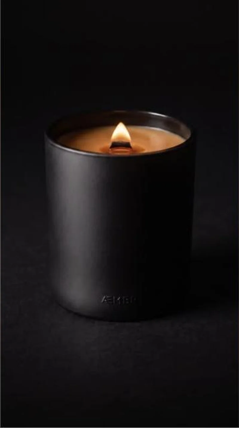 Aembr A near black packshot of one lit candle routes to the right product, then meets an orange food styled hero and a pre ticked $19 add on.
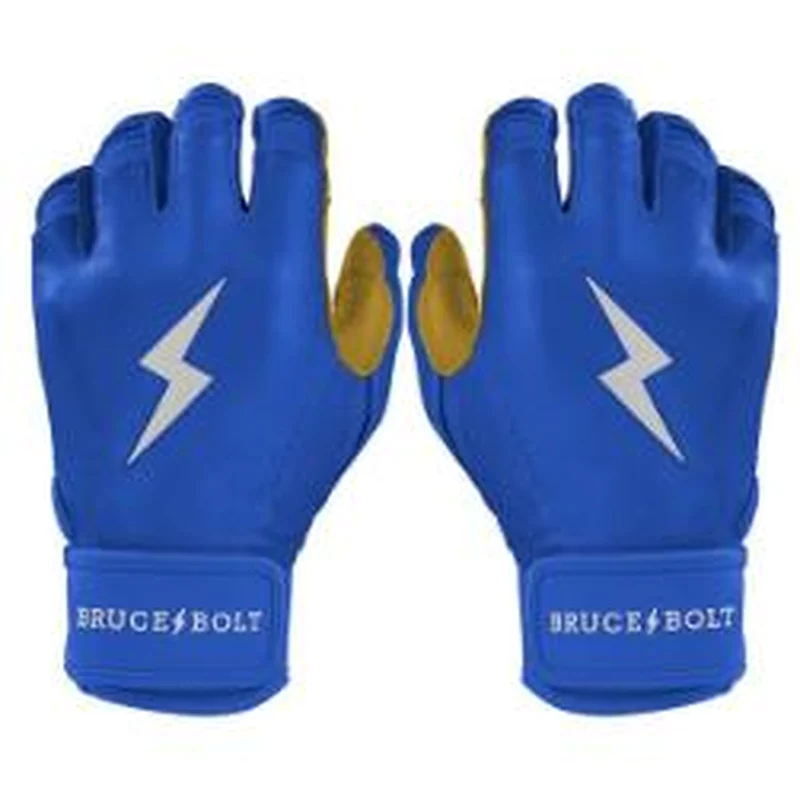 Bruce Bolt A flat pair of royal blue batting gloves in the ad, the same pair on the page at $65, under a cookie banner parked across the buy zone.
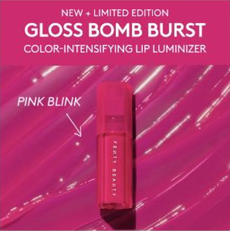 Fenty Beauty Fourteen of sixteen live statics route to a product page, and the Gloss Bomb Burst pair proves the routing is set at shade level, not product level.
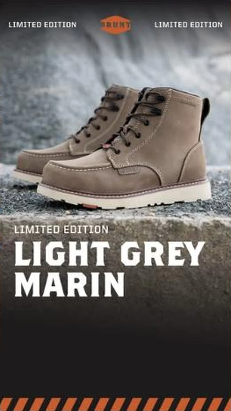 BRUNT Workwear A limited edition boot ad hands off to the exact Light Grey Marin page, where the scarcity line is repeated on the cart button.
Does your own handoff survive the click?
This is the same read I run on live funnels: the ad, the page, and the gap between them. Scored, free, no call required.
Audit my store freeNew teardowns as they land, in Commerce Dispatch: the ad, the page it clicked to, and what the gap cost. Same free newsletter as the footer, no separate list.
Back to The Handoff, the full library of 253 teardowns, 226 of them ad and page pairs, filterable by objective, funnel stage, format, placement, category and persuasion mechanic.
Read next: what breaks, across every rated pair, drawn from every pair in this library.
Branch is named here solely to identify the advertising being analysed. Brand names and marks are the property of their respective owners. No brand shown has any affiliation with, or has endorsed, Taylor Sicard Consulting.