Baron Fig · Conversion / Purchase · Cold / prospecting · August 2026 · Handoff: Partial · By Taylor Sicard
Baron Fig ad teardown: comparison / us-vs-them into purchase
A tick list comparison against throwaway pens lands on the right product page, where a signup popup covers every claim the ad made.
“Which one deserves a spot on your desk?”
Handoff: Partial
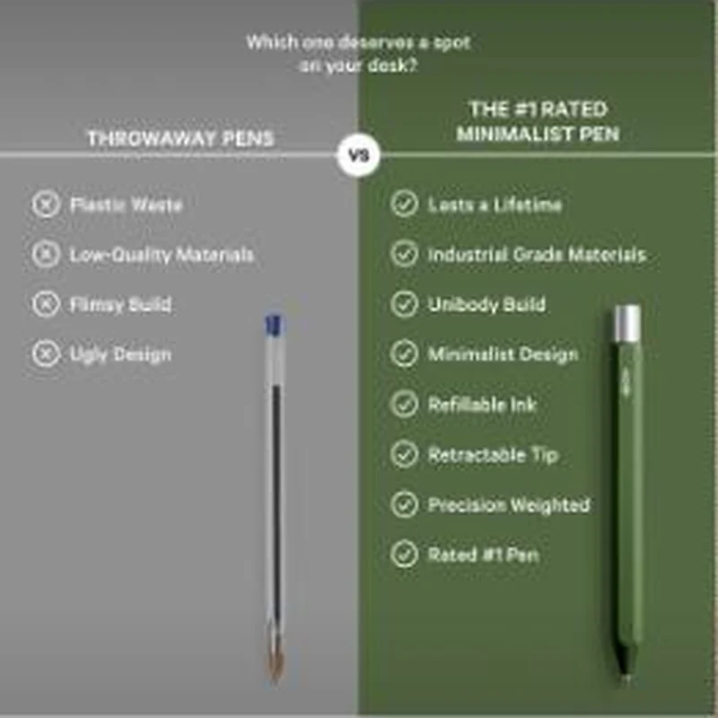
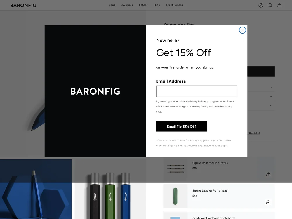
The creative is a split panel headed Which one deserves a spot on your desk?, with a grey THROWAWAY PENS column carrying four crosses, Plastic Waste, Low-Quality Materials, Flimsy Build and Ugly Design, against a green THE #1 RATED MINIMALIST PEN column carrying eight ticks including Lasts a Lifetime, Refillable Ink, Retractable Tip and Rated #1 Pen. The page is the Squire Hex Pen and the olive pen in the ad appears in the gallery alongside the black and blue versions. None of the eight ticks are visible on arrival: the fold is a New here? Get 15% Off email panel over the price and the add to cart, and what shows beneath it is an upsell rail, Squire Rollerball Ink Refills at $15, Squire Leather Pen Sheath at $45 and Confidant Hardcover Notebook at $28. The comparison the ad picks is never restated on the page.
The read
A checklist comparison against an unnamed category rather than a named rival, which keeps it legal and keeps it universal, since everyone owns the pens in the left column. Eight ticks against four crosses is the whole argument, and the asymmetry is the point. The desk question at the top turns a purchase into a small identity decision.
What the ad does
- The rival is a category, not a brand. "THROWAWAY PENS" lets the reader supply the competitor from their own drawer, and the four crosses beside it, Plastic Waste, Low-Quality Materials, Flimsy Build and Ugly Design, are complaints about a pen they already own rather than about a named rival.
- Eight ticks against four crosses reads as a verdict. The asymmetry lands before a single line is actually read, and Lasts a Lifetime and Refillable Ink pre-empt the obvious objection to paying real money for a pen. None of the eight is visible on the page the click opens.
Objective fit
It fits a purchase objective, since a comparison ad closes most of the decision before the click and only needs the page to confirm the product and the price. The page has both, once the overlay is gone.
Baron Fig ran this conversion creative to the landing page it clicked through to, both captured August 2026. A tick list comparison against throwaway pens lands on the right product page, where a signup popup covers every claim the ad made. Read as a pair, the handoff rates partial.
- The rival is a category, not a brand.
- Eight ticks against four crosses reads as a verdict. The asymmetry lands before a single line is actually read, and Lasts a Lifetime and Refillable Ink pre-empt the obvious objection to paying real money for a pen.
- What to fix: Repeat at least three of the eight ticks on the product page. A reader arrives on the Squire Hex Pen holding Lasts a Lifetime and Refillable Ink, and meets a New here?
Ad captured by Taylor Sicard 2026-08-21, landing page 2026-08-29. Screenshots reproduced for commentary and criticism.
Tagged
- Objective
- Conversion / Purchase
- Funnel
- Cold / prospecting
- Format
- Comparison staticStatic image
- Placement
- Meta feedInstagram stories
- Category
- Home & Household
- Mechanic
- Comparison / us-vs-themLongevity / proven hookSpecificity
- Handoff
- Partial
- Brand
- Baron Fig
Specificity is #2 of 21 ranked mechanics, on 83 pairs. See where specificity ranks
How this was evidenced
- Evidence
- Pair captured The ad and the page it clicked through to were both captured first-hand, and the destination recorded is the page the ad pointed at.
- Ad creative
- Captured August 2026
- Destination
- https://baronfig.com/products/squire-hex-pen Captured August 2026. Advertisers change their ads and pages continuously, so the live page may differ from the capture above. That is expected, and the capture is the record.
- Ad Library
- No permalink. This creative was observed running in-feed; Meta does not issue a stable public URL for a non-political ad, and purges it from the library once it stops running. The capture above is the record.
What to fix
Repeat at least three of the eight ticks on the product page. A reader arrives on the Squire Hex Pen holding Lasts a Lifetime and Refillable Ink, and meets a New here? Get 15% Off panel over the price and the add to cart, then an upsell rail of Squire Rollerball Ink Refills at $15 and Squire Leather Pen Sheath at $45. Suppress the email panel for this ad set so the comparison has somewhere to land.
One of 40 pairs where a popup is the landing page. See the pattern · See all 40
Sources
The same play elsewhere
Same comparison / us-vs-them, different brands.
 Alen A sleep score comparison of 100 against 65 hands off to a sale page whose first four cards are all buy two, save more bundles.
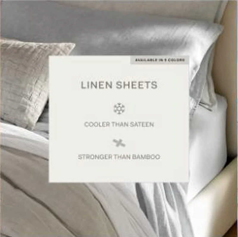 Boll & Branch A card claiming linen cooler than sateen and stronger than bamboo lands on the Linen Sheet Set page, which answers only the cooling half.
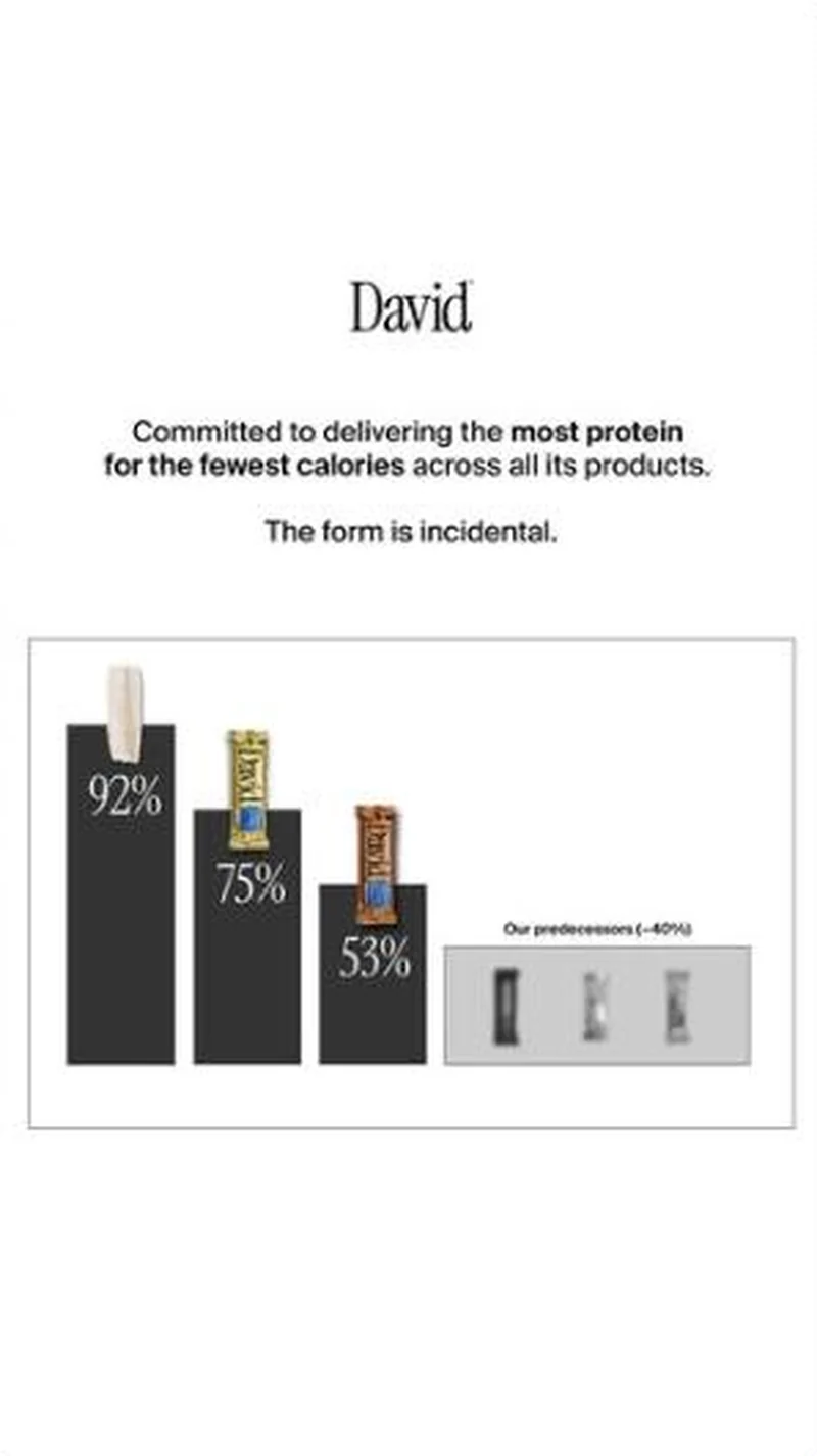 David Protein A bar chart that ranks David's own products against each other first, and the rest of the category second, so the brand ends up owning a metric instead of a flavour.
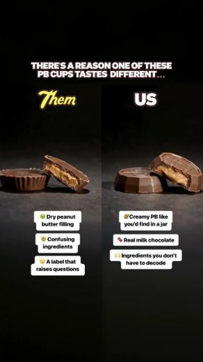 Feastables A cross-sectioned competitor cup labelled Them beside a Feastables cup labelled US, with the ingredient argument stuck on as callouts.
Does your own handoff survive the click?
This is the same read I run on live funnels: the ad, the page, and the gap between them. Scored, free, no call required.
Audit my store freeNew teardowns as they land, in Commerce Dispatch: the ad, the page it clicked to, and what the gap cost. Same free newsletter as the footer, no separate list.
Back to The Handoff, the full library of 253 teardowns, 226 of them ad and page pairs, filterable by objective, funnel stage, format, placement, category and persuasion mechanic.
Read next: what breaks, across every rated pair, drawn from every pair in this library.
Baron Fig is named here solely to identify the advertising being analysed. Brand names and marks are the property of their respective owners. No brand shown has any affiliation with, or has endorsed, Taylor Sicard Consulting.