Boarderie · Conversion / Purchase · Cold / prospecting · June 2026 · By Taylor Sicard
Boarderie ad teardown: Anti aesthetic
Rejects DTC art direction on purpose, because the buyer is not the person DTC art direction was designed for.
“Deliberately unfashionable creative, aimed at women over 65.”
Ad creative not captured
No ad creative could be paired with this page. All 28 Boarderie ads captured for this entry are polished lifestyle photography or unboxing shots, set in rounded sans-serif overlay type with generous negative space and skewing to younger milestones such as a 30th-birthday toast and a 53rd-birthday reveal, which is the opposite of the plain, large-type execution this entry describes. The read below is of the landing page on its own.
The read
Modern Retail reported creative built to look nothing like a modern consumer brand: larger type, plainer layouts, less negative space. Aimed at a 65-plus audience that most DTC brands art-direct straight past. It reportedly ran 66% above the account average on click-through.
What the ad does
- Plainness is aimed at someone. Larger type, plainer layouts and less negative space are read as access rather than as taste by the 65-plus buyer, and Modern Retail reported the work running 66% above the account average on click-through against that audience.
- The interrupt is generational. In a feed where every consumer brand is art-directed the same way, looking conventional is the thing that stands out, so the efficiency comes from reduced competition for that audience's attention rather than from a better offer.
Objective fit
Conversion against an underserved demographic. The efficiency comes from reduced competition for attention, not from a better offer.
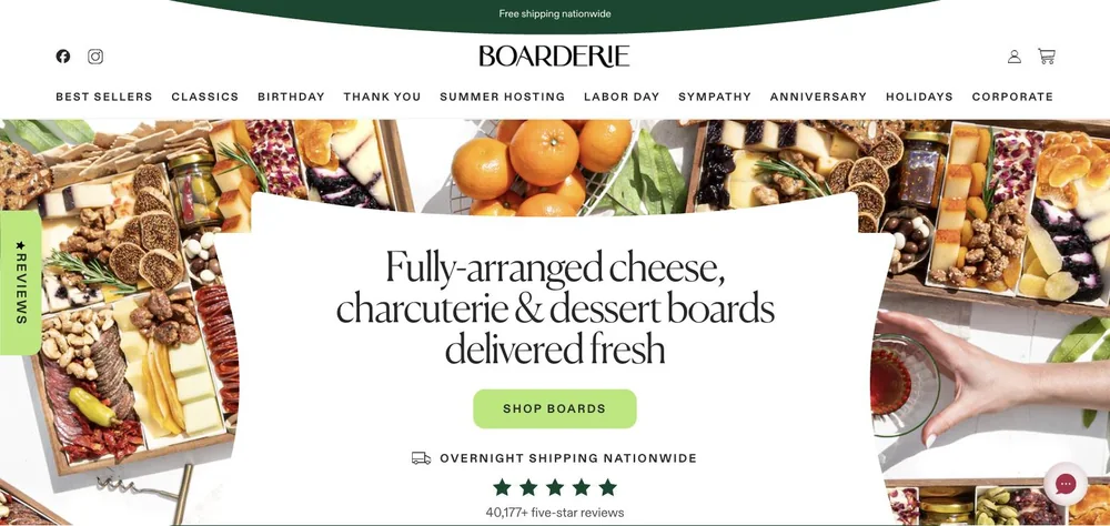
Boarderie ran this conversion campaign to the landing page below, captured August 2026. Rejects DTC art direction on purpose, because the buyer is not the person DTC art direction was designed for. Because the ad creative could not be found in the Ad Library, the entry carries no handoff rating: a rating measures the distance between two artefacts and only one of them is here.
- Plainness is aimed at someone. Larger type, plainer layouts and less negative space are read as access rather than as taste by the 65-plus buyer, and Modern Retail reported the work running 66% above the account average on click-through against that audience.
- The interrupt is generational. In a feed where every consumer brand is art-directed the same way, looking conventional is the thing that stands out, so the efficiency comes from reduced competition for that audience's attention rather than from a better offer.
- What to fix: Only copy this if you are aiming it at a specific audience, because the same execution shown to a 25-to-34 group reads as a brand that could not afford a designer.
Landing page captured by Taylor Sicard, 2026-08-20; no ad creative captured. Screenshots reproduced for commentary and criticism.
Tagged
- Objective
- Conversion / Purchase
- Funnel
- Cold / prospecting
- Format
- Static image
- Placement
- Meta feed
- Category
- Food & Beverage
- Mechanic
- Identity appealSpecificityPattern interrupt
- Kind
- Destination only, ad not captured
- Brand
- Boarderie
Identity appeal is #1 of 21 ranked mechanics, on 110 pairs. See where identity appeal ranks
How this was evidenced
- Evidence
- Ad not captured The landing page was captured, but the ad creative could not be found in the Ad Library, so there is no pair and no rating.
- Ad creative
- Not captured. No ad creative could be paired with this page. All 28 Boarderie ads captured for this entry are polished lifestyle photography or unboxing shots, set in rounded sans-serif overlay type with generous negative space and skewing to younger milestones such as a 30th-birthday toast and a 53rd-birthday reveal, which is the opposite of the plain, large-type execution this entry describes. The read below is of the landing page on its own.
- Destination
- https://boarderie.com Captured August 2026. Advertisers change their ads and pages continuously, so the live page may differ from the capture above. That is expected, and the capture is the record.
What to fix
Only copy this if you are aiming it at a specific audience, because the same execution shown to a 25-to-34 group reads as a brand that could not afford a designer. Treat the 66% figure as reported rather than verified as well: a review of all 28 Boarderie crops in the capture window found only polished modern-DTC lifestyle work, so no captured creative demonstrates the plain execution described here.
Across every brand: the 6 ways a handoff breaks · persuasion mechanics, ranked by how often the page keeps the promise.
The same play elsewhere
Same identity appeal, different brands.
 Aembr A near black packshot of one lit candle routes to the right product, then meets an orange food styled hero and a pre ticked $19 add on.
 Chomps One blue template, one offer, one landing page, and nineteen live creatives that differ mainly in the headline and the picture in the middle.
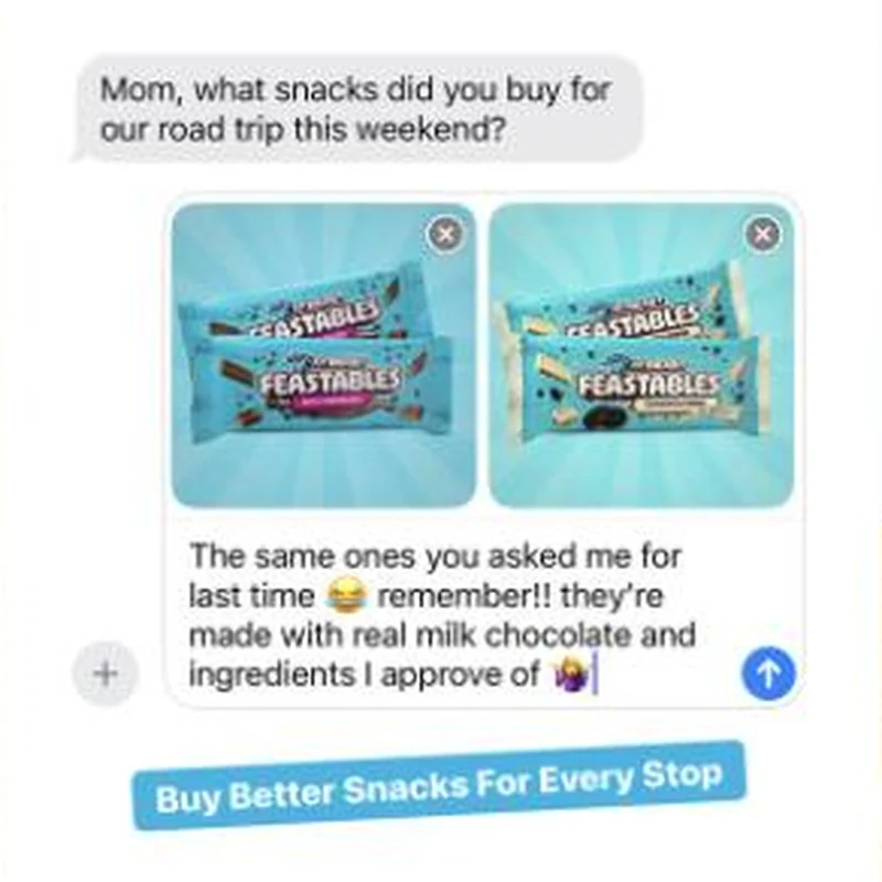 Feastables Fifty active US ads, four Amazon listings, zero clicks to feastables.com: the landing page is fine, it just belongs to somebody else.
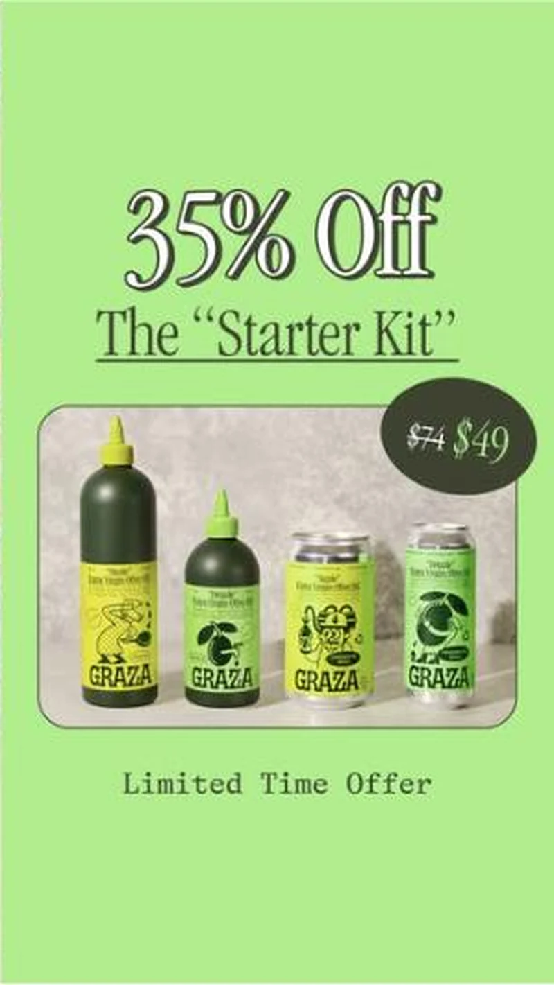 Graza One lime-green offer card with a swappable badge carries most of Graza's account, and it sells a bundle whose name does not match the page it lands on.
Does your own handoff survive the click?
This is the same read I run on live funnels: the ad, the page, and the gap between them. Scored, free, no call required.
Audit my store freeNew teardowns as they land, in Commerce Dispatch: the ad, the page it clicked to, and what the gap cost. Same free newsletter as the footer, no separate list.
Back to The Handoff, the full library of 253 teardowns, 226 of them ad and page pairs, filterable by objective, funnel stage, format, placement, category and persuasion mechanic.
Read next: the 5 landing page shapes these ads land on, drawn from every pair in this library.
Boarderie is named here solely to identify the advertising being analysed. Brand names and marks are the property of their respective owners. No brand shown has any affiliation with, or has endorsed, Taylor Sicard Consulting.