Blended ecommerce return rates sit near 19% to 20% of online orders on the latest available data (NRF 2025), but that number is close to useless because return rate is set by category. Apparel returns at 20 to 40%, footwear 17 to 30%, electronics 8 to 15%, beauty 4 to 12%, and home and furniture 15 to 20%. Benchmark against your category row instead of the average.
- Apparel and footwear sit at the top, driven by fit, sizing, and bracketing.
- Consumables and beauty sit at the bottom, held down by the hygiene barrier.
- A low return rate can still be an expensive one: recovery value and cost per return decide the margin hit.
Every DTC founder eventually asks whether their return rate is normal, and almost every answer they find is wrong for their business, because it is a blended, all-category number. The headline you keep reading, that online ecommerce returns run around 19% to 20% in 2026, is real, but it describes an average that no single brand lives at. A fashion brand returning at 30% and a supplement brand returning at 3% both average into that figure, and a benchmark that fits neither of them fits nobody. The dollar version of that row, past the refund, is what one return really costs you.
The number to watch is your category's rate. Online apparel returns at 20% to 40%, footwear at 17% to 30%, consumer electronics at 8% to 15%, beauty and skincare at 4% to 12%, and home and furniture at 15% to 20%. Those ranges describe structurally different businesses with different return behavior, and the spread inside each one is where return strategy gets decided. This post is the benchmark table by vertical, plus the part most tables skip: what a return in each category costs you.
I ran returns as an operator. At WIN Brands Group we shipped and took back physical product across apparel, home, and accessories, which means I have watched the same 20% return rate be a shrug in one category and a margin emergency in another. The rate is only the first number. What the returned unit costs to handle, and what it is worth when it lands back in your warehouse, are the two numbers that decide whether returns are a nuisance or the reason your contribution margin does not add up. If you want to run your own figures while you read, I built a free returns cost calculator that turns a return rate into an annual dollar number.
One caveat before the table. The blended and cross-channel figures below come from the NRF and Happy Returns 2025 Retail Returns Landscape, a primary source I link. The category ranges are consistent across the published 2025 and 2026 benchmark data and match what I saw operating, but treat them as directional bands, not a quote on your specific SKUs. Use them to place your brand in the right row, then go read your own numbers.
The blended return
rate is the wrong
number to watch.
Start with the anchor. The NRF and Happy Returns 2025 Retail Returns Landscape put total U.S. retail returns at 15.8% of sales in 2025, worth about $850 billion, roughly in line with 16.9% the year before. Online, the rate is higher: an estimated 19.3% of online sales were returned in 2025. That online figure is your headline, and it is roughly two to three times the brick-and-mortar rate. It is also the number you should stop comparing yourself against the moment you know your category.
That 19.3% is a weighted blend of businesses with nothing in common. It folds a fast-fashion brand losing 35% of units to fit, an electronics seller at 12%, and a supplement brand at 3% into one average, then reports the average as if it were a target. An apparel brand that benchmarks against 19% will conclude it has a crisis when it is normal for its category, and a supplement brand doing the same will conclude it is a star when it only sells into a low-return category.
There is a second reason the headline moves slower than your business does. The blended rate has been remarkably stable, hovering in the mid-to-high teens for total retail and around 19% online for a few years running. Stability at the top hides a lot of movement underneath, because category mix, discounting, and bracketing behavior shift the real driver while the average barely twitches. If you manage to the stable headline, you will miss the category-level and SKU-level changes that are taking money out of your margin.
"A 19% blended return rate describes an apparel brand at 30% sitting next to a supplement brand at 3%. It fits neither of them, which means it fits nobody."
Return rate by
category: the 2026
benchmark table.
The whole post is built around this table: nine common ecommerce categories with the directional online return rate for each, the primary driver behind it, and the cost pressure it creates. Rates are online return rates, ordered high to low. Screenshot it, then read the rows below for how to use it.
| Category | Return rate | Primary driver | Cost pressure |
|---|---|---|---|
Apparel & fashion | 20–40% (~25%) | Fit, sizing, bracketing | High volume, recovery decays with season |
Footwear | 17–30% | Sizing, fit | Bulkier boxes, higher reverse shipping |
Home & furniture | 15–20% | Size, color, damage, assembly | Highest per-unit cost, can exceed margin |
Consumer electronics | 8–15% (~11%) | Defect, remorse, compatibility | $30–$65 reverse cost, fraud risk |
Beauty & skincare | 4–12% | Shade match, reaction claims | Near-total write-off, no resale |
Accessories & jewelry | 4–8% | Gifting, defect | Low volume, decent recovery |
Health & supplements | 1–5% | Consumed, hygiene barrier | Non-resellable, near-total write-off |
Food & beverage | Low single digits | Perishable, mostly final sale | Refund without return, zero recovery |
Blended online (all) | ~19–20% | Category mix | $10–$65 all-in per return |
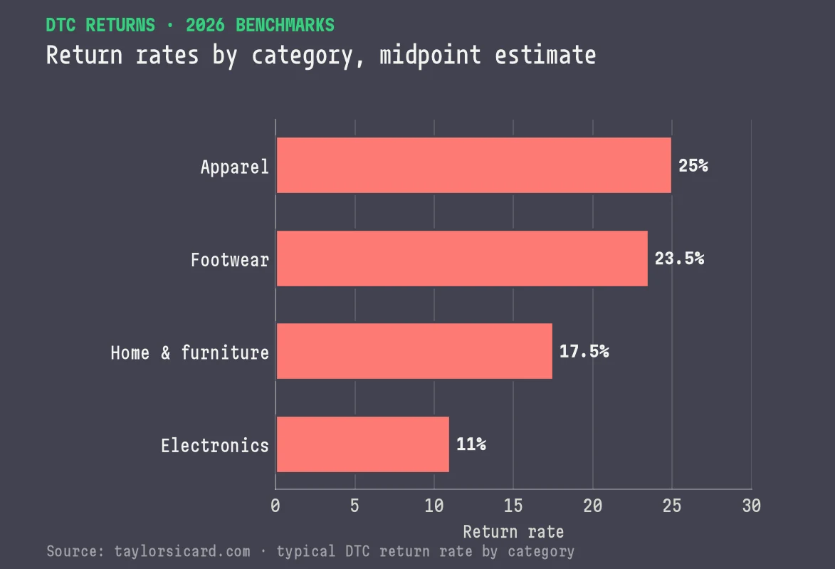
The table splits in two: the top four categories (apparel through electronics) are where return rate is a headline problem. In the bottom four (beauty through food), return rate looks tame on paper and hides a different trap: almost nothing you take back is worth anything on the way in. Read it on two axes, rate and cost, because a high rate and a high cost do not move together, and a category can be brutal on one while looking gentle on the other.
Reading the rows
the way an
operator would.
Apparel and footwear sit at the top for one reason: you cannot try the product on before it ships. Fit and sizing drive the majority of fashion returns, and bracketing (ordering three sizes intending to keep one) guarantees a return on every order it touches. That is why a fashion brand can do everything right on fulfillment and still run at 25% to 35%: the rate is baked into how the category is bought. The lever there is better fit data and sharper product pages that cut the returns that should never have shipped, not a stricter policy.
Home and furniture look moderate at 15% to 20%, and founders relax at that number until the first oversized return lands. This is the category where a single return can cost more than the unit's entire margin, because reverse shipping on a bulky item is enormous, damage in transit is common, and a scratched console table is a markdown or a write-off. A 15% return rate on furniture is often a bigger margin problem than a 30% rate on t-shirts, because the cost per return is a different order of magnitude.
Electronics is the quiet danger. The rate is middling at 8% to 15%, but reverse logistics on an electronics unit runs $30 to $65 on its own, and the category carries the highest return fraud exposure of anything on the table. A returned device has to be tested, wiped, sometimes repackaged, and frequently cannot be sold as new again. So the modest rate sits on top of the most expensive per-unit handling on the list, and that combination ambushes the hardware brand that only tracked the percentage.
At the bottom of the table, beauty, supplements, and food return at low single digits to low teens, and the instinct is to celebrate. Resist it: these are the categories where recovery value collapses to almost nothing, because hygiene rules mean an opened jar of moisturizer or a half-used supplement cannot go back on the shelf. A 6% beauty return rate where every returned unit is a write-off can cost as much per return as a 25% apparel rate where half the units resell. The trap is assuming a low rate means a low cost.
High-rate categories are a volume problem. Low-rate categories are a recovery problem. If you sell apparel, your work is cutting the number of returns through fit and product-page accuracy. If you sell beauty or supplements, your rate is already low, so your work is making sure the few returns you take are not pure write-offs, which often means a returnless refund is cheaper than shipping the unit back. Confusing the two is how a brand pours effort into the wrong lever.
Return rate is a
volume metric. Cost
is the margin one.
The benchmark table gives you the rate, and the rate does not show you the damage. Two brands returning at the same 15% can have completely different return economics, because the money sits in two numbers the percentage never shows: the cost to process each return, and the recovery value of the unit that comes back. Get those wrong and your contribution margin will not reconcile no matter how clean the top line looks.
Cost first. The all-in cost to process a single ecommerce return commonly runs $10 to $65, and reverse logistics runs two to three times the cost of forward fulfillment per unit. That stack is reverse shipping, receiving and inspection labor, restock or refurbishment, the payment fee you do not get back, and customer-service time. It scales with the physical product: a t-shirt sits at the bottom of that range, a console table or a laptop at the top. I take the full stack apart, line by line, in the real cost of a DTC return, which is the cost companion to this benchmark table.
Recovery second, and this is the line almost every model omits. Only about half of returned items are resold at full price across ecommerce. The rest are discounted, liquidated, or written off. So even a cheap-to-process return often hands you back a depreciated asset. Layer that onto the category table and the picture inverts: beauty and consumables look low-return but recover almost nothing, while apparel looks high-return but recovers a decent share on markdown. Rate alone cannot see any of that.
If your return rate looks fine for your category but your margin still does not add up, the gap is usually in cost per return and recovery value. That is the model I build with brands.
Always read the rate next to two more numbers: refund rate, the share of revenue you are giving back, and cost per return, what each one costs to handle. Together the three tell you whether a category-normal rate is fine or bleeding you. This is the same discipline that runs through contribution margin: the metric everyone quotes is rarely the one that decides profitability. If you want the category context for the rest of your economics, the DTC benchmark card lays out CAC, order value, repeat rate, and payback by vertical the same way this table lays out returns.
What actually drives
your rate up, and
who is behind it.
Three forces set where your brand lands inside its category band, and none of them is bad luck. The first is fit and sizing, which is why apparel and footwear top the table. Anything a customer buys to wear without being able to try it on returns more. The fix is upstream: accurate size charts, fit tools, honest product photography, and reviews that set correct expectations. A return you prevent at the product page costs nothing to process and loses nothing on recovery.
The second is bracketing, and it is getting worse. The NRF and Happy Returns data found that close to two-thirds of consumers admit to at least one costly returns behavior, and shoppers aged 18 to 30 made an average of 7.7 online returns in the last 12 months, more than any other generation. Bracketing (buying multiple sizes or colors intending to send most back) guarantees returns by design. Free-returns expectations feed it: 82% of shoppers now say free returns are a major factor in where they buy, up from 76% the year before. The more frictionless your policy, the more bracketing you invite, which is the tension every returns policy has to solve.
The third is fraud, which is now a real cost line. The same report found that 9% of all returns are fraudulent, from wardrobing to empty-box and decoy returns, and 85% of retailers say they are deploying AI to detect it. Electronics and high-value apparel carry the most exposure. Fraud adds the most expensive kind of return, because a fraudulent return is a total loss with processing cost stacked on top. Any brand in a high-value category needs this on the radar, not filed under "cost of doing business."
Your category rate is the floor. Where you land above it is set by customer behavior you can see if you look. Segment returns by customer, and a small group of serial bracketers will account for a wildly outsized share of your return volume and cost. The category benchmark tells you what is normal for the product. Your own customer-level data tells you where the fixable cost is hiding, and it is almost never spread evenly across the base.
Building the return
benchmark that
actually matters: yours.
The category table is the warm-up for building your own return benchmark, refreshed every quarter, at a resolution the industry average can never reach. Pull four things and write them next to your category row.
Why it matters: Your blended rate hides the handful of SKUs generating most of the cost. A single badly-sized style or a fragile item can drag the whole number, and you cannot fix what you have averaged into invisibility.
Why it matters: Return cost concentrates in a small slice of customers. Seeing that slice is what lets you run behavior-based policy: frictionless for good customers, tighter terms for abusers, without taxing the base you want to keep.
Why it matters: This is the line that turns a percentage into a dollar hit to contribution margin. A category-normal rate with a poor recovery value is a bigger problem than a scary rate with strong resale.
With those in hand, the category table works as a diagnostic. Where you beat your category, understand why so you can protect it. Where you trail it, decide whether it is a fixable product problem or a deliberate trade you are making for a generous policy. And where your rate looks normal but your recovery is poor, that is usually the highest-value fix on the board, because it is invisible to anyone benchmarking on rate alone. The upstream half of this, the fulfillment and reverse-logistics setup that determines your cost per return, is where a strong 3PL and reverse-logistics partner earns its keep.
This is the same move that separates operators from founders on every metric. The industry average is a crowd you happen to be standing in, and your category row is only a starting hypothesis. Your SKU-level, customer-level, cost-aware return data describes the business you run. If you want to see how returns sit inside the rest of the category picture, the unit economics by category breakdown puts them next to margin, CAC, and repeat rate, and the broader 2026 DTC and Shopify app benchmarks place your whole P&L against the market.
Returns are one of the last big lines that DTC brands still benchmark badly. Most have squeezed CAC and scrutinized COGS while quoting a blended return rate that describes nobody. Put your real category rate on the table, read it next to cost and recovery, and go one level deeper into SKU and customer, the level where you can act on it. If you want a second set of eyes on whether your rate is healthy for your category, that is the kind of hidden-margin question the DTC growth consultant exists to answer.
Measured. Online return rate by category, blended online and total retail return rates, cost per return, and how much returned stock gets resold.
Period. NRF's 2025 figures. Category ranges compiled July 2026.
Sources. NRF and Happy Returns' 2025 Retail Returns Landscape, for the blended rates, return fraud, free-returns behavior and shopper patterns.
Basis. The category ranges and cost-per-return figures draw on published 2025 and 2026 ecommerce data, checked against what we took back across apparel, home and accessories at WIN Brands Group.
Limits. Category ranges are directional.
Common questions on
ecommerce return
rate benchmarks.
What is the average ecommerce return rate in 2026?
About 19% to 20% of online orders are returned heading into 2026. The NRF and Happy Returns 2025 Retail Returns Landscape put the online return rate at 19.3% in 2025, versus 15.8% of total retail sales across all channels. That blended figure is roughly two to three times the brick-and-mortar rate, but it is close to useless as an operating number because return rate is set almost entirely by category. A fashion brand at 30% and a supplement brand at 3% both average into that 19%.
What is the return rate for apparel and fashion?
Online apparel and fashion returns run roughly 20% to 40%, with most brands landing near 25% and fast fashion or occasion wear pushing toward 40%. Fit and sizing drive the bulk of it, and bracketing (ordering several sizes intending to keep one) inflates the rate further. Apparel and footwear are the highest-returning categories in ecommerce, which is why a blended benchmark is meaningless for a fashion brand: your real comparison is the apparel row, not the all-category average.
Which product categories have the lowest return rates?
Consumables have the lowest return rates. Health, supplements, and food and beverage return in the low single digits because the product gets used up and hygiene rules make it non-returnable. Beauty and skincare run 4% to 12%, held down by the same hygiene barrier, with the high end reflecting shade mismatches and reaction claims. Jewelry and accessories sit around 4% to 8%. Low return rate is not the same as cheap returns: beauty and consumables recover almost nothing on resale, so the few returns you do take are near-total write-offs.
Why does return rate matter less than cost per return?
Because two brands with the same return rate can have completely different return economics. The all-in cost to process one return runs $10 to $65, and reverse logistics costs two to three times forward fulfillment per unit. A bulky home item or an electronics unit can cost more to take back than its remaining margin, while a low-value beauty item is a near-total write-off because it cannot be resold. Return rate tells you volume, while cost per return and recovery value tell you what returns are doing to your margin, and margin decides profitability. The full line-by-line breakdown lives in the return P&L teardown.
How do I benchmark my brand's return rate?
Compare against your own category row, not the all-category average, then go deeper. Pull your return rate by SKU and by customer, because a small slice of products and serial bracketers concentrate most of the cost. Track refund rate and cost per return alongside the raw percentage, since those tie the return directly to margin. Then benchmark your trend against your own history quarter over quarter. The published category ranges are a starting hypothesis. Your SKU-level and customer-level data is the operating truth, and the returns cost calculator turns it into an annual dollar figure.
Read your return rate against the right benchmark.
I help DTC brands figure out whether their return rate is a nuisance or a margin problem, and which lever to pull first. Co-founded WIN Brands Group across apparel, home, and accessories, where returns were a real line on the P&L, not an afterthought.
Start a conversation More about Taylor →