TUSHY · Conversion / Purchase · Cold / prospecting · August 2026 · Handoff: Partial · By Taylor Sicard
TUSHY ad teardown: humour into purchase
A creator on a peach-tiled toilet set jokes about IBS supplements and dry TP, then lands on a bidet catalog behind a $10 cashback quiz.
“spending $50/month on IBS supplements and still wiping with dry TP.”

Handoff: Partial
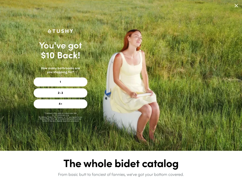
The creative is a styled bathroom set, peach vertical tile, cream toilet brush, a potted plant, a creator seated on the toilet with her jeans at her ankles, and the burned caption Delulu over spending $50/month on IBS supplements and still wiping with dry TP. The page holds the voice exactly: The whole bidet catalog, dek From basic butt to fanciest of fannies, we've got your bottom covered, and a running marquee that reads 3 million plus butts love TUSHY. The catalog itself is strong, eleven products from a $25 Travel bidet to the $1,599 Eau, a right bidet for your butt chooser and a full comparison table. What it drops is the audience the ad recruited: nothing on the page mentions IBS, flares or gut issues, and before any of it is visible a full-bleed panel headed You've got $10 Back asks how many bathrooms you are shopping for.
The read
The joke is the qualifier. Opening on a gut-issue confession narrows the audience to people already spending money on their digestion, and the punchline reframes a bidet as the cheaper half of a routine they are paying for anyway. Staging it on a designed set rather than a real bathroom is what keeps a toilet ad watchable in a feed.
What the ad does
- The confession is the targeting. "spending $50/month on IBS supplements and still wiping with dry TP" names a gut problem in the first line, so everyone still watching has effectively raised a hand as in market, and a monthly spend makes the $129 attachment look like a rounding error without the comparison ever being said out loud.
- The set is what makes a toilet ad watchable. Peach vertical tile, a cream toilet brush and a potted plant turn a creator seated on the toilet into a styled frame, which is the only reason this category can run a creative like this in a feed at all.
- The catalog holds the voice and drops the audience. "From basic butt to fanciest of fannies, we've got your bottom covered" and a marquee reading "3 million plus butts love TUSHY" carry the joke through, and eleven products from a $25 Travel bidet to the $1,599 Eau do the choosing, but nothing on the page mentions IBS, flares or gut issues.
Objective fit
A catalog page is a fair destination for a creative that sells the category rather than one model, and this catalog does the choosing work well once you reach it. Purchase is the right objective; the friction is what stands between the click and the grid.
TUSHY ran this conversion creative to the landing page it clicked through to, both captured August 2026. A creator on a peach-tiled toilet set jokes about IBS supplements and dry TP, then lands on a bidet catalog behind a $10 cashback quiz. Read as a pair, the handoff rates partial.
- The confession is the targeting.
- The set is what makes a toilet ad watchable. Peach vertical tile, a cream toilet brush and a potted plant turn a creator seated on the toilet into a styled frame, which is the only reason this category can run a creative like this in a feed at all.
- The catalog holds the voice and drops the audience.
- What to fix: Drop the $10 cashback interstitial for this creative's traffic: a panel headed You've got $10 Back asks how many bathrooms you are shopping for before a single product is visible, which spends the attention the joke just earned.
Ad captured by Taylor Sicard 2026-08-21, landing page 2026-08-29. Screenshots reproduced for commentary and criticism.
Tagged
- Objective
- Conversion / Purchase
- Funnel
- Cold / prospecting
- Format
- UGC videoCreator-led
- Placement
- Meta reelsTikTokInstagram stories
- Category
- Home & Household
- Mechanic
- HumourProblem agitationPrice anchoring
- Handoff
- Partial
- Brand
- TUSHY
Problem agitation is #9 of 21 ranked mechanics, on 35 pairs. See where problem agitation ranks
How this was evidenced
- Evidence
- Pair captured The ad and the page it clicked through to were both captured first-hand, and the destination recorded is the page the ad pointed at.
- Ad creative
- Captured August 2026
- Destination
- https://hellotushy.com/collections/bidet-attachments Captured August 2026. Advertisers change their ads and pages continuously, so the live page may differ from the capture above. That is expected, and the capture is the record.
- Ad Library
- No permalink. This creative was observed running in-feed; Meta does not issue a stable public URL for a non-political ad, and purges it from the library once it stops running. The capture above is the record.
What to fix
Drop the $10 cashback interstitial for this creative's traffic: a panel headed You've got $10 Back asks how many bathrooms you are shopping for before a single product is visible, which spends the attention the joke just earned. Then put one line of gut copy on the catalog, because an IBS-led hook landing on a page that never mentions IBS leaves its narrowest promise unanswered.
One of 44 pairs where the page drops the argument that earned the click. See the pattern · See all 44
Sources
The same play elsewhere
Same price anchoring, different brands.
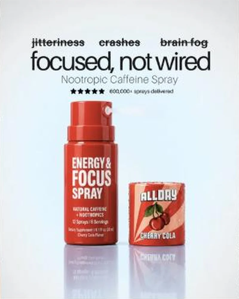 ALLDAY A 40 percent off caffeine spray ad landing on a homepage whose entire first view is a 51 percent off goal quiz.
 French Bandit A French break the glass poster for the sage fountain lands on an English, dollar priced cat grid that opens with a 12 dollar filter subscription.
 Grüns A blunt gut health static that says the word nobody else in the feed will say, then hands the claim to one fibre number.
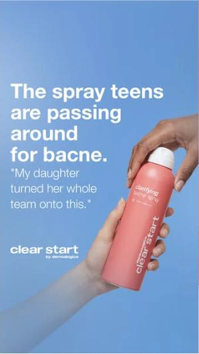 Dermalogica Every hook in the Clear Start block is spoken by the person doing the buying, not the person with the breakout.
Does your own handoff survive the click?
This is the same read I run on live funnels: the ad, the page, and the gap between them. Scored, free, no call required.
Audit my store freeNew teardowns as they land, in Commerce Dispatch: the ad, the page it clicked to, and what the gap cost. Same free newsletter as the footer, no separate list.
Back to The Handoff, the full library of 253 teardowns, 226 of them ad and page pairs, filterable by objective, funnel stage, format, placement, category and persuasion mechanic.
Read next: how DTC promotions survive the click, drawn from every pair in this library.
TUSHY is named here solely to identify the advertising being analysed. Brand names and marks are the property of their respective owners. No brand shown has any affiliation with, or has endorsed, Taylor Sicard Consulting.