SKIMS · Conversion / Purchase · Cold / prospecting · August 2026 · Handoff: Break · By Taylor Sicard
SKIMS ad teardown: Skims x tangle teezer
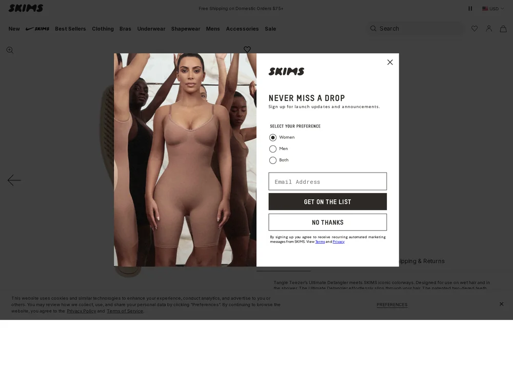
A four brush collab ad opens the right product page, where a shapewear signup modal covers every part of the product itself.
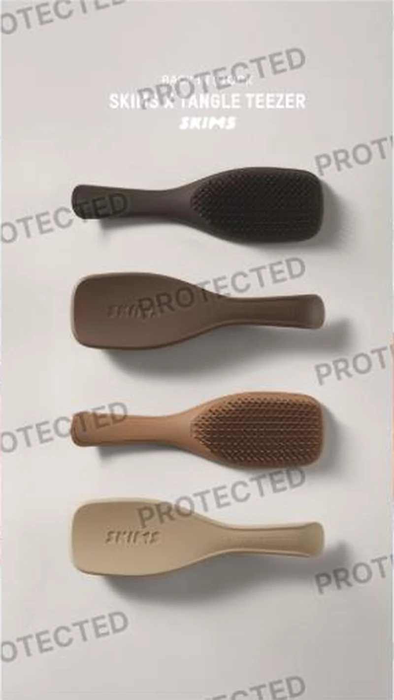
“SKIMS X TANGLE TEEZER”
Handoff: Break
The URL is correct and none of it reaches the screen. The first view is a NEVER MISS A DROP email capture over a shapewear photograph, with a SELECT YOUR PREFERENCE control offering Women, Men or Both, a GET ON THE LIST button and a cookie consent bar pinned across the bottom. Behind it the page is almost empty: one dark sliver of a brush at the left edge and one line of description, Tangle Teezer's Ultimate Detangler meets SKIMS iconic colorways. The four brushes stacked in four nude to espresso shades that are the entire ad have no counterpart on screen, and the title, the price and the shade selector are all behind an interstitial selling a different category.
The read
A single static, watermarked by the ad library. Four brushes lie stacked on a pale ground in four nude to espresso shades, alternating bristle side and back side so the SKIMS name debossed into the handle reads on two of them. The type sits at the top in three lines, a small line above SKIMS X TANGLE TEEZER with the wordmark under it. It is a lineup shot: no hand, no hair, no demonstration, no price. The whole pitch is that a hair tool now exists in the brand's colour language, and that the brand it exists with is the one people already own.
What the ad does
- The borrowed authority is the product. SKIMS has no standing in hair tools, so the collaborator's name carries the function claim while SKIMS carries the shade range. "SKIMS X TANGLE TEEZER" is the only headline in the frame because naming both brands in one line is the entire mechanic: no hand, no hair, no demonstration and no price.
- Four colourways instead of one hero. Stacking four brushes in four nude to espresso shades turns a single utility object into a shade decision, which is how the brand sells everything else, and it lets one static stand in for four SKUs at feed size without a carousel. Alternating bristle side and back side keeps the debossed SKIMS name readable on two of them.
Objective fit
The creative is built for purchase, and it points at the exact SKU. The objective is undermined on arrival rather than in the ad: a signup unit for a different product line takes the first screen, so a click that was earned by a hair tool gets asked for an email about shapewear drops.
SKIMS ran this conversion creative to the landing page it clicked through to, both captured August 2026. A four brush collab ad opens the right product page, where a shapewear signup modal covers every part of the product itself. Read as a pair, the handoff rates break.
- The borrowed authority is the product. SKIMS has no standing in hair tools, so the collaborator's name carries the function claim while SKIMS carries the shade range.
- Four colourways instead of one hero.
- Where the handoff lands: The URL is correct and none of it reaches the screen.
- What to fix: Suppress the modal for paid entrances, or at minimum let the product render behind it.
Ad captured by Taylor Sicard 2026-08-21, landing page 2026-08-29. Screenshots reproduced for commentary and criticism.
Tagged
- Objective
- Conversion / Purchase
- Funnel
- Cold / prospecting
- Format
- Static image
- Placement
- Meta feedInstagram storiesMeta reels
- Category
- Beauty & Skincare
- Mechanic
- Authority / expertMoment anchoringIdentity appeal
- Handoff
- Break
- Brand
- SKIMS
Identity appeal is #1 of 21 ranked mechanics, on 110 pairs. See where identity appeal ranks
How this was evidenced
- Evidence
- Pair captured The ad and the page it clicked through to were both captured first-hand, and the destination recorded is the page the ad pointed at.
- Ad creative
- Captured August 2026
- Destination
- https://skims.com/products/tangle-teezer-x-skims-the-ultimate-detangler-straight-to-wavy-clay Captured August 2026. Advertisers change their ads and pages continuously, so the live page may differ from the capture above. That is expected, and the capture is the record.
- Ad Library
- No permalink. This creative was observed running in-feed; Meta does not issue a stable public URL for a non-political ad, and purges it from the library once it stops running. The capture above is the record.
What to fix
Suppress the modal for paid entrances, or at minimum let the product render behind it. A "NEVER MISS A DROP" email capture over a shapewear photograph takes the first screen of the most expensive traffic on the site, with a cookie bar pinned beneath it, so the buyer's first two decisions are both about consent. The four shades that are the whole ad, plus the title, the price and the shade selector, are all behind an interstitial selling a different category.
One of 40 pairs where a popup is the landing page. See the pattern · See all 40
Sources
The same play elsewhere
Same identity appeal, different brands.
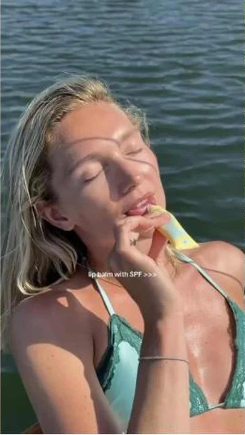 Bask A sunlit lake clip captioned lip balm with SPF lands on the exact yellow tube at $20, with a cart panel sitting over the buy zone.
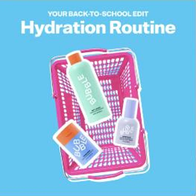 Bubble The back to school headline carries word for word, then a 15% off modal and a cookie bar cover the grid that replaced the routine.
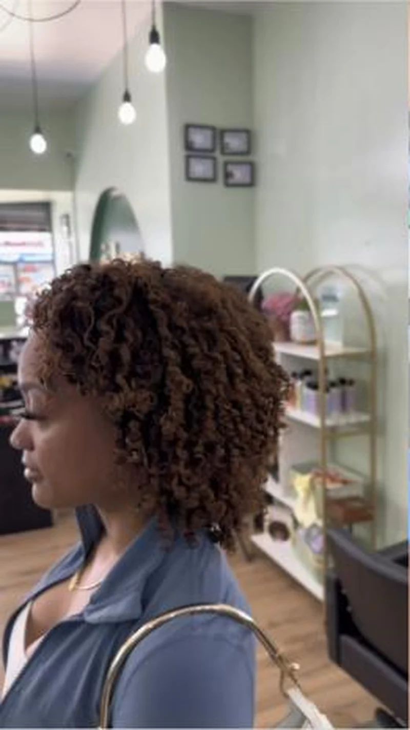 Bask and Lather A salon clip of finished curls sends a launch story to a bare collection grid of six bottles with no hero, no routine and no hair.
 Freaks of Nature A black card where an ultra-endurance athlete says I'm a freak lands on an all products grid fronted by a different name, Kelly Slater.
Does your own handoff survive the click?
This is the same read I run on live funnels: the ad, the page, and the gap between them. Scored, free, no call required.
Audit my store freeNew teardowns as they land, in Commerce Dispatch: the ad, the page it clicked to, and what the gap cost. Same free newsletter as the footer, no separate list.
Back to The Handoff, the full library of 253 teardowns, 226 of them ad and page pairs, filterable by objective, funnel stage, format, placement, category and persuasion mechanic.
Read next: what breaks, across every rated pair, drawn from every pair in this library.
SKIMS is named here solely to identify the advertising being analysed. Brand names and marks are the property of their respective owners. No brand shown has any affiliation with, or has endorsed, Taylor Sicard Consulting.