Cuts · Conversion / Purchase · Cold / prospecting · August 2026 · Handoff: Partial · By Taylor Sicard
Cuts ad teardown: identity appeal into purchase
A phone-shot rooftop portrait in a textured sand tee hands off to the Riviera Knit grid, which opens under a 50% off email gate.

Handoff: Partial
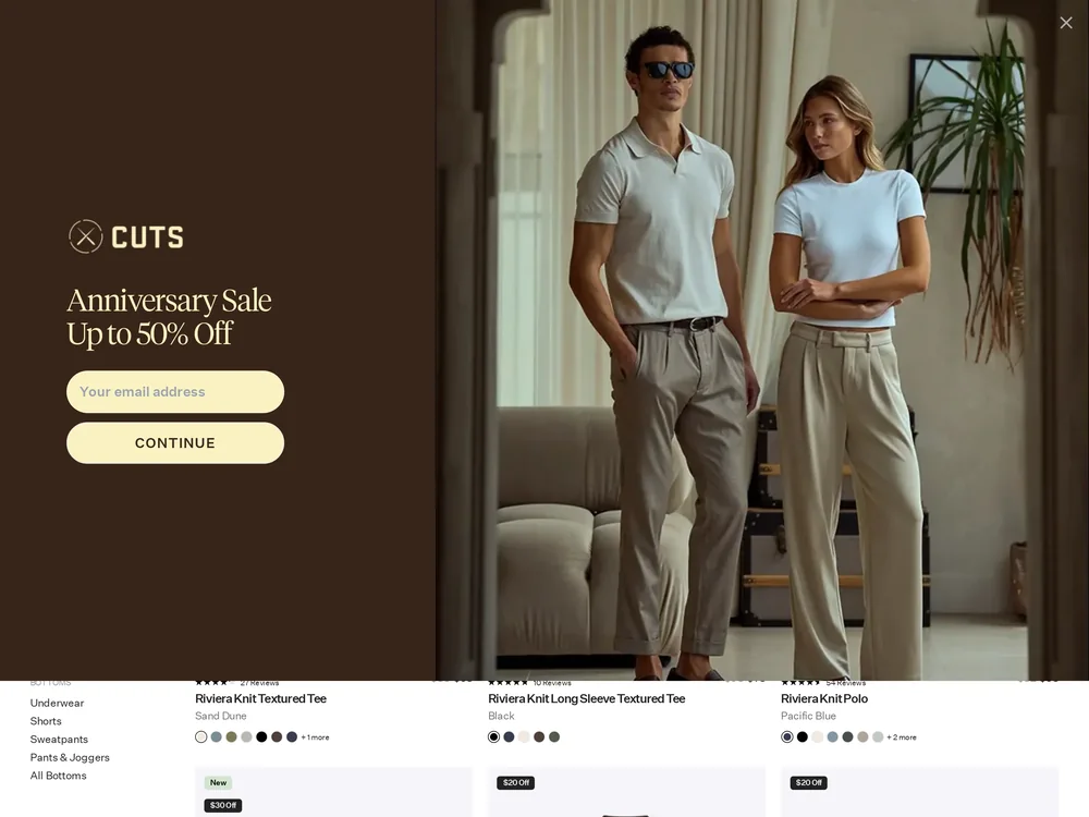
The garment carries across: the sand textured crew in the ad is the Riviera Knit Textured Tee in Sand Dune, sitting in the first row of the collection grid at $68 with 27 reviews. What breaks the line is what sits on top of it. A full screen Anniversary Sale Up To 50% Off email capture covers the fold, and the grid itself opens mid scroll with no collection banner, so there is no headline restating the lightweight breathable knit the ad sold. The page also front loads $20 Off and $30 Off badges the ad never raised, so the first idea after the click is a sale rather than the fabric.
The read
A dusk rooftop bar, a phone held at chest height, a guy in a sand textured tee with a drink in front of him. It is framed like a photo a friend posted rather than a campaign asset, and the garment is present without being the subject. The whole argument is the setting: this is what the shirt is for.
What the ad does
- The tee is worn, not shown. Arms crossed on a table at a dusk rooftop bar, drink in front, the sand textured knit catching low light. It is framed like a photo a friend posted, and it resolves on the page as the Riviera Knit Textured Tee in Sand Dune at $68 with 27 reviews, so the garment itself carries across.
- It refuses ad grammar. No logo, no badge, no type and no price anywhere in the frame. In a feed of overlaid claims a plain photo buys a half second on look alone, and the setting, rooftop, dusk, cocktails, other people in shot, tells a scroller whether they are the buyer before any copy does.
Objective fit
A textureless lifestyle frame with no claim on it needs the page to finish the sentence, and a collection grid can do that. What it cannot do is repeat the promise, which is the job the missing collection header was there for.
Cuts ran this conversion creative to the landing page it clicked through to, both captured August 2026. A phone-shot rooftop portrait in a textured sand tee hands off to the Riviera Knit grid, which opens under a 50% off email gate. Read as a pair, the handoff rates partial.
- The tee is worn, not shown. Arms crossed on a table at a dusk rooftop bar, drink in front, the sand textured knit catching low light.
- It refuses ad grammar. No logo, no badge, no type and no price anywhere in the frame.
- Where the handoff lands: The garment carries across: the sand textured crew in the ad is the Riviera Knit Textured Tee in Sand Dune, sitting in the first row of the collection grid at $68 with 27 reviews. What breaks the line is what sits on top of it.
- What to fix: Suppress the anniversary email capture for paid entrances.
Ad captured by Taylor Sicard 2026-08-21, landing page 2026-08-29. Screenshots reproduced for commentary and criticism.
Tagged
- Objective
- Conversion / Purchase
- Funnel
- Cold / prospecting
- Format
- Static image
- Placement
- Meta reelsInstagram stories
- Category
- Apparel & Accessories
- Mechanic
- Identity appealMoment anchoringNative camouflage
- Handoff
- Partial
- Brand
- Cuts
Identity appeal is #1 of 21 ranked mechanics, on 110 pairs. See where identity appeal ranks
How this was evidenced
- Evidence
- Pair captured The ad and the page it clicked through to were both captured first-hand, and the destination recorded is the page the ad pointed at.
- Ad creative
- Captured August 2026
- Destination
- https://www.cutsclothing.com/collections/riviera-knit Captured August 2026. Advertisers change their ads and pages continuously, so the live page may differ from the capture above. That is expected, and the capture is the record.
- Ad Library
- No permalink. This creative was observed running in-feed; Meta does not issue a stable public URL for a non-political ad, and purges it from the library once it stops running. The capture above is the record.
What to fix
Suppress the anniversary email capture for paid entrances. The first thing a cold visitor does on this page is dismiss a full-screen "Anniversary Sale Up To 50% Off" panel, and the grid underneath opens with no collection banner, so nothing restates the knit the ad sold. The "$20 Off" and "$30 Off" badges the ad never raised then make the first idea after the click a sale rather than the fabric.
One of 40 pairs where a popup is the landing page. See the pattern · See all 40
Sources
The same play elsewhere
Same identity appeal, different brands.
 Avenue The Label A phone snap of a raffia hat packed beside loafers in a suitcase, landing on the Izzy Sunhat page that sells exactly that packability.
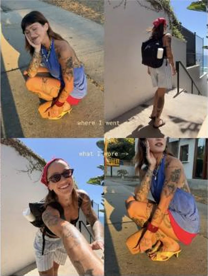 Dagne Dover A creator's four-panel trip collage that names two specific bags in the caption and then sends the click to a collection page that leads with neither.
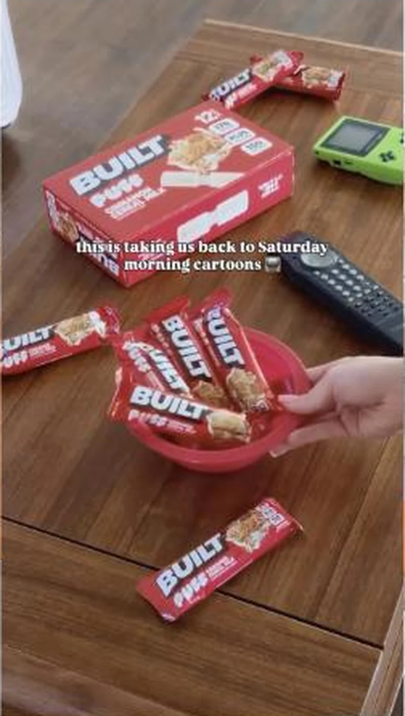 Built A nostalgia staged bowl of Cinnamon Cereal Milk bars lands on the right flavour page, which sells a 4ct where the ad shows a 12 count box.
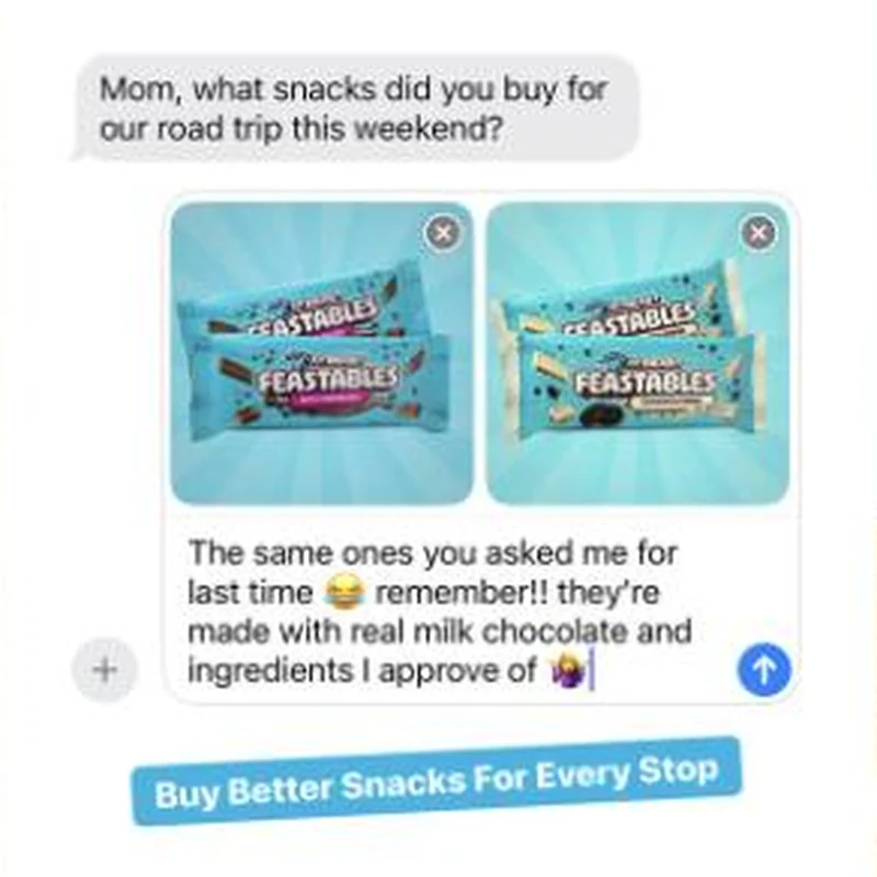 Feastables Fifty active US ads, four Amazon listings, zero clicks to feastables.com: the landing page is fine, it just belongs to somebody else.
Does your own handoff survive the click?
This is the same read I run on live funnels: the ad, the page, and the gap between them. Scored, free, no call required.
Audit my store freeNew teardowns as they land, in Commerce Dispatch: the ad, the page it clicked to, and what the gap cost. Same free newsletter as the footer, no separate list.
Back to The Handoff, the full library of 253 teardowns, 226 of them ad and page pairs, filterable by objective, funnel stage, format, placement, category and persuasion mechanic.
Read next: what breaks, across every rated pair, drawn from every pair in this library.
Cuts is named here solely to identify the advertising being analysed. Brand names and marks are the property of their respective owners. No brand shown has any affiliation with, or has endorsed, Taylor Sicard Consulting.