Away · Conversion / Purchase · Warm / consideration · August 2026 · Handoff: Partial · By Taylor Sicard
Away ad teardown: The ultimate travel flex
A four size Flex lineup lands on the matching collection, but the page leads with a bundle discount and buries the expandability at the foot.
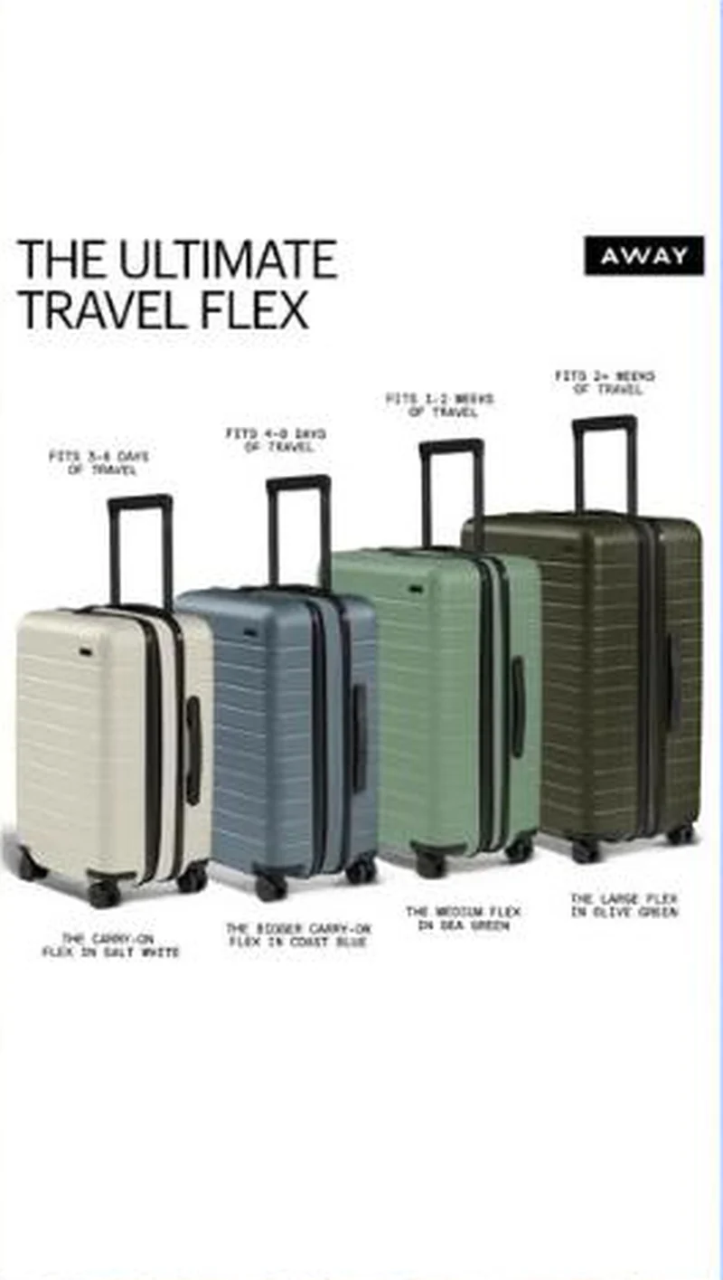
“THE ULTIMATE TRAVEL FLEX”
Handoff: Partial
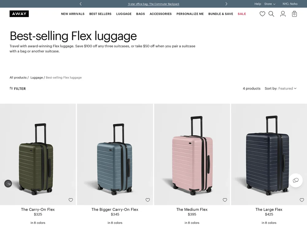
The ad lines up four cases left to right, each labelled twice: a name and colour underneath, a trip length above, from fits 3 to 5 days on the Carry-On Flex in Salt White through to fits 2+ weeks on the Large Flex in Olive Green. The page is the right collection and holds exactly those four products in the same order, Carry-On Flex at $325 through Large Flex at $425. Two things shift. The lead line is a discount the ad never raised, save $100 off any three suitcases or $50 when you pair a suitcase with a bag, and the trip length mapping that made the ad useful is gone from every card. The expandable explanation the whole lineup rests on sits at the very bottom of the page, under the reviews, the category browse and a rate your experience widget.
The read
This is a sizing chart pretending to be an ad. The lineup answers the question that actually stalls a luggage purchase, which is not whether the case is good but which one to buy, and it answers it in the buyer's own unit: days away. Naming each colour turns four silhouettes into four specific products rather than a size ladder.
What the ad does
- The label is a decision, not a spec. Each case is captioned in days away, from fits 3 to 5 days on the Carry-On Flex through to fits 2+ weeks on the Large Flex, so the viewer chooses by trip rather than by litres. The collection then drops trip length from every card and leaves the buyer to work it out again.
- Naming the colours makes it merchandising. Salt White and Olive Green turn a size ladder into four specific products, and the page holds exactly those four in the same left to right order, Carry-On Flex at $325 through Large Flex at $425. The order survives the click even though the argument does not.
Objective fit
As a consideration ad it is doing the right job for a high ticket category, and landing on the four product collection instead of one product page is the correct call. The page just does not pick the ad's argument back up.
Away ran this conversion creative to the landing page it clicked through to, both captured August 2026. A four size Flex lineup lands on the matching collection, but the page leads with a bundle discount and buries the expandability at the foot. Read as a pair, the handoff rates partial.
- The label is a decision, not a spec. Each case is captioned in days away, from fits 3 to 5 days on the Carry-On Flex through to fits 2+ weeks on the Large Flex, so the viewer chooses by trip rather than by litres.
- Naming the colours makes it merchandising. Salt White and Olive Green turn a size ladder into four specific products, and the page holds exactly those four in the same left to right order, Carry-On Flex at $325 through Large Flex at $425.
- Where the handoff lands: The ad lines up four cases left to right, each labelled twice: a name and colour underneath, a trip length above, from fits 3 to 5 days on the Carry-On Flex in Salt White through to fits 2+ weeks on the Large Flex in Olive Green.
- What to fix: Print the trip length on the collection cards in the ad's own words, so fits 3 to 5 days is the first line on the Carry-On Flex tile.
Ad captured by Taylor Sicard 2026-08-21, landing page 2026-08-29. Screenshots reproduced for commentary and criticism.
Tagged
- Objective
- Conversion / Purchase
- Funnel
- Warm / consideration
- Format
- Comparison static
- Placement
- Meta feedInstagram stories
- Category
- Apparel & Accessories
- Mechanic
- SpecificityCategory educationMechanism reveal
- Handoff
- Partial
- Brand
- Away
Specificity is #2 of 21 ranked mechanics, on 83 pairs. See where specificity ranks
How this was evidenced
- Evidence
- Pair captured The ad and the page it clicked through to were both captured first-hand, and the destination recorded is the page the ad pointed at.
- Ad creative
- Captured August 2026
- Destination
- https://www.awaytravel.com/collections/flex-luggage Captured August 2026. Advertisers change their ads and pages continuously, so the live page may differ from the capture above. That is expected, and the capture is the record.
- Ad Library
- No permalink. This creative was observed running in-feed; Meta does not issue a stable public URL for a non-political ad, and purges it from the library once it stops running. The capture above is the record.
What to fix
Print the trip length on the collection cards in the ad's own words, so fits 3 to 5 days is the first line on the Carry-On Flex tile. If the bundle discount has to lead, put it under the lineup: save $100 off any three suitcases answers a question a first time visitor has not reached yet, and the expandability the whole lineup rests on should not be sitting under the reviews.
One of 44 pairs where the page drops the argument that earned the click. See the pattern · See all 44
Sources
The same play elsewhere
Same category education, different brands.
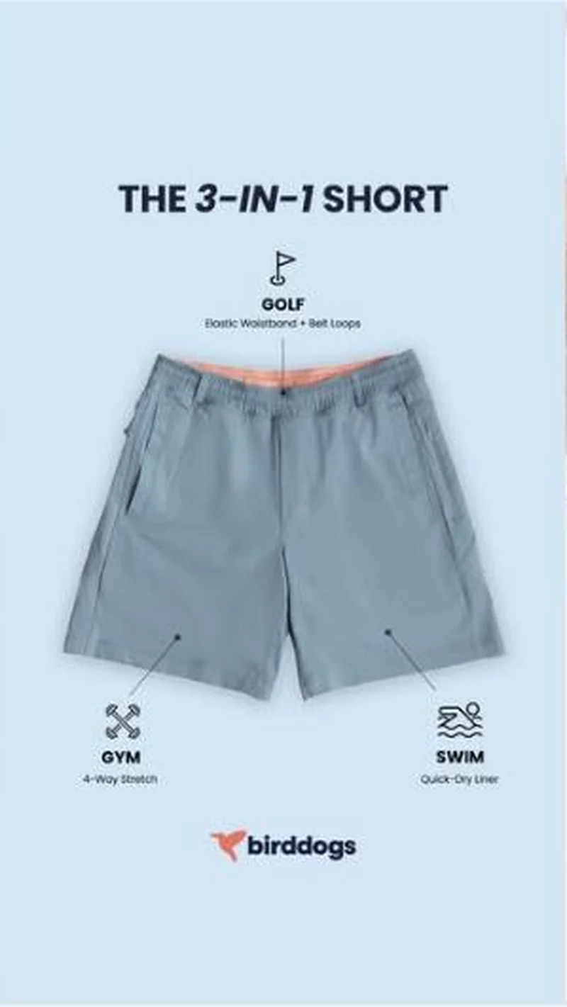 Birddogs The one calm ad in a loud account, an annotated spec sheet that finally says what the product is, shipped with the brand's own typo in the copy.
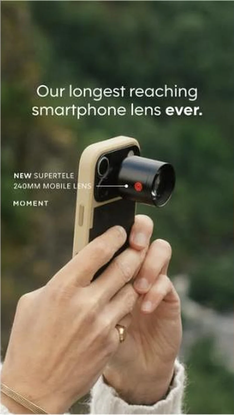 Moment A vertical product shot promises Moment's longest reaching phone lens, then lands on the right product page where the lens is on back order.
 Amberjack An annotated outsole diagram sells the engineering, then the page opens with a scratch to win game before any of it appears.
 Dermalogica Eleven of thirty-seven live creatives point at one exosome serum, and the whole block argues from a dated clinical timeline rather than from a promise.
Does your own handoff survive the click?
This is the same read I run on live funnels: the ad, the page, and the gap between them. Scored, free, no call required.
Audit my store freeNew teardowns as they land, in Commerce Dispatch: the ad, the page it clicked to, and what the gap cost. Same free newsletter as the footer, no separate list.
Back to The Handoff, the full library of 253 teardowns, 226 of them ad and page pairs, filterable by objective, funnel stage, format, placement, category and persuasion mechanic.
Read next: what breaks, across every rated pair, drawn from every pair in this library.
Away is named here solely to identify the advertising being analysed. Brand names and marks are the property of their respective owners. No brand shown has any affiliation with, or has endorsed, Taylor Sicard Consulting.