APL · Traffic / Clicks · Cold / prospecting · August 2026 · Handoff: Partial · By Taylor Sicard
APL ad teardown: identity appeal into clicks
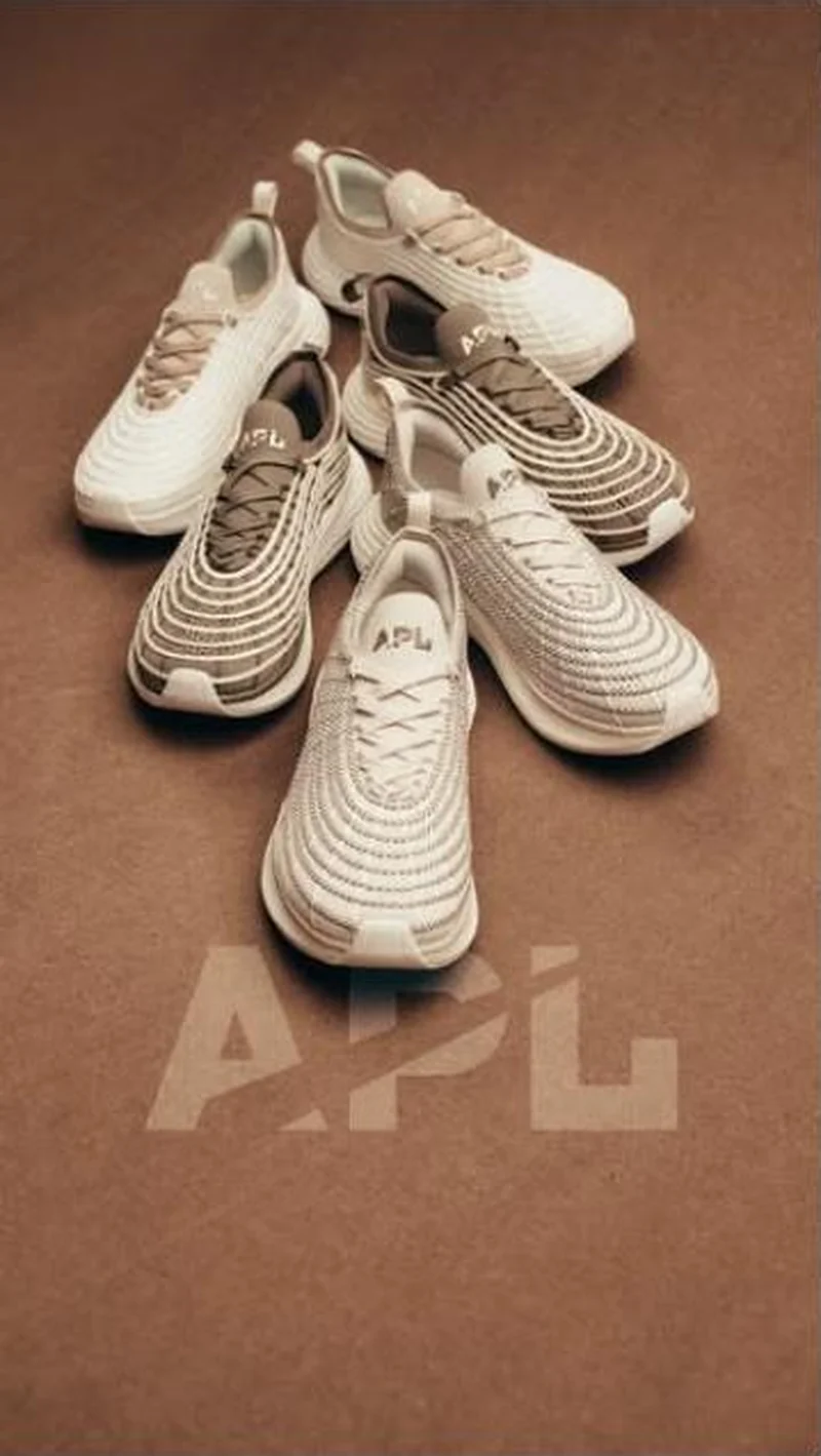
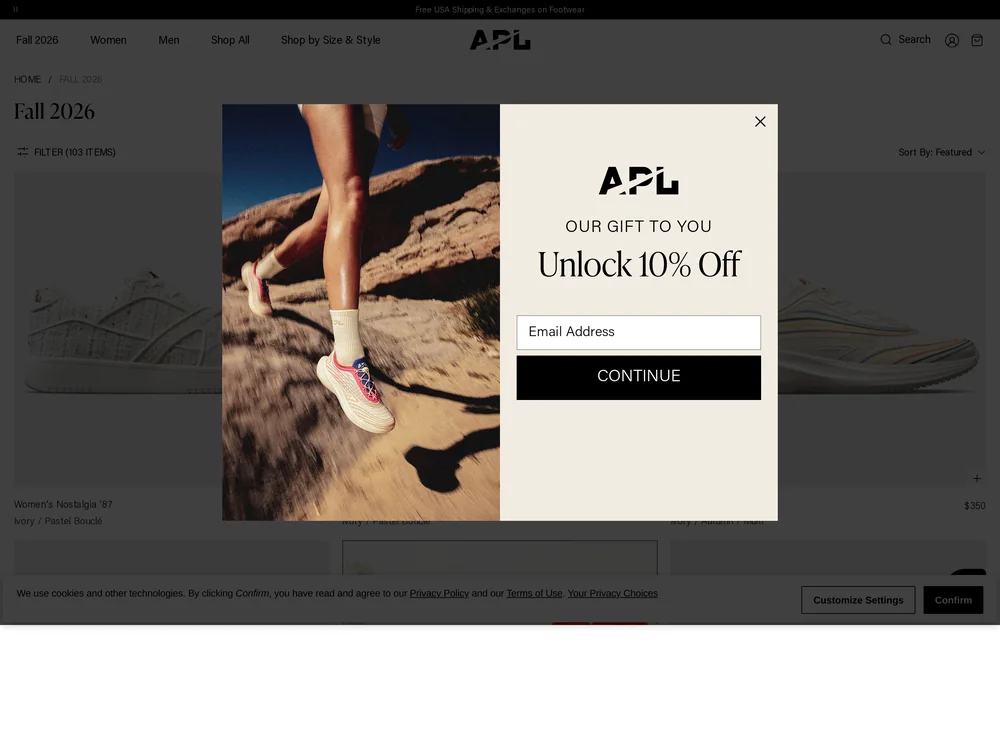
Five cream sneakers on brown paper under a ghosted APL wordmark, clicking into a Fall 2026 collection dimmed by an email modal.
“APL”
Handoff: Partial
The creative is a loose cluster of five APL runners in cream, oat and taupe on a mid-brown paper ground, with a large translucent APL wordmark ghosted across the lower third and no model, price, product name or call to action anywhere in frame. The destination is correct, Fall 2026, filter count 103 items, and the first row carries the same palette: Women's Nostalgia 87 in Ivory and Pastel Boucle, and an Ivory, Autumn and Multi pair at $350. What the visitor actually meets is not the collection. An email capture panel headed OUR GIFT TO YOU, Unlock 10 percent off, sits over the grid with a cookie consent bar beneath it, and in this capture nothing renders past that first dimmed row. A creative that spends its entire frame on tone hands off to two overlays and a filter count, and the season's colour story is never written down anywhere on the page.
The read
This is a palette ad. Nothing in the frame argues a benefit, names a model or shows a foot, so the only things on sale are a colour story and the confidence to run your own logo at low opacity. Grouping five shoes rather than shooting one is the tell that this is a season rather than a product, which is the correct setup for a collection click.
What the ad does
- Five shoes means a drop, not a product. A loose cluster of five runners in cream, oat and taupe on a mid brown paper ground reads as a season rather than an item, which is the correct setup for a collection click. Nothing in frame argues a benefit, names a model or shows a foot.
- The palette is the whole creative and the page never writes it down. The destination is right, Fall 2026 at 103 items, and the first row carries the same tones, Women's Nostalgia 87 in Ivory and Pastel Boucle and an Ivory, Autumn and Multi pair at $350, but the season's colour story appears nowhere in words.
Objective fit
The creative carries no price and no call to action, so its job is to move people into a collection rather than close a sale, and a seasonal grid is the right destination for that. It only pays off if the grid is the first thing the visitor sees.
APL ran this traffic creative to the landing page it clicked through to, both captured August 2026. Five cream sneakers on brown paper under a ghosted APL wordmark, clicking into a Fall 2026 collection dimmed by an email modal. Read as a pair, the handoff rates partial.
- Five shoes means a drop, not a product. A loose cluster of five runners in cream, oat and taupe on a mid brown paper ground reads as a season rather than an item, which is the correct setup for a collection click.
- The palette is the whole creative and the page never writes it down.
- What to fix: Show the look on the first screen when the creative sells a look.
Ad captured by Taylor Sicard 2026-08-21, landing page 2026-08-29. Screenshots reproduced for commentary and criticism.
Tagged
- Objective
- Traffic / Clicks
- Funnel
- Cold / prospecting
- Format
- Static image
- Placement
- Meta reelsInstagram stories
- Category
- Footwear
- Mechanic
- Identity appealMoment anchoringPattern interrupt
- Handoff
- Partial
- Brand
- APL
Identity appeal is #1 of 21 ranked mechanics, on 110 pairs. See where identity appeal ranks
How this was evidenced
- Evidence
- Pair captured The ad and the page it clicked through to were both captured first-hand, and the destination recorded is the page the ad pointed at.
- Ad creative
- Captured August 2026
- Destination
- https://www.athleticpropulsionlabs.com/collections/fall-2026 Captured August 2026. Advertisers change their ads and pages continuously, so the live page may differ from the capture above. That is expected, and the capture is the record.
- Ad Library
- No permalink. This creative was observed running in-feed; Meta does not issue a stable public URL for a non-political ad, and purges it from the library once it stops running. The capture above is the record.
What to fix
Show the look on the first screen when the creative sells a look. An email capture headed OUR GIFT TO YOU, Unlock 10 percent off sits over the grid with a cookie consent bar beneath it, and in this capture nothing renders past that first dimmed row, so the traffic the ad paid for meets two overlays and a filter count instead of Fall 2026.
One of 40 pairs where a popup is the landing page. See the pattern · See all 40
Sources
The same play elsewhere
Same identity appeal, different brands.
 Aldo A creator street style photo that names no product, landing on a 55 item men's footwear grid where the bag in frame is not sold.
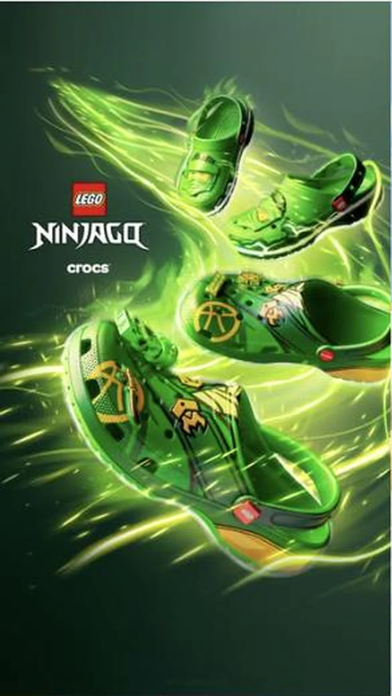 Crocs The licensed logo is the entire headline: four NINJAGO creatives launched in four days, none carrying a price, a claim or a product name, all pointing at one collection hub.Traffic / ClicksOn Running A performance-footwear brand running overwhelmingly static in a category that defaults to motion.
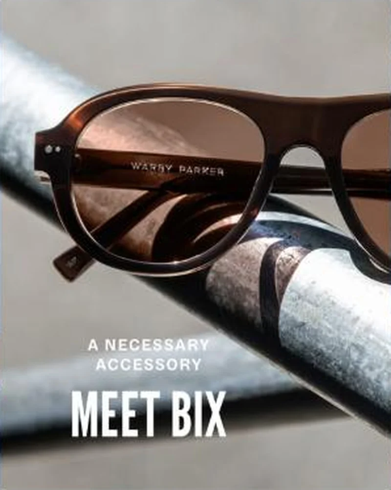 Warby Parker All 17 active US ads sit outside conventional hook taxonomy. The image is the entire argument.
Does your own handoff survive the click?
This is the same read I run on live funnels: the ad, the page, and the gap between them. Scored, free, no call required.
Audit my store freeNew teardowns as they land, in Commerce Dispatch: the ad, the page it clicked to, and what the gap cost. Same free newsletter as the footer, no separate list.
Back to The Handoff, the full library of 253 teardowns, 226 of them ad and page pairs, filterable by objective, funnel stage, format, placement, category and persuasion mechanic.
Read next: what breaks, across every rated pair, drawn from every pair in this library.
APL is named here solely to identify the advertising being analysed. Brand names and marks are the property of their respective owners. No brand shown has any affiliation with, or has endorsed, Taylor Sicard Consulting.